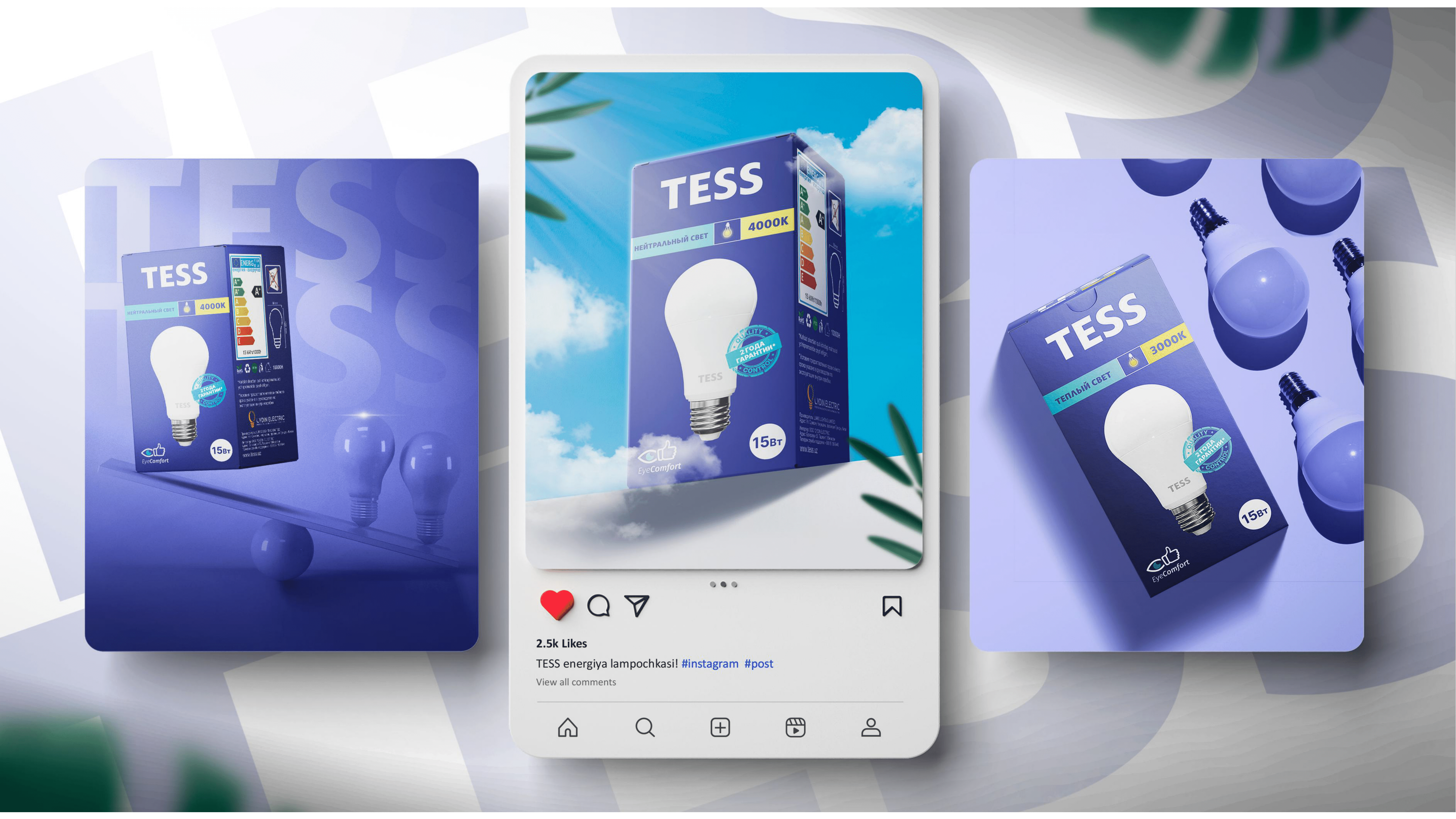
The redesign of the packaging aims to enhance the perception of the TESS light bulb among customers, making it more appealing and in demand. The redesign was carried out by Oydin Electric in order to update the visual appeal of the product, and make it more competitive in the market.
Problem
The client approached us with a request to update the packaging design as the existing versions did not align with current trends and were not distinctive on the shelves compared to competitors. Additionally, the current packaging had a diverse design, which hindered product recognition.One of the shortcomings of the previous design was that the term “Led” appeared to be the brand name, overshadowing the actual brand name.
Solution
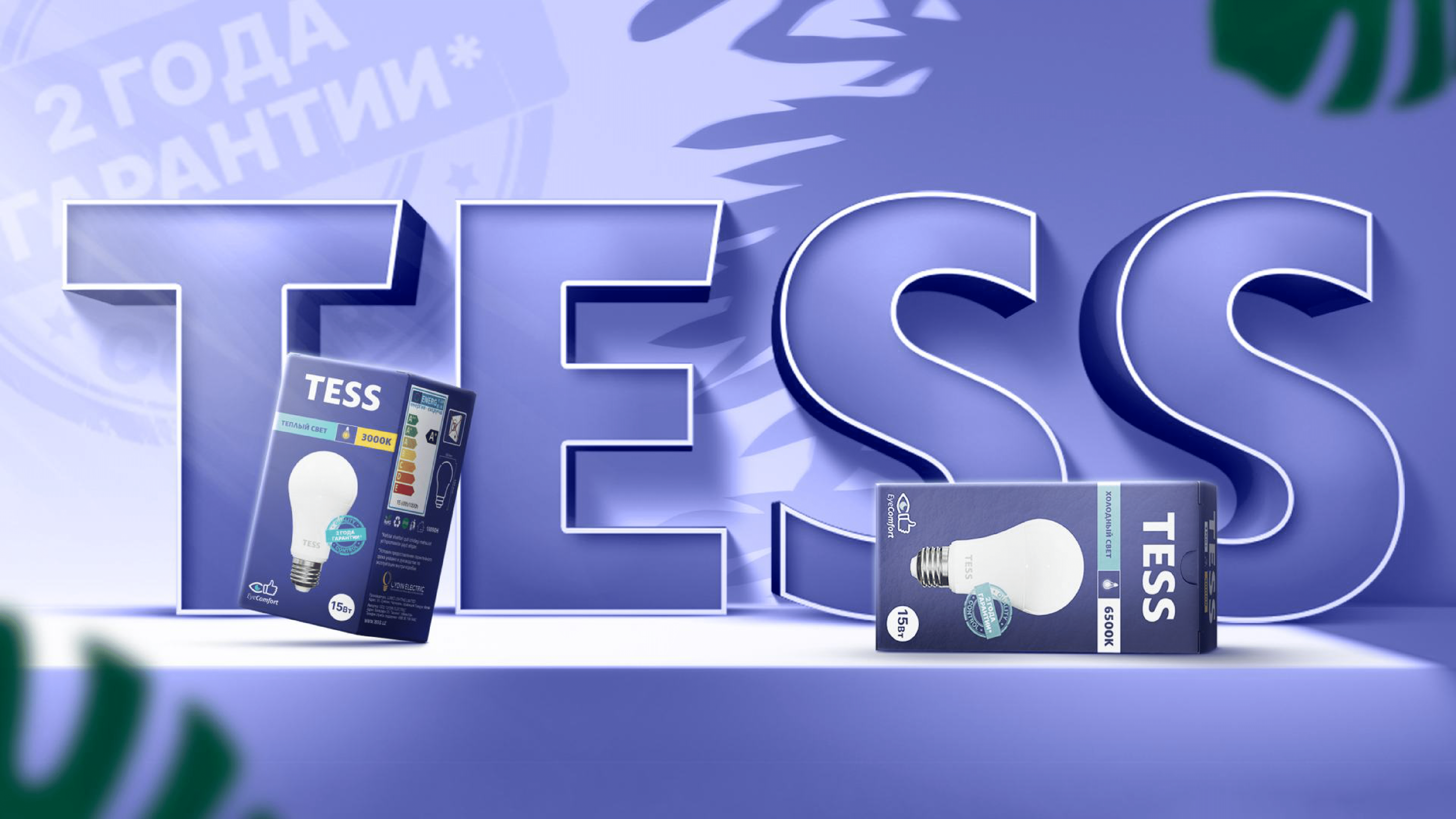
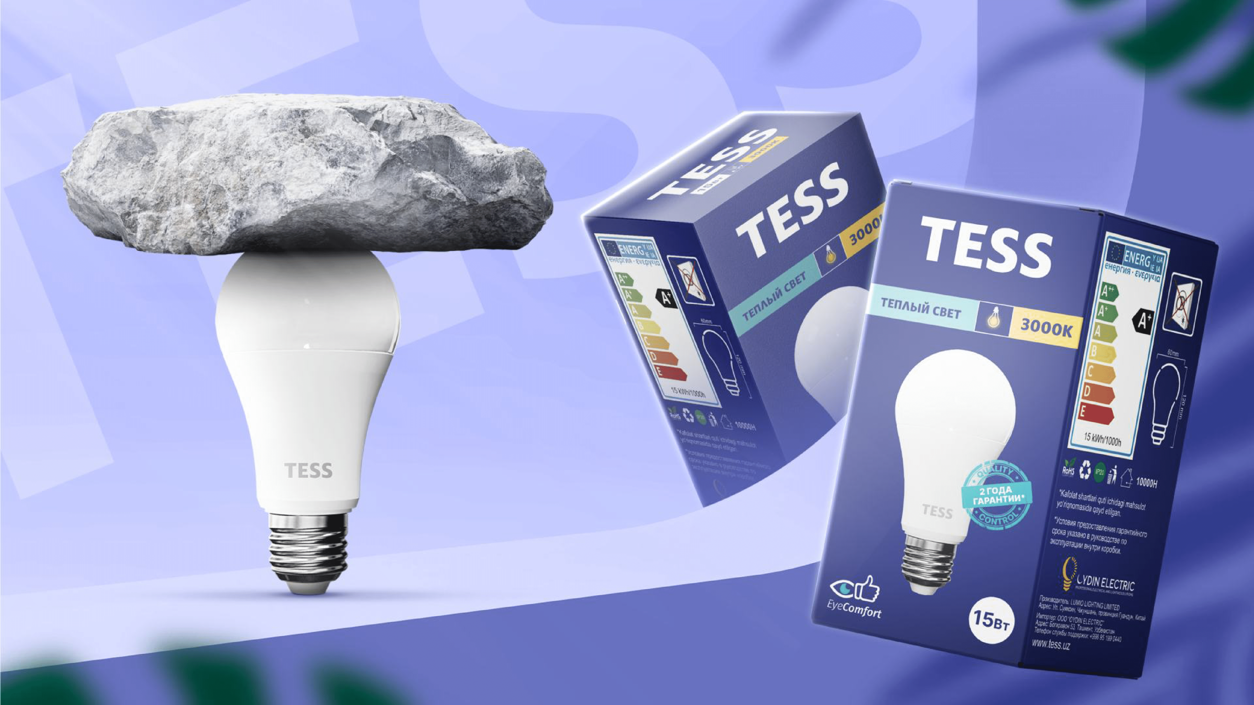
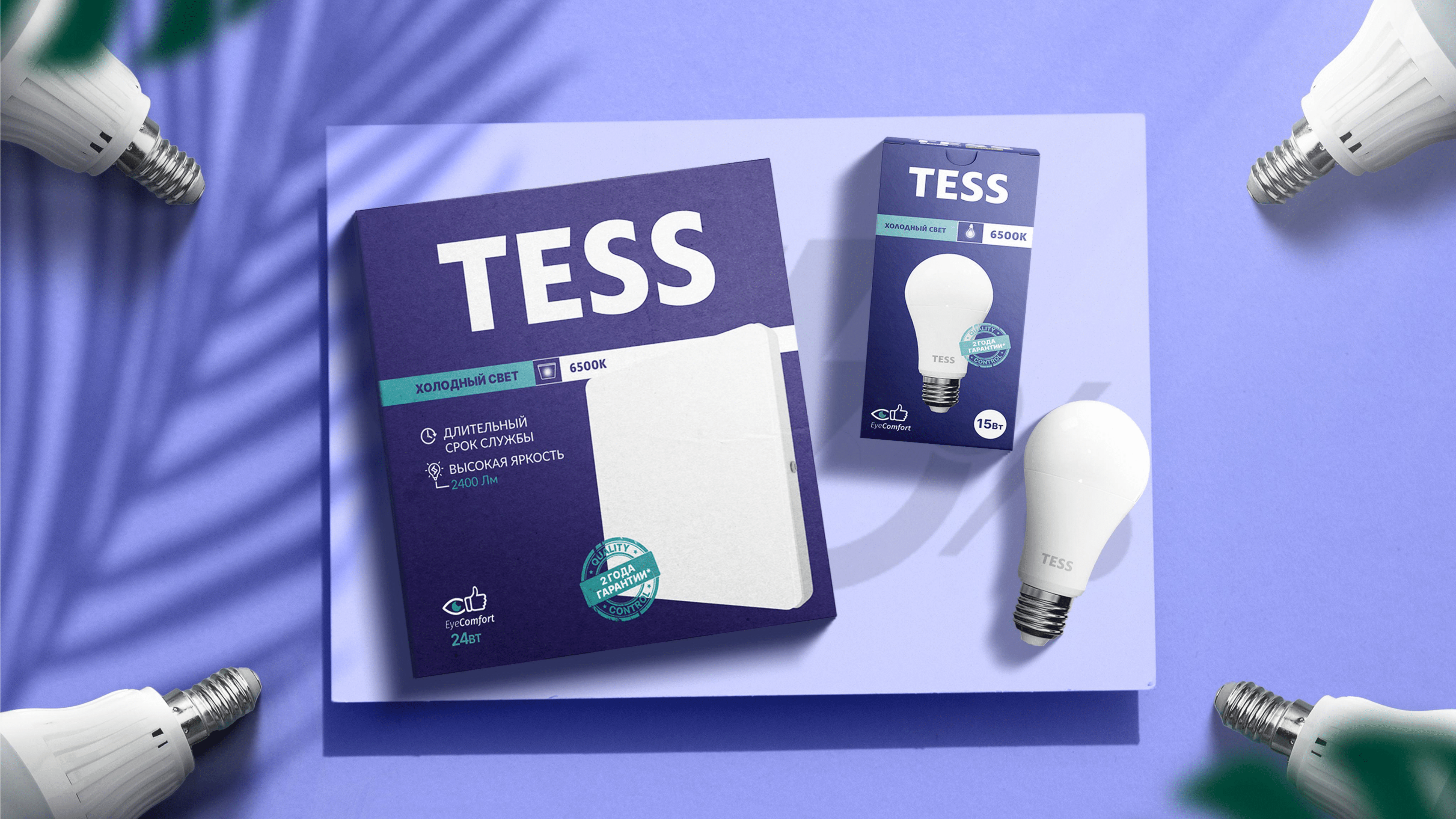
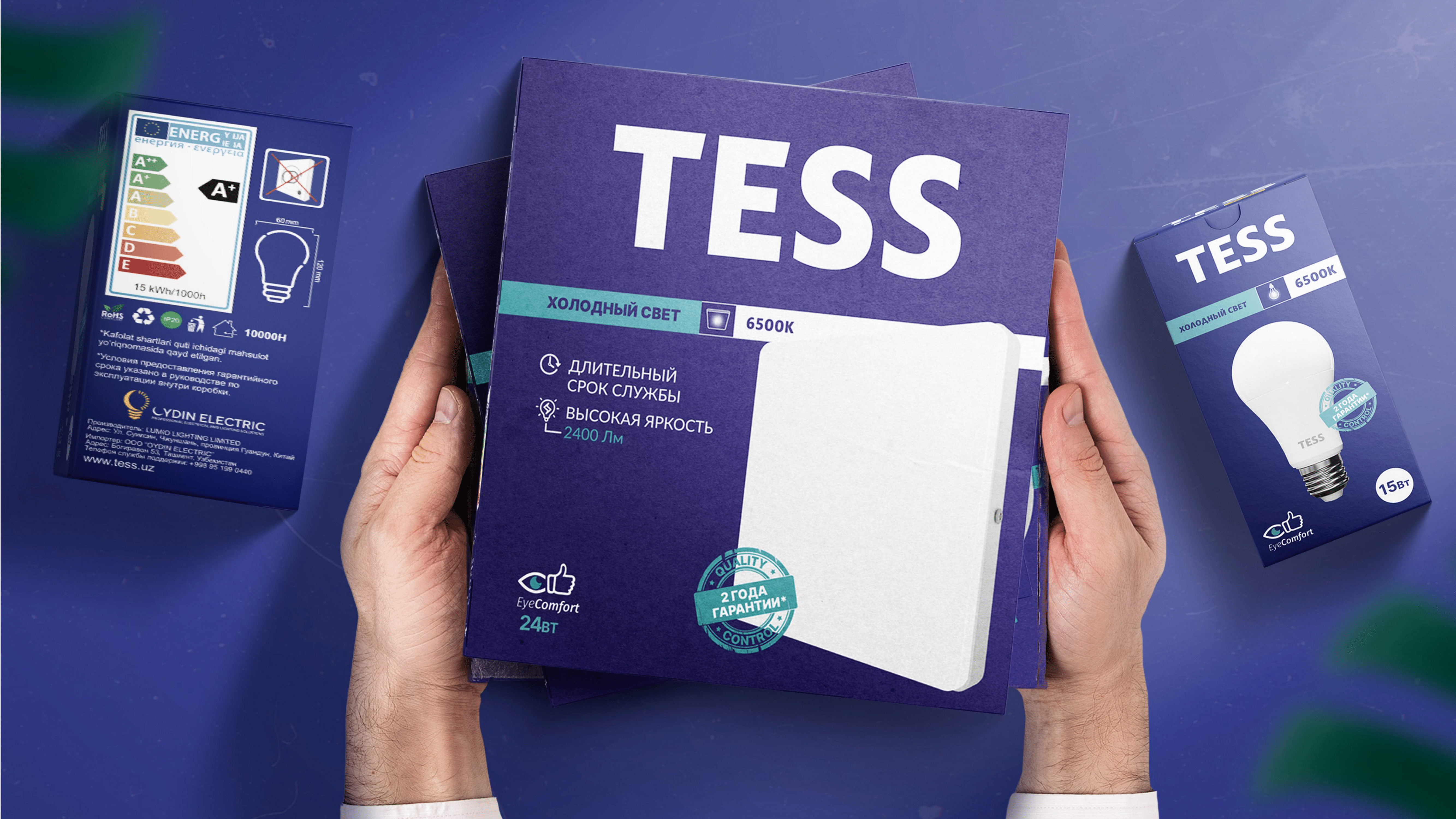
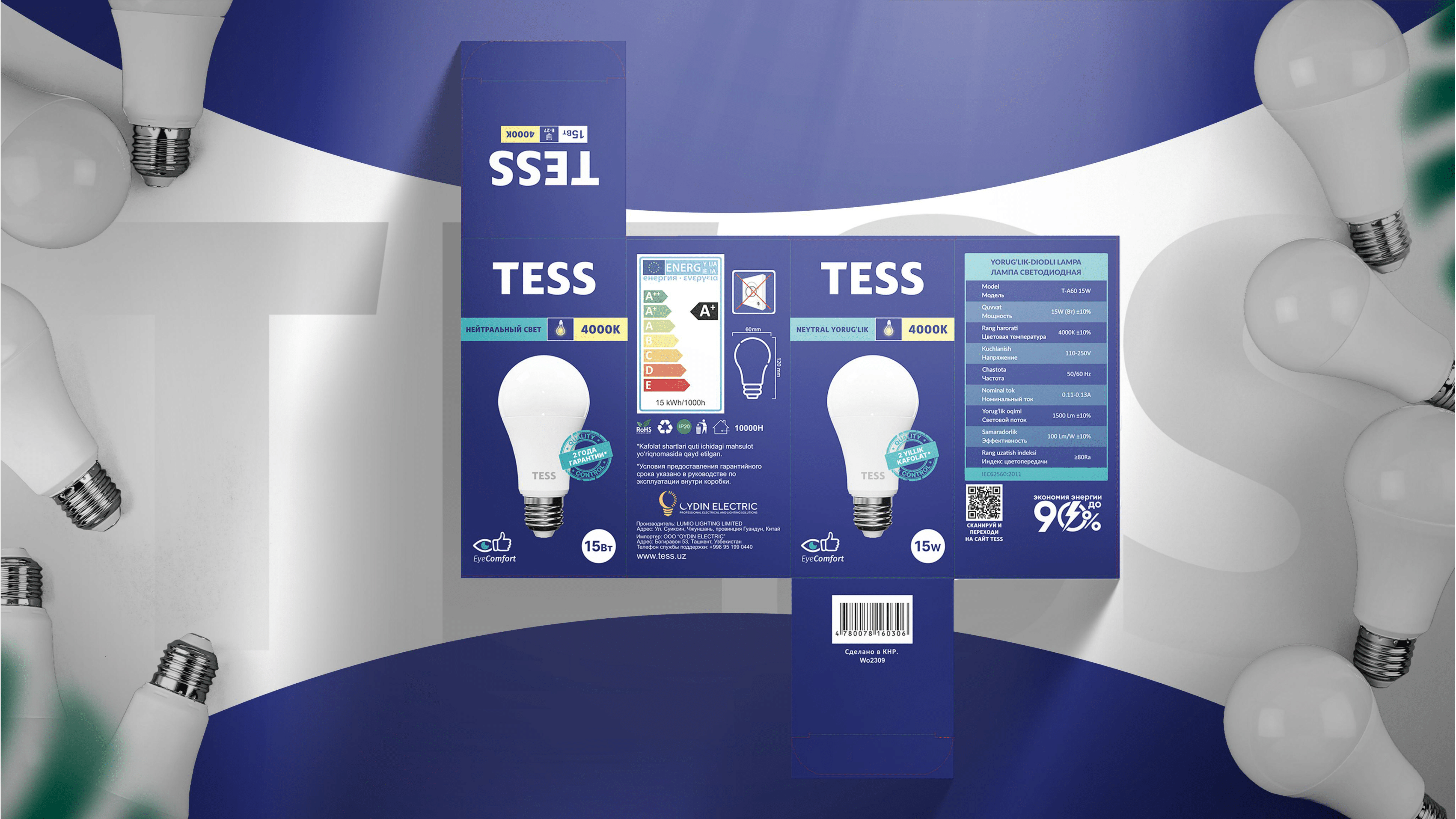
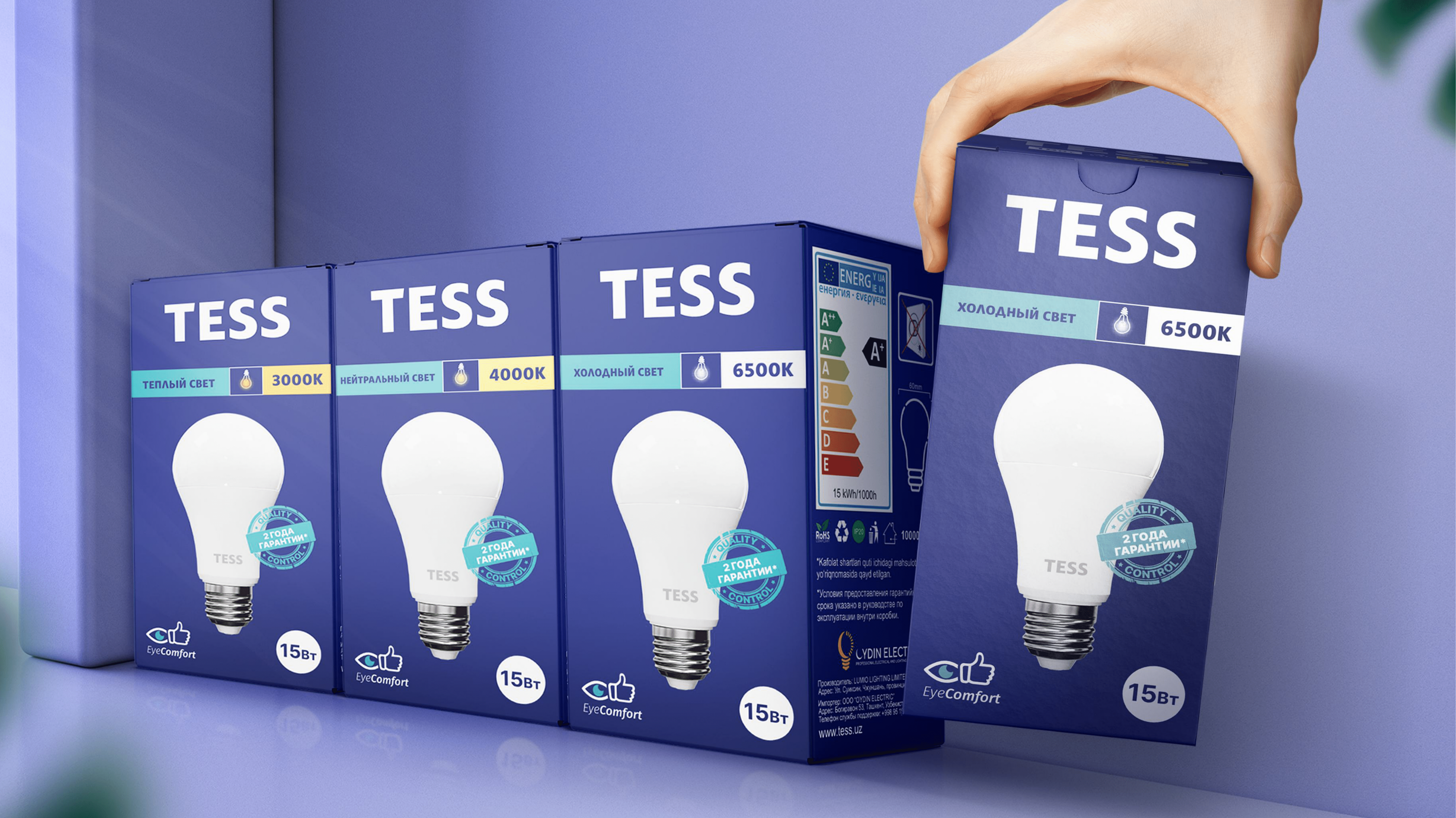
We have designed a unified packaging solution for the entire TESS lighting product line. A dark navy blue has been chosen as the primary color, which conveys a sense of trust and reliability while also providing a strong contrast with the white of the lighting fixtures.
Essential digital information has been incorporated into the packaging to allow customers to easily understand the product specifications. Icons and graphics have been added to enhance information clarity and emphasize key features.
Additionally, we have enhanced the visibility of the TESS brand name to prevent confusion with the term “LED” and ensure product recognition.
Result
The newly designed packaging is now gradually appearing in the country’s retail stores and has resulted in an 85% increase in sales. This redesign has enhanced the aesthetic appeal of the products, making it easier for customers to navigate through the assortment. The customer has expressed satisfaction with the outcome and acknowledged the successful completion of this project by our agency.