Our team developed the naming and packaging design for the sunflower oil product. We started with marketing analysis, studying the market and the needs of the target audience. The first important insight we received was that consumers are more loyal to sunflower oil brands that have a Russian name and spelling. Moreover, we took into account that the name should express the purity and quality of the product.
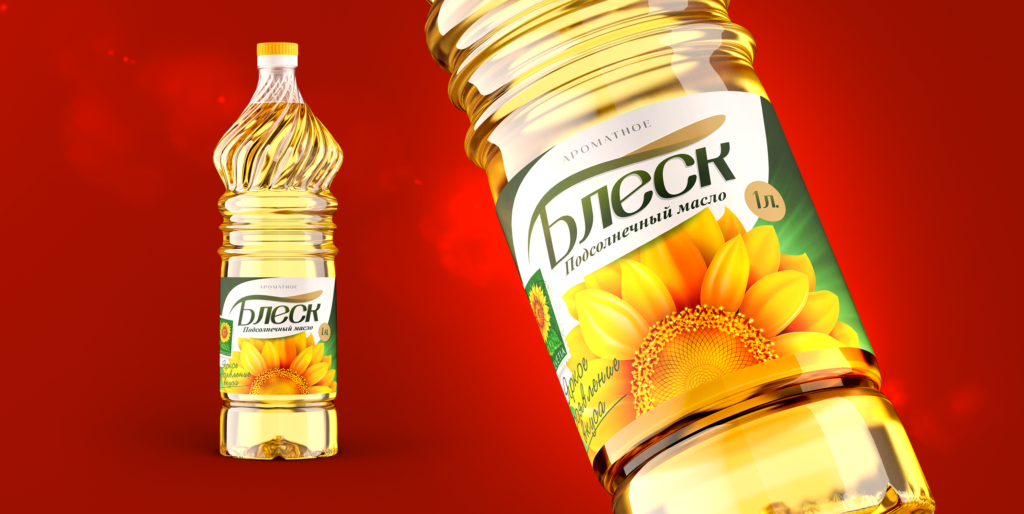
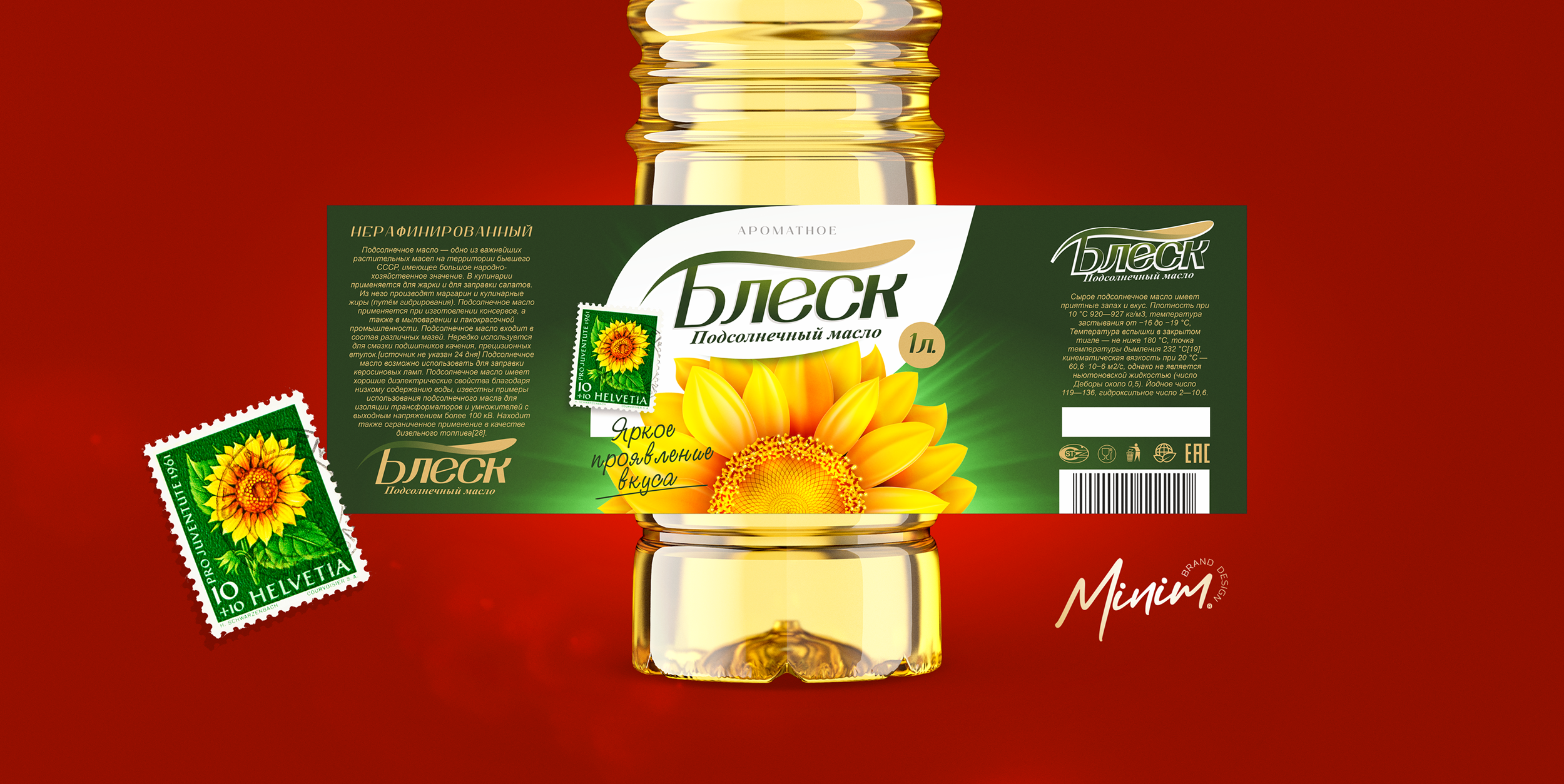
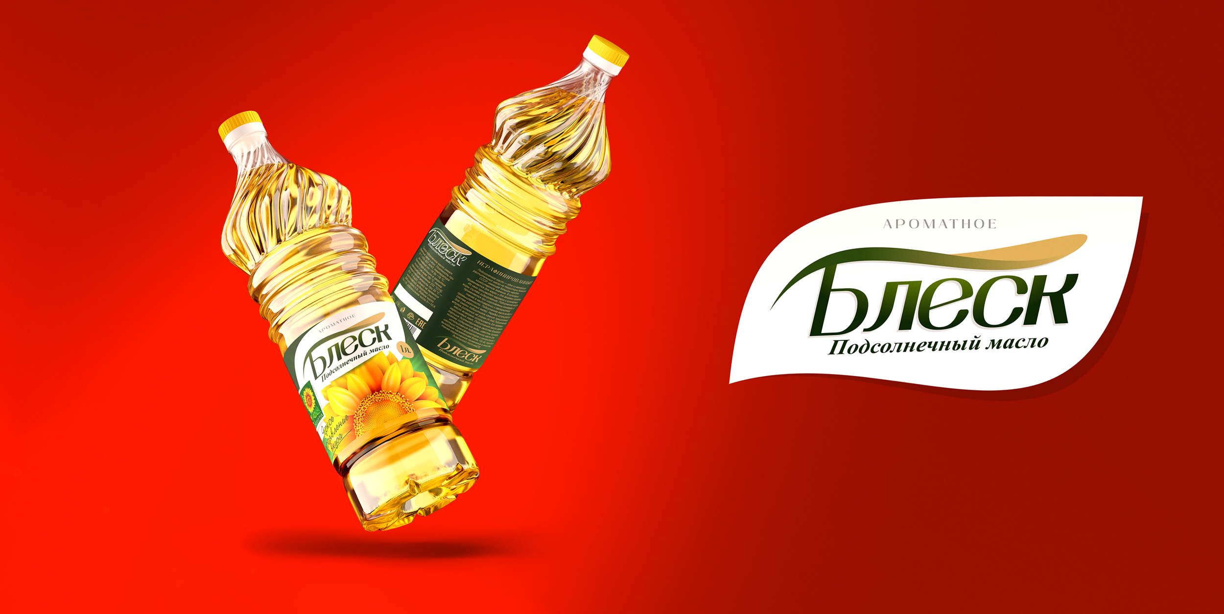
As a result of our work, we offered the client the name “Shine”, which meets all the above criteria. We have previously checked this name for patent clearance and found out that it has not yet been registered.
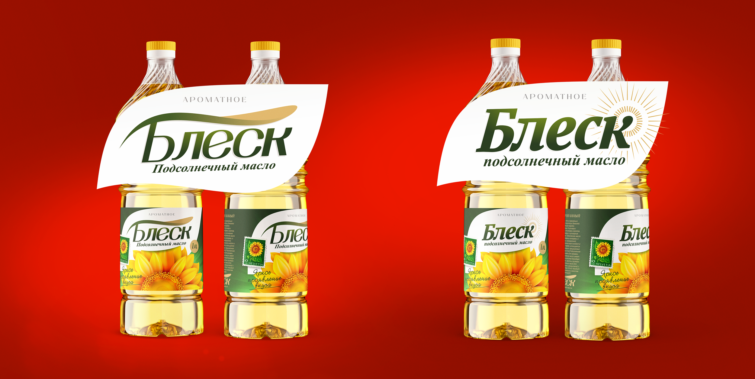
Further, we were entrusted with the task of creating an up-to-date and attractive design with a Russian flavor, which would be understandable to the modern consumer. We chose the shape of the bottle, made in a shape reminiscent of Moscow domes, and the bright image of a sunflower in the center of the label turned out to be the best solution for the new design.