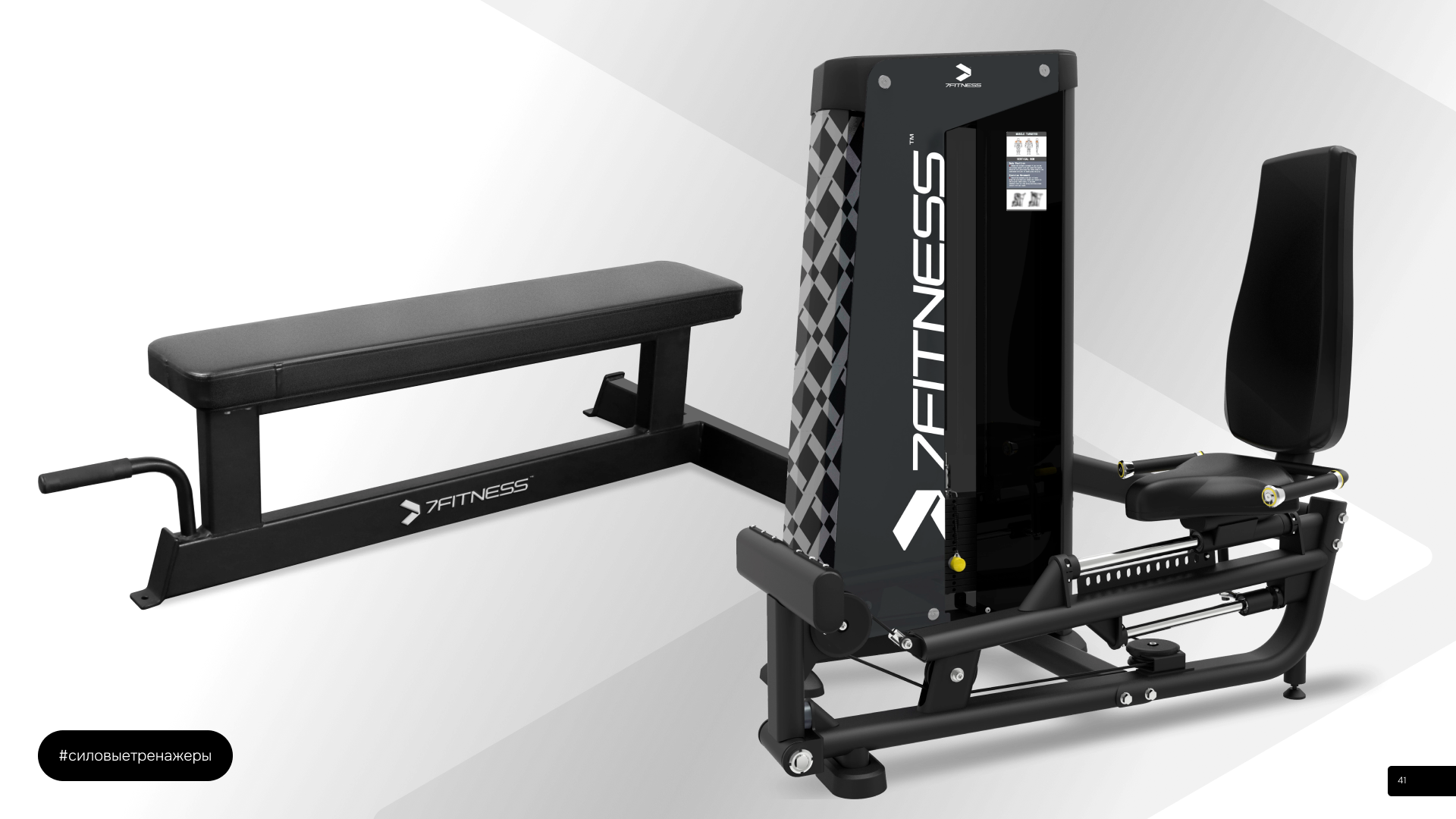
7Fitness is a new company that specializes in the distribution of sports equipment. They have a brand philosophy of “One goal, seven ways,” which encompasses various areas such as fitness clubs, wellness centers, and at-home fitness.
Problem
The client wanted a logo that was simple and minimalistic, similar to logos of well-known brands like Nike, Adidas, and Apple. It was also important for the logo to incorporate the number 7 in some way, as this represents the seven focus areas of their brand. Additionally, the logo needed to convey the idea of continuous movement and progress.
Solution
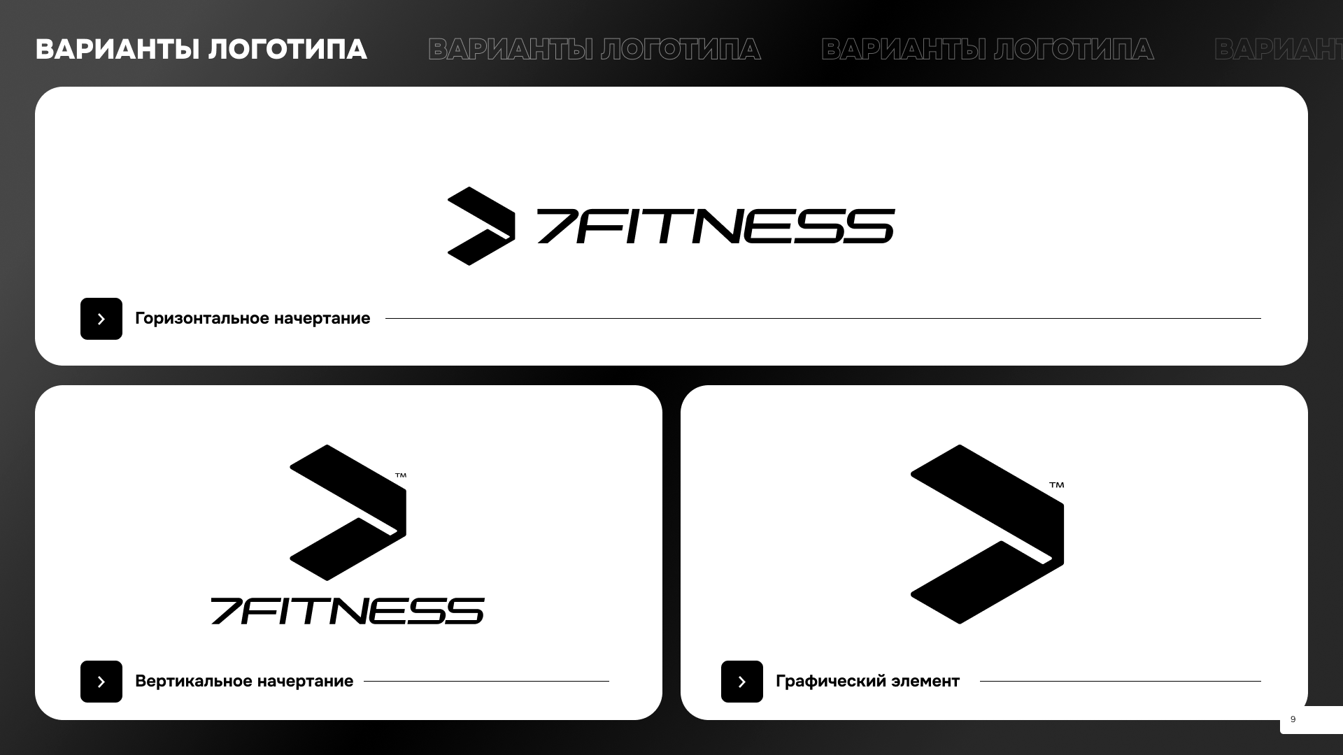
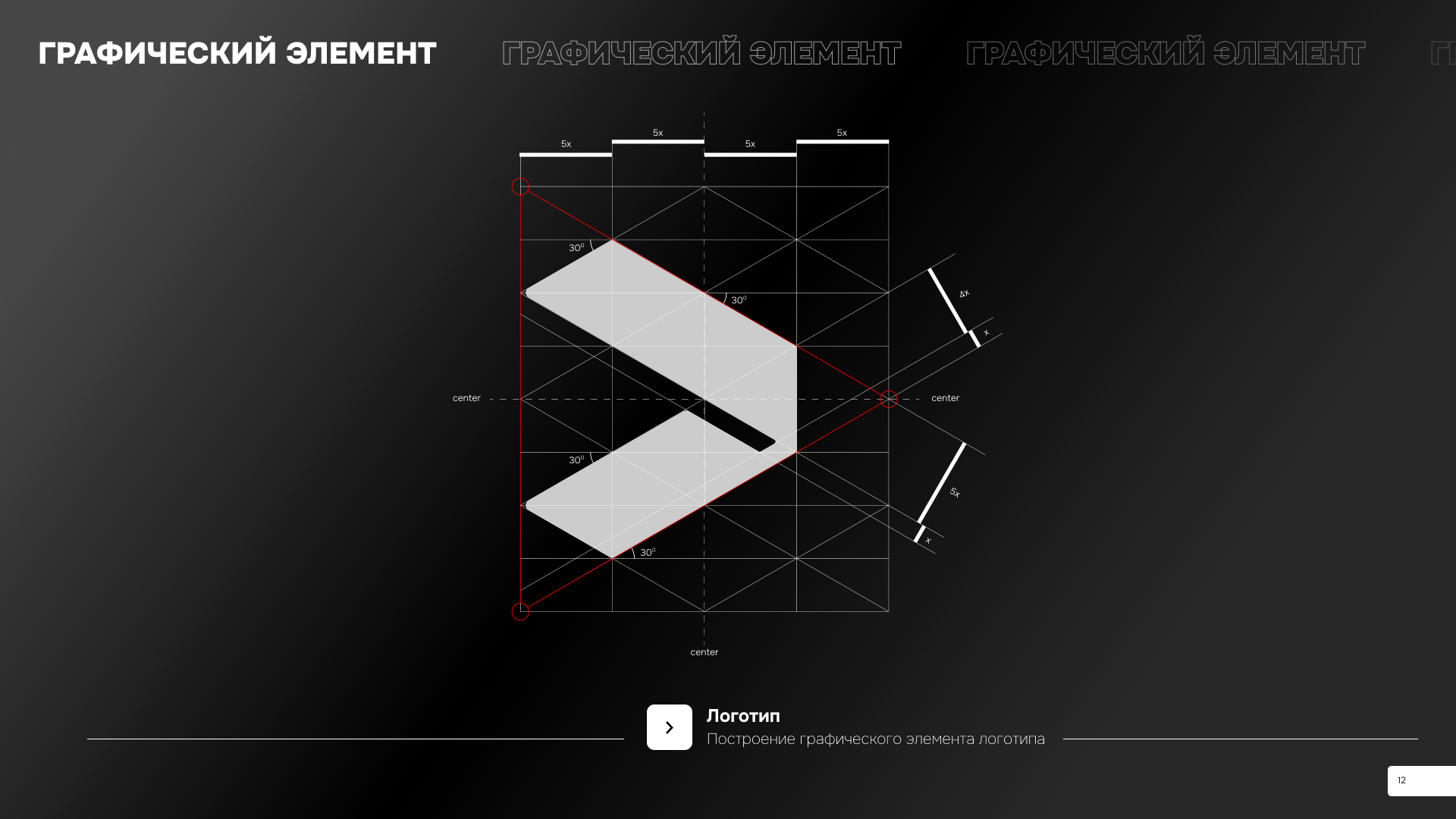
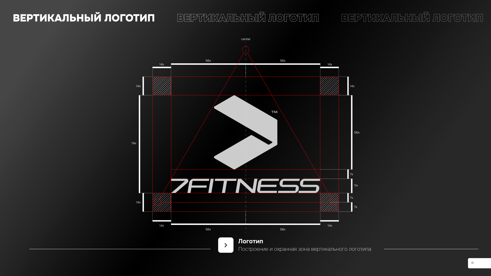
We have created a logo that perfectly represents the essence of the brand. The graphic element of the logo is composed of abstract shapes, which can be interpreted as a large sign, an arrow, or a track. These symbols represent the constant forward movement, the desire for improvement, and the achievement of goals.
Result
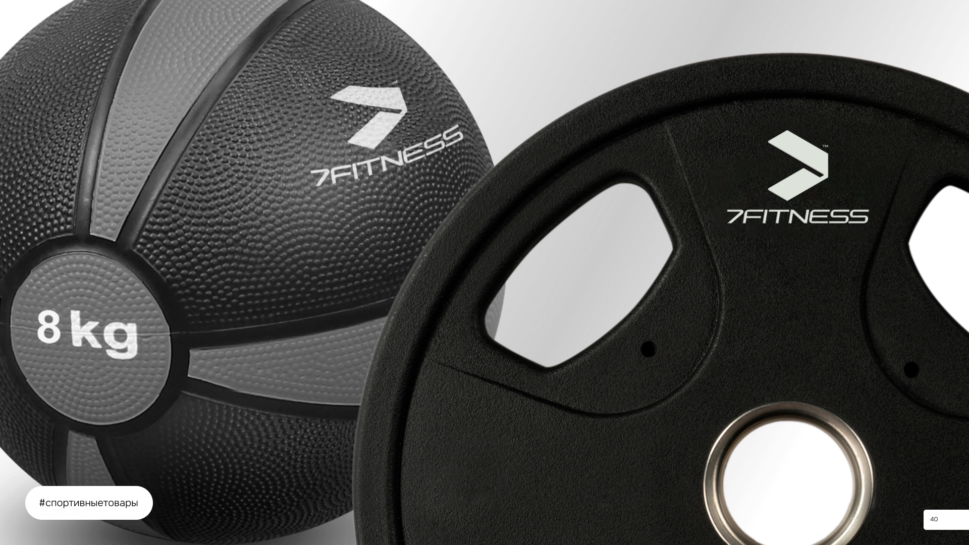
7Fitness has successfully launched its brand and established partnerships with several fitness clubs. We continue to expand our market presence and strive to provide our clients with high-quality services. Our clients have been satisfied with our work and have provided positive feedback about our cooperation.