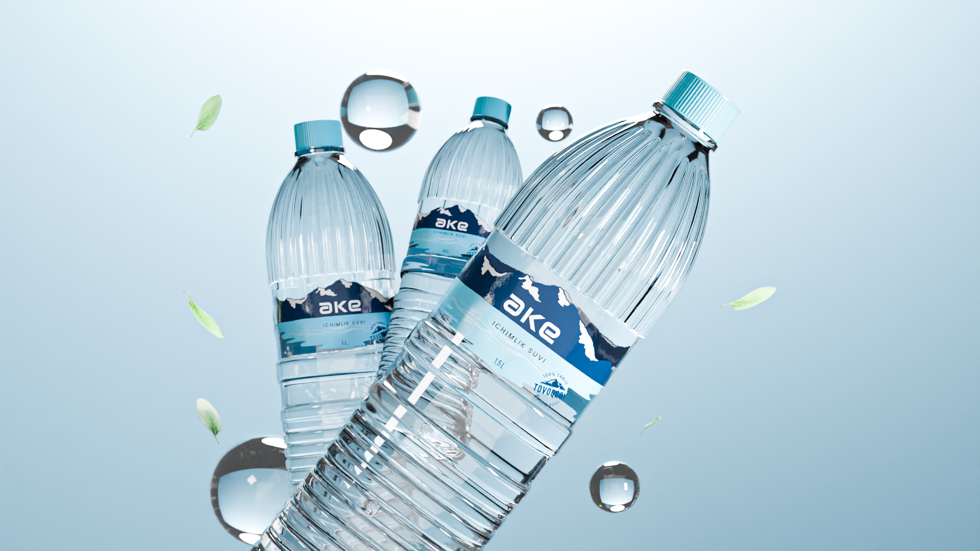
The design of the mineral water packaging conveys the grandeur and authenticity of mountain water in a natural way. We have endeavoured to capture this impression through every aspect of the design.
The minimalistic logo design, created in a minimalist style, has a profound symbolic significance. The mirror-image letter “a” within the word “ake” forms the letter “e”, symbolizing the unity and balance that lies at the heart of our water’s essence. The soft, rounded font reflects the gentleness and delicacy of this natural product. In the background, we have incorporated majestic mountain scenery, which serves as a reminder of the source of the water and symbolizes its power and vitality. The mountains reflect in the clear water, forming a beautiful mirrored pattern that invites one to enter a realm of purity and harmony with nature.