Beun decided to update its product packaging to improve brand perception and increase market recognition. The old design did not fully reflect the brand’s values and did not allow consumers to immediately identify the product as a premium cosmetic.
Solution
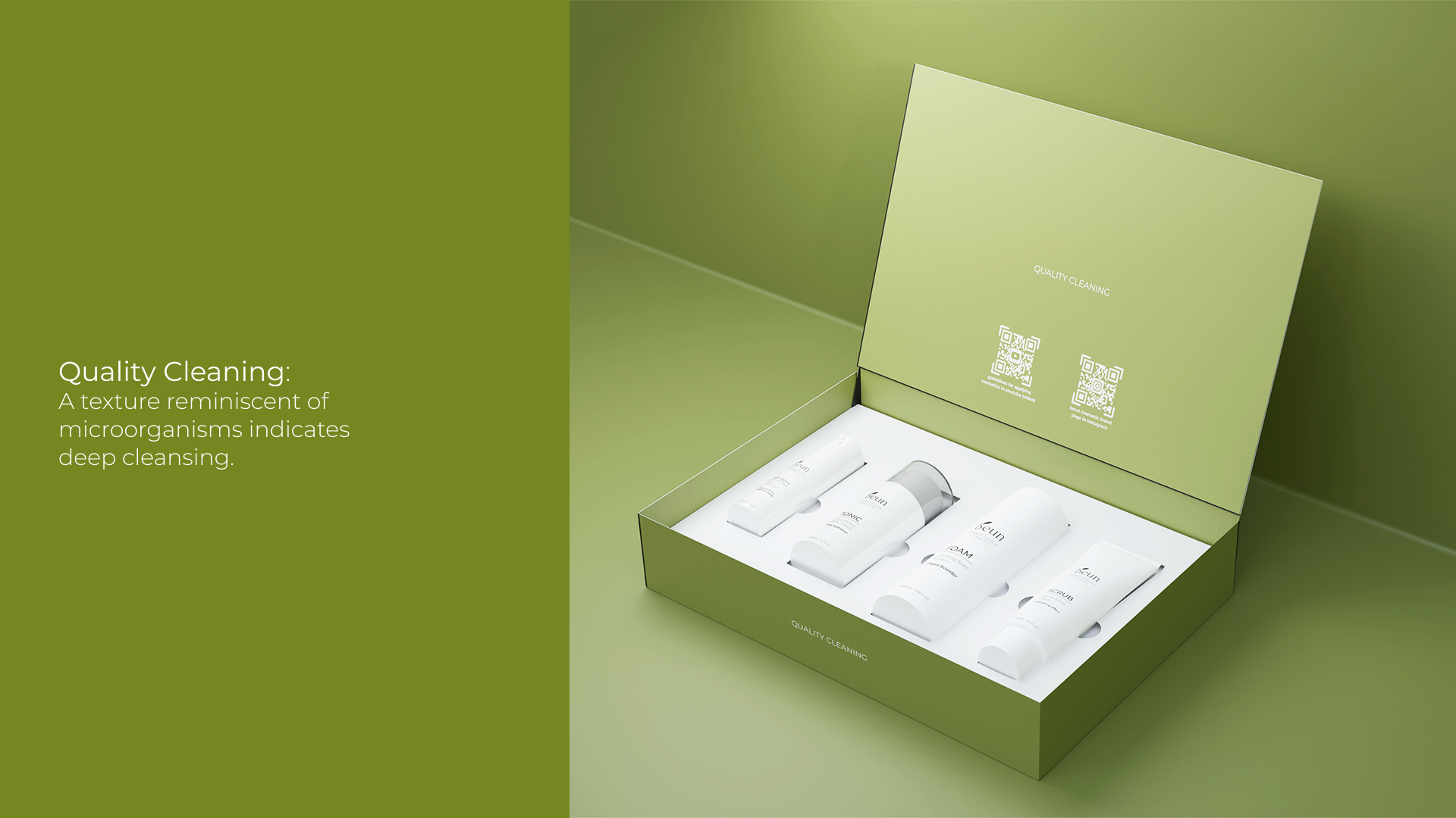
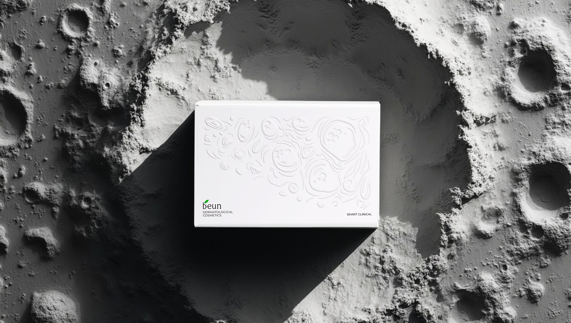
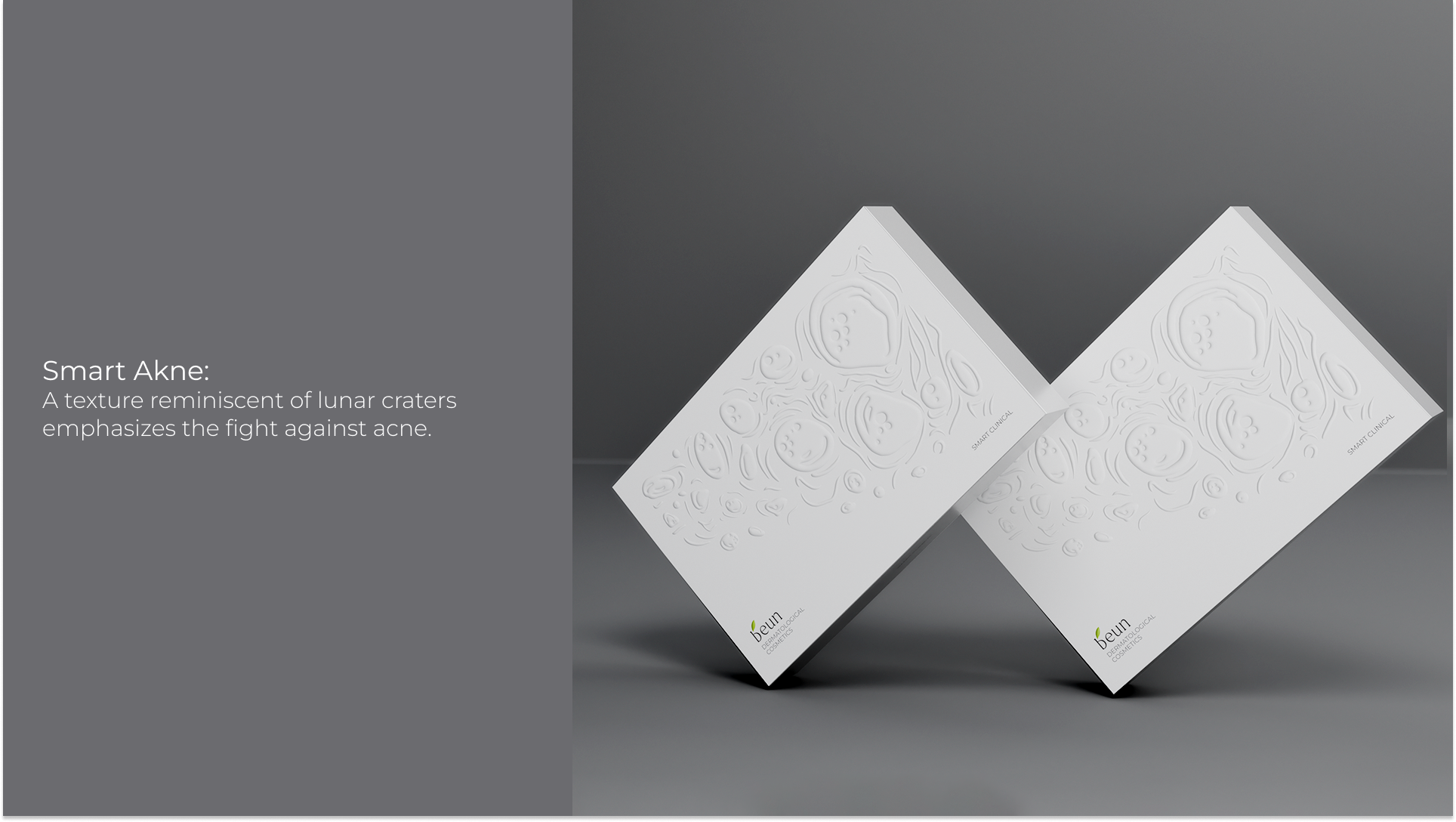
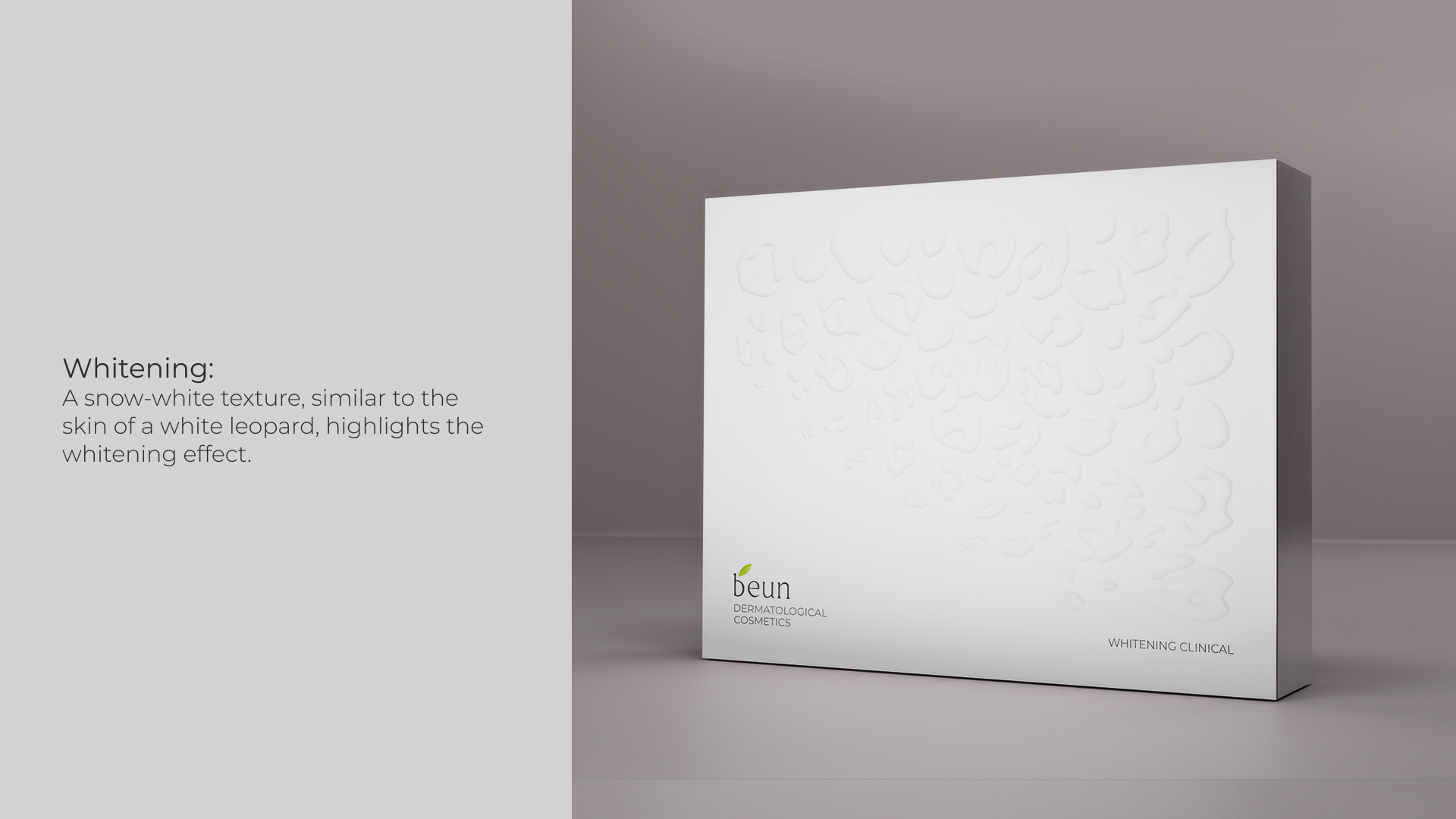
We completely redesigned the packaging, focusing on its premium features and characteristics.
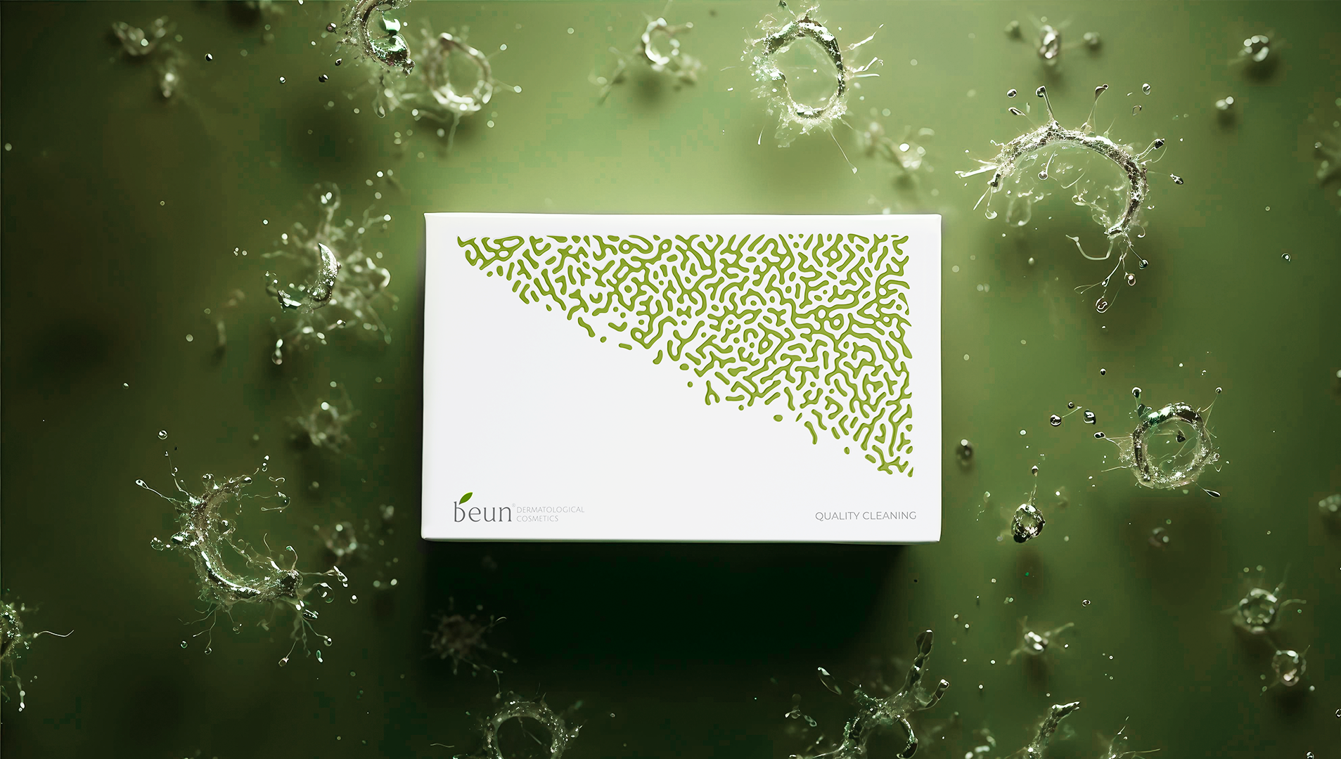
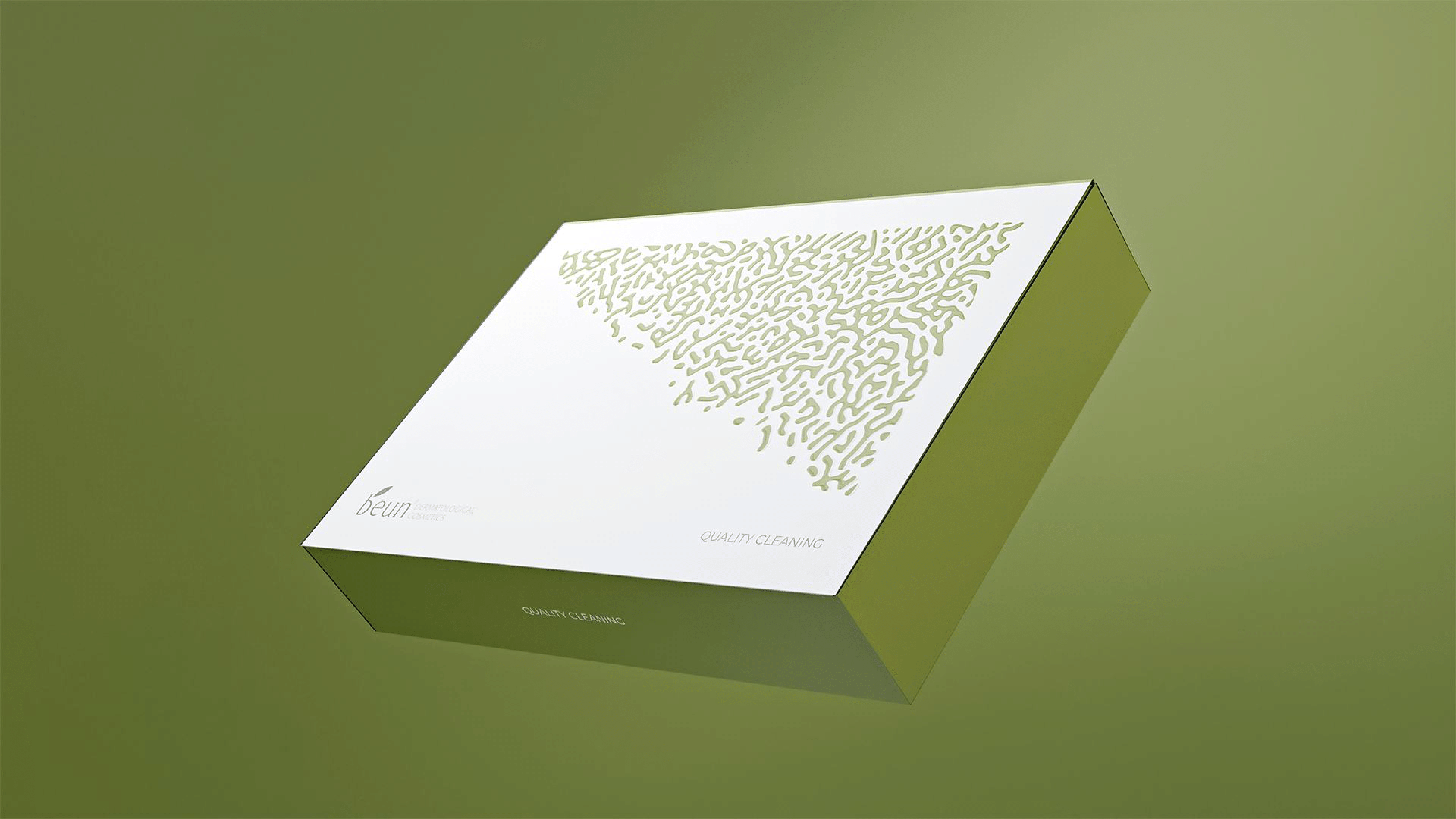
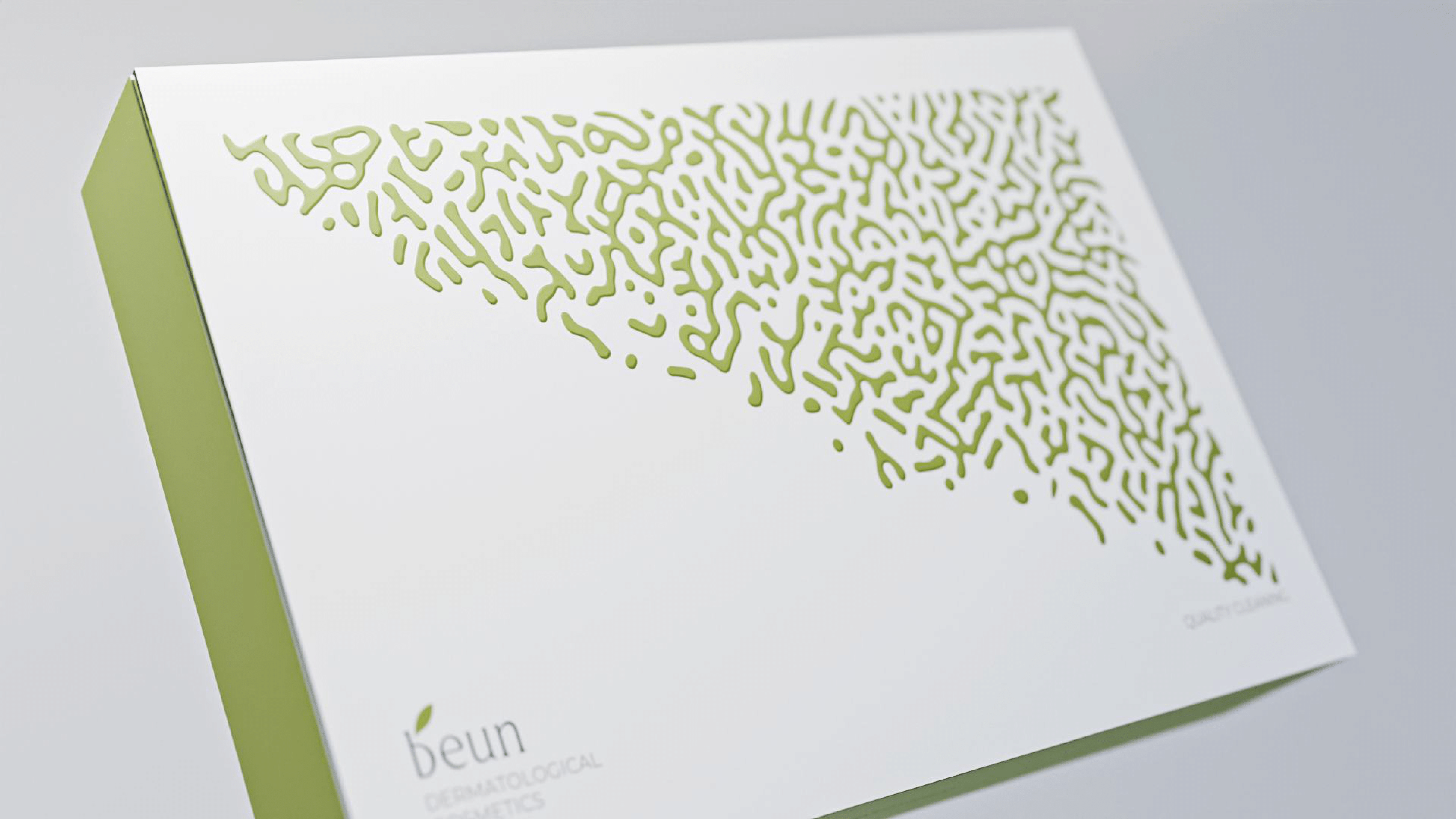
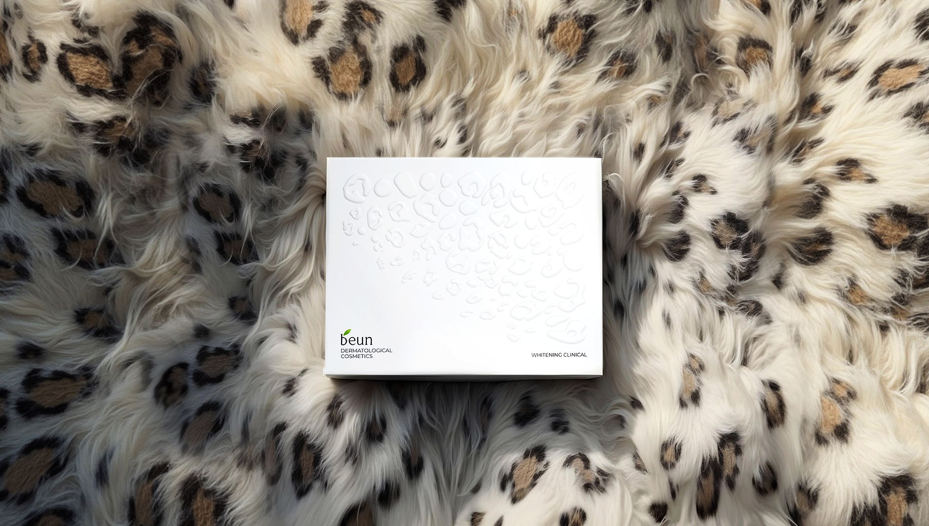
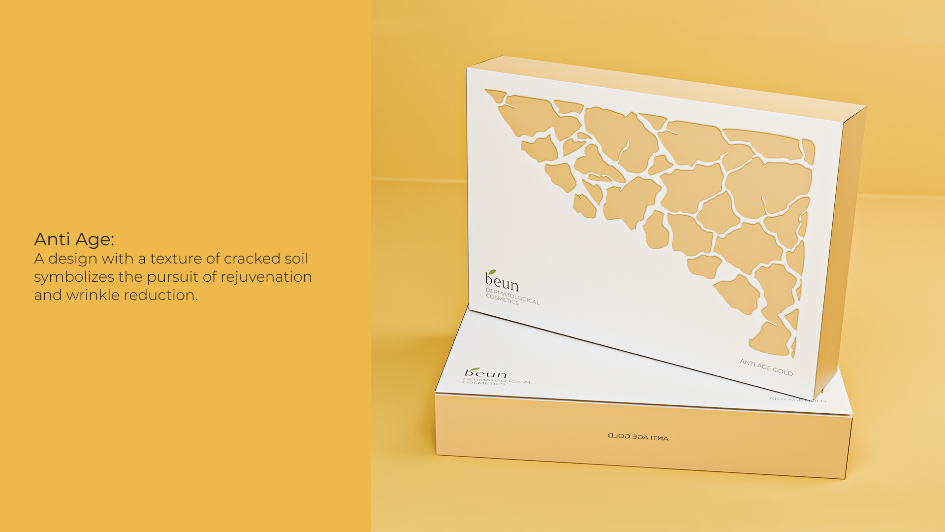
A unique design was created for each of the four sets: – Smart Akne: A texture reminiscent of lunar craters emphasizes the fight against acne. – Anti Age: A design with a texture of cracked soil symbolizes the pursuit of rejuvenation and wrinkle reduction. – Whitening: A snow-white texture, similar to the skin of a white leopard, highlights the whitening effect. – Quality Cleaning: A texture reminiscent of microorganisms indicates deep cleansing.
Where the name beun is present, the texture smoothly disappears, as if “cleansed” and “restored” — both metaphorically and visually. This symbolizes the brand’s care for purity and naturalness, as well as the restoration of the skin’s natural beauty.
Result
The new Beun packaging design has become more attractive and recognizable to the target audience. The packaging is now clearly associated with cosmetics, which has contributed to increased sales and strengthened the brand’s market position.