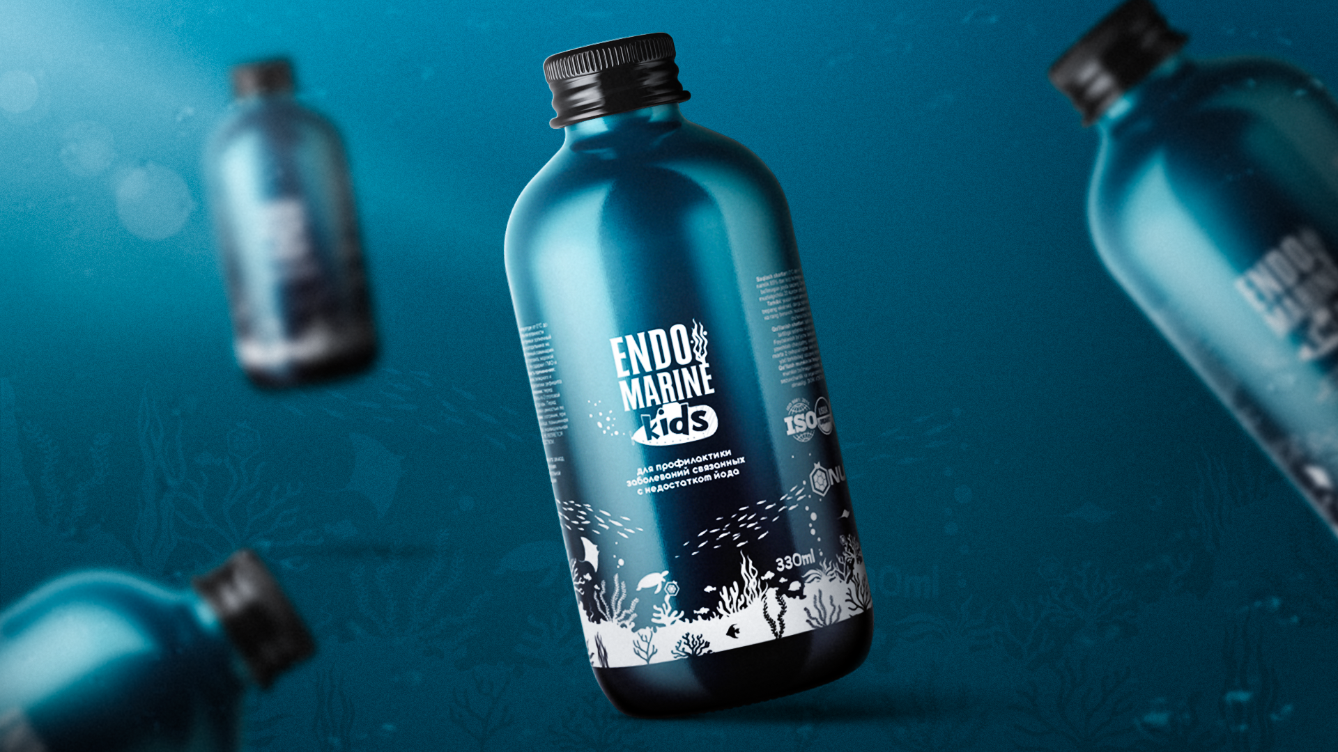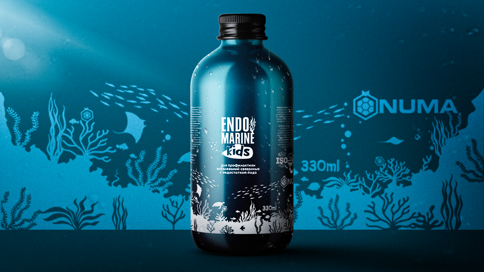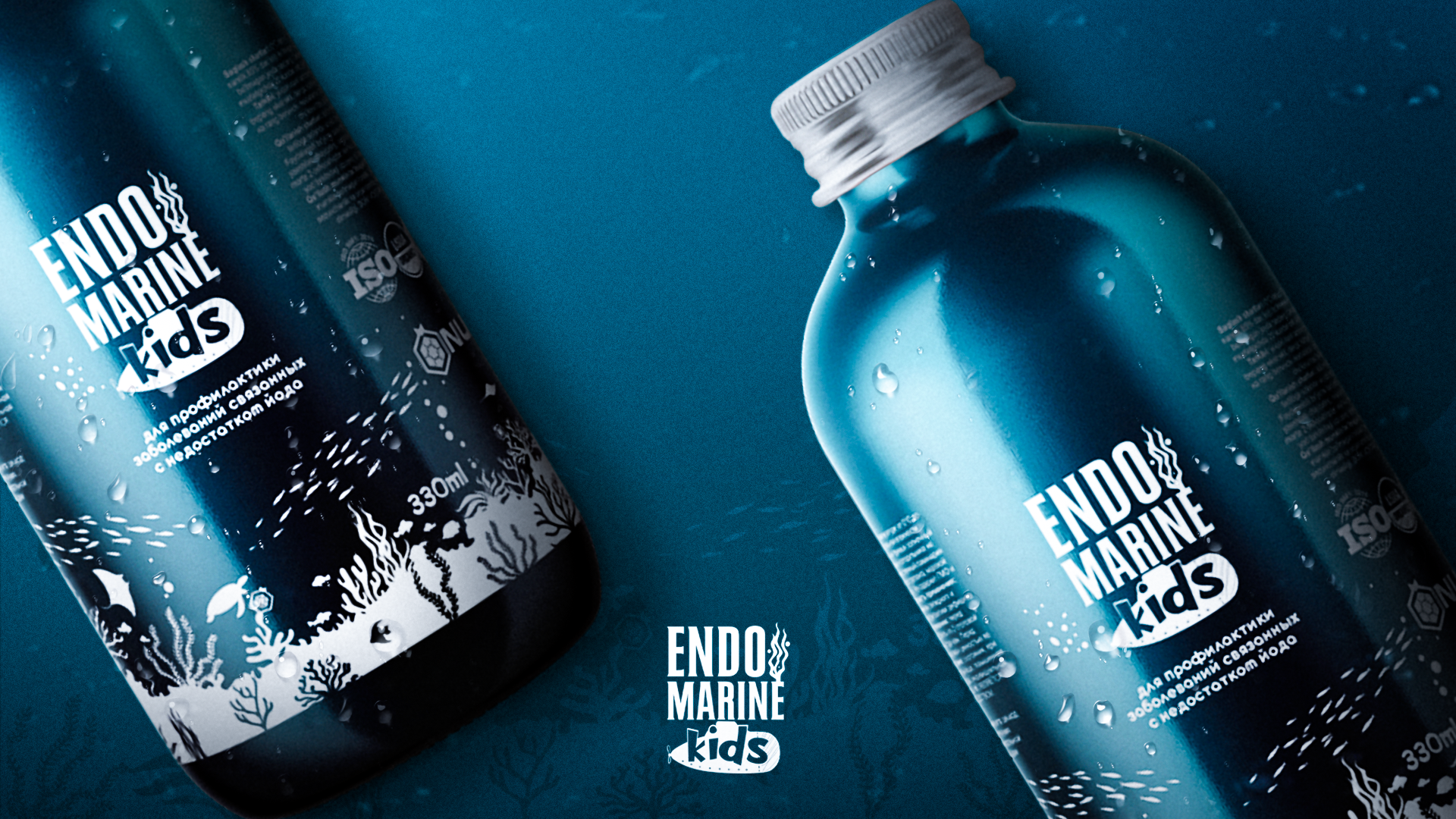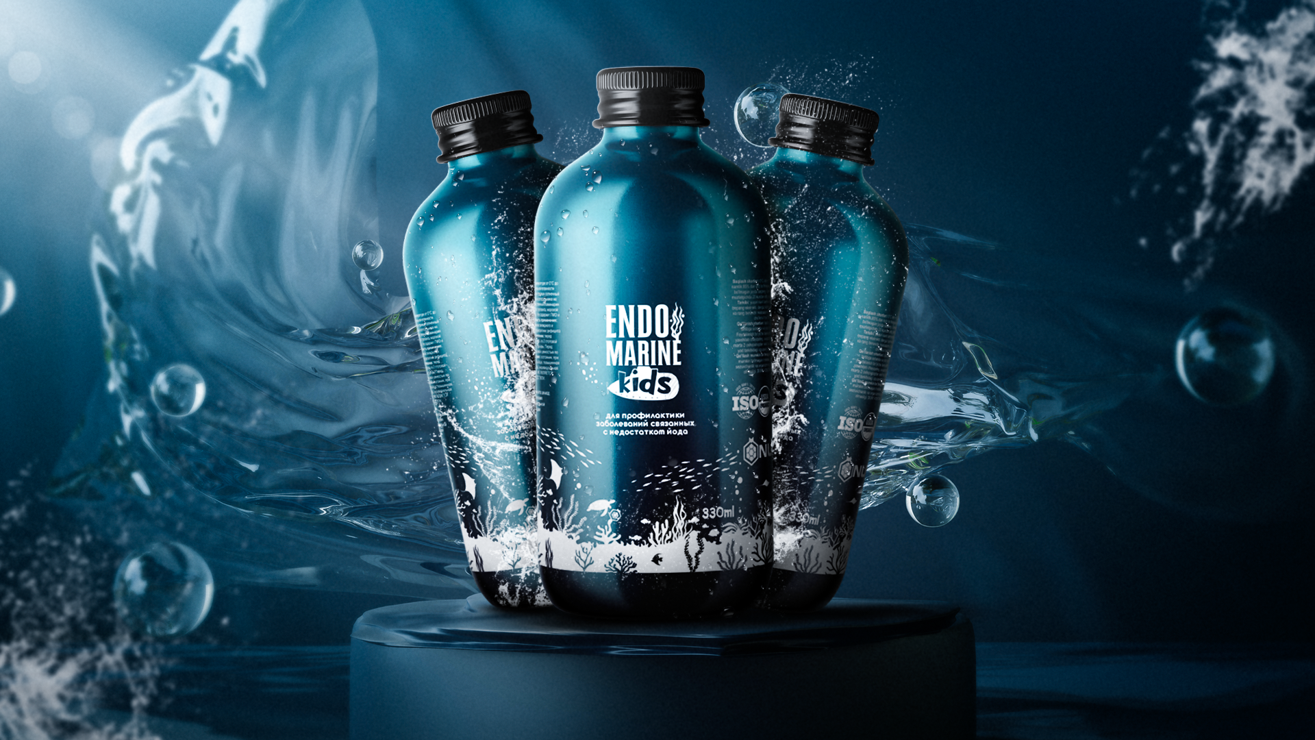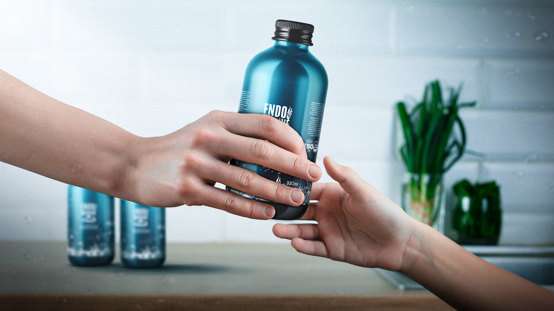
The company represents a high-quality, honest and most importantly natural food supplement, prepared on the basis of modern innovative technologies without chemical-technical processing. Specially developed multi complex for saturating children’s body with natural vitamins, microelements and biologically active substances necessary for normal functioning.
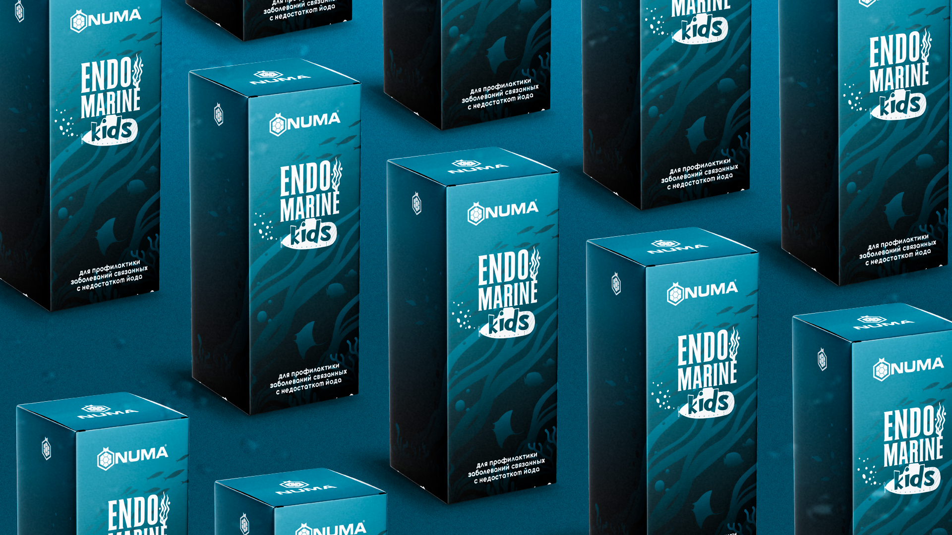
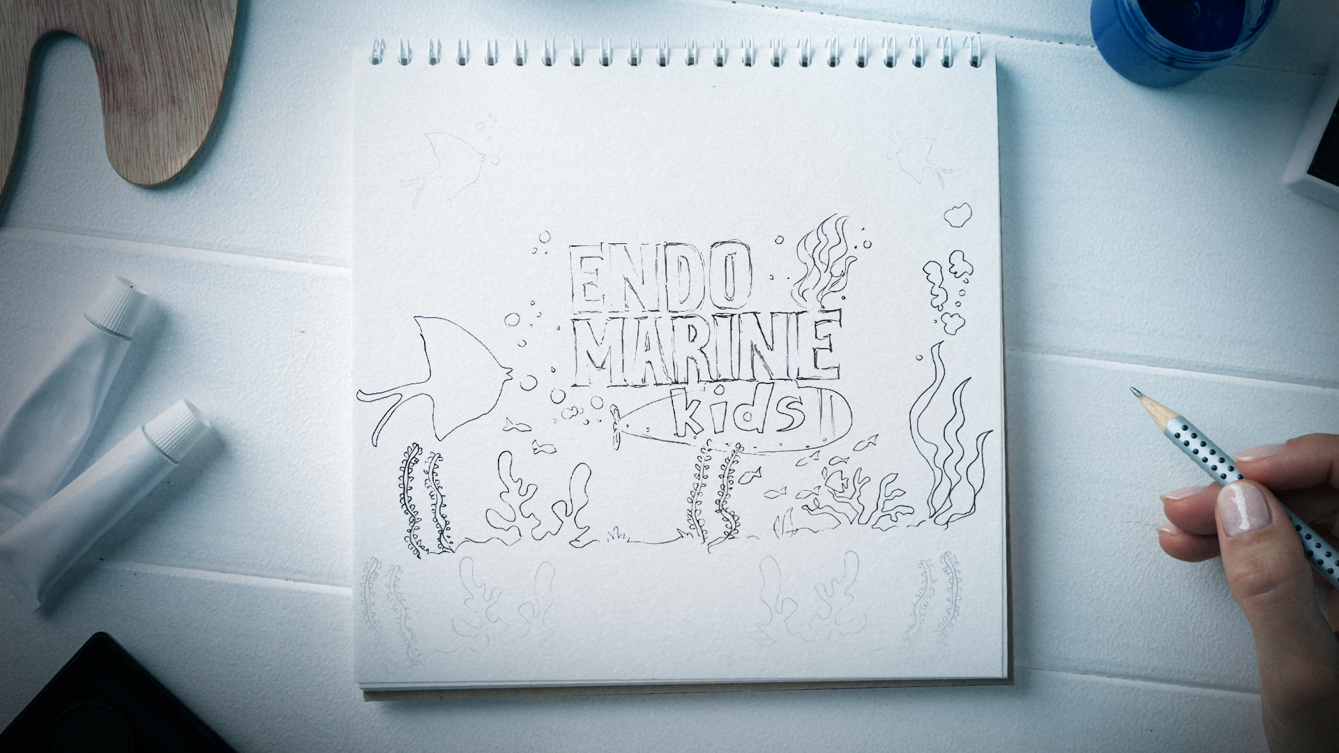
The word Marine in the name means sea. Accordingly, in the design we tried to convey a fairy-tale atmosphere at the bottom of the sea. For example, imagine Disney’s Ariel: a three-toothed dagger, swarms of fish, excrement and seahorses…. Almost all of that is on the packaging. And the seaweed in the design means it’s an eco-friendly product.
The blue color on the packaging naturally represents the color of the sea.


