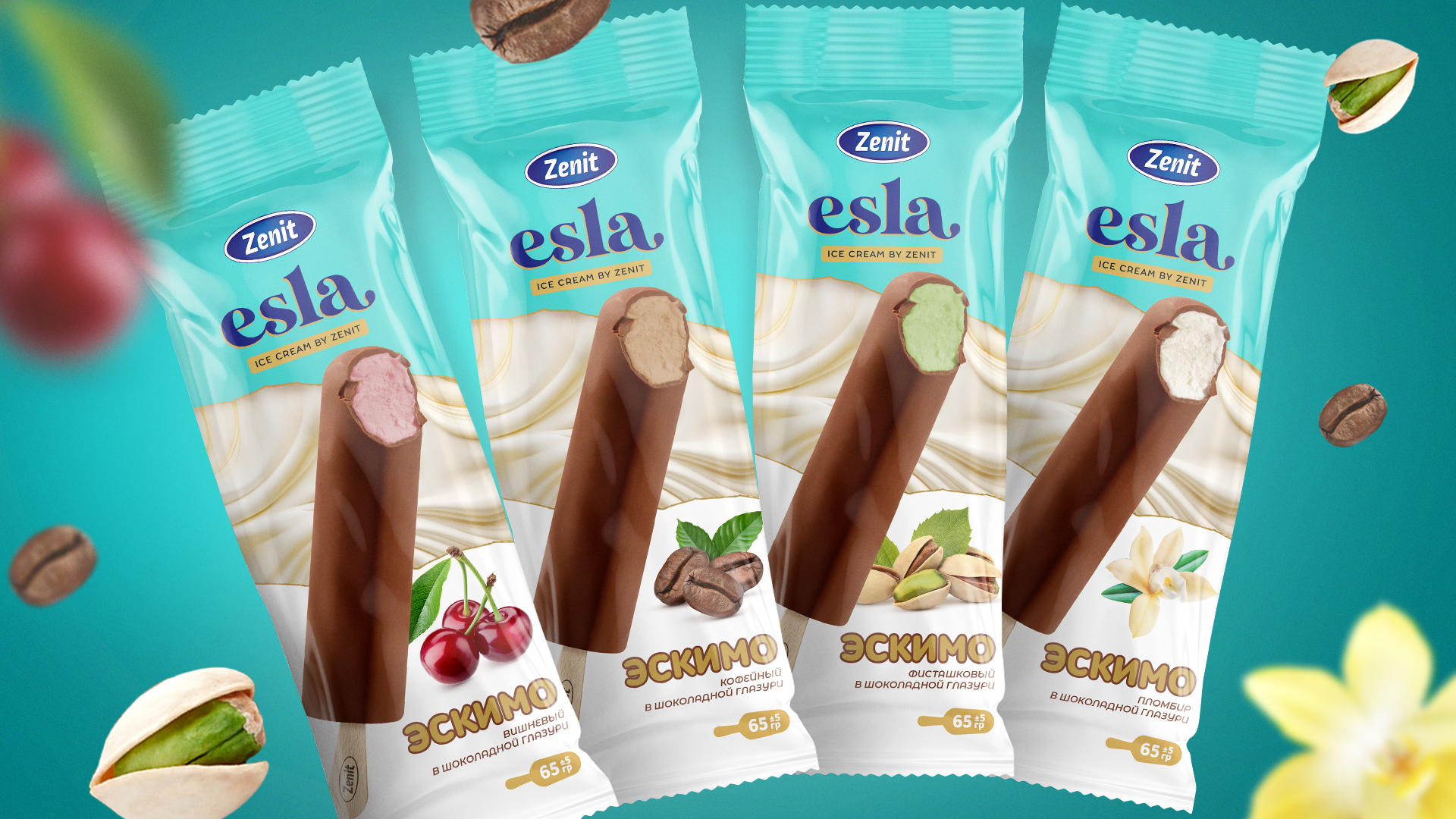
Zenit, an ice cream brand in Uzbekistan, faced a challenge: to create a unique identity for their product that would differentiate it from competitors and connect with cultural values emotionally. Our task was to develop the name, logo, and packaging design for a new ice cream product from Zenit. Their current brand identity did not convey their uniqueness or reflect the quality of their products.
Analysis
We began by conducting a thorough analysis of the target market and audience. We interviewed consumers to understand their preferences and expectations, and we emphasized the importance of tradition and emotional connections in their sweet choices. We looked to Uzbek culture for inspiration, as well as the popular song “Eslab-Eslab,” which emphasizes the importance of memory and connection to the past. We wanted the logo to be simple, memorable, and reflect the core values of Zenit.
Solution
Based on the data collected, we came up with the name “Esla”, which means “to remember” in Uzbek. This name served as the basis for creating a strong and memorable identity. The logo is designed in blue and includes text that emphasizes the reliability and professionalism of the brand. For the ice cream packaging, we chose a gently turquoise color that symbolizes freshness and lightness. We also proposed a targeted marketing strategy: small ice cream cups that are easy to eat quickly. These cups are available both individually and in boxes, allowing customers to purchase more ice cream for themselves and their loved ones. This approach enhances the convenience and attractiveness of the product, making it an excellent choice for family gatherings With the help of these new elements, we helped Zenit to establish a unique position in the market.A position in the ice cream market that links it with traditions and culture makes the product appealing to a wide range of people.