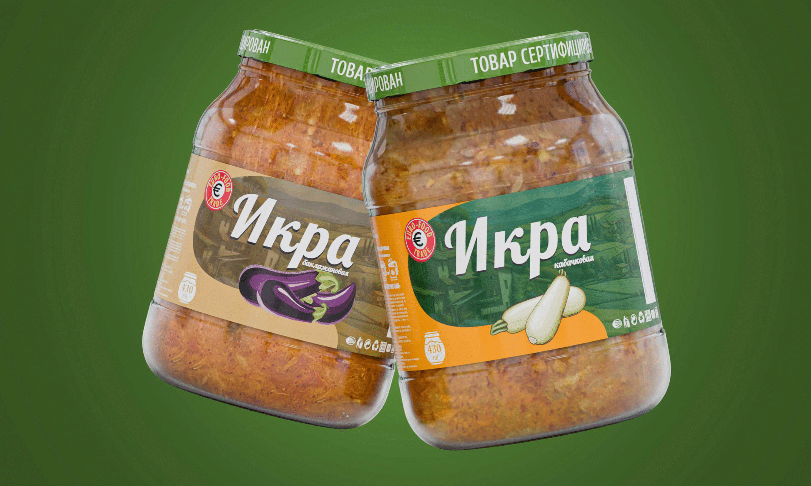
EURO FOOD TRADE is a leading provider of premium vegetable and fruit preserves in Uzbekistan, based on traditional, home-made recipes. The company’s products are distributed in major cities across Russia, China, and South Korea, facing increasing competition. To maintain its position in the market, EURO FOOD TRADE has decided to redesign its label to emphasize the natural ingredients and stand out on store shelves.
Problem
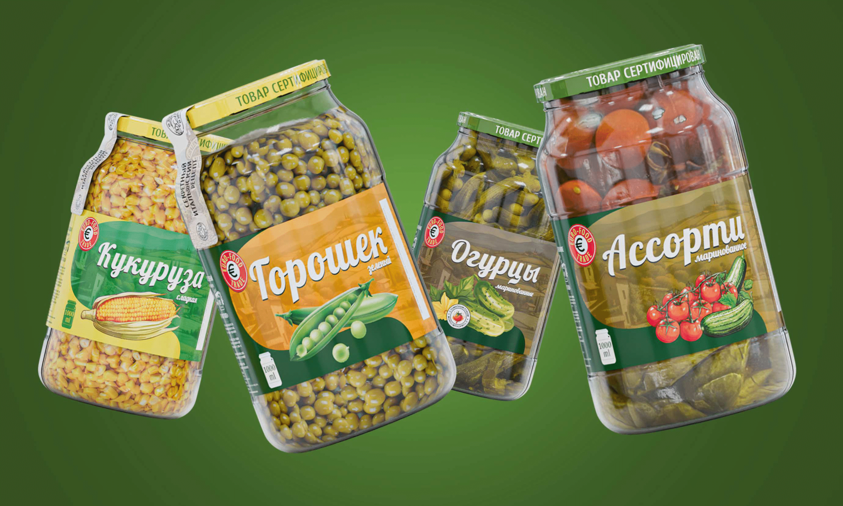
The company has tasked us with designing a new label for its canned product line that meets modern standards and attracts customers’ attention. The design should be consistent across all products in the range, reflecting the quality and natural origin of the ingredients.
Solution
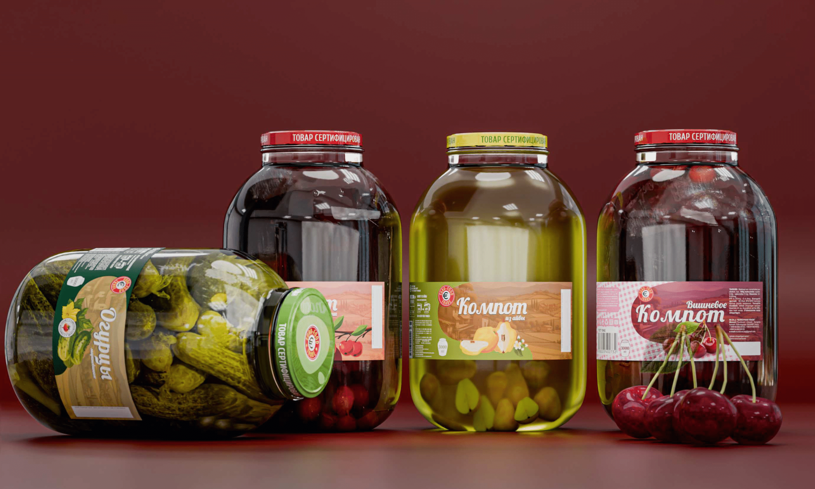
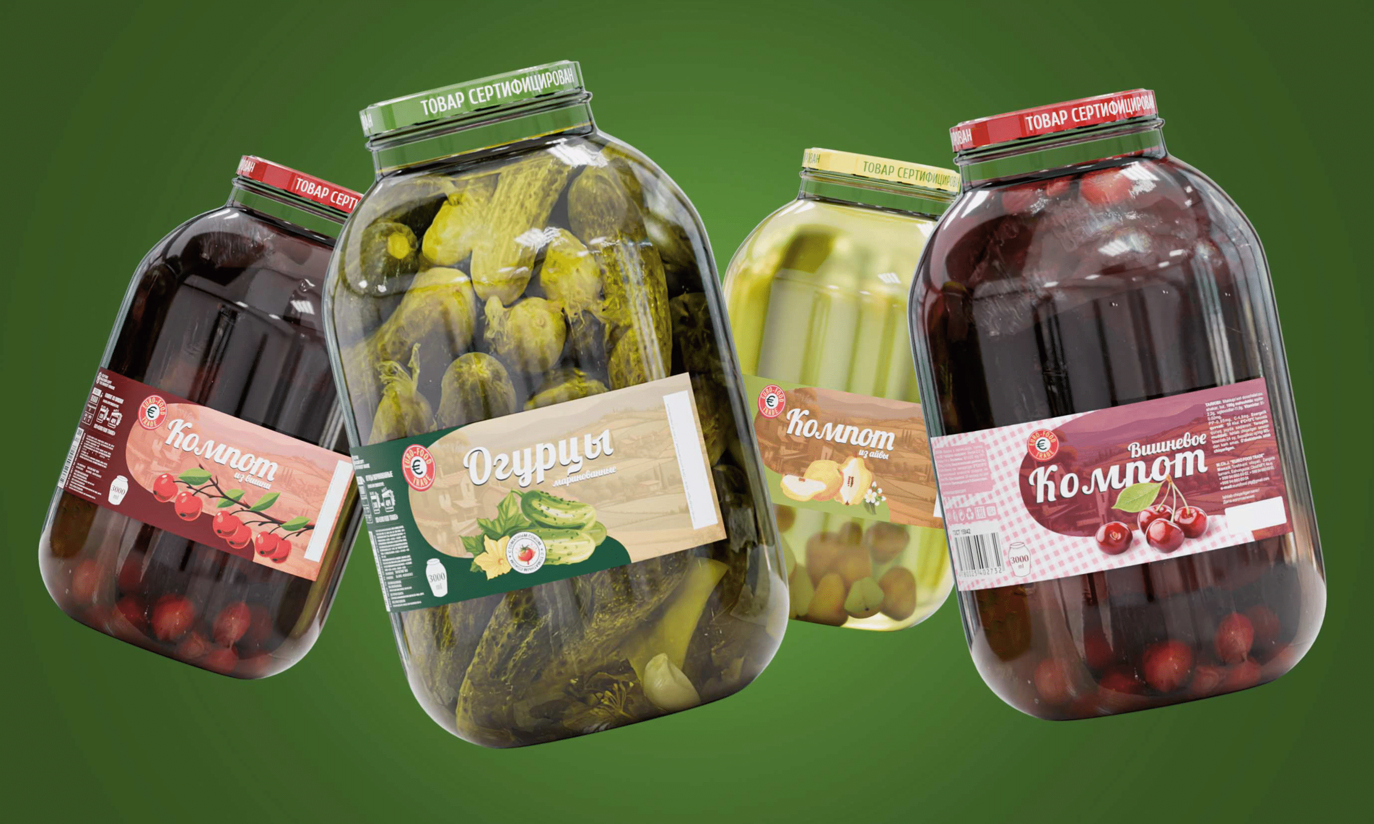
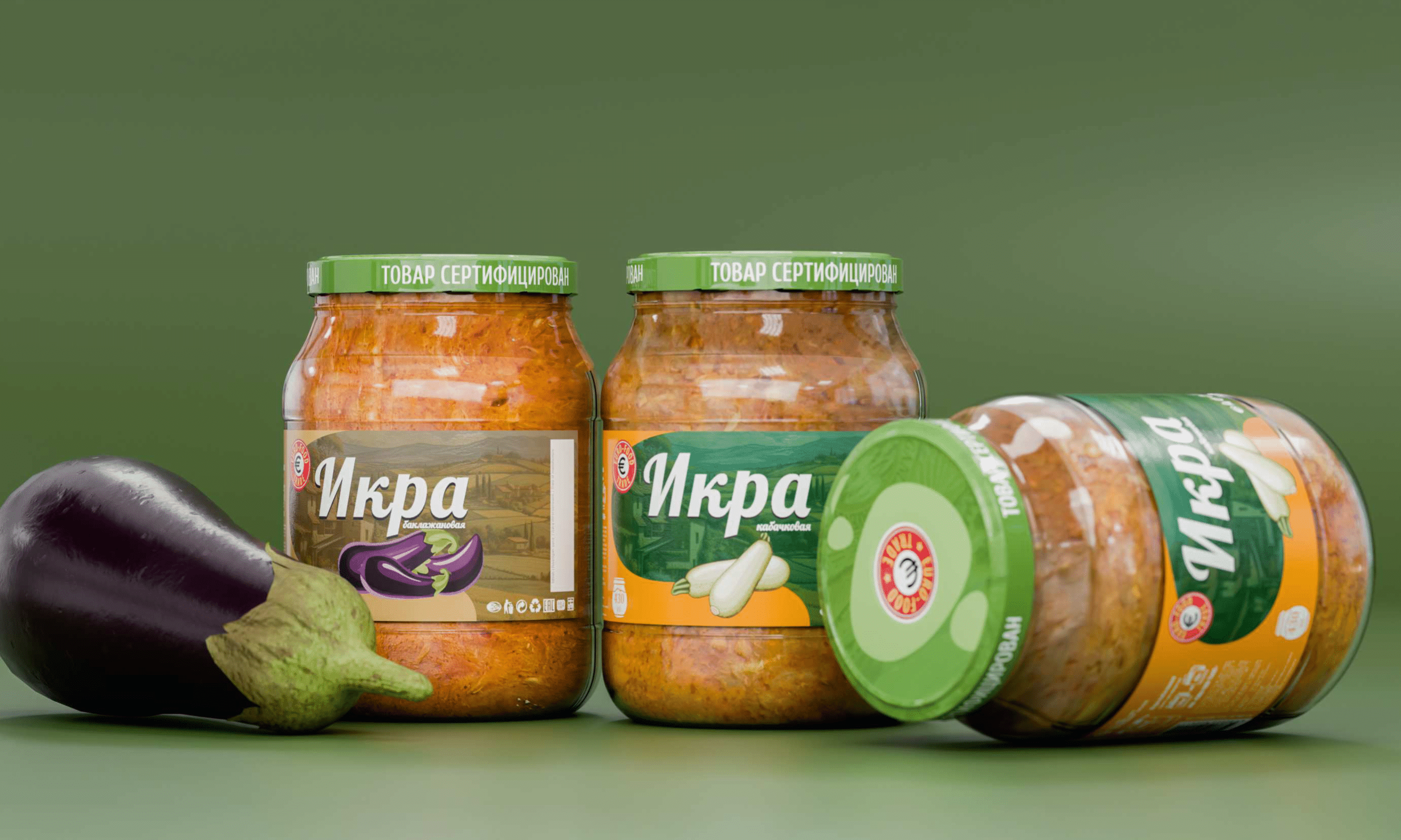
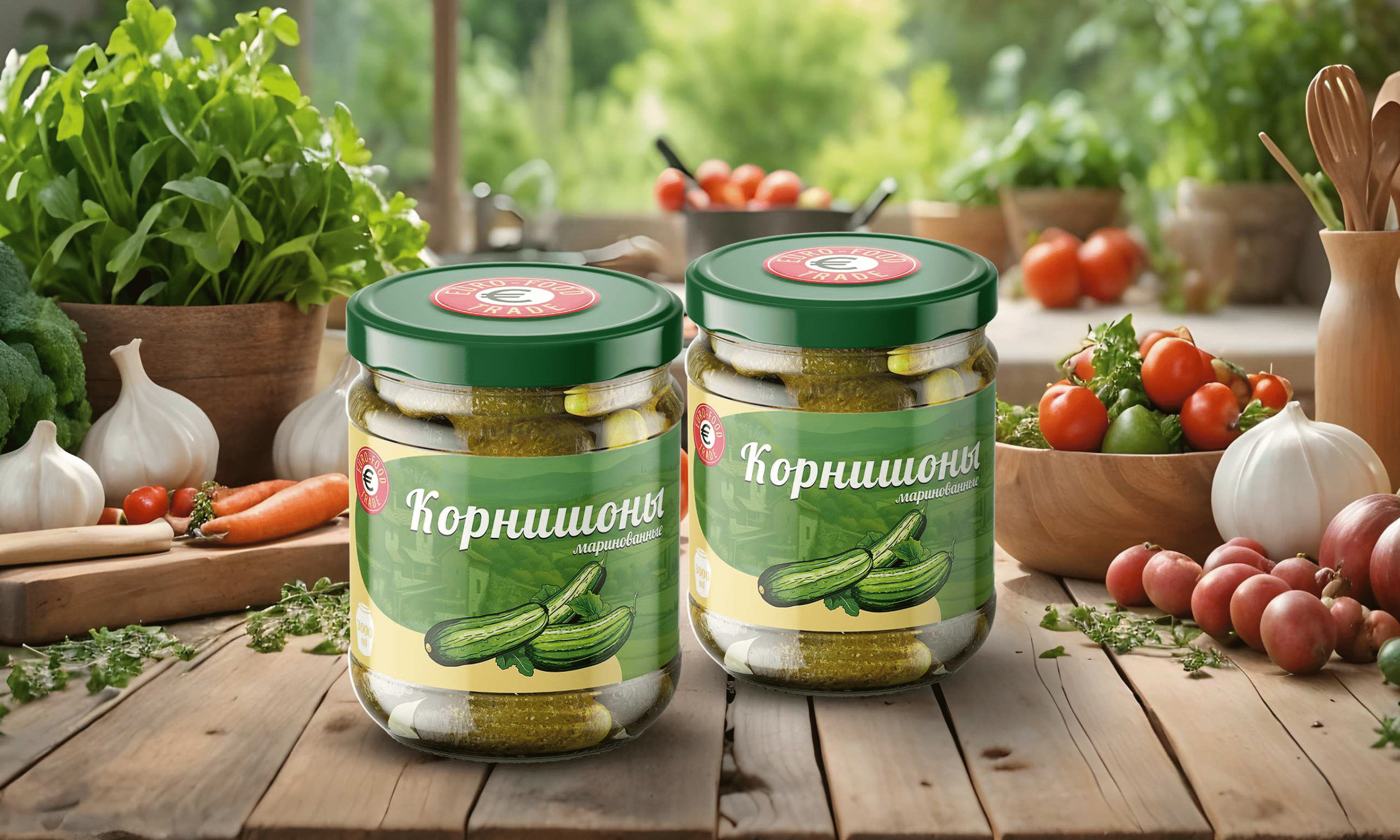
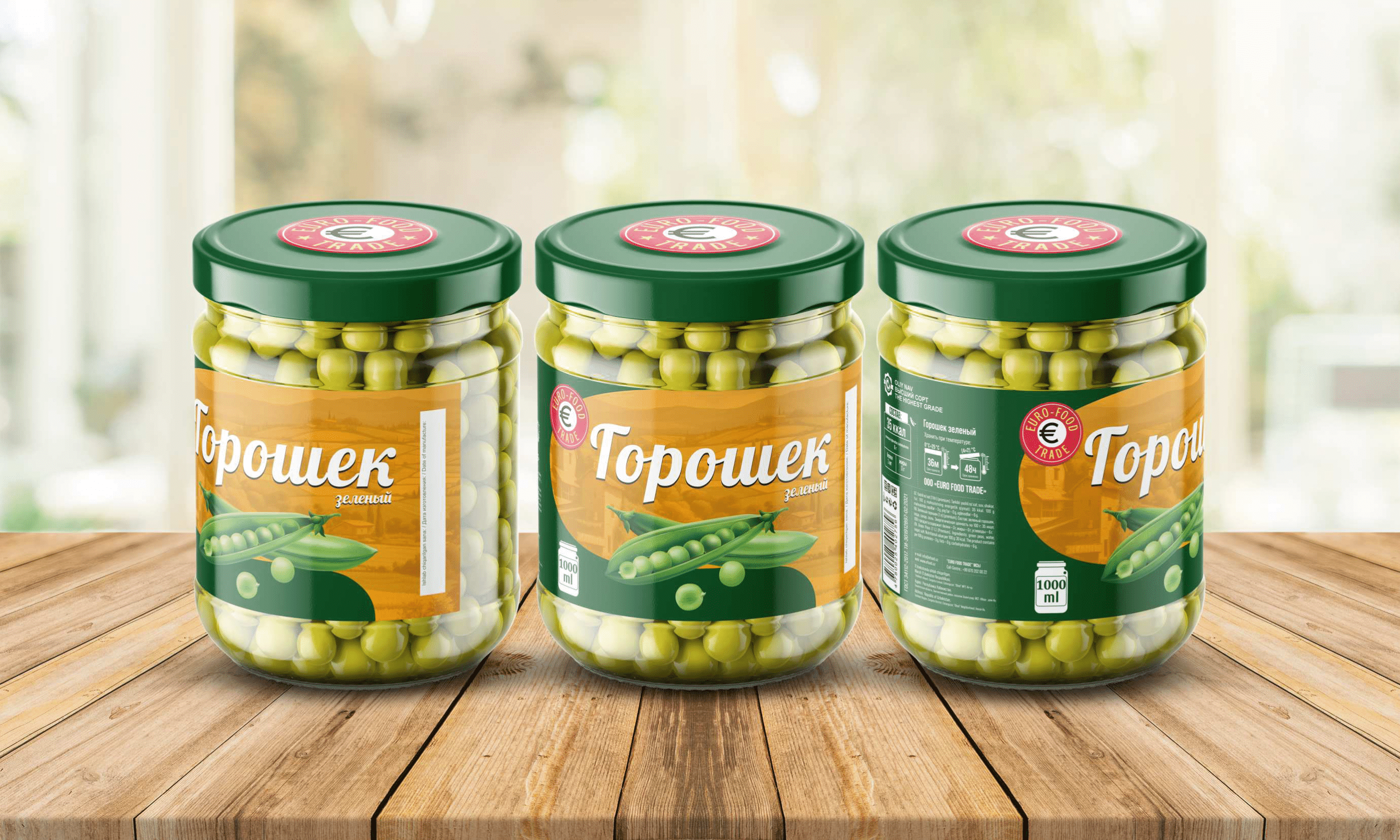
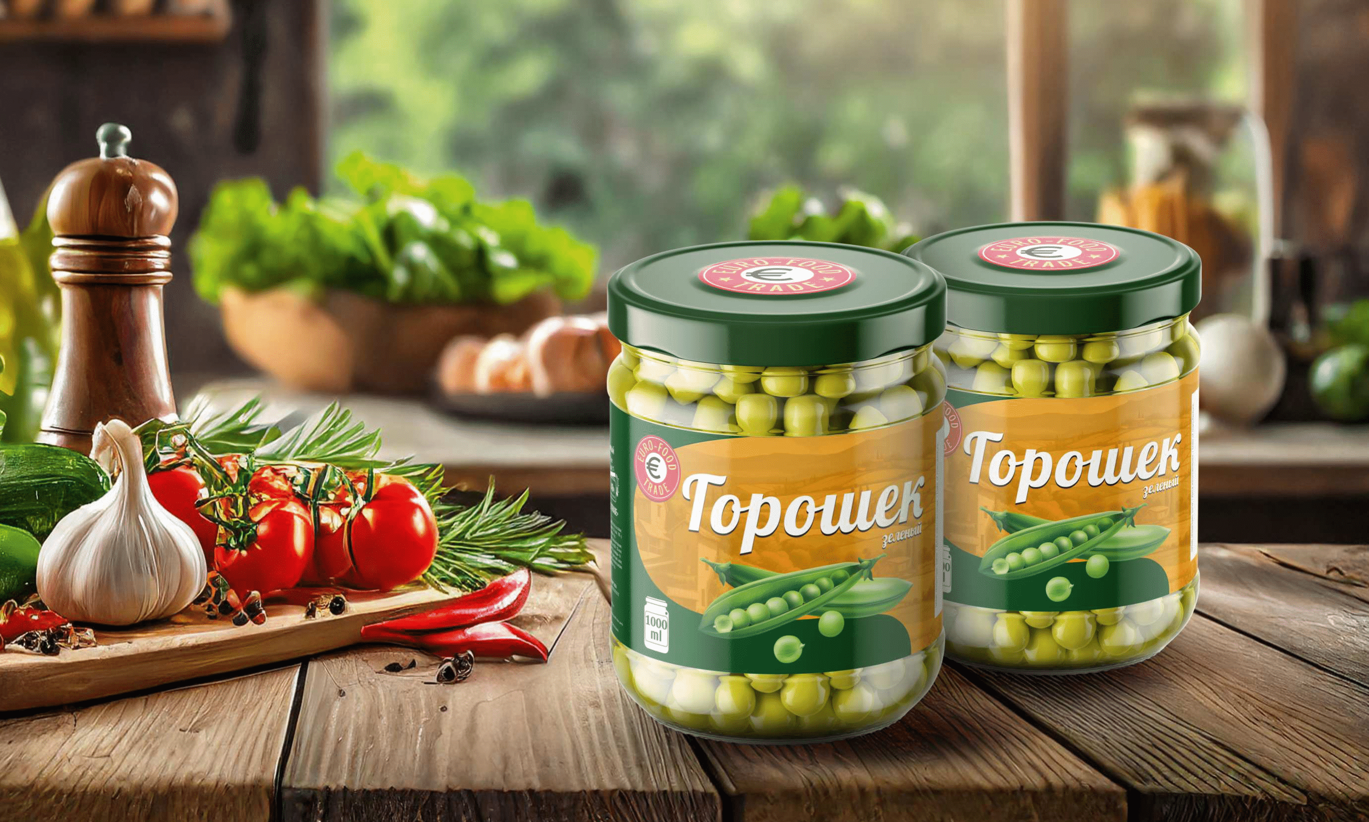
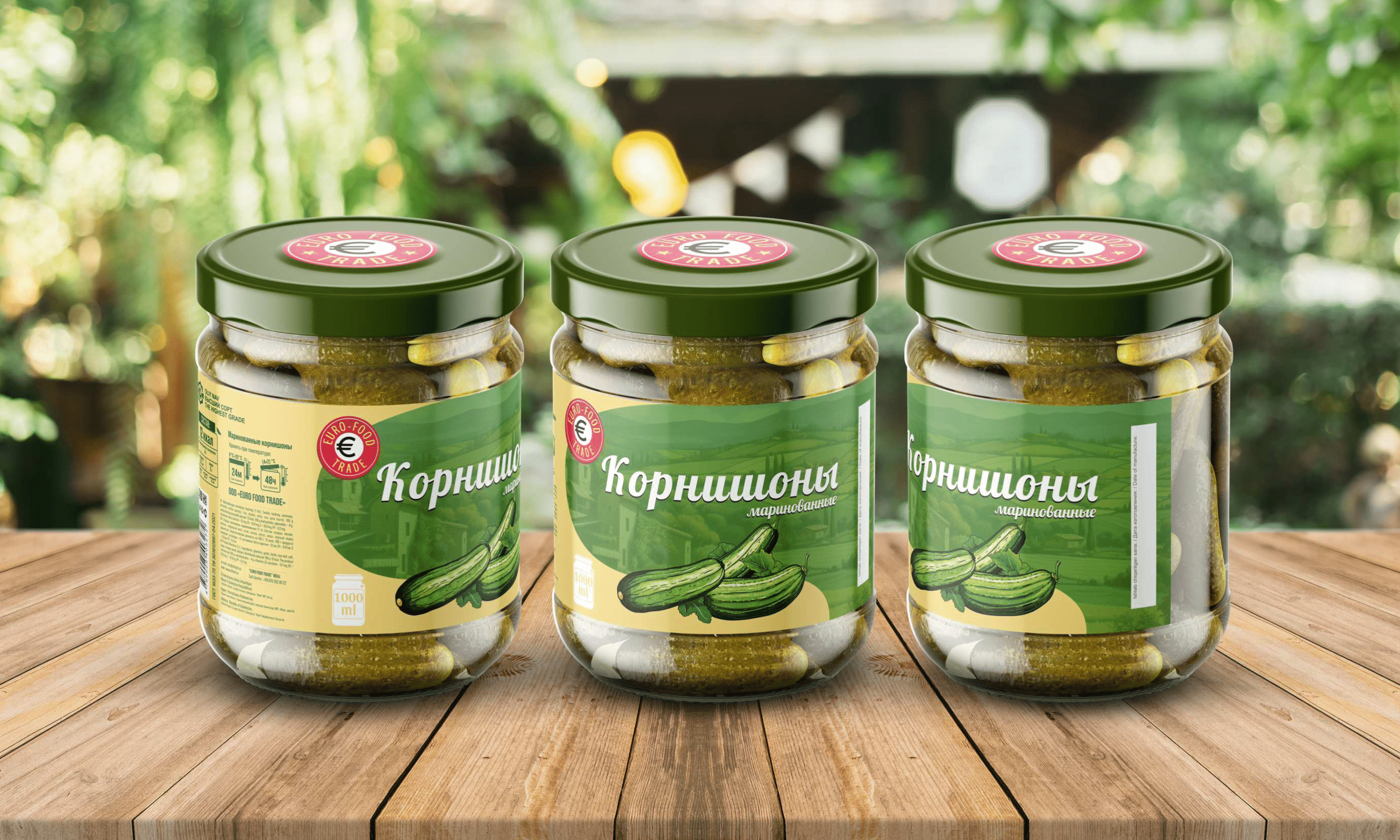
We have developed a label design that incorporates the company’s brand identity and values, while highlighting the naturalness and freshness of the product. The design is modern and stylish, yet retains the traditional feel of the company’s history. The use of high-quality materials and attention to detail ensures that the label stands out from competitors’ products.We have selected a classic and balanced design, featuring rich colors and illustrations of vegetables and fruits. The single rustic background creates a cozy and traditional atmosphere, while the emphasis on important characteristics such as volume and calorie content helps customers navigate the range more efficiently
Result
The new label design has been approved and will soon be available on store shelves. It is anticipated that the updated packaging will draw the attention of more customers, boost sales, and strengthen the company’s position as a provider of high-quality canned goods.