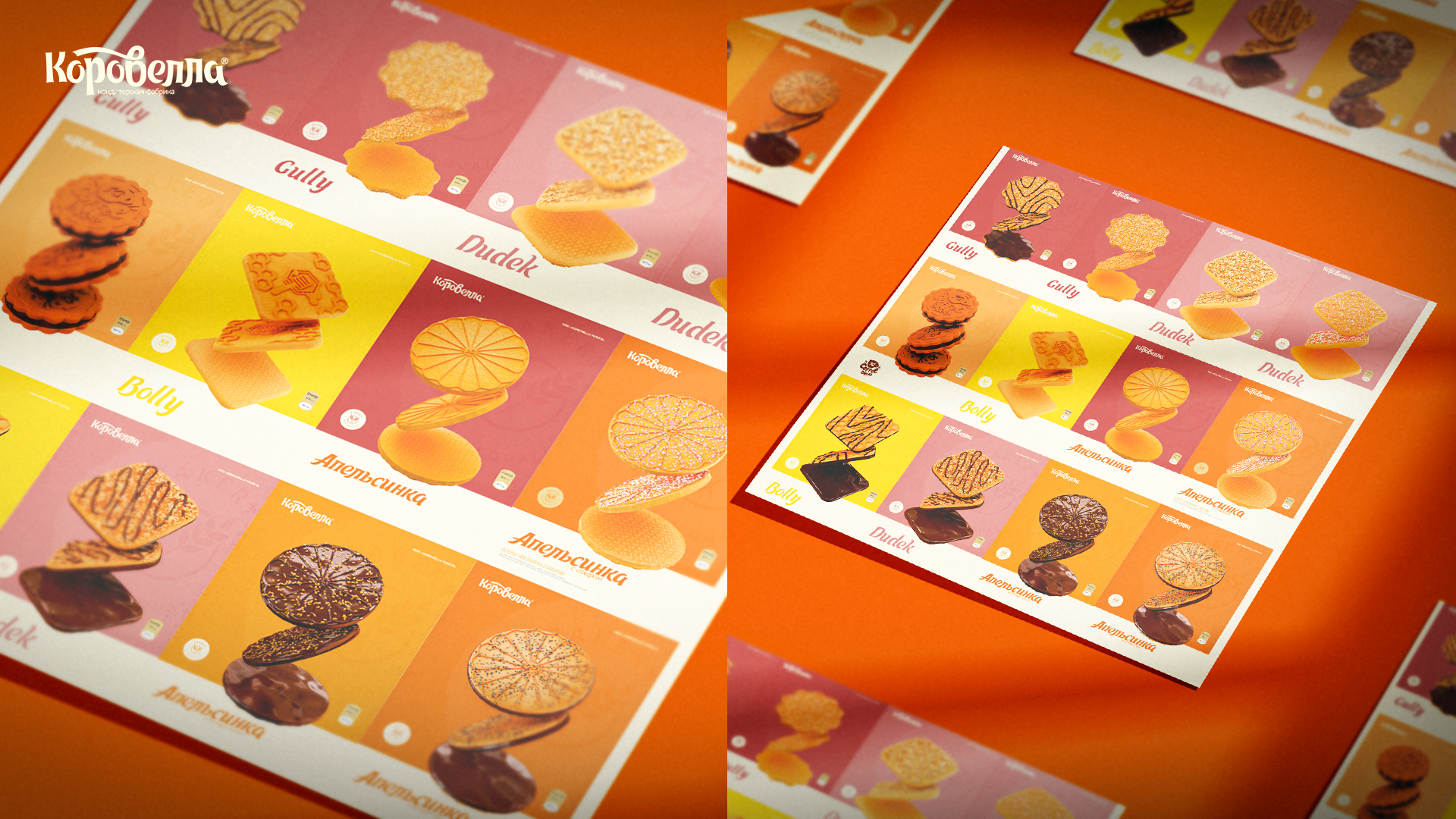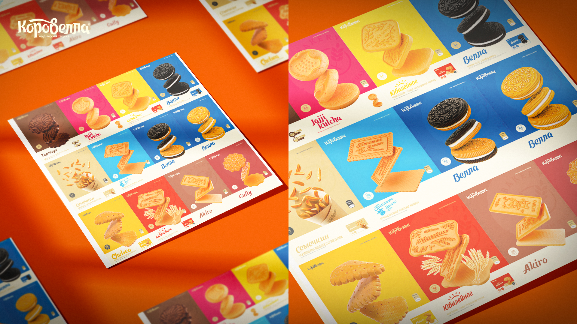
Korovella is a product created in the best traditions of the cult cookies “Yubileynoe”, with a high milk content and made only from natural ingredients.
In order to convey all the advantages of the product to the consumer, we decided to use the naming Korovella in order to immediately make it clear that our cookies are dairy. This goal is achieved because of the meaning of the word “korova”, which in Russian means “cow”.
We put the name not only on the packaging, but also on the product itself — for this we developed a realistic 3D model so that the client could start production on its basis and get cookies with ready-made engraving.
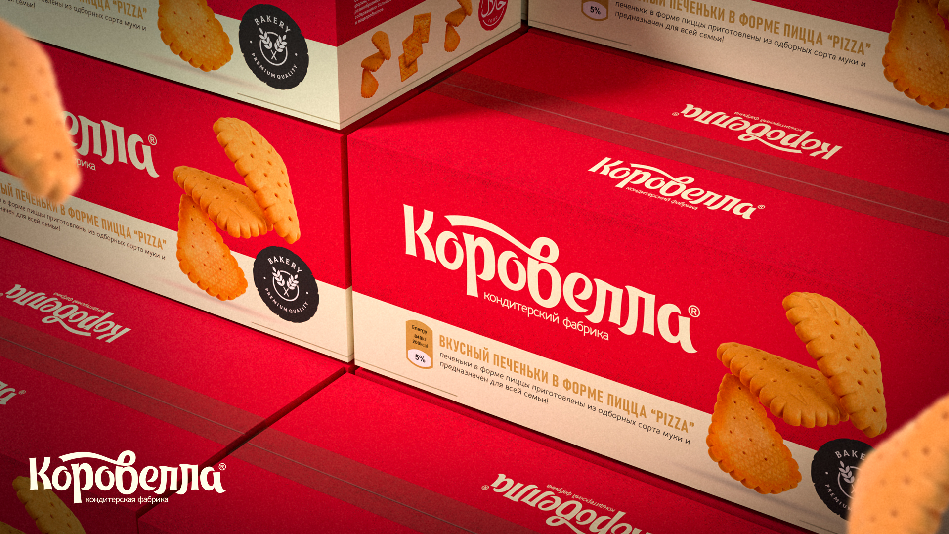
The naming is also unique — the typography was hand-drawn, keeping a little retro-style spirit. Handmade waves and ribbons remind customer classic design of cookies that are well known in all CIS countries.
The packaging itself is made in the format of a box for wholesale, so the design for it was slightly different from the standard work with small containers. It has more space, and it has to be easy to find in big warehouses where it is gonna be kept in future.
The box is decorated with branded colors and a special pattern that fills the free space, making the box much more noticeable for everyone.
In the future, it is planned to develop boxed packages that are intended for direct retail trade.
But since now the product reaches the end consumer without branded packaging, it was very important to keep the identity elements directly in the product itself, because otherwise the consumer may not know which cookies he tried.
Korovella can become an everyday treat for thousands of Uzbek families, as it is a natural and affordable product. In this term our packaging becomes much more important, because supporting local green producers can lead to complex changes inside the industry itself.


