In today’s competitive potato chip market, companies strive to differentiate themselves by offering products with unique features. One trend that has gained popularity is the focus on natural ingredients.
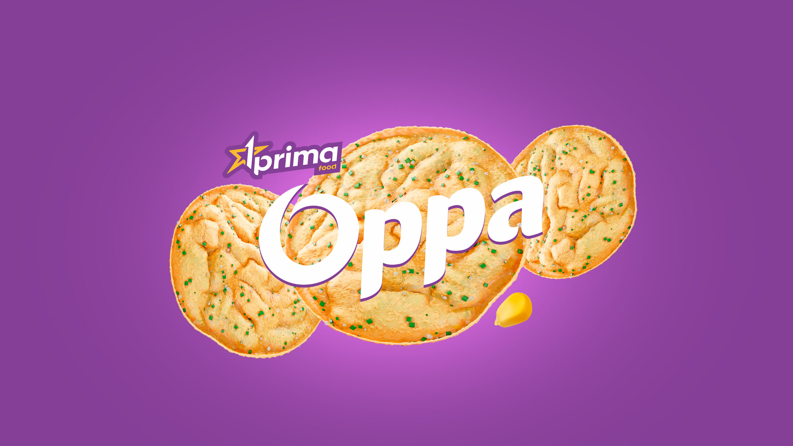
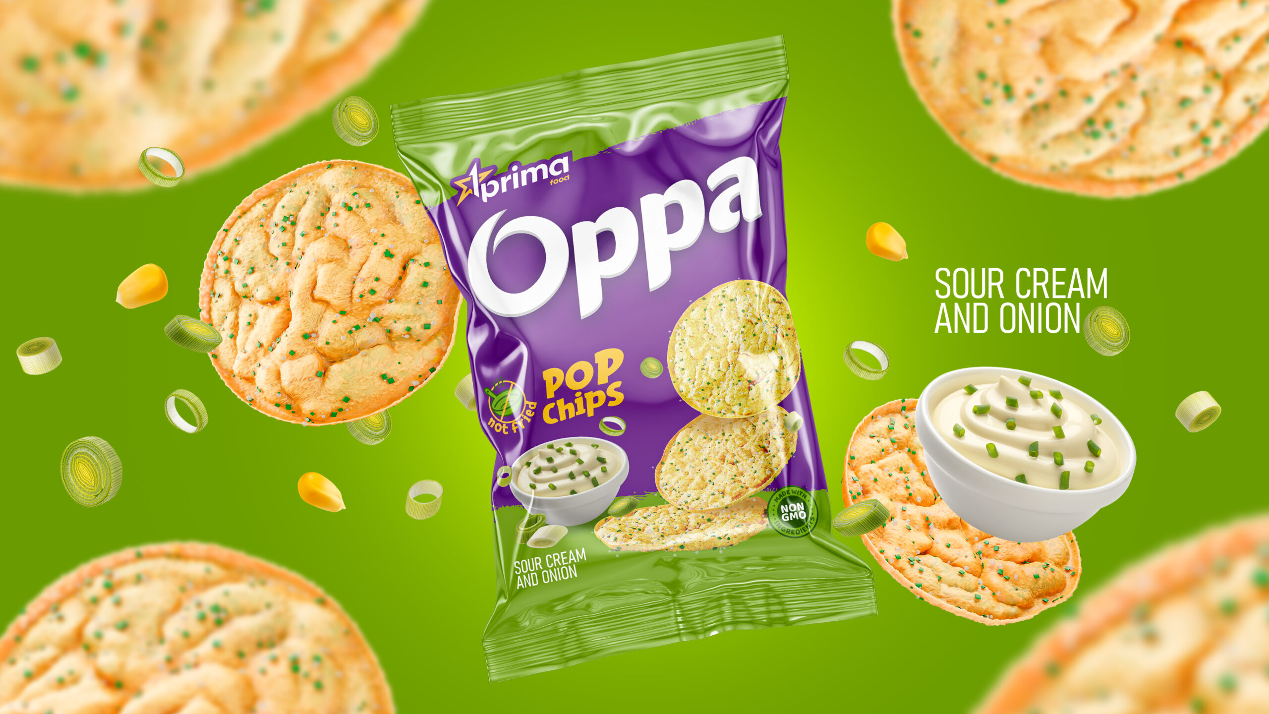
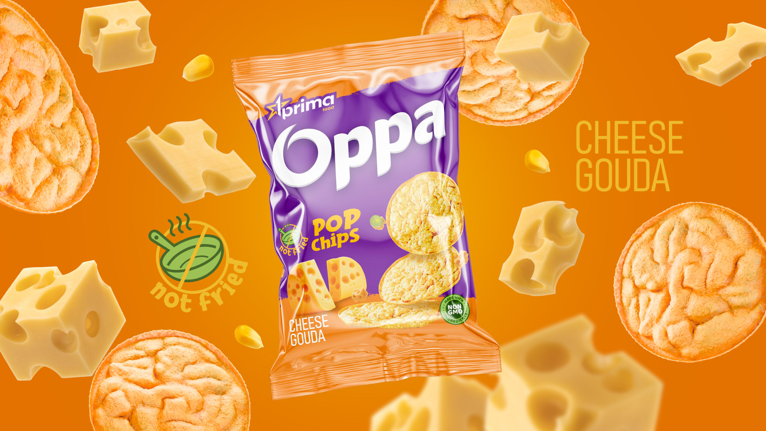
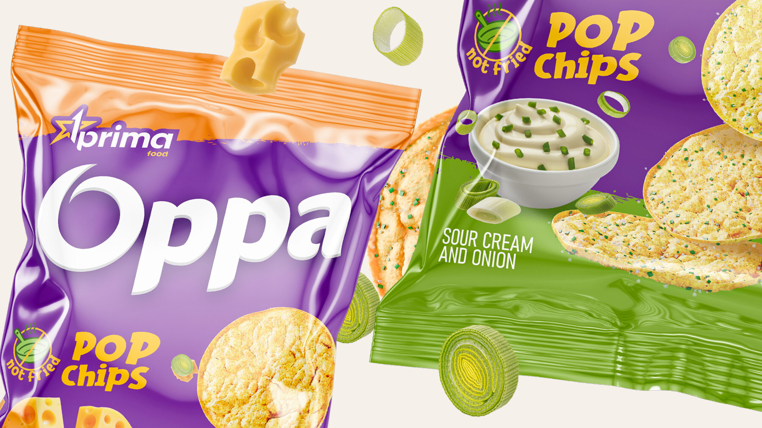
Prima Food has recently launched a new range of Oppa chips that stands out from the crowd by utilizing real potatoes and avoiding frying. By avoiding genetically modified organisms (GMOs), these chips offer a healthier alternative to other options on the market.
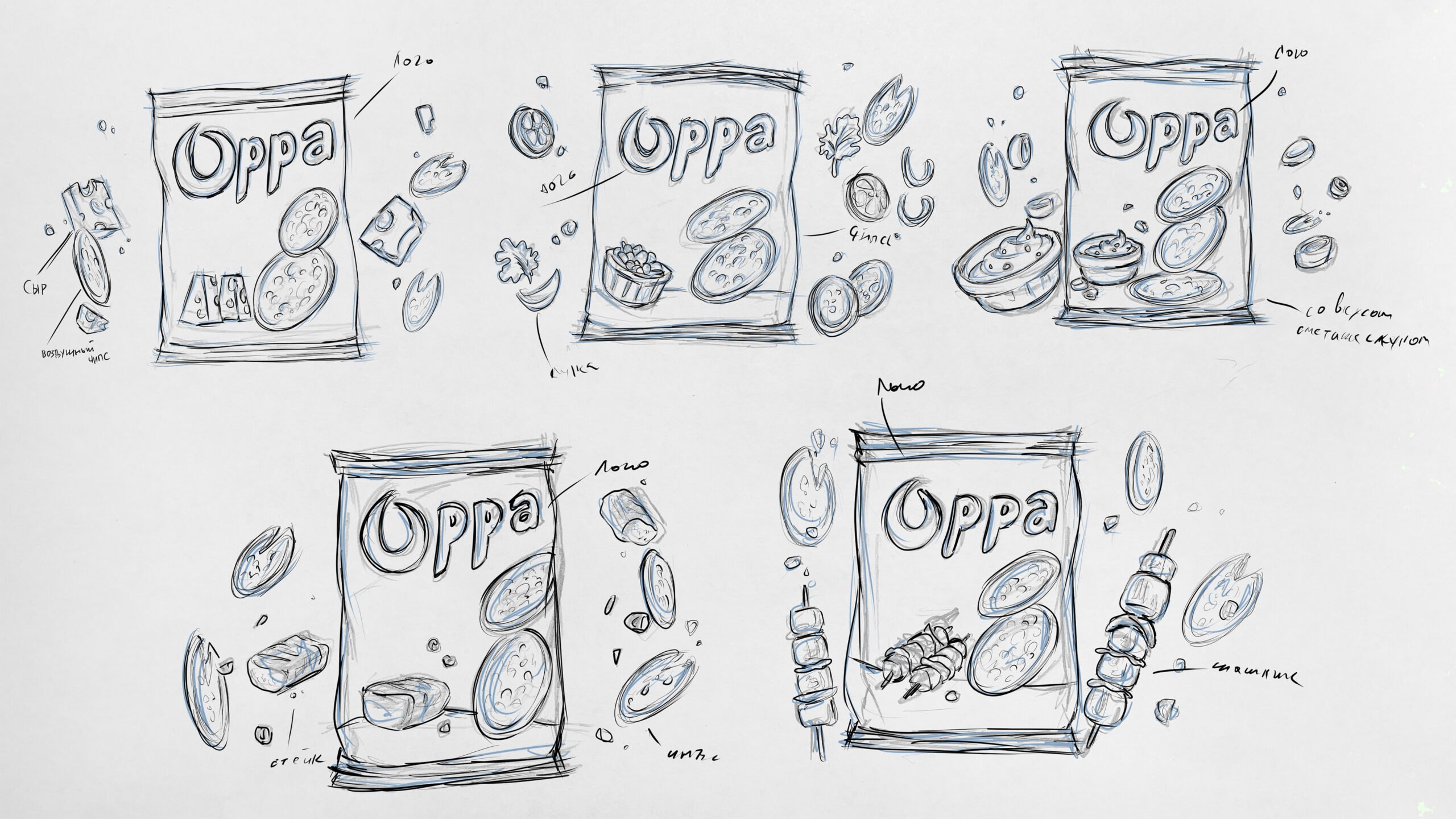
The packaging for the Oppa chips has been carefully designed to reflect its focus on naturalness. The logo features a rounded, cheerful font that complements the round shape of the chips and appeals to young consumers.
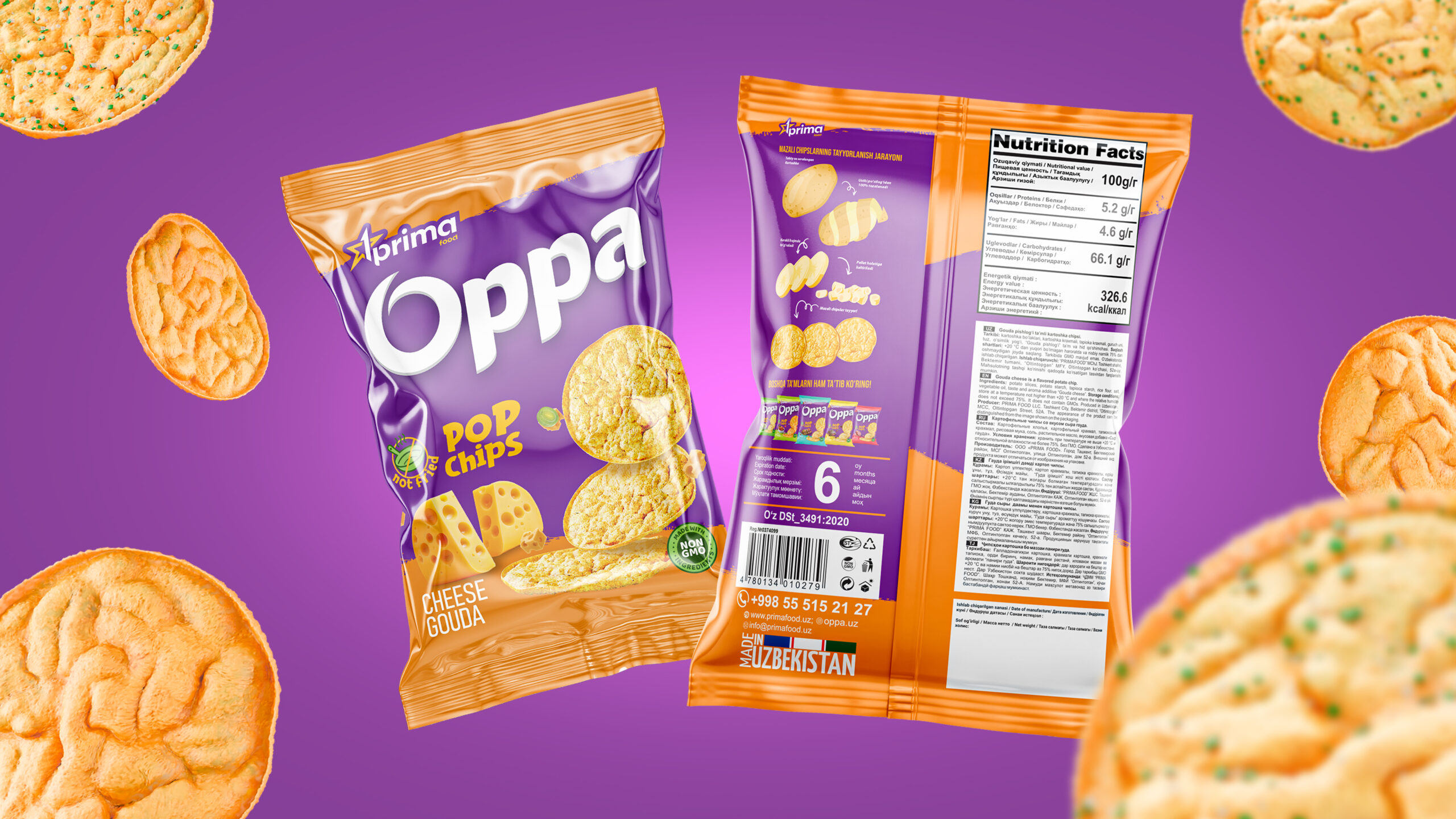
On the packaging, mouthwatering images of the chips are prominently displayed, while the taste profile of each variety is highlighted on the individual packaging. Icons are used to emphasize the advantages of the products, such as their lack of frying and the absence of GMOs.We have carefully placed the composition of the product, its nutritional information, barcode and other relevant details in appropriate locations on the packaging. Additionally, we have clearly illustrated the stages of production that lead to the final product on the back of the packaging.
You can always contact Minim for high-quality and thoughtful packaging design services.