Saff Clean
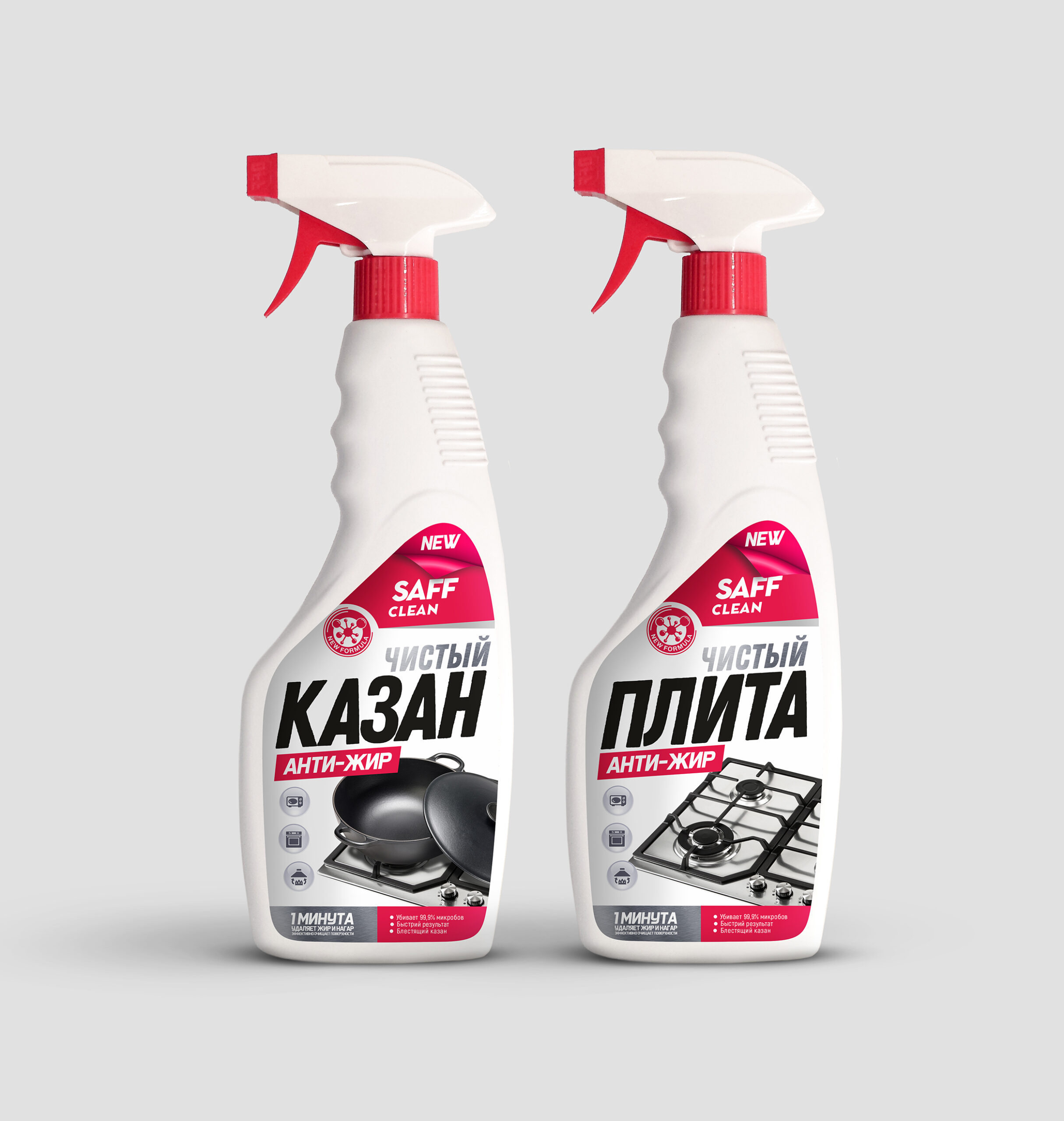
Our work on the development of packaging design for Antizhir – a means of cleaning a cauldron and a gas stove.
The use of white, which symbolizes purity, is great for cleaning products and helps convey the promise of product quality and effectiveness.
The black color, which is associated with cauldrons and gas stoves, perfectly conveys the theme and purpose of the products, making the packaging recognizable and emphasizing its specificity.
Incorporating red to add contrast and brightness to the packaging is a great move that grabs the attention of consumers and makes the product stand out on the shelf.
The use of large illustrations and icons on the packaging is a good solution, as they convey important information visually, which improves the convenience and attractiveness of the packaging for buyers. Customers can quickly understand which product it is, which contributes to ease of choice when purchasing.
The desire for clarity and convenience, expressed in the large names “Pure KAZAN” and “Pure PLATE”, gives the package additional information and confidence to consumers in their choice.
This work we have done demonstrates a deep understanding of customer needs and the ability to appeal to them visually. Professional design not only raises the level of the brand, but also helps to convince customers of the reliability and quality of products.


