The client approached our agency with a request to create a naming, logo, and packaging design for a new product – wet wipes. The goal was to ensure that the design reflected the brand’s values of care, gentleness, and safety.
Solution
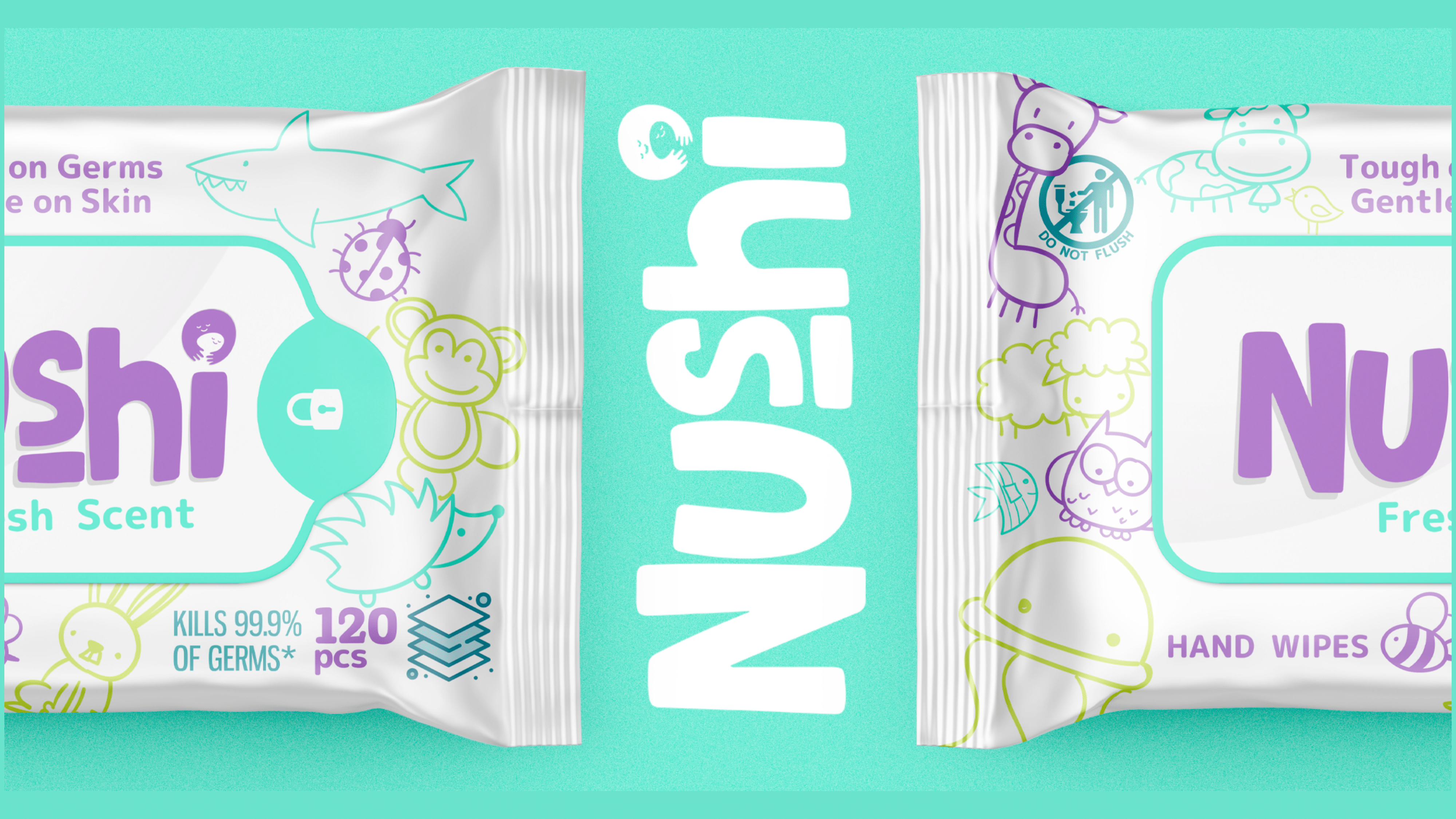
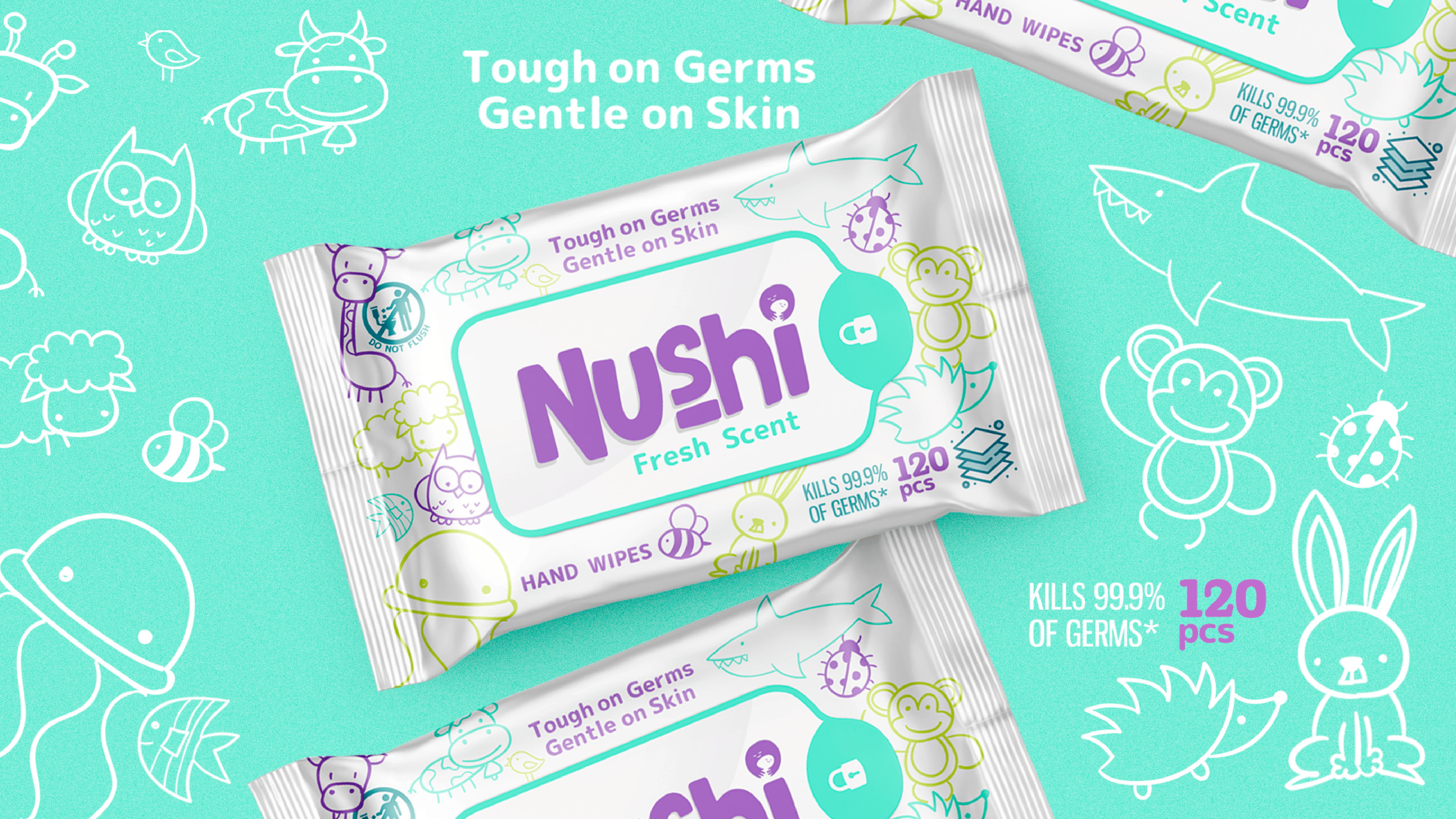
Naming: The name “Nushi,” derived from the Japanese word for “master,” was chosen to represent the brand’s responsibility and care towards its users. This name conveys a sense of expertise and confidence in providing the most delicate and gentle skin care products.
Logo
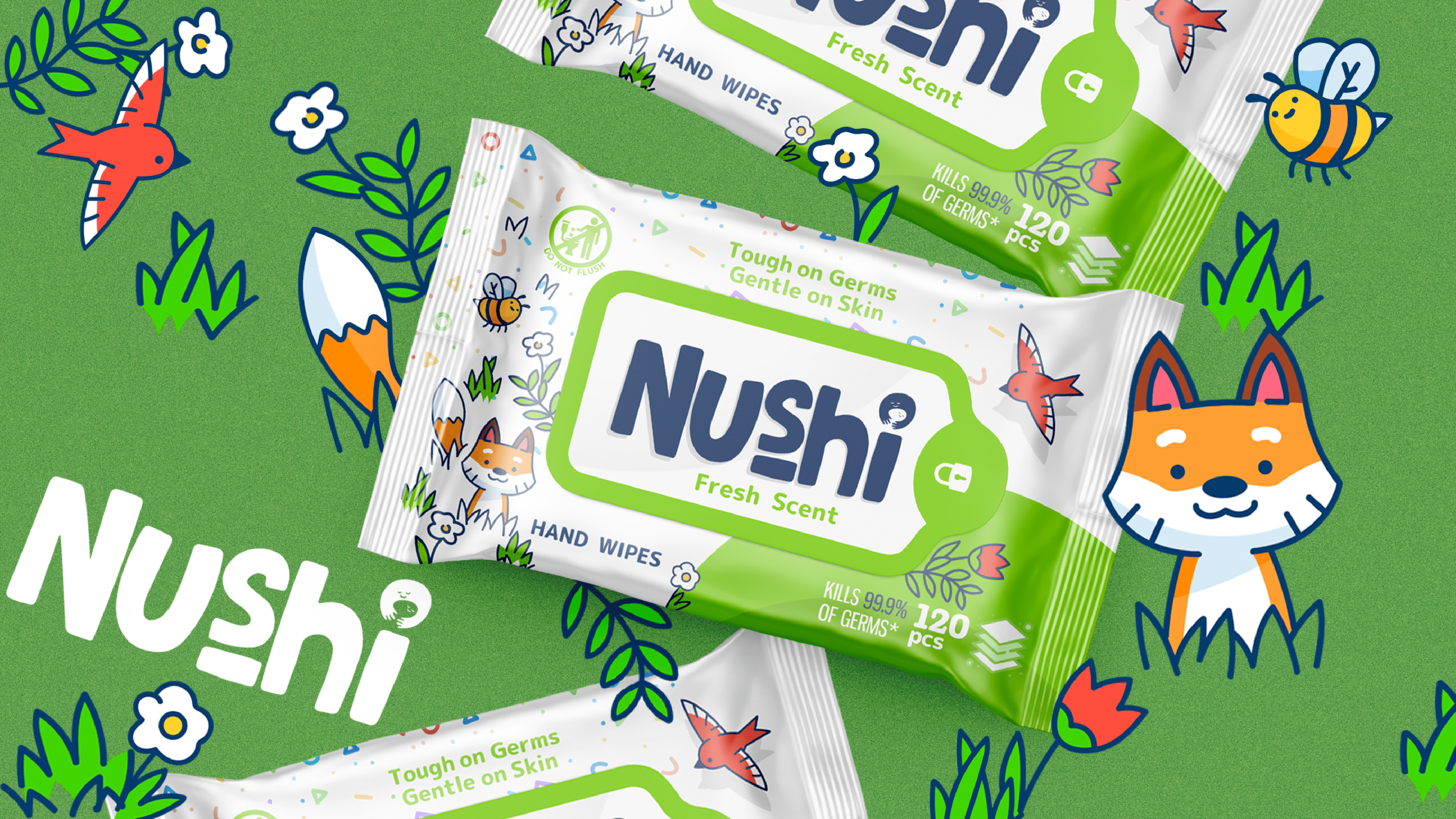
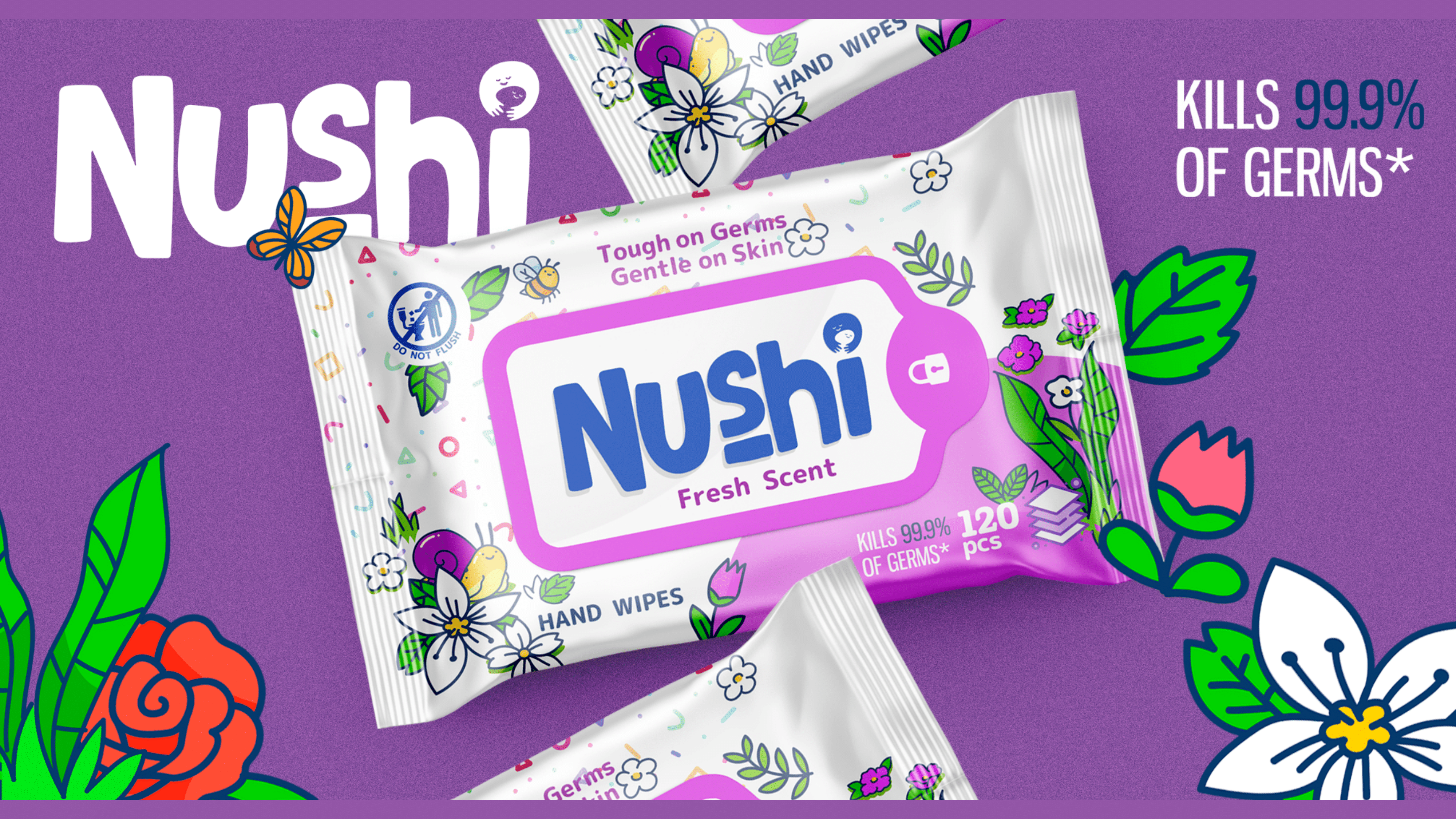
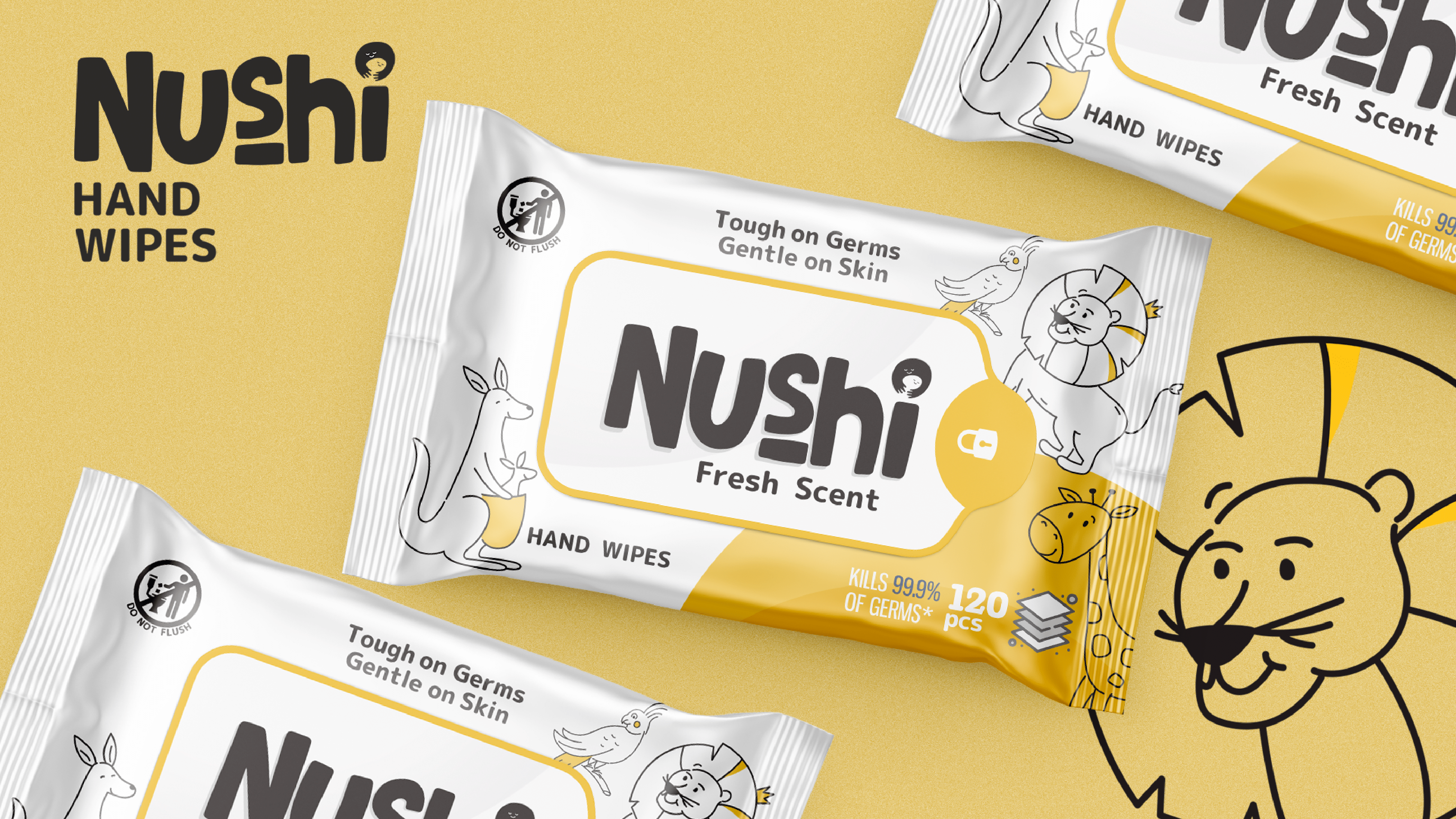
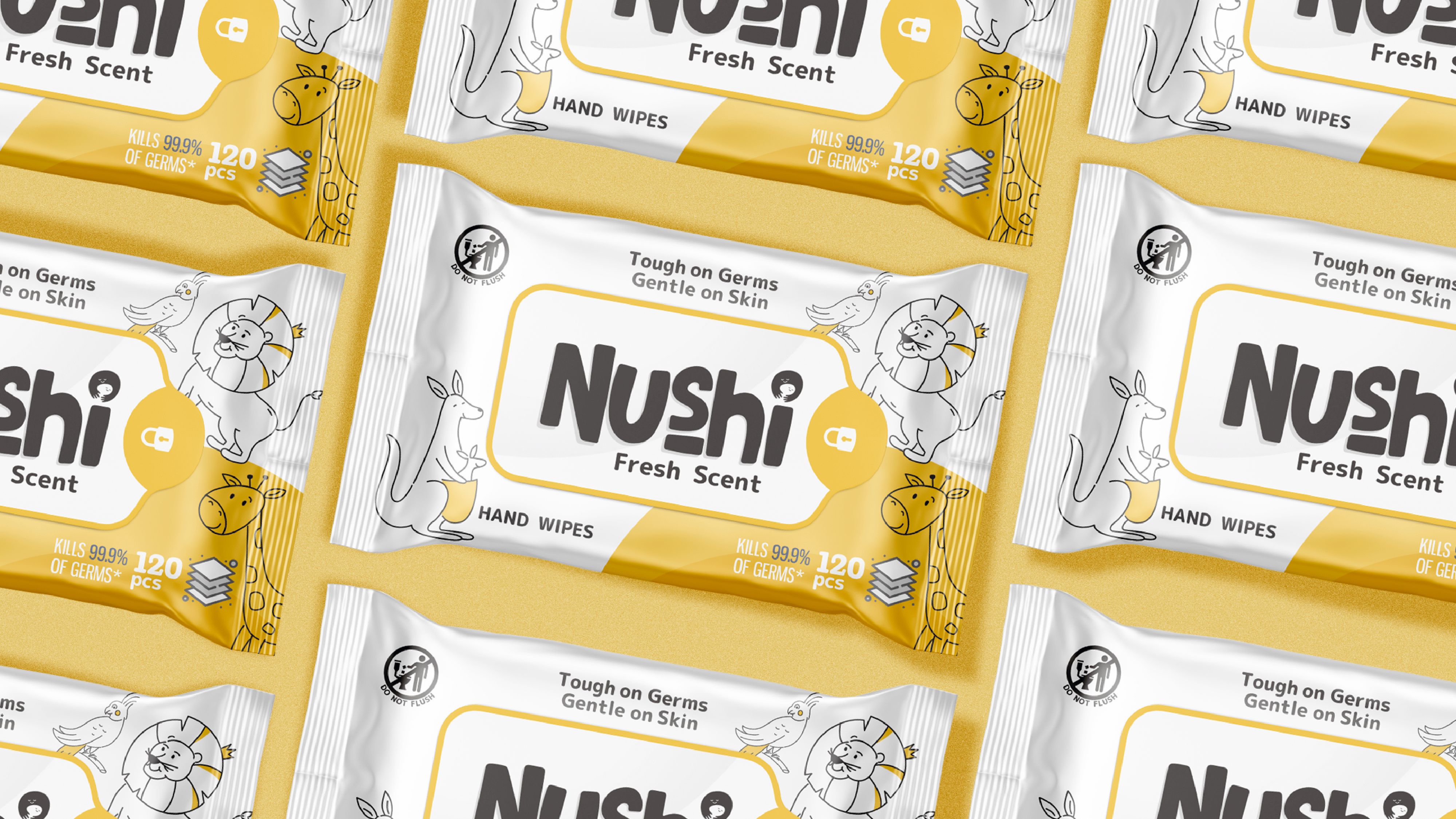
The logo features an image of a smiling face holding a child, representing the warmth and affection that Nushi products provide. The green color palette was chosen to evoke feelings of safety, nature, and tranquility, aligning with the brand’s core values.
Packaging Design:
We have focused on the core values of the brand – care, tenderness, and safety. The use of bright colors and fun images with animals make the packaging approachable and reassuring, which will particularly appeal to families with children. We have incorporated elements of nature and humorous symbols to communicate to customers that Nushi is a trustworthy choice for daily skincare.
Results
The created naming, logo, and packaging design have played a significant role in establishing the recognition and trustworthiness of the product. Not only do they accurately reflect the essential aspects of the brand, but they also successfully establish its visual identity. This approach will allow Nushi to establish itself in the market for wet wipes and build an emotional bond with consumers.