Packaging design for Agro Gold+ brand
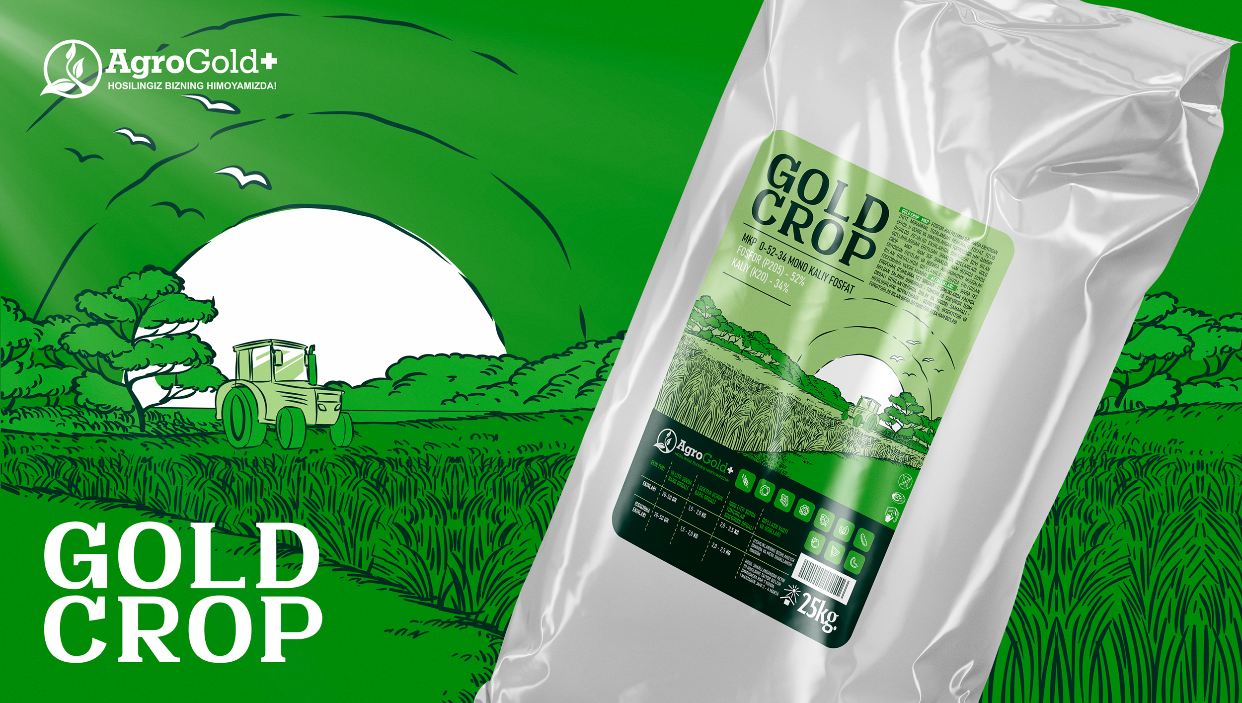
We present our work on the development of packaging design for Agro Gold +. The name of the product was proposed by the customer – Gold Crop, which means “Golden Harvest”, which emphasizes the value and effectiveness of the product.
Gold crop is a fully balanced fertilizer that meets the needs of plants for nitrogen, phosphorus, potassium and trace elements during the growth period. Taking green as the main color, we wanted to convey the idea of the world of plants and emphasize the direction of the company.
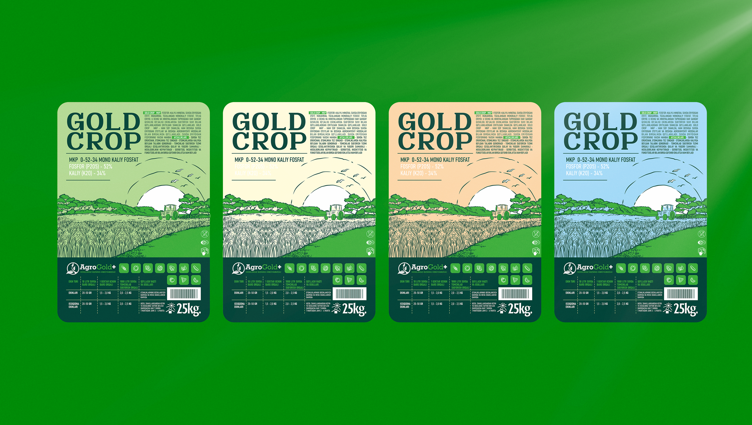
We developed the concept of the product line and created a unique illustration, as well as selected a specific color for each type of fertilizer. Bright elements and strict design create a harmonious combination that provides an attractive appearance and easy navigation through the necessary information.
Tables and icons simplify the process of selecting and using a product, providing clear and informative packaging for anyone who wants to grow beautiful and healthy plants.


