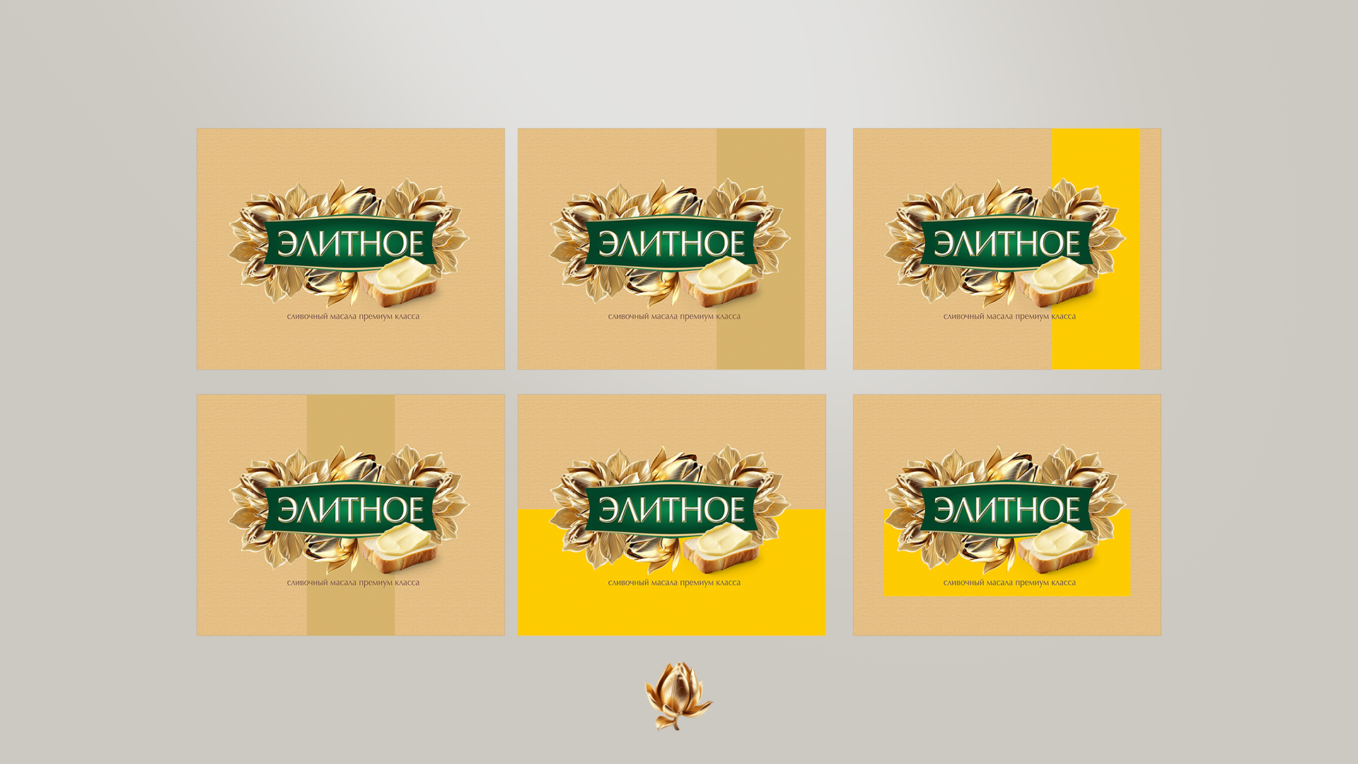
People have a good saying: “To live up to your name”. This is usually said if a name represents some positive quality of a person and if this quality is manifested in the bearer of the name.
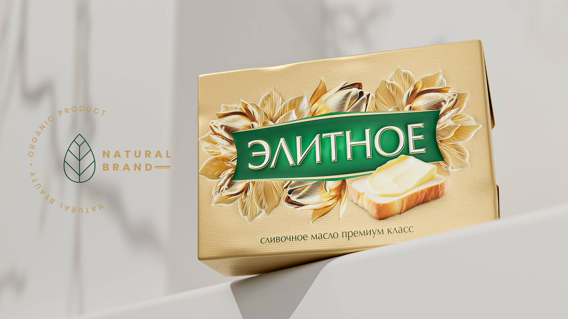
How wonderful if this phrase could be applied to a product! We had the task of developing an appropriate package design for a butter called “Elite”.
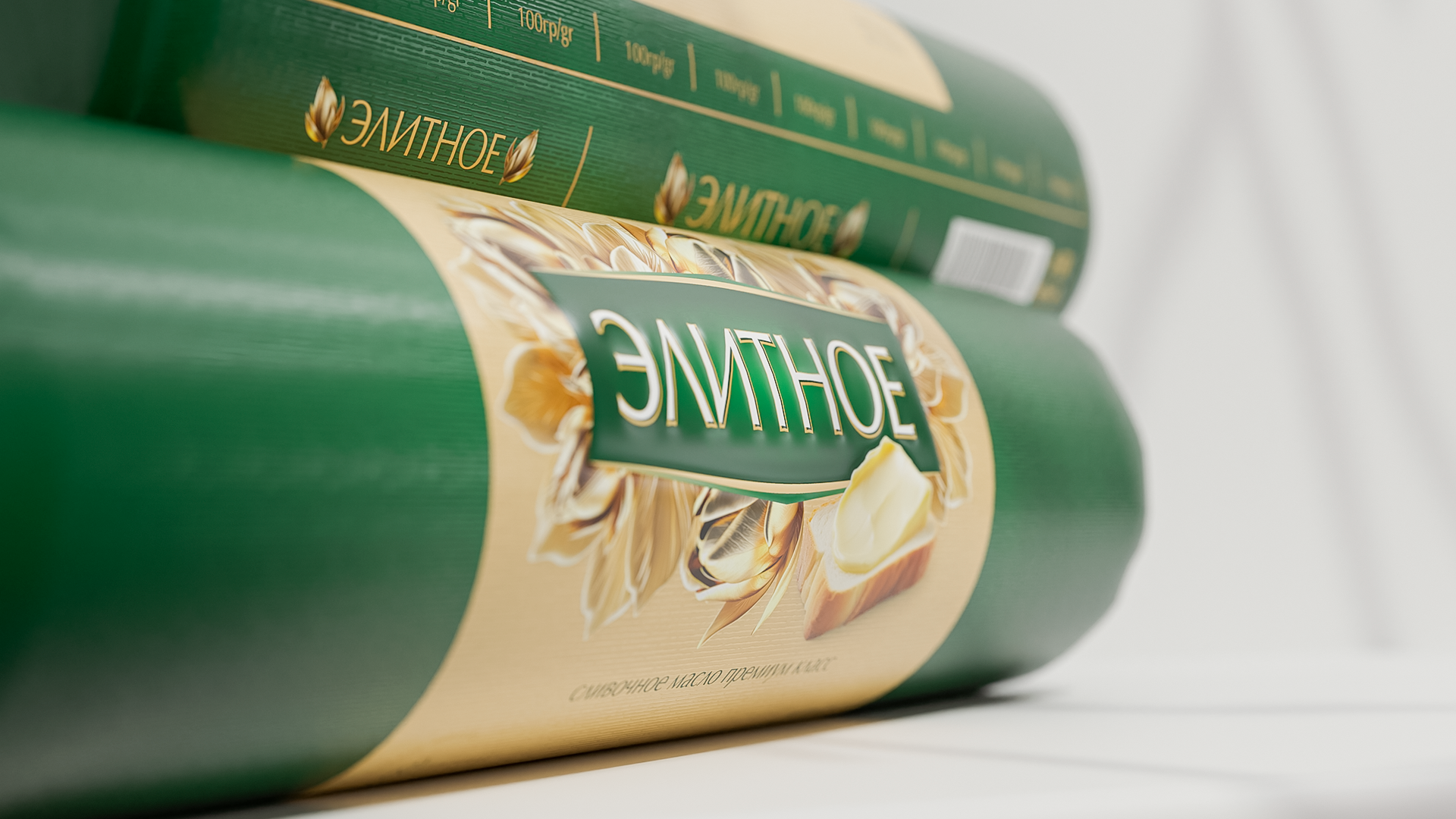
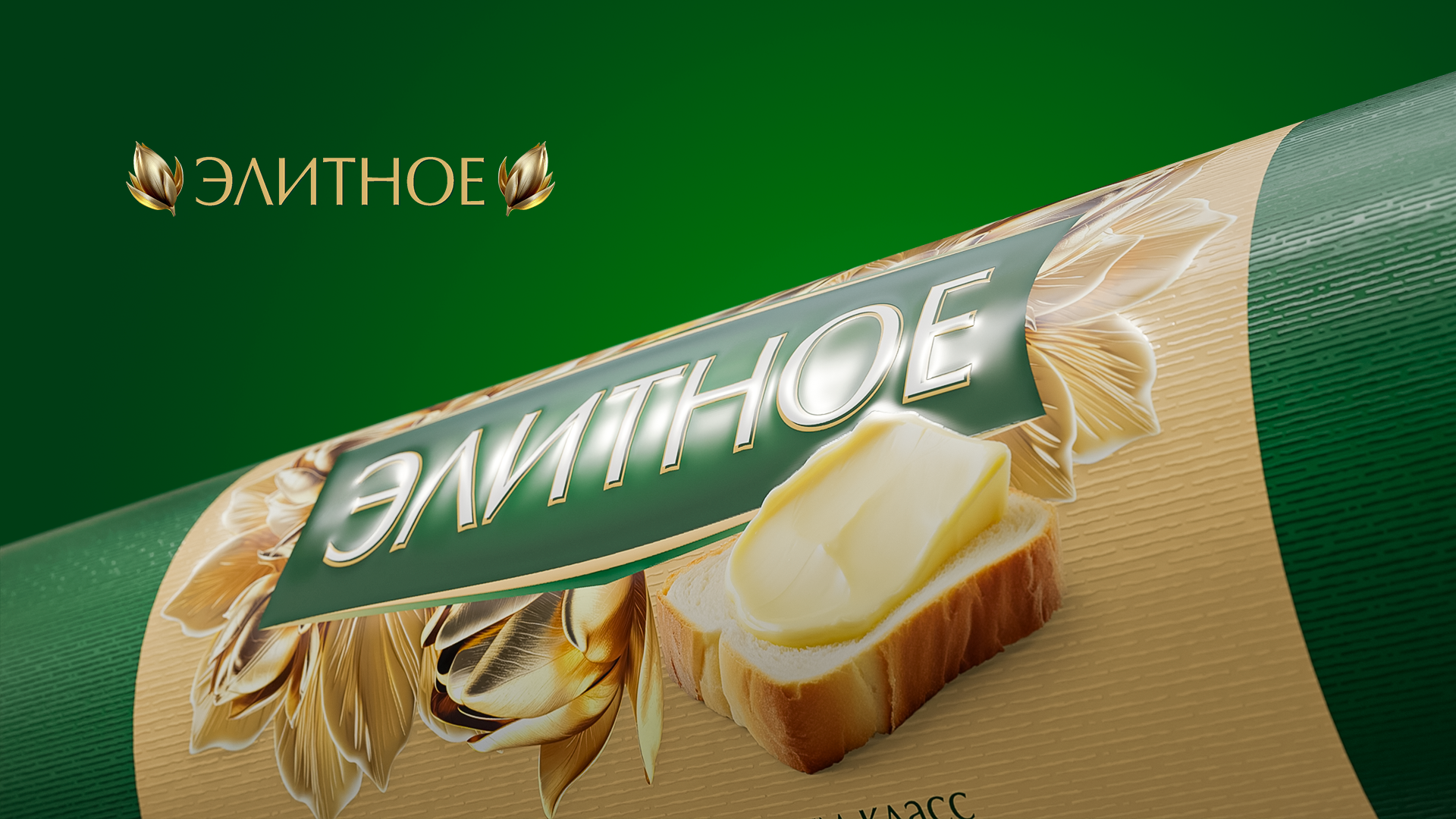
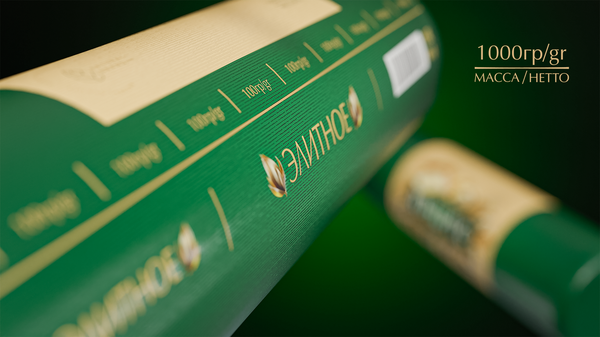
We used a combination of gold and velvety green to emphasize elite and luxury. Flowers and leaves depicted in gold represent abundance, while the green color conveys a sense of reliability and high quality.
Butter spread on toaster bread also gives special emotions. The phrases “Premium quality butter” and “Premium butter” once again emphasize the quality of the product.
Tell me, does your product live up to its name too?