Today, we would like to share a successful packaging design example for the mineral water brand.
The newly launched brand is called “Oqtosh”, which means “white stone” in Uzbek. The design concept was developed based on this name.
Bottle Design
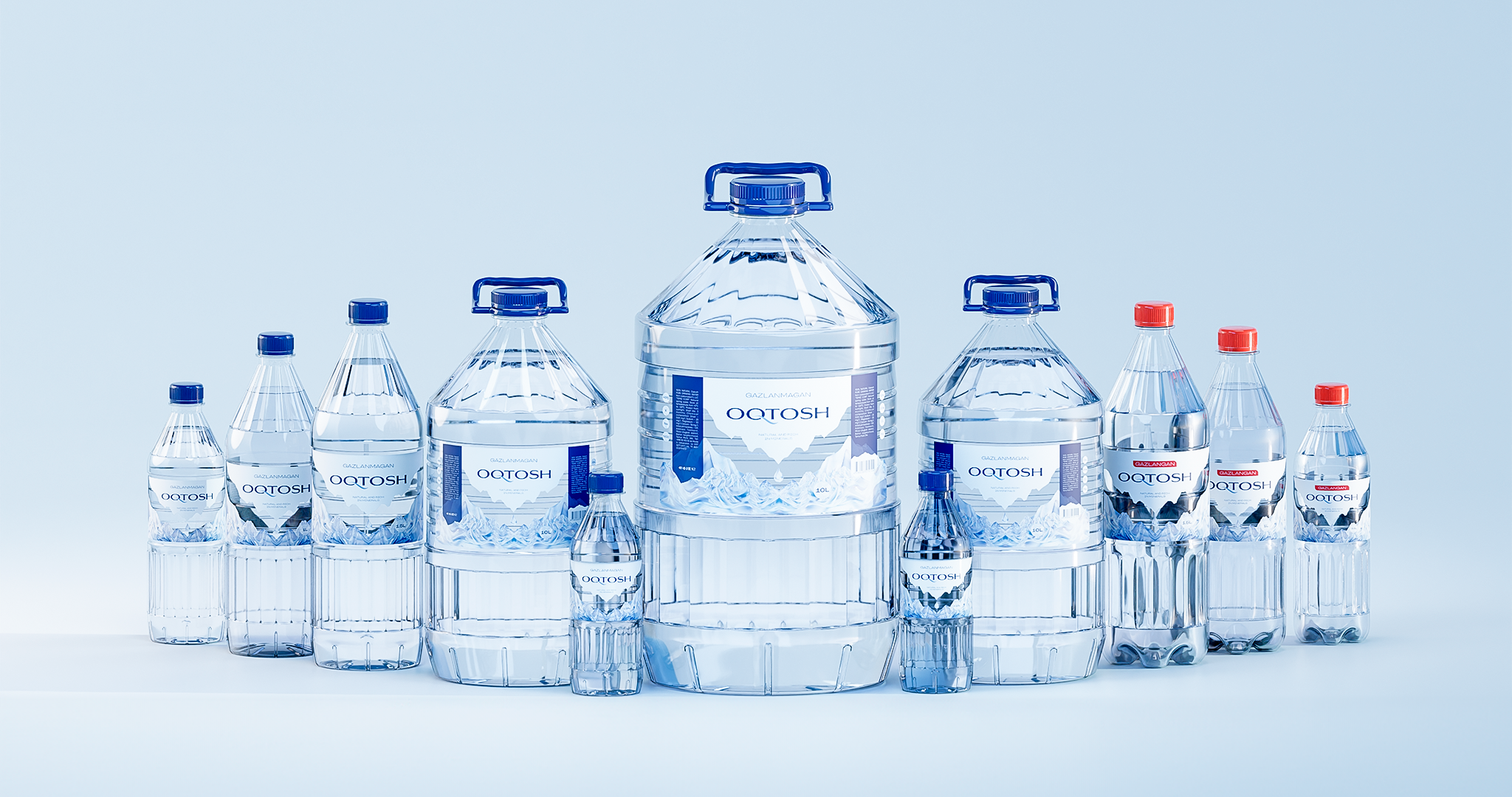
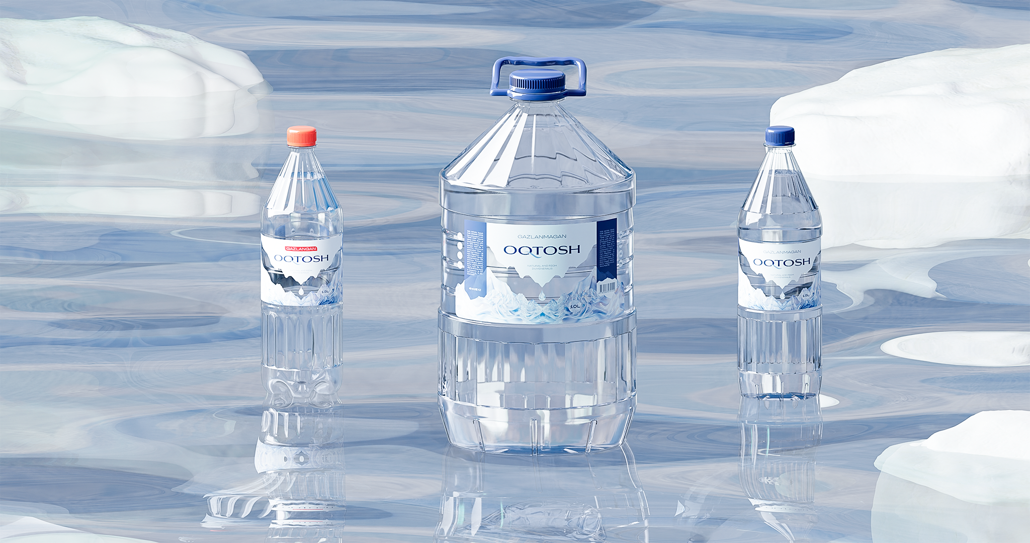
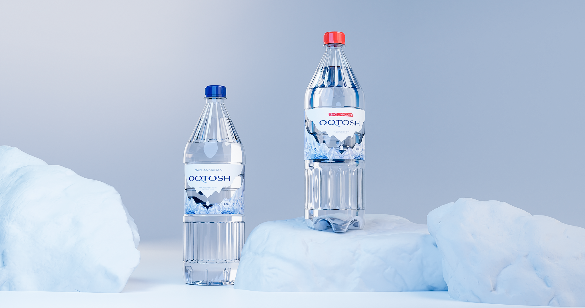
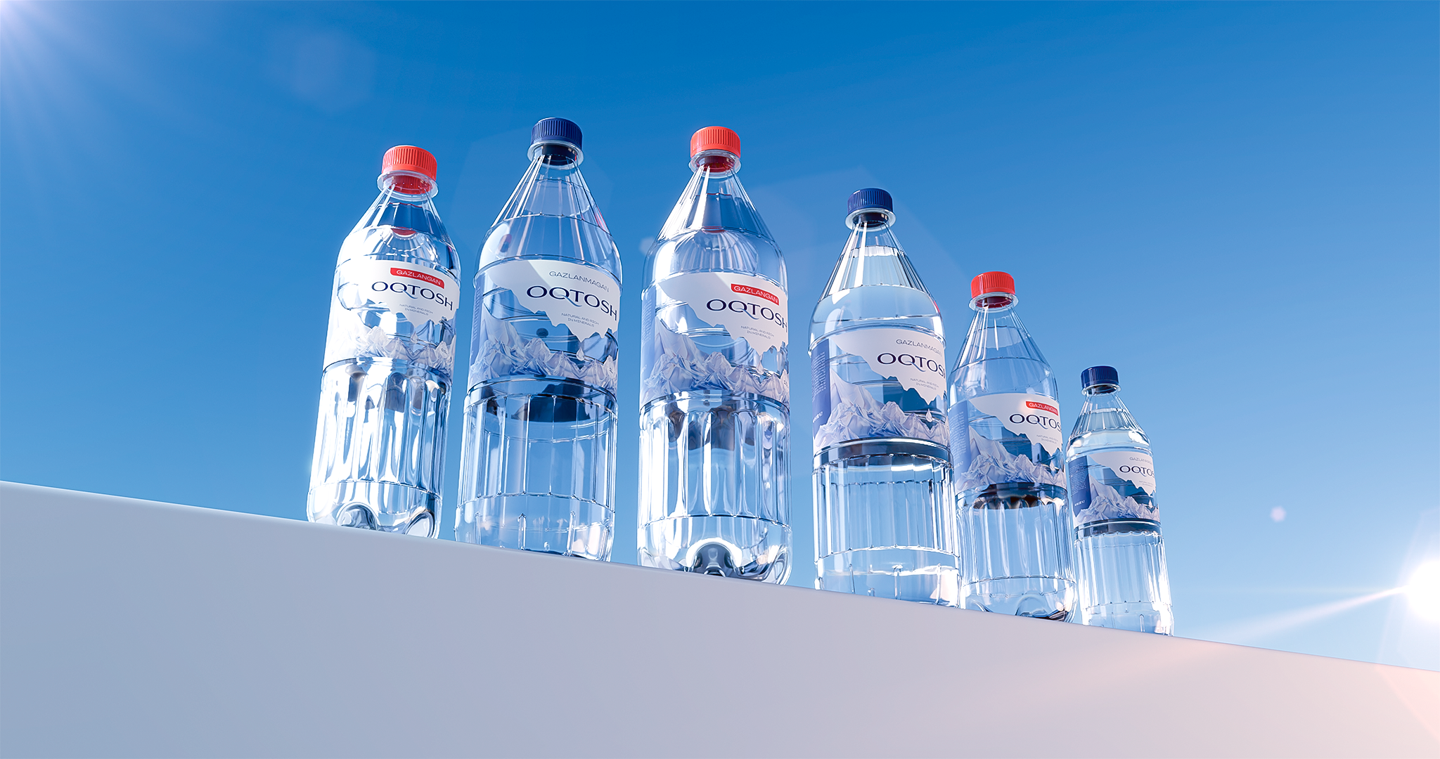
We designed packages in various sizes – 0.5, 1, 1.5, 3, 5, and 10-liter bottles. The design takes into account ease of grip, lifting, and transport, as well as stability when placed on a flat surface, and sufficient strength given the volume of water contained. 3D models were created for each size, giving the bottles a distinctive appearance. To visually differentiate between carbonated and non-carbonated water, red and blue color schemes were chosen for the bottle caps.
Label Design
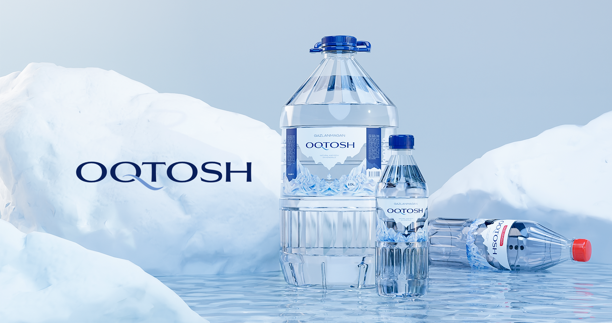
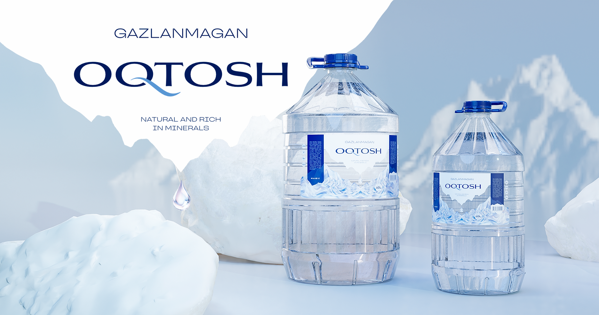
The labels are designed in light blue and white hues. The central element is a drop falling from a white iceberg onto crystal mountains. The space between the mountains and iceberg has been rendered transparent, emphasizing the purity of the product. The text “Natural and Rich in Minerals” highlights the beneficial properties of the water, while a list of minerals is represented visually using icons.
Results
The proposed concept was well-received by the client, and the new product is expected to be released soon. We believe that the design will help the product gain a strong market presence and establish itself as a reputable brand.