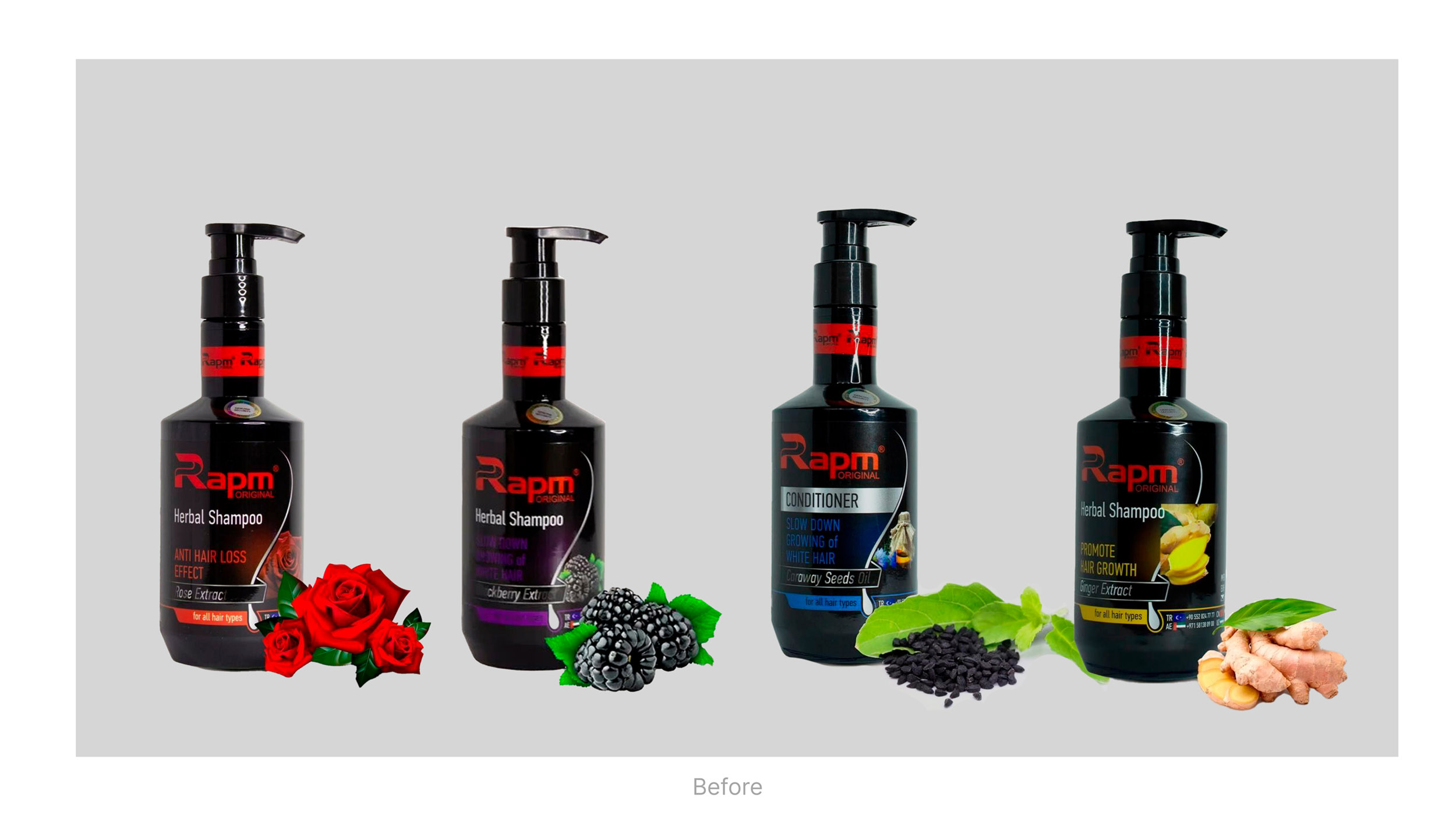
RAPM is a brand of a made-for-men shampoos and shower gels that are produced by a local company out of natural extracts and ingredients, in order to make self hygiene not just a daily routine, but something pleasant even for extremely masculine, not quite emotional and sentimental men.
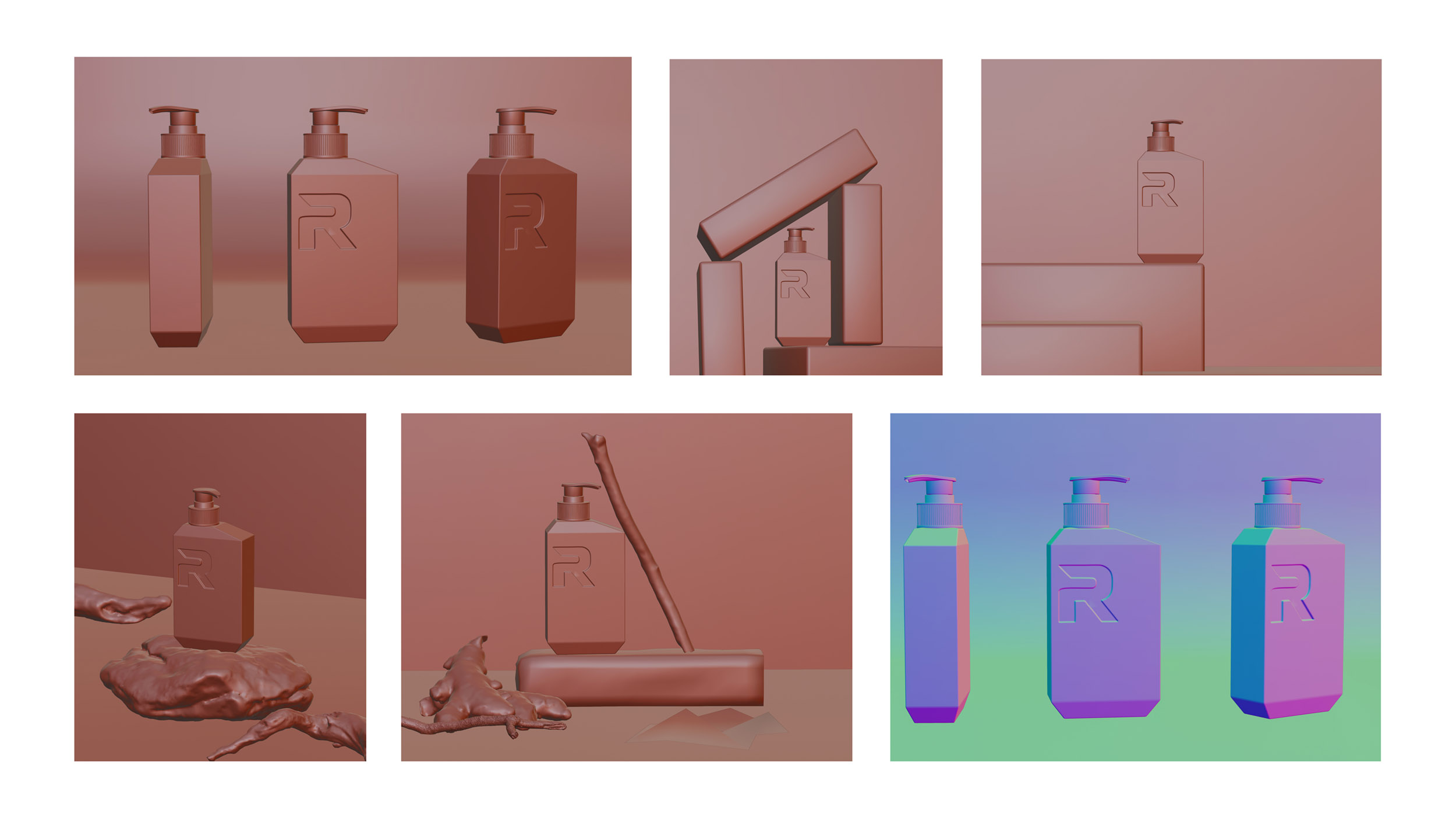
Our mission was a complex rebranding of a trademark, in order to renew it, but keep its common visual identity, which was already well-known for the customers — to reach this goal we re-made its appearance, saving main elements of the branding.
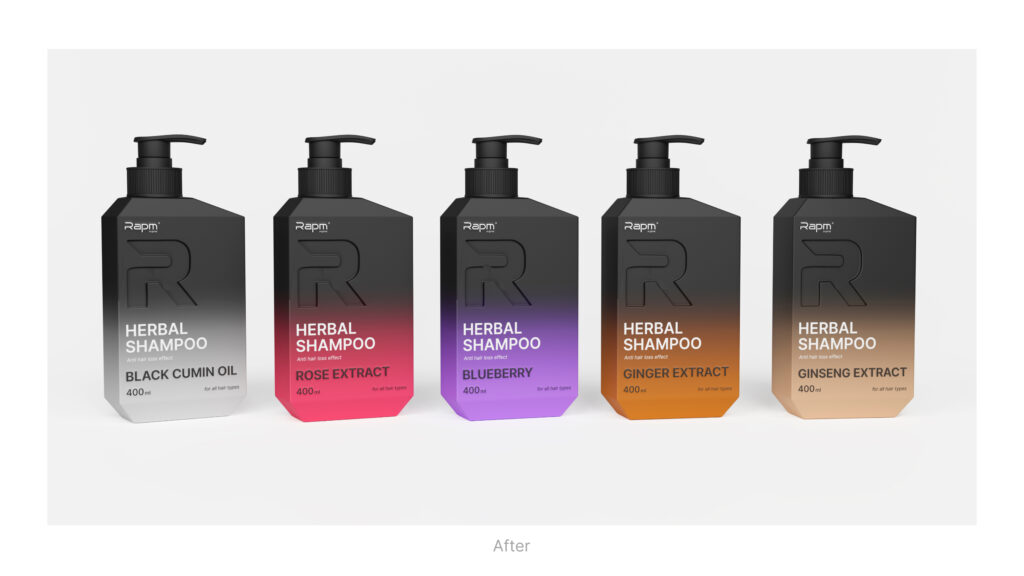
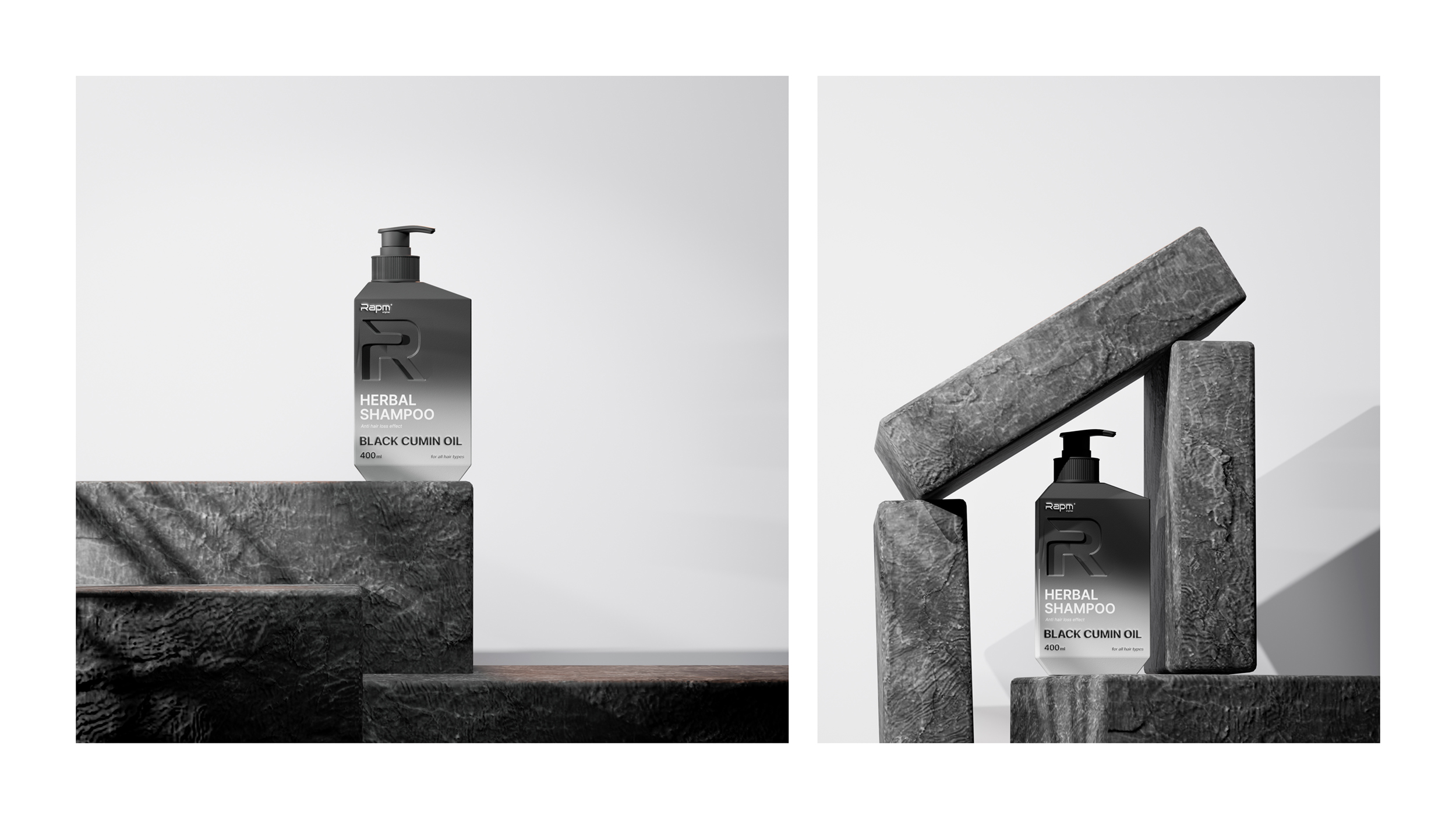
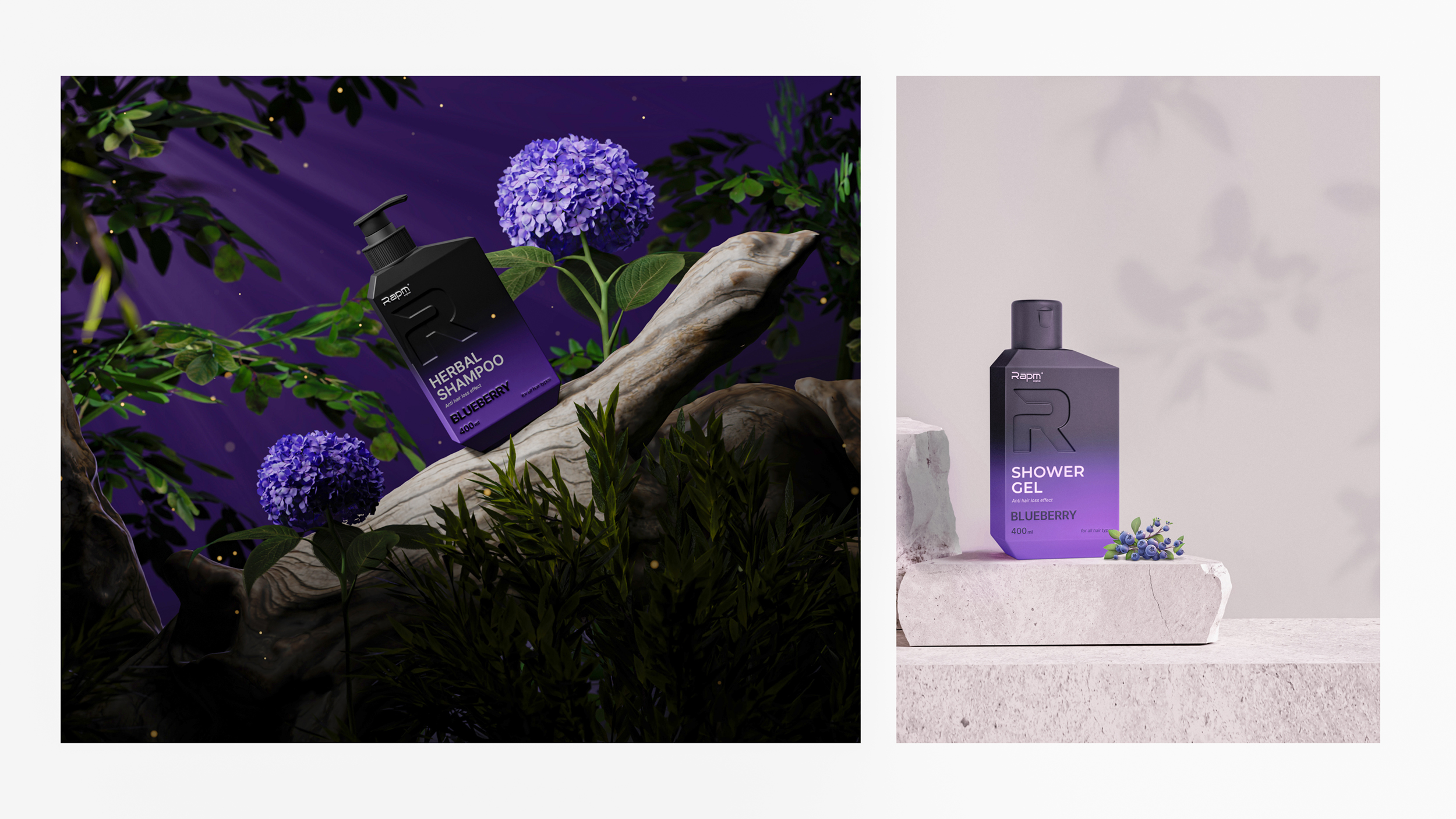
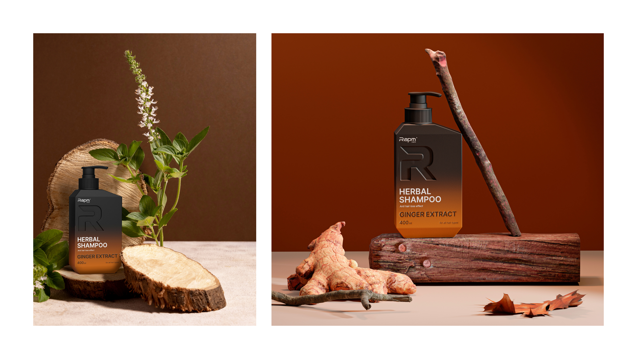
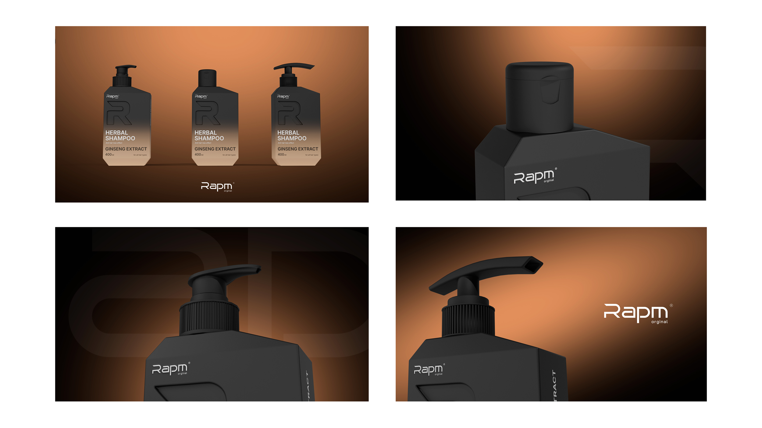
Also it was crucial for us to keep a men-suitable form of packaging: bold, serious, trustful and accurate.
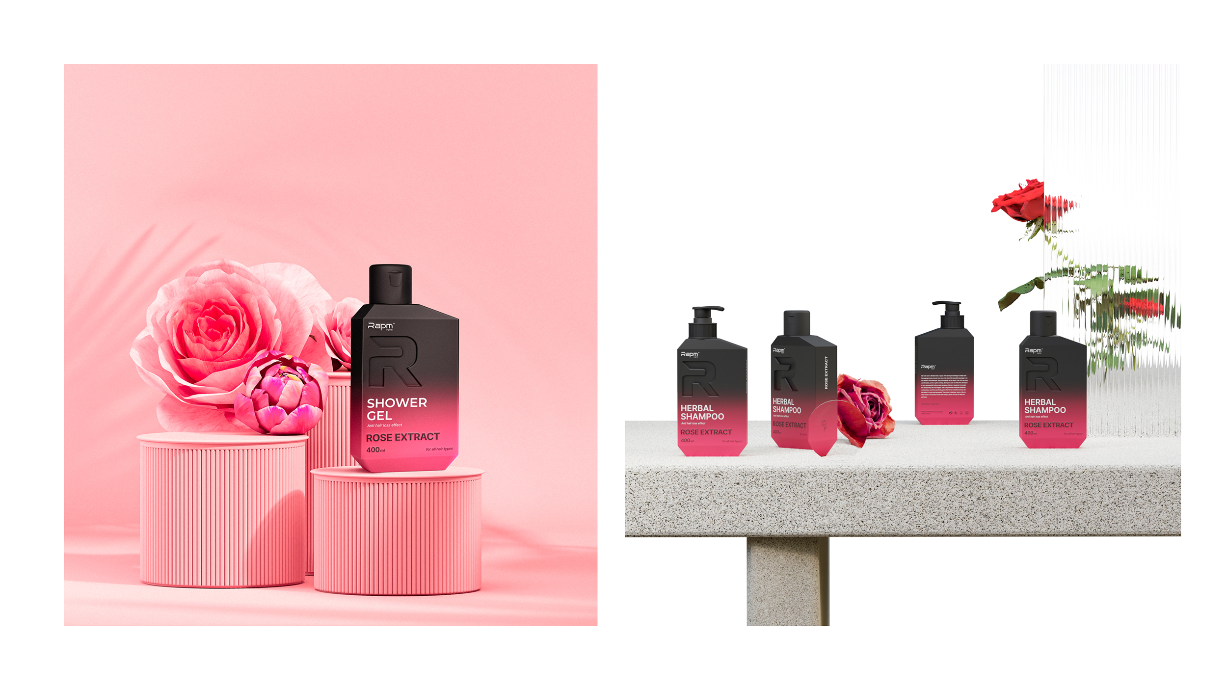
Another important part of the project was developing a solution that could be somewhere between minimalistic approach and premium design. Our product is supposed to be promoted by bloggers and influencers, and that means that the packaging also had to be presentable enough, even for massive audiences on different social media resources.
Color solution also took into consideration all factors we mentioned above: we decided to use a combination of black color and other, more bright tones to reflect different types of our product: black and silver for cumin oil, elegant pink for rose extract, violet tones for blueberry, bold orange for ginger and light brown tones for ginseng extract.
Moreover, we left some space on the packaging to declare different qualities of the product: for example, our shampoos got anti-hair loss effect, and this is a quite important fact for our audience that has to be on the packaging.
All in all, our product got a visual identity and packaging that suits all business goals and already started increasing RAPM sales.