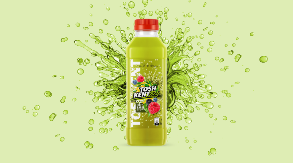
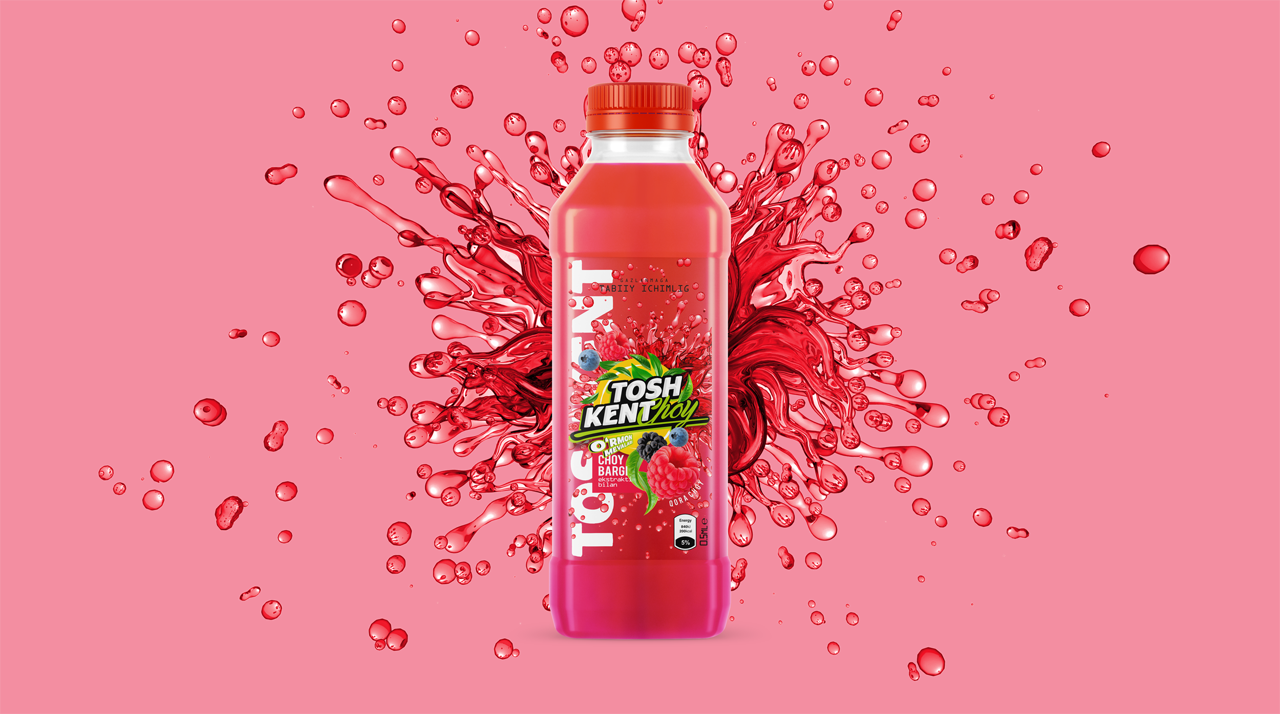
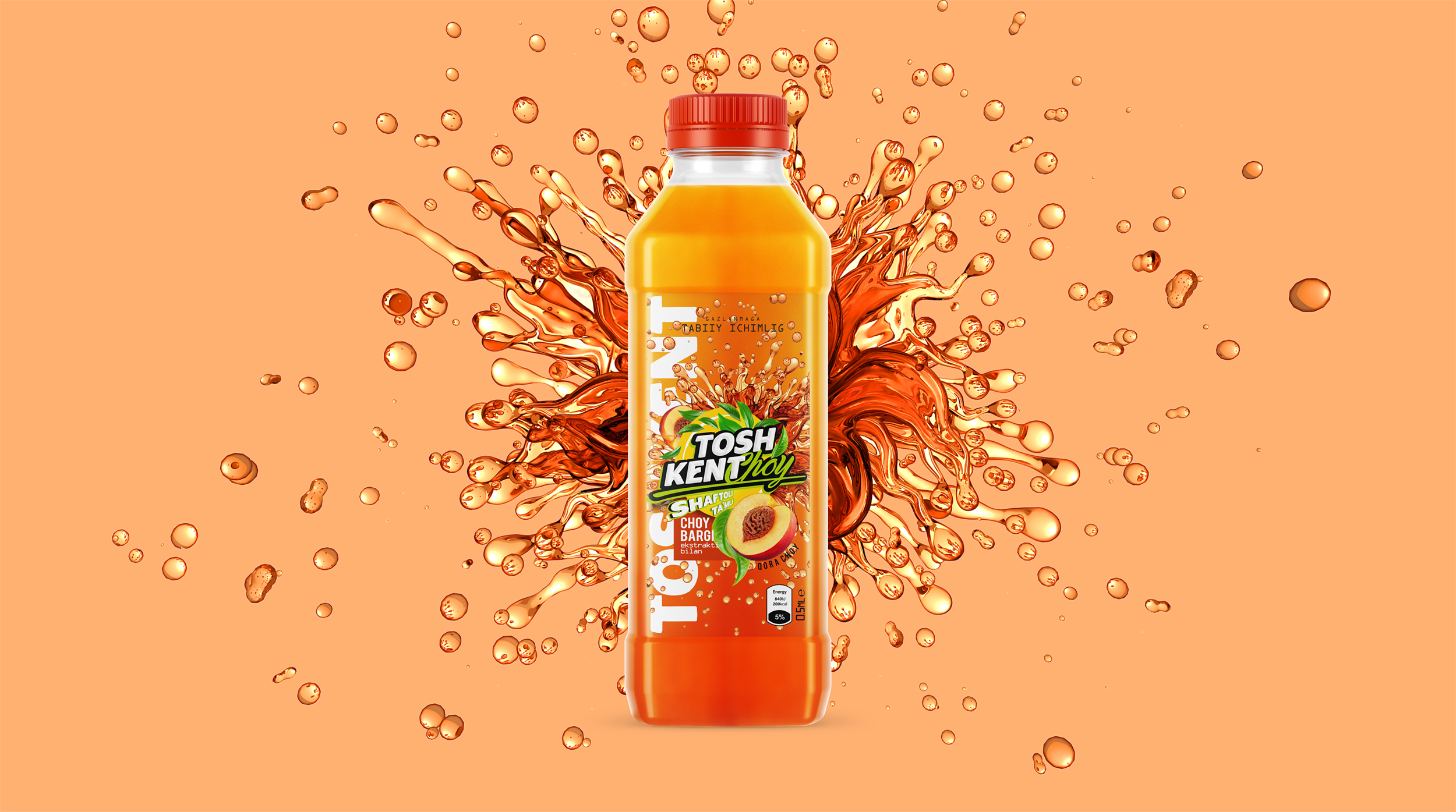
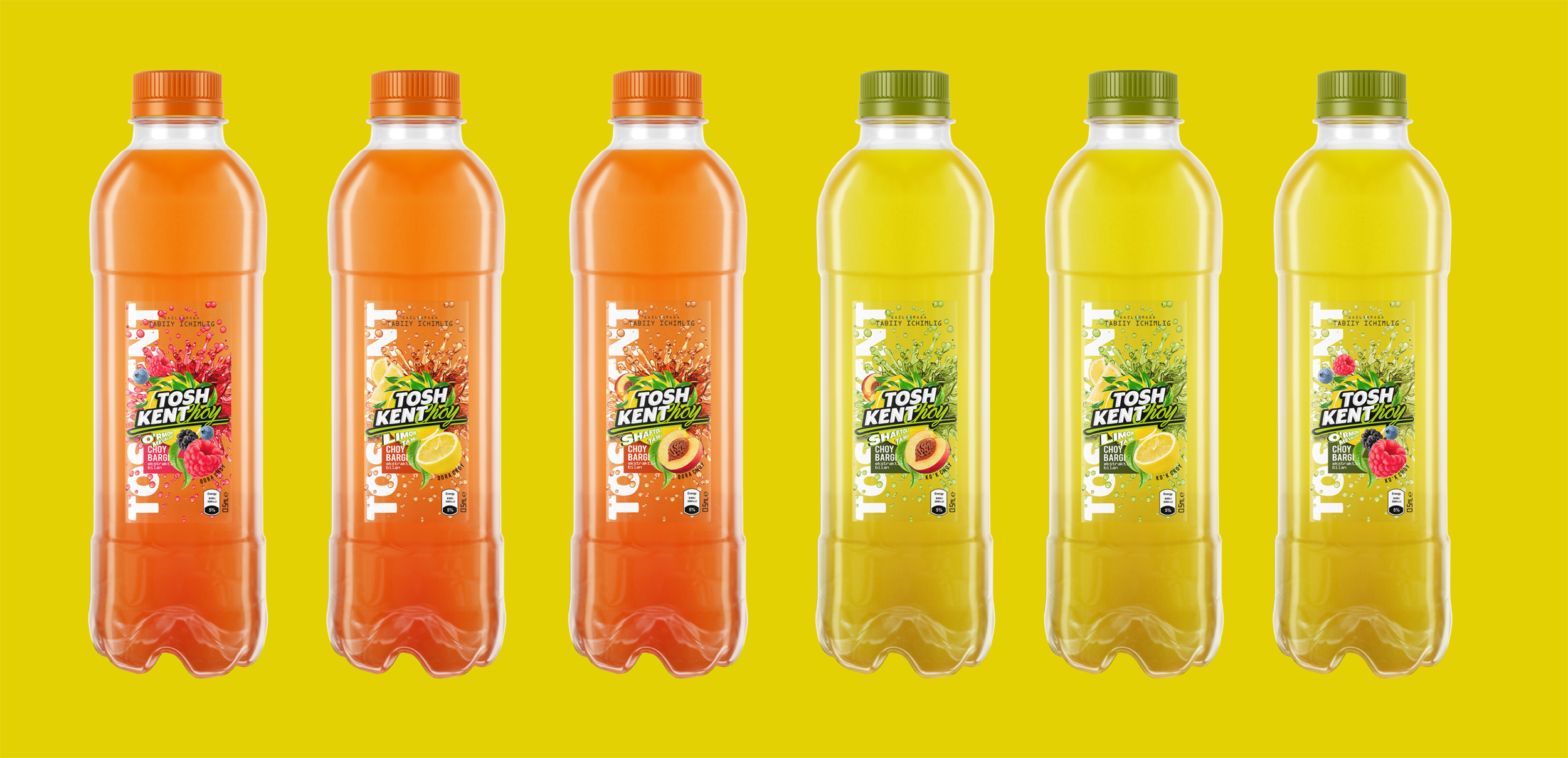
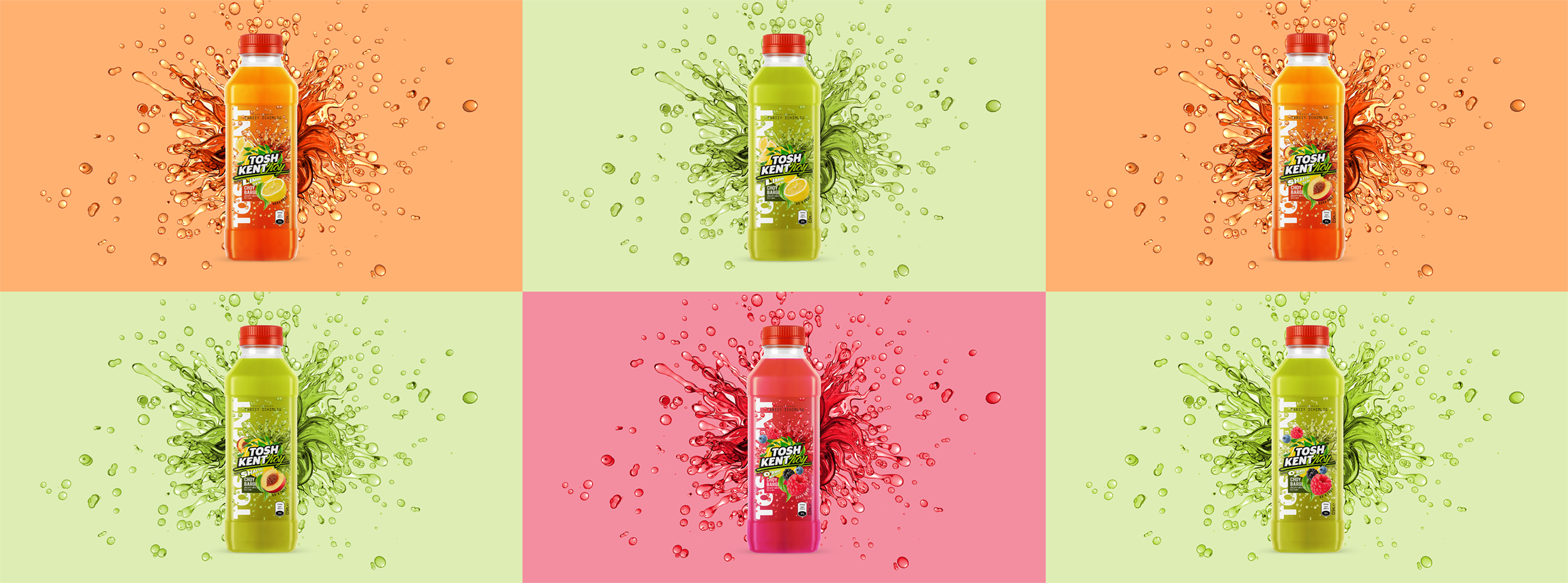
Package design and logo for “Toshkent choy” soft drink.
The product has two flavors – wild berries and peach, both flavors have two types: with black and green tea extract.
The logo was designed taking into account the stylistic features of the product theme, which makes the packaging unique and helps to immediately recognize the product among others on the shelves.
The image of juicy fruits on the packaging perfectly conveys the variety of product flavors. This will allow consumers to see at a glance what the drink tastes like. This is important in order to attract interest and stimulate appetite.
Disintegrating drops of a soft drink against the background of the package is a great way to visually convey the refreshing and cooling effect of the drink. Such an element adds dynamism and emphasizes the unique properties of the product.
This combination of design elements makes the packaging attractive and recognizable, which is important for a successful market entry and attracting the target audience.