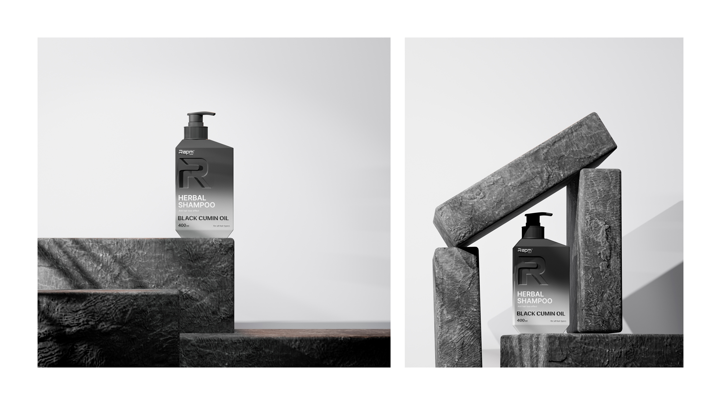
The Pr.uz publication published an article where they presented the opinion of two experts on the work of our agency for the local brand RAPM. We support the publication’s desire to spur the market to an open, reasoned and impartial discussion of the work of market participants, and, in turn, express our arguments about the opinions expressed in the article.
As a design team, we value art, creativity and uniqueness. We are convinced that original ideas are the key to successful design. Every project we work on starts with deep research, target audience analysis, target market competitor research and international practice to create a unique and attractive product for our partners.
As we know, in the field of design there is the concept of “reference”, which implies a source of inspiration. References are an important tool in many areas of creativity and are not a source of plagiarism. Any self-respecting professional designer, before starting a project, refers to references as an example, based on which he will subsequently create his own work. References can inspire a designer to interesting ideas, guide his thoughts and push him to create a new masterpiece.
The article by Pr.uz compares our work with the packaging of the Australian brand Kevin Murphy. Despite some similarities between these designs, they share a number of distinctive features.
The target audience
– Kevin Murphy products are designed for a female audience.
— The target audience of RAPM shampoos are, on the contrary, men, which fundamentally changes the approach to design development. It was the client portrait that served to create a brutal form of packaging.
Color solution
— Cosmetic products Kevin Murphy are decorated in light, pastel colors.
– The main color of the packaging of RAPM men’s shampoos, even after the redesign, remained black, retaining its identity. At the same time, we were able to combine other color solutions based on the composition of the shampoos, thus creating a unique gradient solution.

Packing form
— The Kevin Murphy packaging shape has many angles in various degrees, as well as asymmetrical corners ground off from different sides.
— The RAPM container is shaped in such a way that strict symmetry is created in the cross section. Also, our idea was to create a design with strict lines – a quadrilateral, attaching a truncated pyramid at the top and bottom, the side faces of which have the shape of a trapezoid.

Convex shape of the logo
Debossing is one way to personalize a product. This embossing method has been used since ancient times and for these reasons cannot become an object of copyright.
Also, Kevin Murphy’s use of this method in their product design does not mean that this is the first and only such case. It is also worth noting that plagiarism could be called such a product that misleads people because of its similarity with the original product. We want to make sure consumers don’t confuse a Kevin Murphy product with a RAPM product.
World Brand Design Society – international community and organizer of design competitions
World Brand Design is a design community. Posting projects to a community site requires meeting several different criteria. Failure to comply with the requirements will result in a refusal to publish. We believe that in the event of plagiarism or an obvious theft of an idea, the community would not publish our project on their site and would not put it in the list of recognized works on the main screen.
Copyright
It is also worth noting that, together with the manufacturer, we recently received intellectual property copyright. As you know, products of creative work that are unique in their content are subject to copyright protection.

We are sincerely glad for the attention shown to our activities and want to emphasize the following in conclusion:
1. Our partners are our main value, and we are proud that the results of our work meet their expectations. We are pleased that our joint work continues, and our partners have decided to entrust us with another project, which is a clear indication of their satisfaction with the results.
2. One of the highlights of our collaboration with the client was the successful acquisition of copyright for the packaging of this product. The successful acquisition of copyright is another confirmation of our professionalism and efficiency in the implementation of projects.
3. We are certainly ready to continue working, despite all the difficulties that we may encounter along the way. We accept challenges and are ready to overcome difficulties, as we are a true team of professionals who strive for continuous development and reaching new heights in design.

