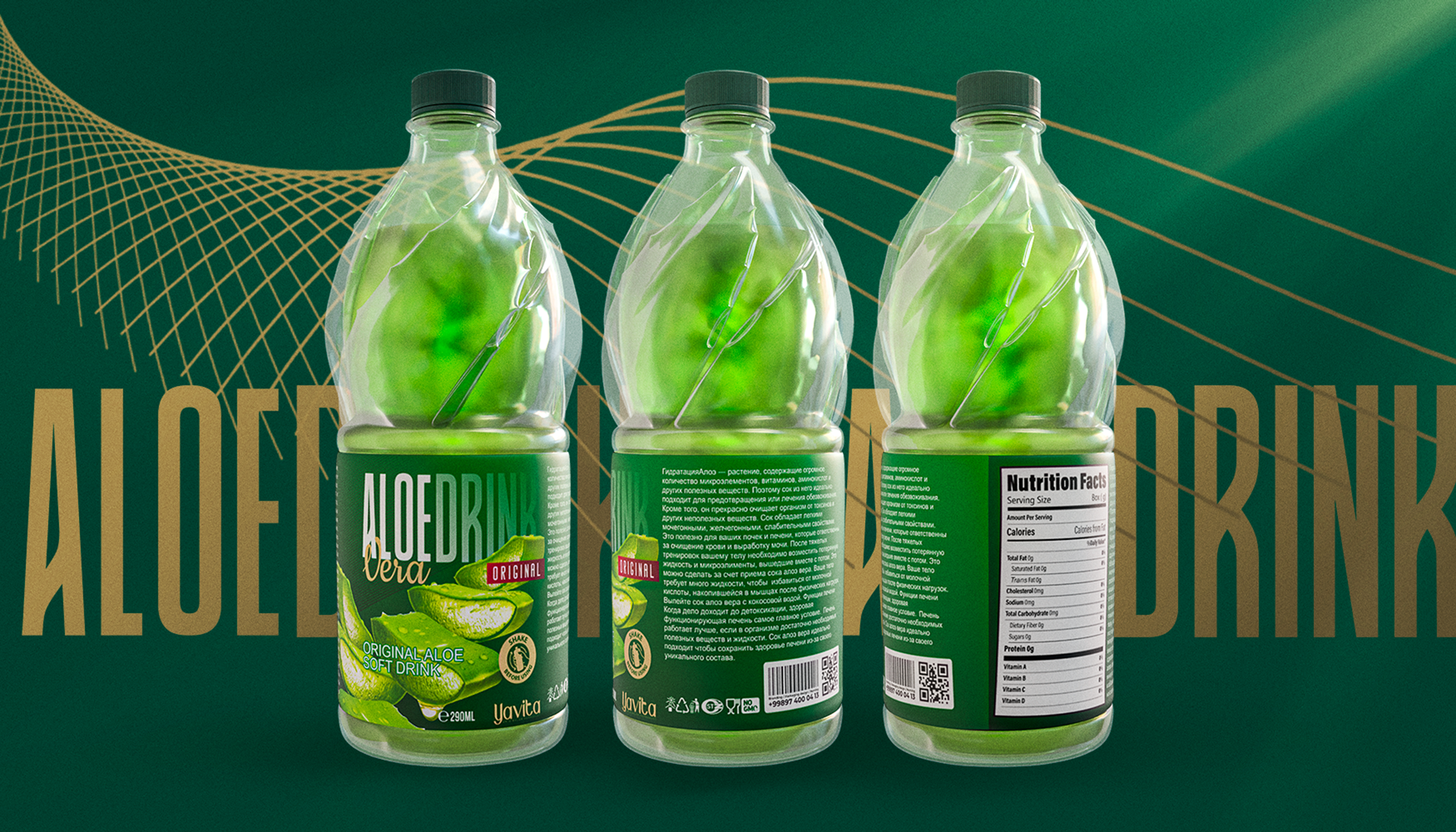
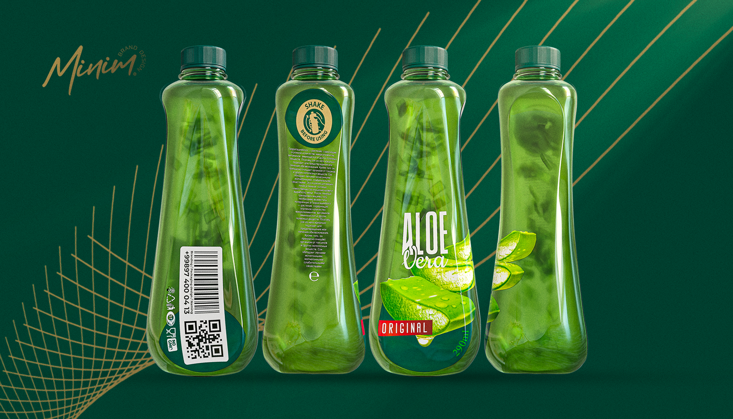
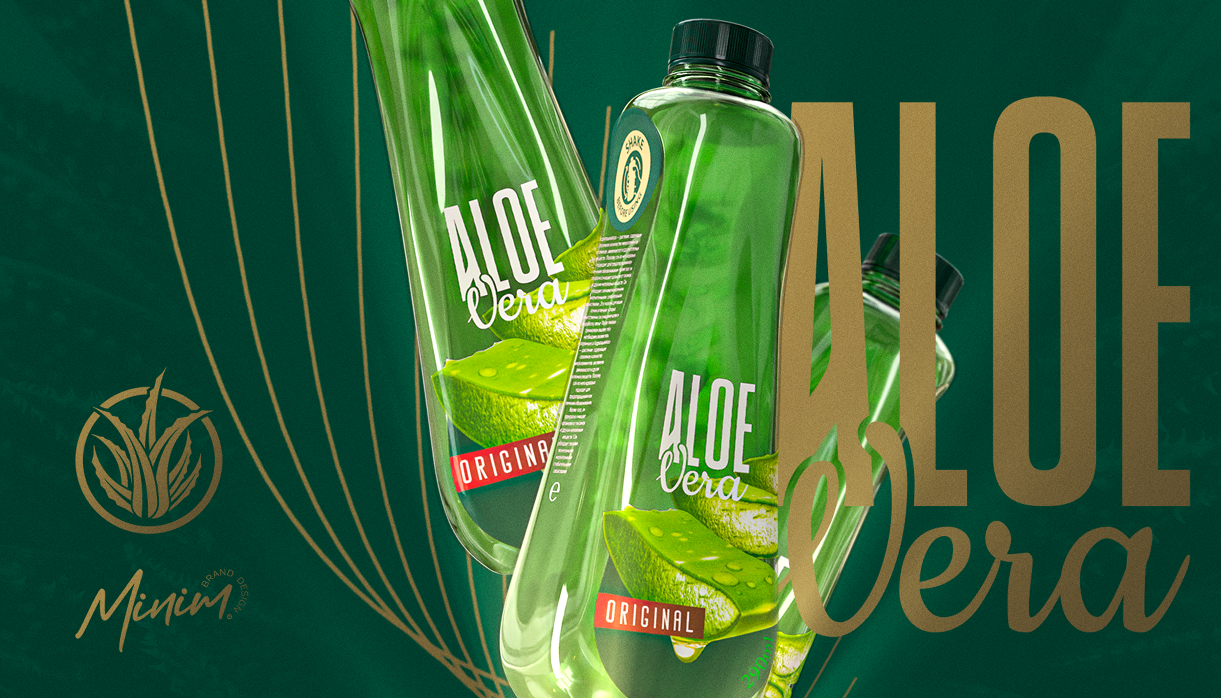
The aloe vera drink is very popular in the Uzbek market, but the visual representation of this product repeats the same forms from year to year, driving the category into a framework that makes products of different brands too similar for the consumer’s perception.
This concept was created precisely in order to distinguish a certain product from competitors, give it more liveliness, ergonomics, and make the overall image of the product more preferable and premium.
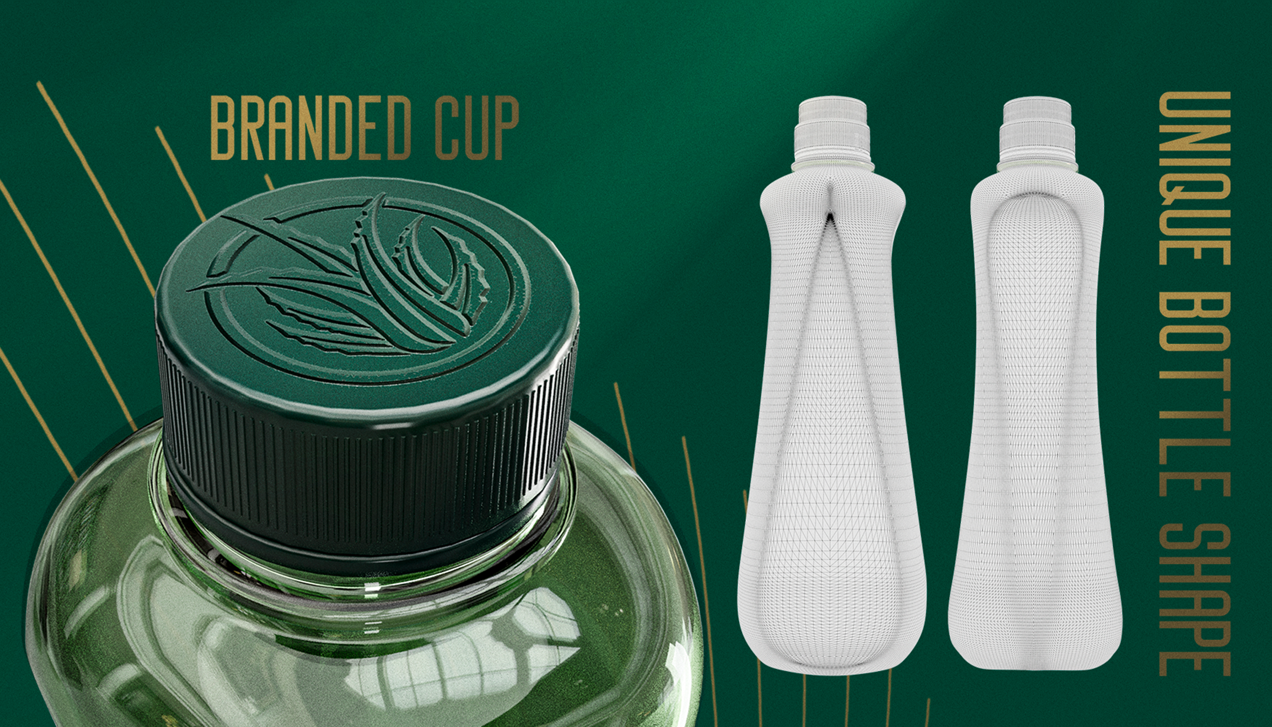
Much attention was paid to the shape of the bottle — it was important to separate it visually and tactilely from competitors, who tend to adhere to more square-like shapes, giving the bottle a rectangular appearance.
In our case, the bottle is more comfortable in the hand, it is easier to interact with it, and the smooth curves resemble not just an ordinary drink, but refer to something more refined and elegant.
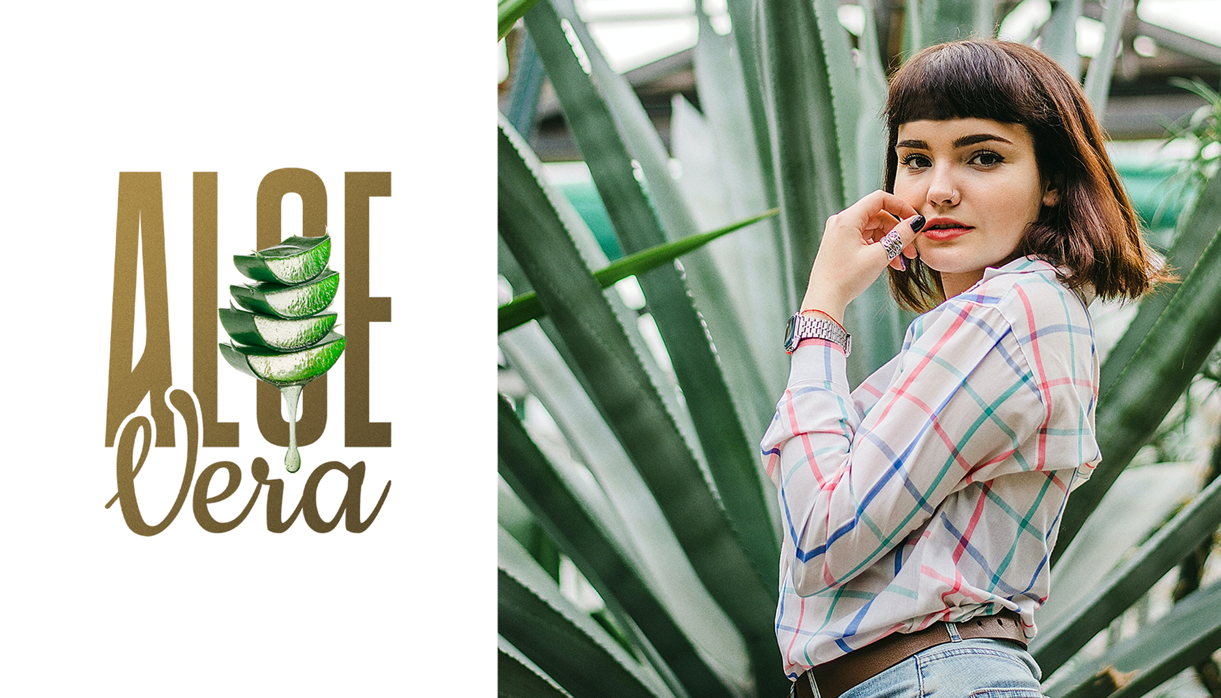
To emphasize the naturalness of the product, we decorated the packaging with aloe leaves, and the visual identity was reduced to a minimum so that the consumer could concentrate on the content and shape, and not the labels on the bottle.
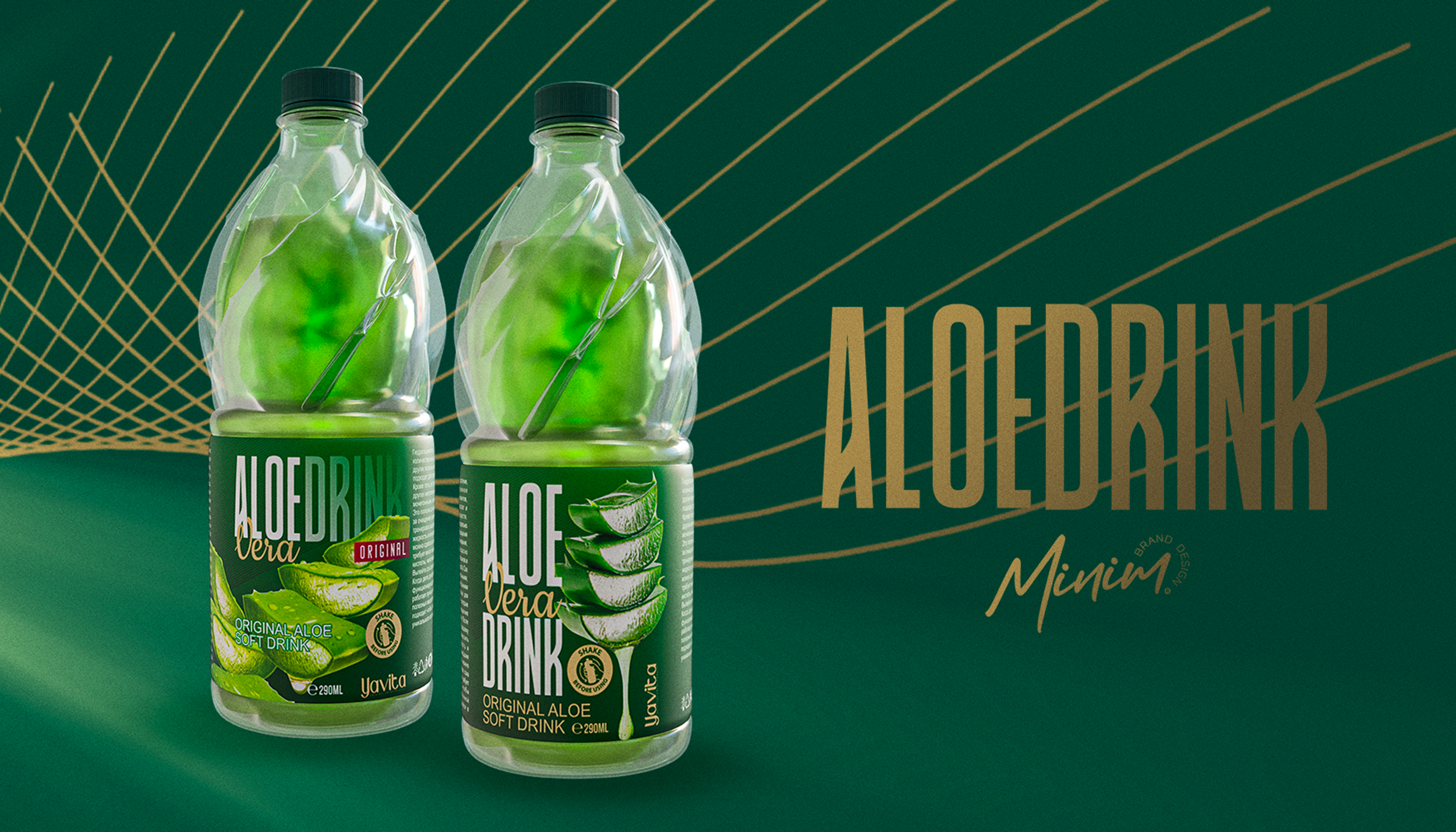
We believe that such conceptual and user-friendly, bold packaging can take aloe vera drinks category to a new segments, helping it to discover more and more consumers that are ready to try a premium product, that would stand beside all-the-same aloe drinks that are currently fulfilling the market not only in Uzbekistan, but in other global markets too.
Now our team is looking forward to a partnership, which can take us to realization of this concept, making our contribution to the category of aloe drinks.