Arabella is a fruit drink created for classic Uzbek celebrations, which needed the same festive identity.
The main target audience of the product is located in the regions of Uzbekistan, and when developing the design, we relied, among other things, on this fact too.
Mainly such drinks are used during traditional weddings, which are one of the main celebrations in the life of almost any citizen of Uzbekistan.
It means that our product will not be a daily drink, on the contrary, it should look and feel like something special for a quite crucial and special day.
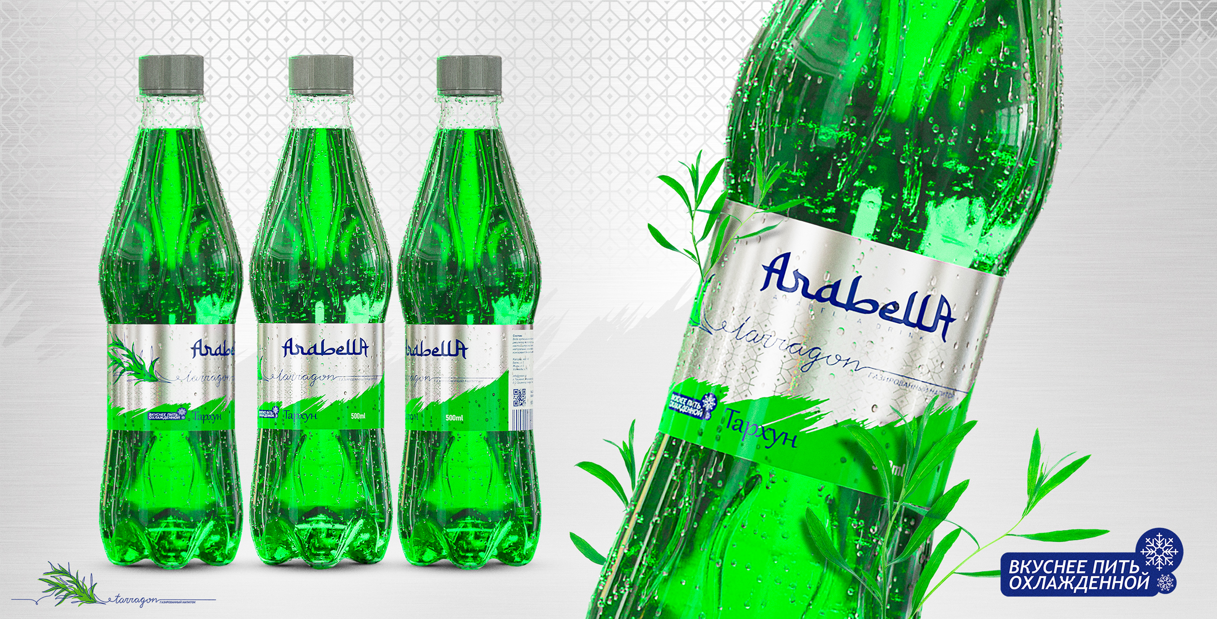
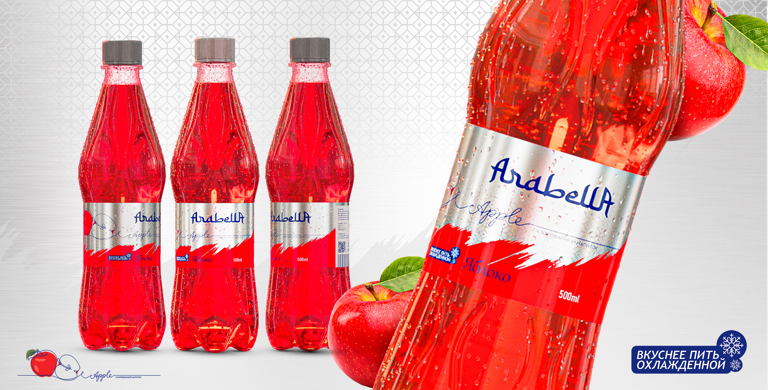
We considered the naming Arabella to be the ideal name for the product, which means “Arabic beauty” in translation.
Based on the naming, we also chose a further style — the most oriental and arabic approach, which is reflected in the developing decorational elements, typography, and even in the style of making the fruit icons for each drink — there we used contour stylistic, that made icons not just informative, but also quite elegant and attractive.
The naming itself is also closely connected with the typography, because the art of Arabic calligraphy has become the main point for development. And this technique was not chosen randomly — Arabic culture was quite popular in Uzbekistan last years, and even more — in regions of the country.
Together, all the visual techniques used in the development gave us a premium visual for a truly festive product.
Thanks to this, the packaging clearly stands out on the shelves, attracts attention and motivates you to try the product.
The search for the favorite tastes is also easy due to the color separation and stylized icons.
We believe that this product can be the first choice drink for local audiences when it comes to festive products, as it reflects local culture code, stands out among other, more classic competitors.