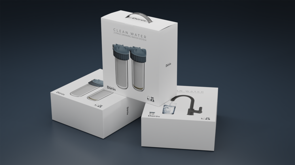
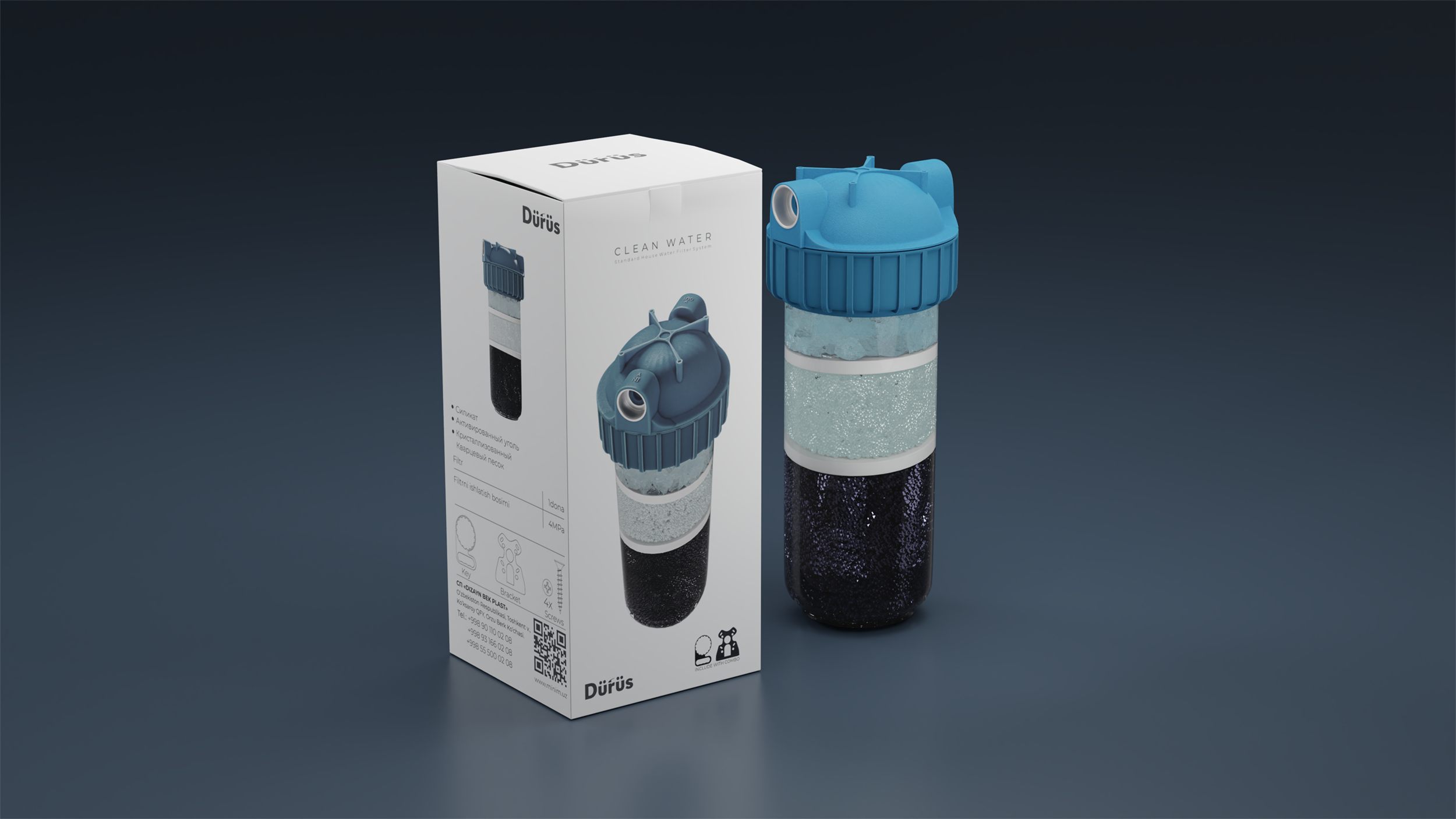
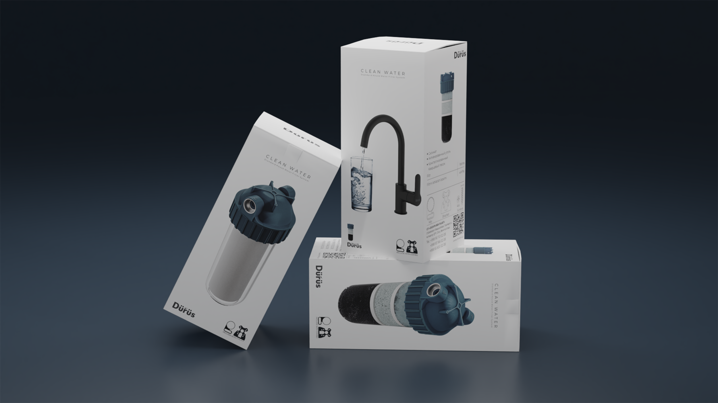
When developing the packaging design for Durus, a wash water filter, we took into account that the product should look simple and understandable to consumers.
First of all, we emphasized the importance of filter cleaning in order to obtain clean water. For this, the single-phase or three-phase cleaning filter itself was depicted on the packaging.
The packaging also features a picture of a glass of clean water and the words “clean water” to immediately evoke the consumer’s association with cleanliness and freshness.
In general, we used a monochrome color scheme with a minimum number of elements to make the product look strict and reliable. Without unnecessary details and bright colors, the packaging design emphasizes the importance of the product for the consumer and its functionality.