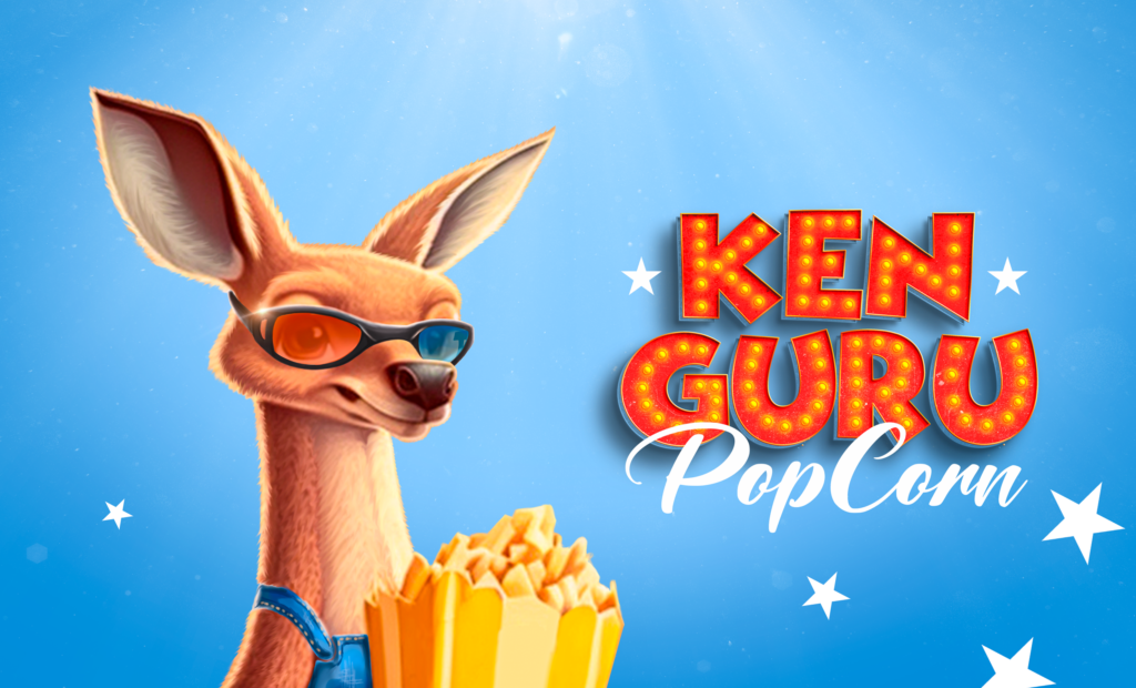
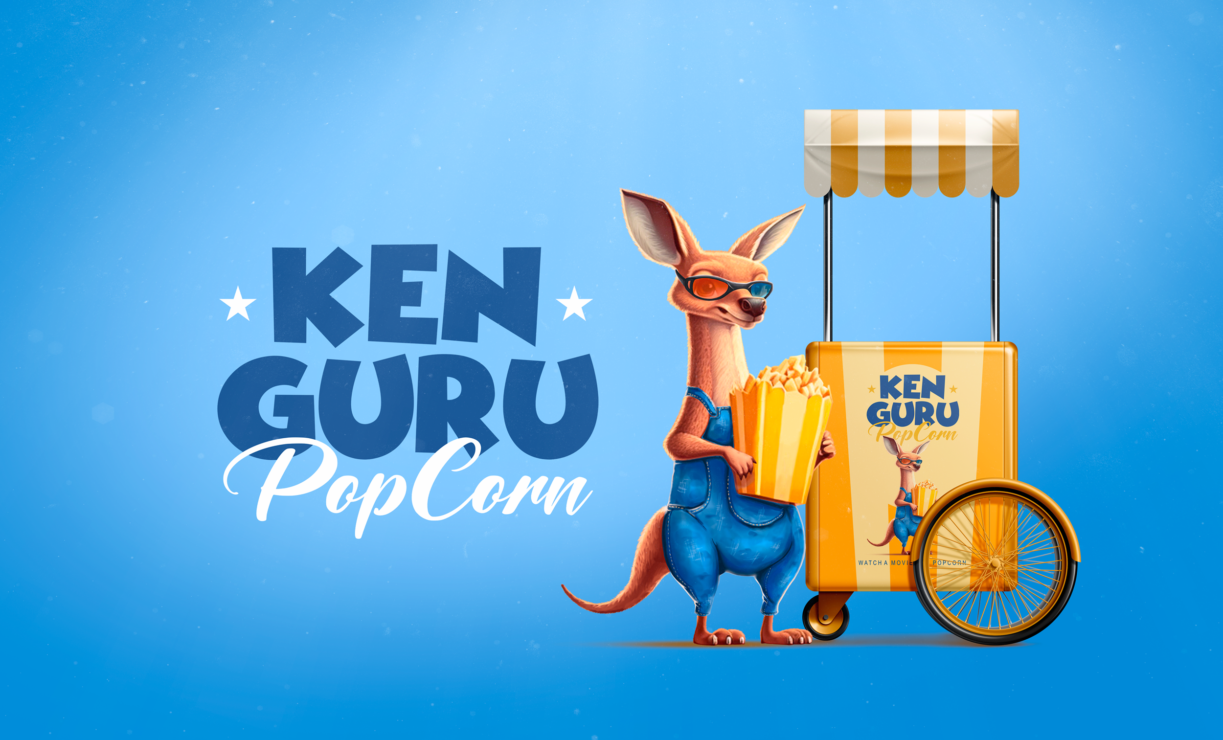
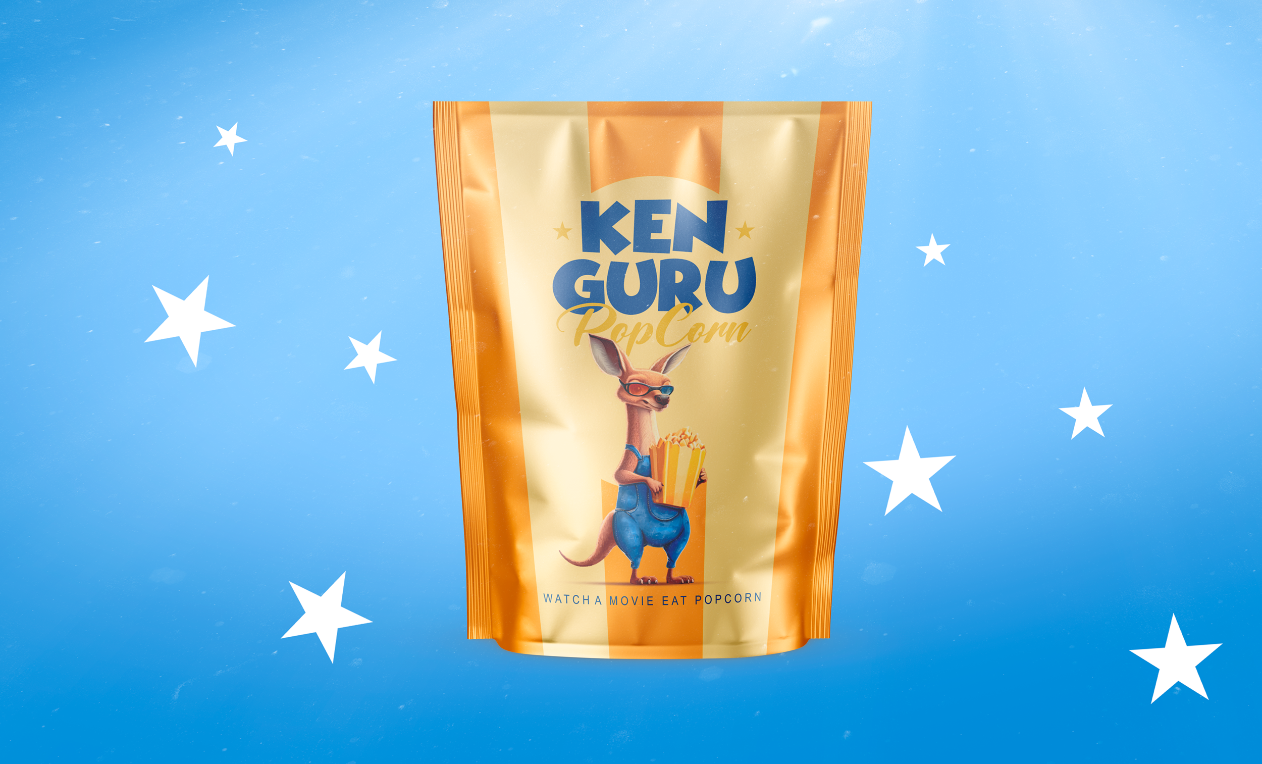
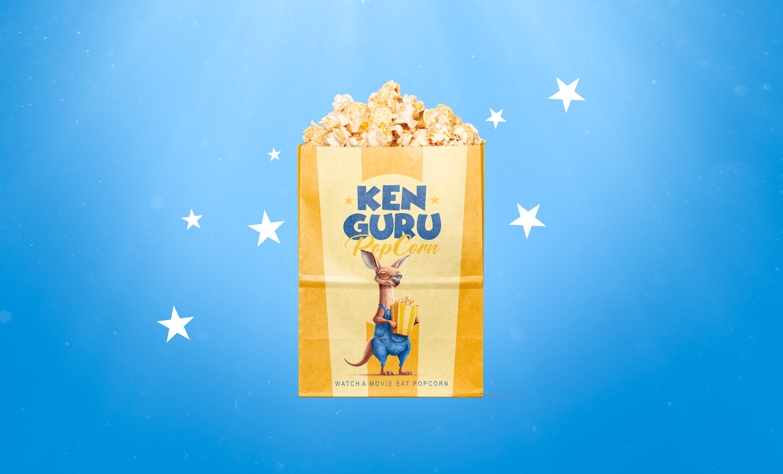
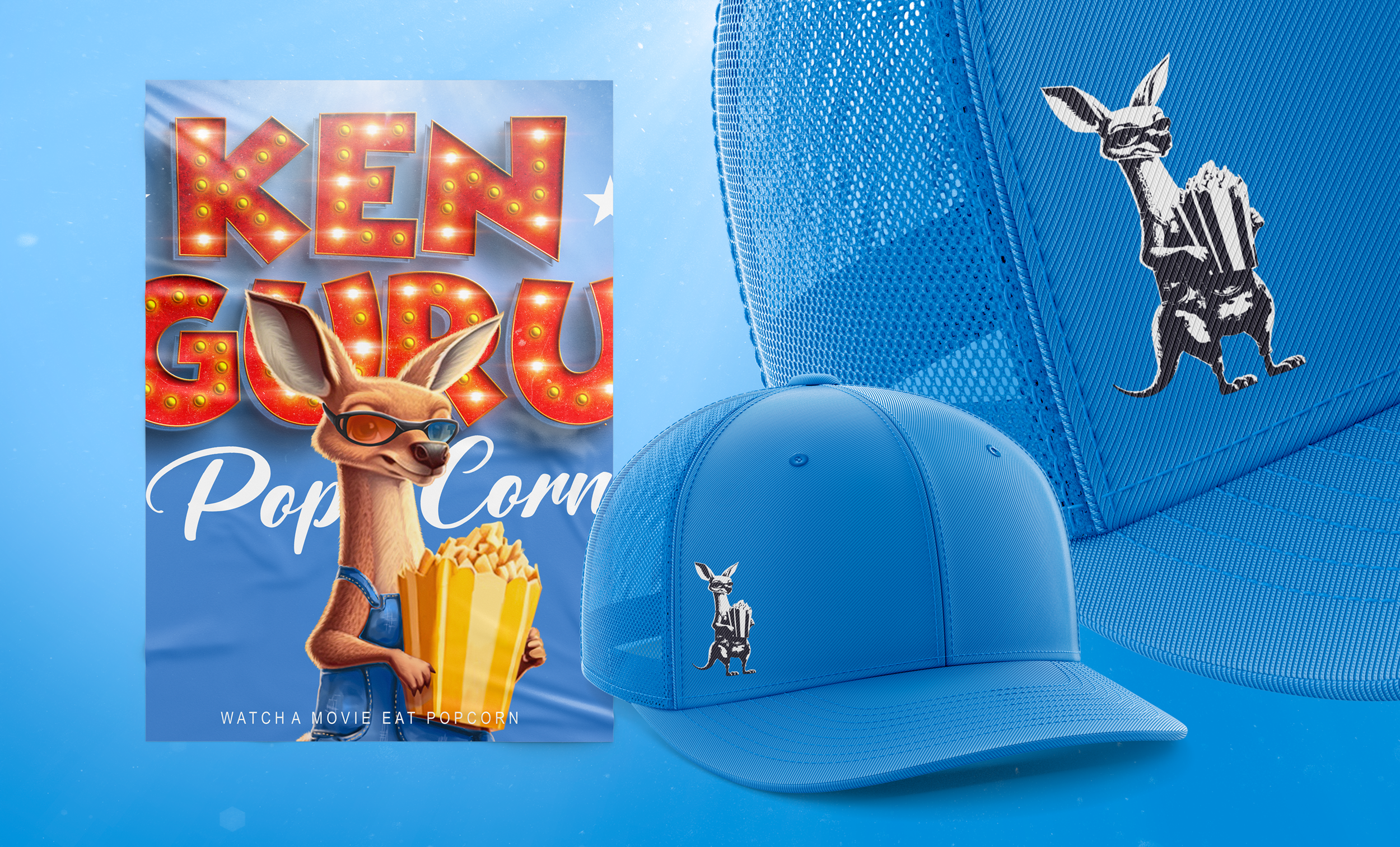
To develop the popcorn packaging design, our team conducted a market research and audience needs research. People usually associate popcorn with cinemas and watching movies. Therefore, when developing a character – a kangaroo (from the brand name), we took this connection into account.
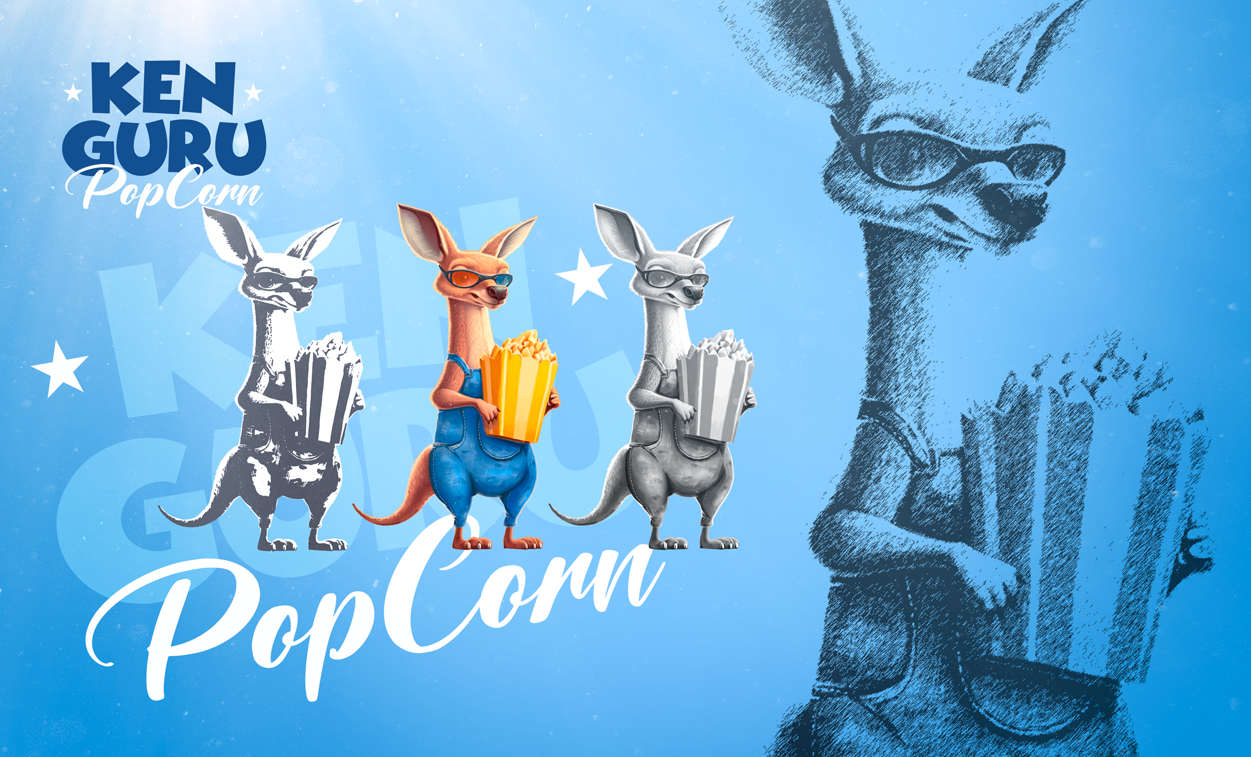
The character we have depicted has a bright personality that will attract the attention of children and adults. It reflects the nature of the product – fun, attractive and super tasty. The 3D glasses on the character indicate that this is the best snack for watching a movie.
Our design team has tried to make the packaging look bright and attractive. The color scheme is dominated by bright colors, which increases the attractiveness of the product on store shelves.
Our design is not only attractive but also versatile. We can use this character in the future when creating other products from the brand, such as chips, corn, and more. Each new product with the same bright character will be easily recognizable and will be able to attract even more customers.