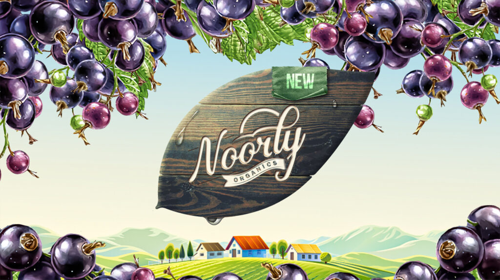
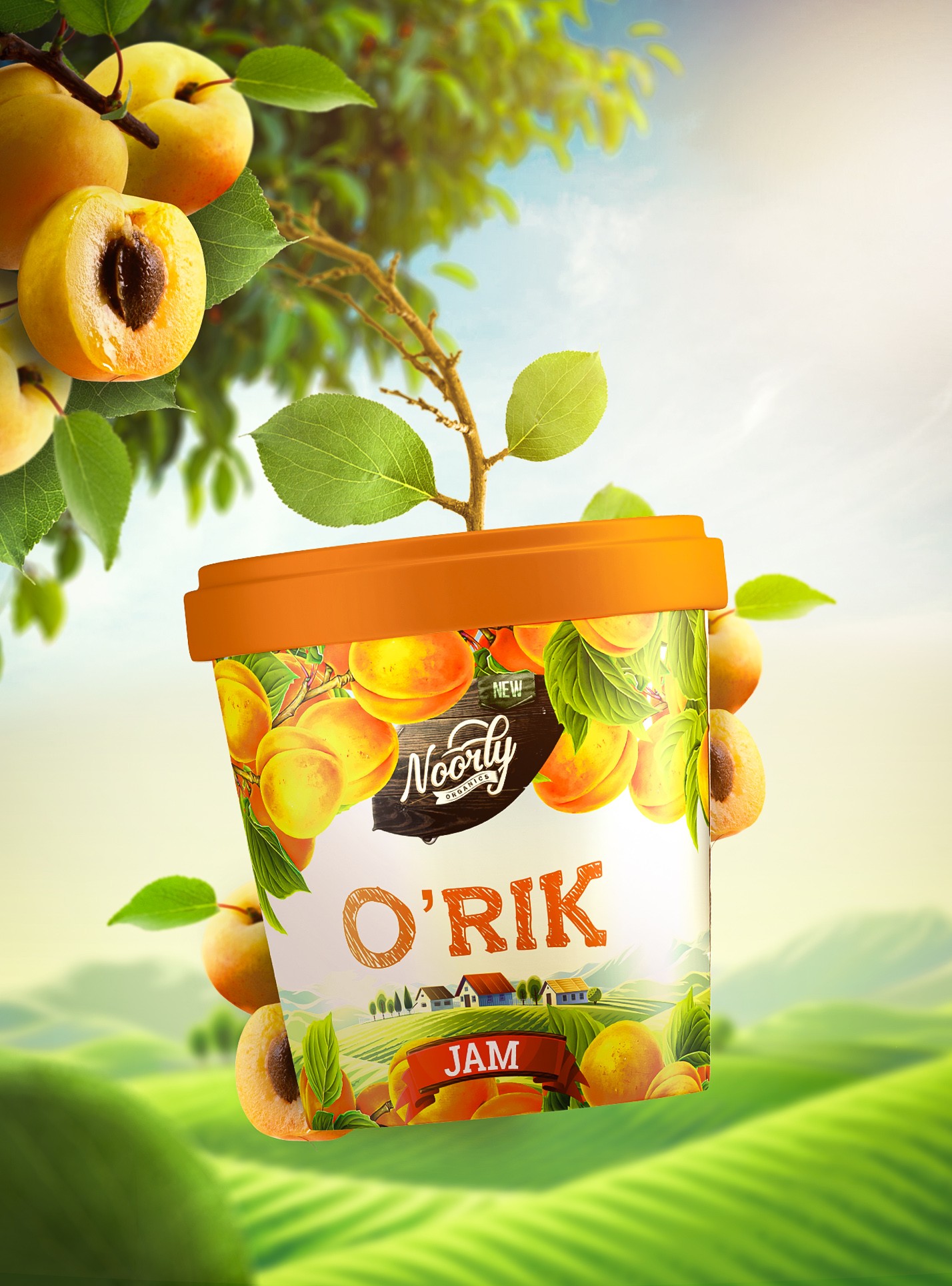
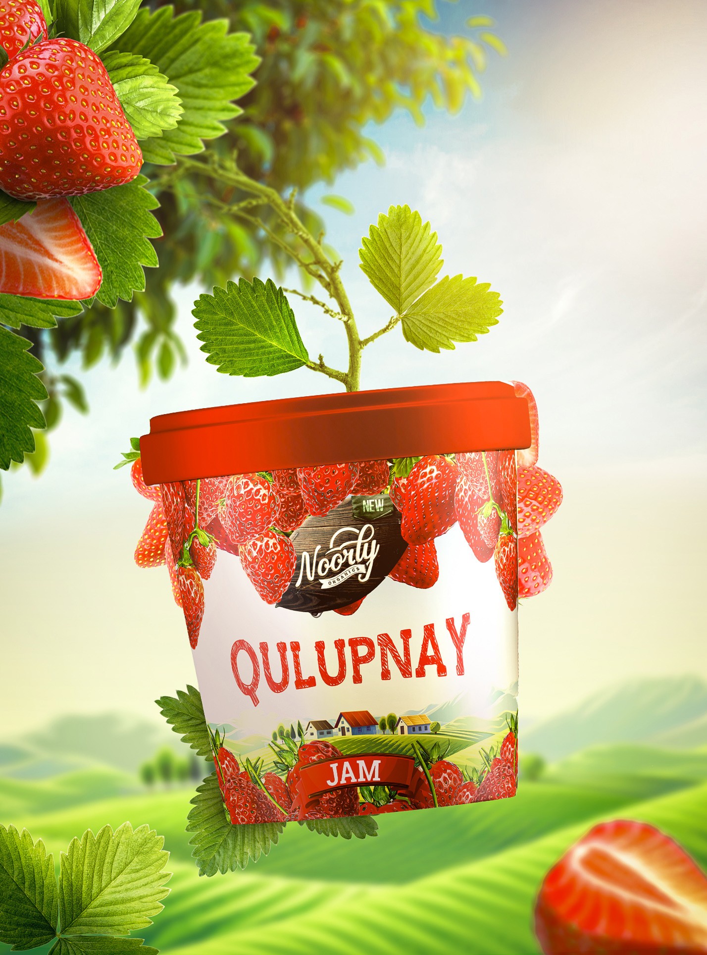
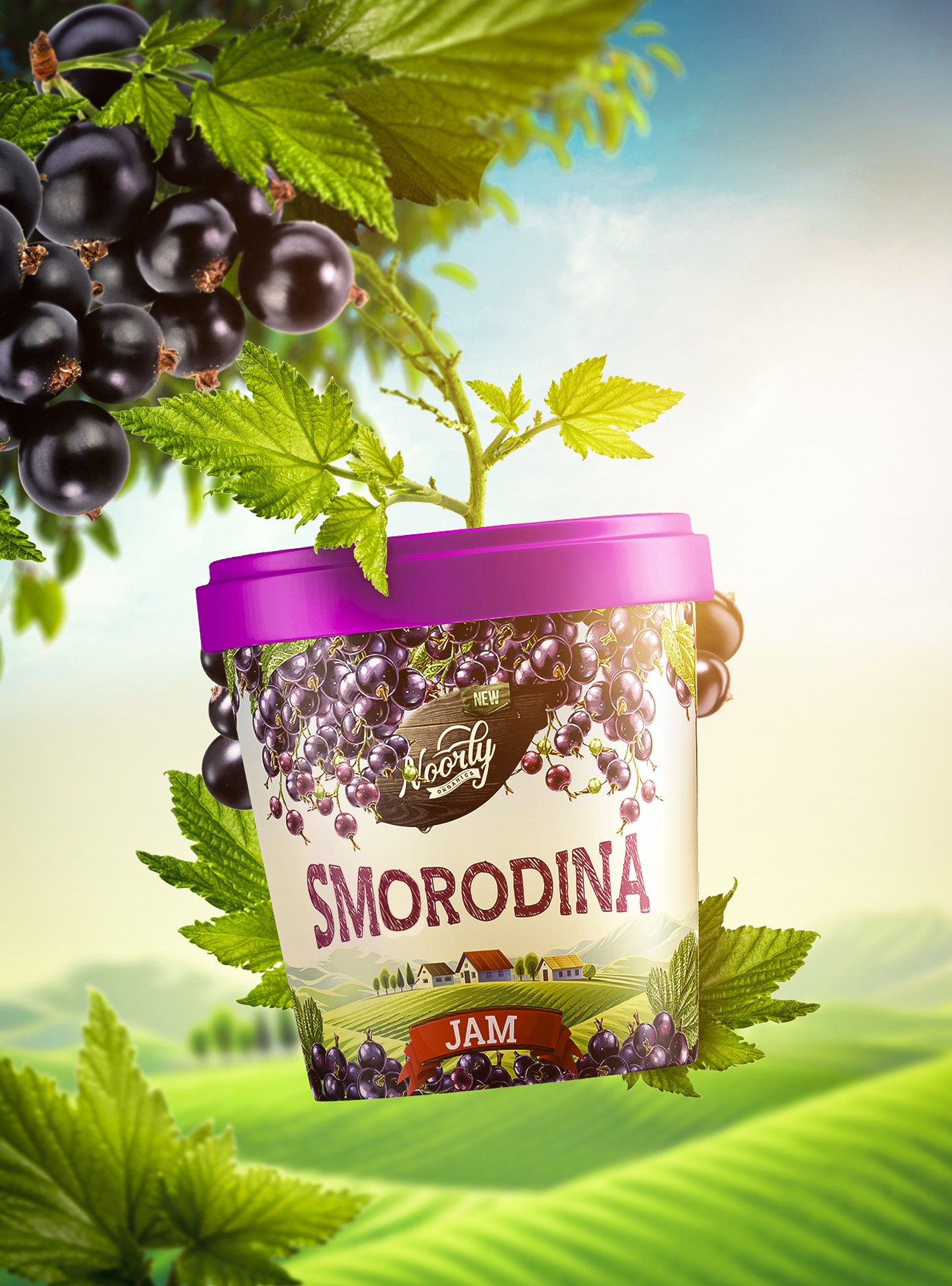
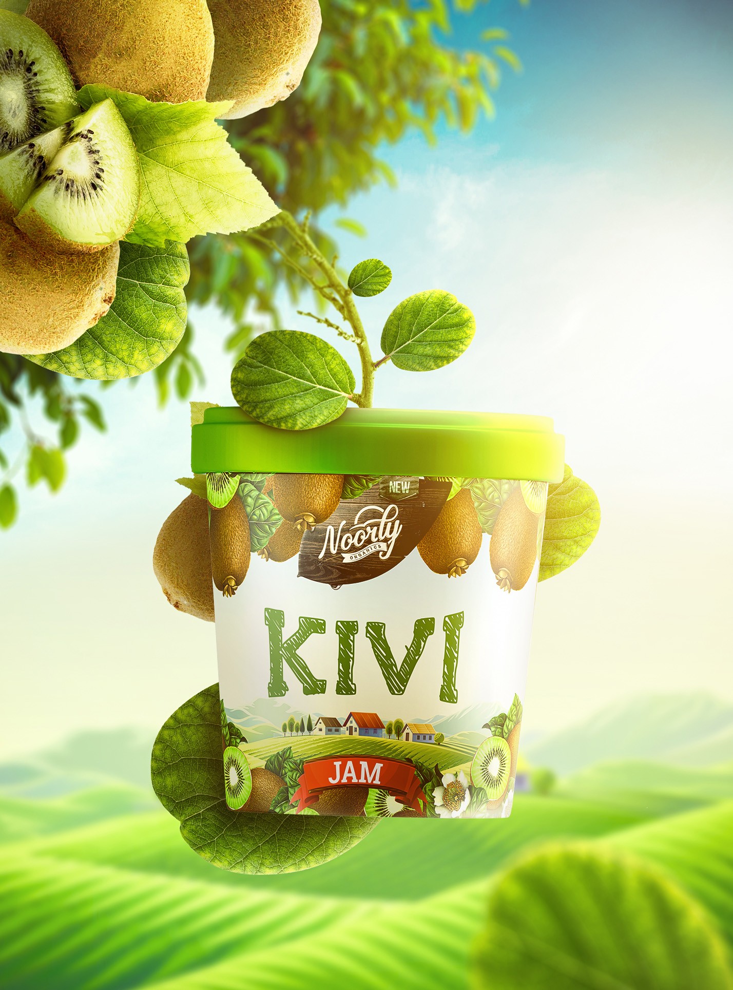
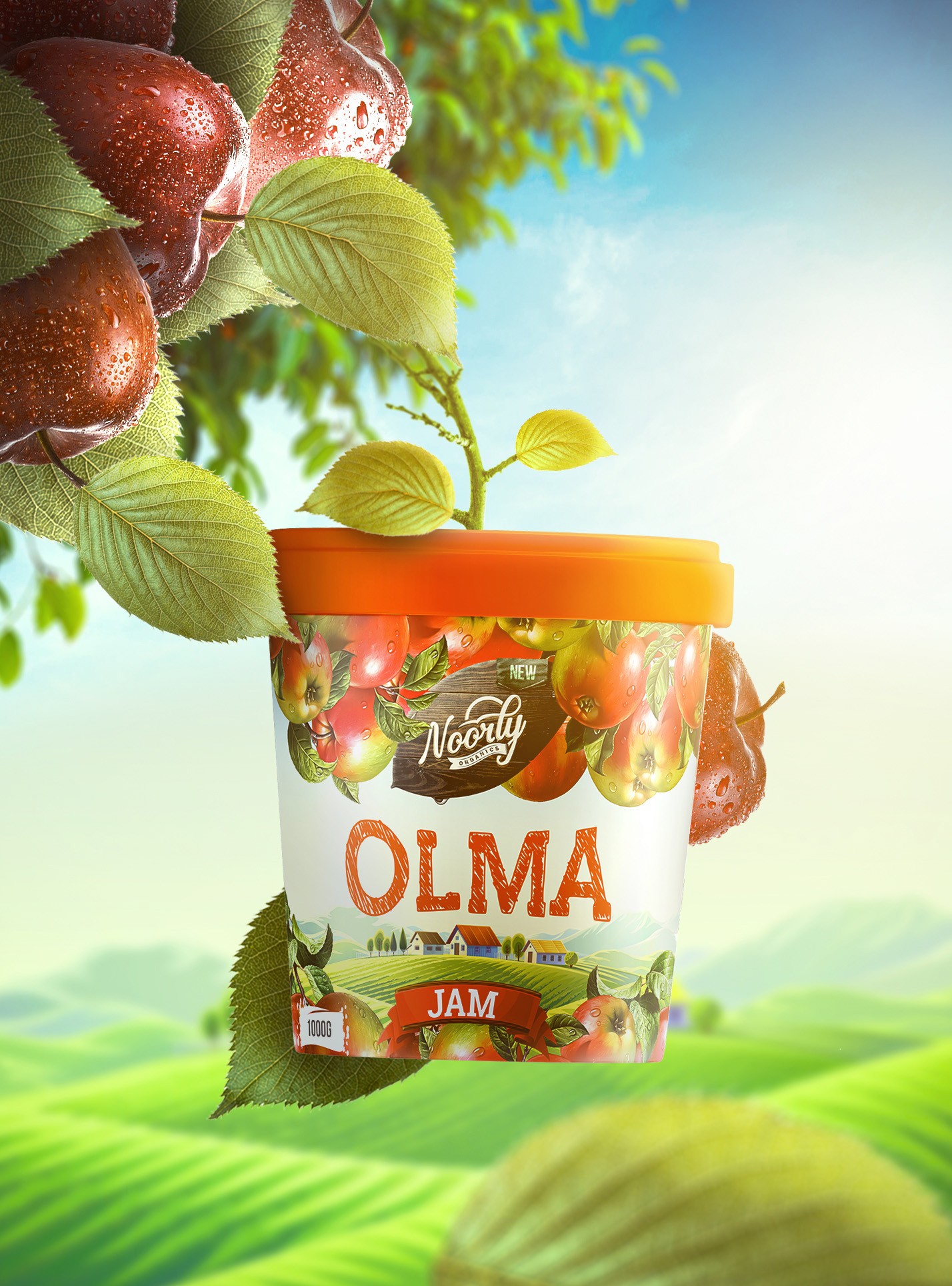
National emblem Uzbekistan is famous for its fruits. The delights of this land are made to taste so delicious that the juice bursts the tongue, enjoying the warmth of the sun. In order to preserve this taste regardless of the season, our entrepreneur has set up the production of fruit jams and jams. The Minim team was tasked with developing a name, logo and packaging design for a new business brand. First of all, they were looking for a name for the brand and settled on the word “Noorly”. It’s not just a random word that sounds jargon. It is based on the Uzbek word “nurli”, which means “full of light”. Also, this name is very convenient, meaningful and pleasant to the ear for domestic and foreign consumers. We defined the logo through the slogan “Light added”. At the next stage, we developed a logo for the brand. We decided to depict it in an unusual font pointing upwards. In this symbolic sense, we wanted to express the desire to spread the brand among people and reach higher heights. Also, based on the meaning of the brand name, we depicted a shining sun against the background of the word Noorly. This, in turn, helped make our logo stand out. In the packaging design, we tried to reflect the sunny nature of Uzbekistan, which is flooded with sunlight all year round. In order to emphasize the naturalness of the product, we used illustrations of fruits suitable for jams and the landscape of the valley. The result is a design that is understandable to consumers and colorful enough to please the eye. The design was recognized by the successful UK community World Brand Design and Packaging of the World, which brings together the most interesting and creative work from around the world, and became the most viewed and most voted design published per day.