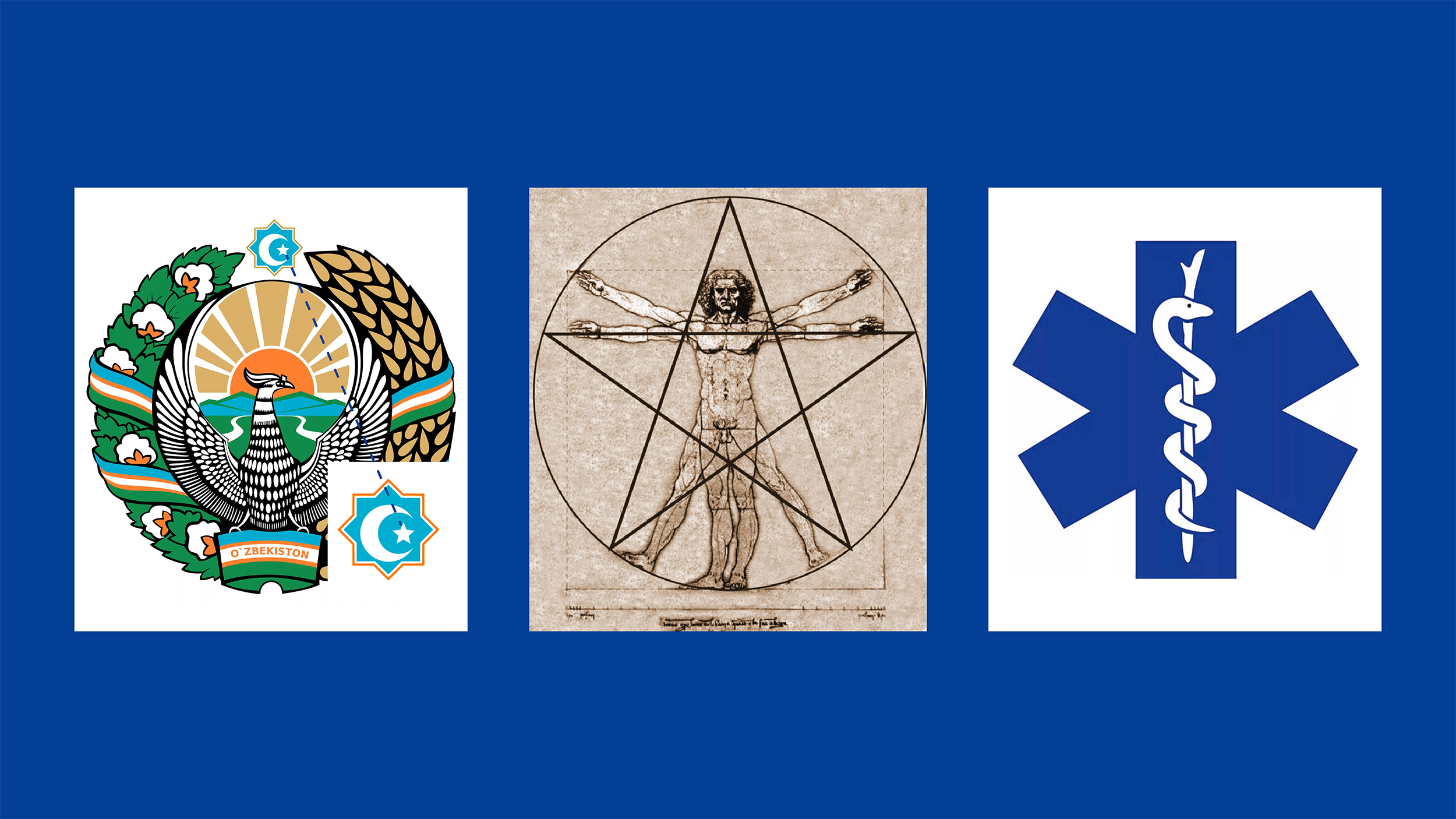
As always, when designing a logo, we started with research, research and analysis. We found out why the medical center is called Sirius.
Sirius is the brightest star we can see. Since ancient times, this star has been a symbol of goodness among many peoples. Sirius Medical Center serves as a symbol of salvation for people seeking healing. Therefore, our first proposal for a logo was an image of the shape of a star.
The sign of the zodiac is not alien to us: – our flag and coat of arms reflect the stars, which are the symbols of our state; – In the work of Leonardo da Vinci, depicting the ideal proportions of a person, there is a reference to the shape of a star. The idea of a healthy person is just right for a medical center; – The five points of the star represent the five main goals of the medical center: 1. High qualification and experience 2. Modern equipment and technology 3. Universality of services 4. Individual approach 5. Innovative methods
To make the logo more than just a star, we again enriched it with a medical theme. This was inspired by the emergency medical symbol, known as the “Star of Life” in the US and many European countries.
The result is a logo that looks simple at first glance, but embodies many ideas. We do not regret likes!