The products are produced mainly for the city of Tashkent and the territory of Uzbekistan as a whole. Launching a new product on the market contributes to the creation of a competitive environment.
As always, we started our work with market research and marketing analysis. As a result of the research we provided the client with a unified design concept.
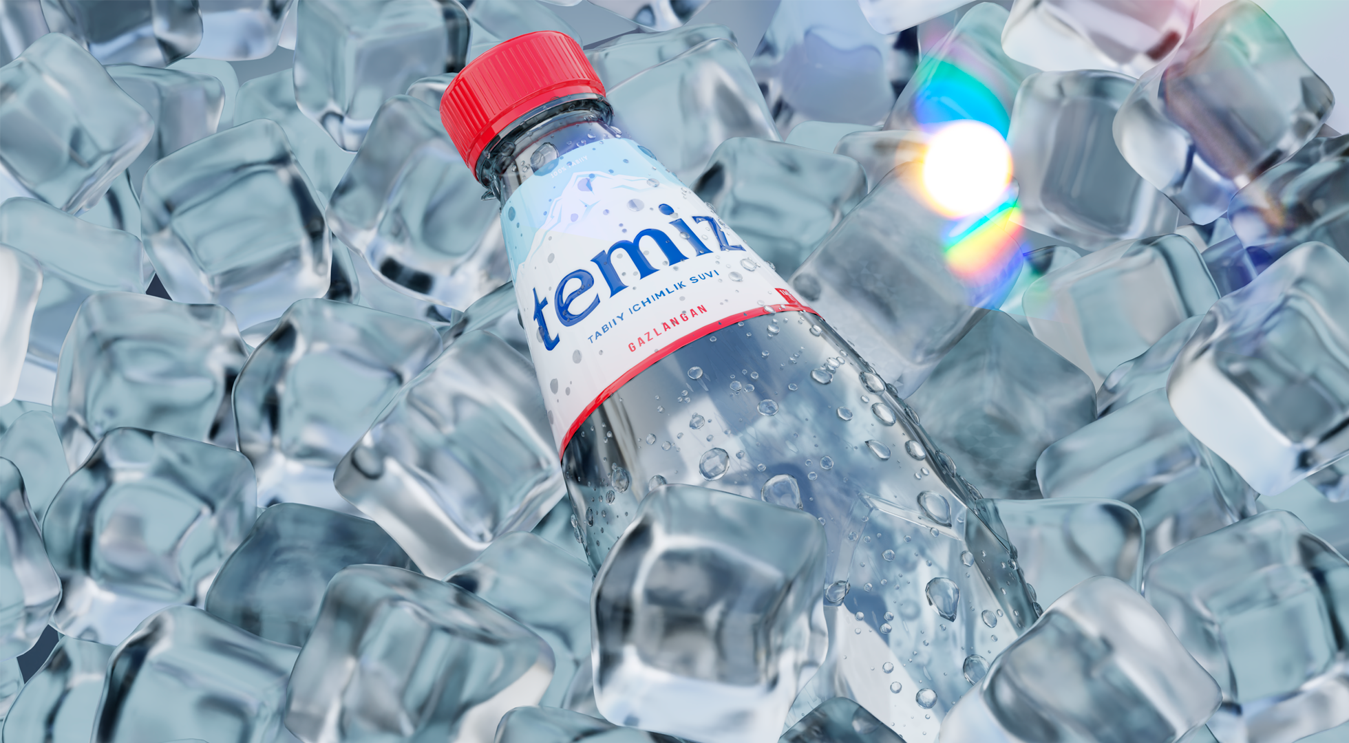
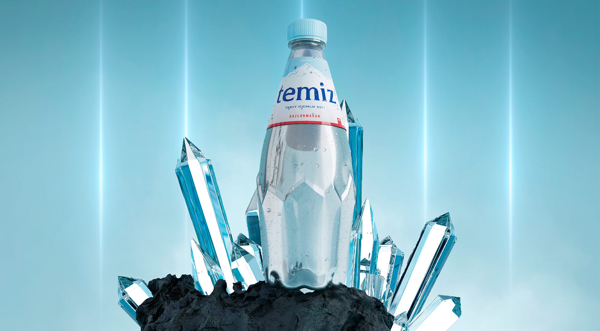
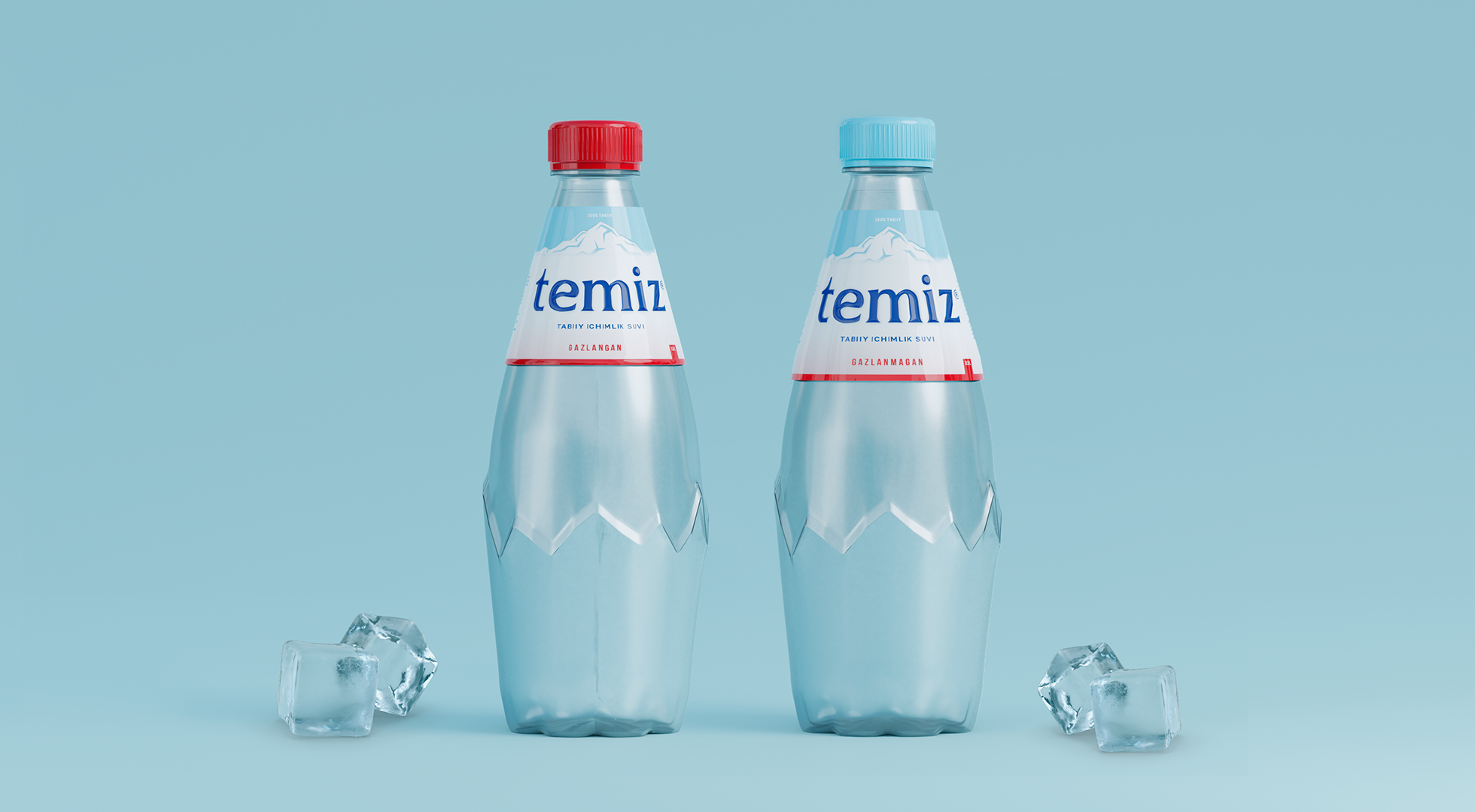
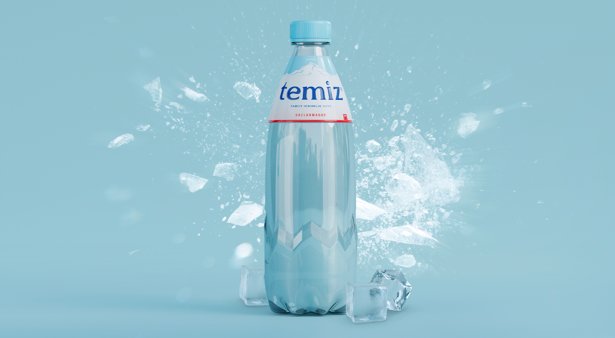
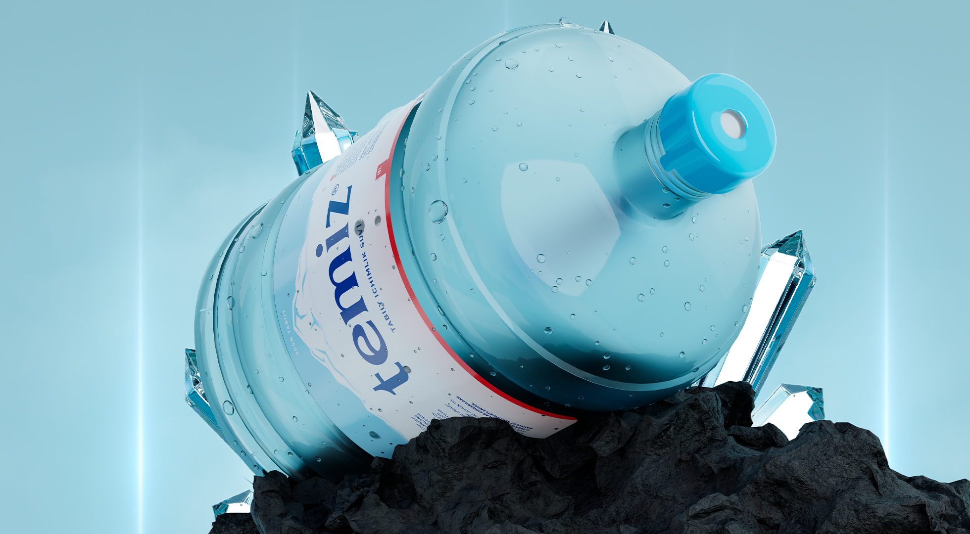
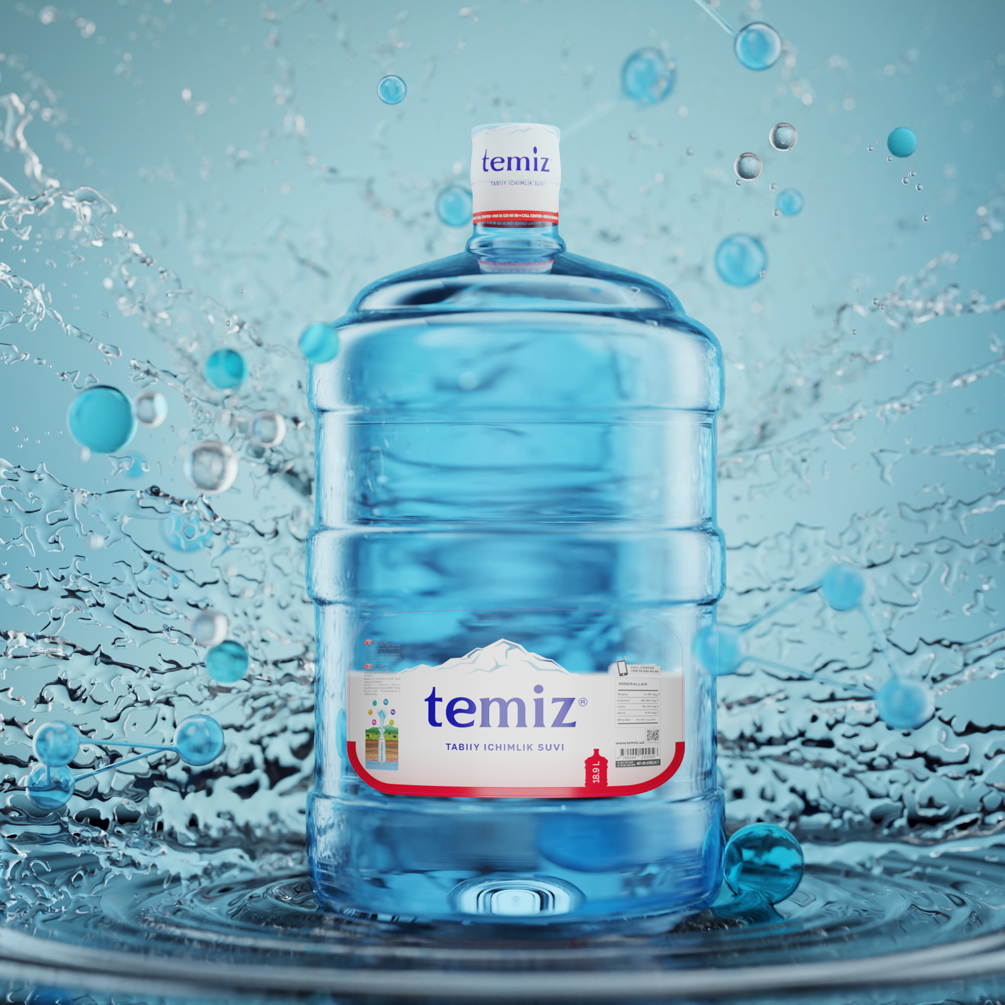
It was important that both the name and packaging of the product symbolized purity and freshness. That is why we proposed the name “Temiz” for the new water brand. This word in Turkish means “purity”, “freshness”. This name perfectly conveys the essence of the product.
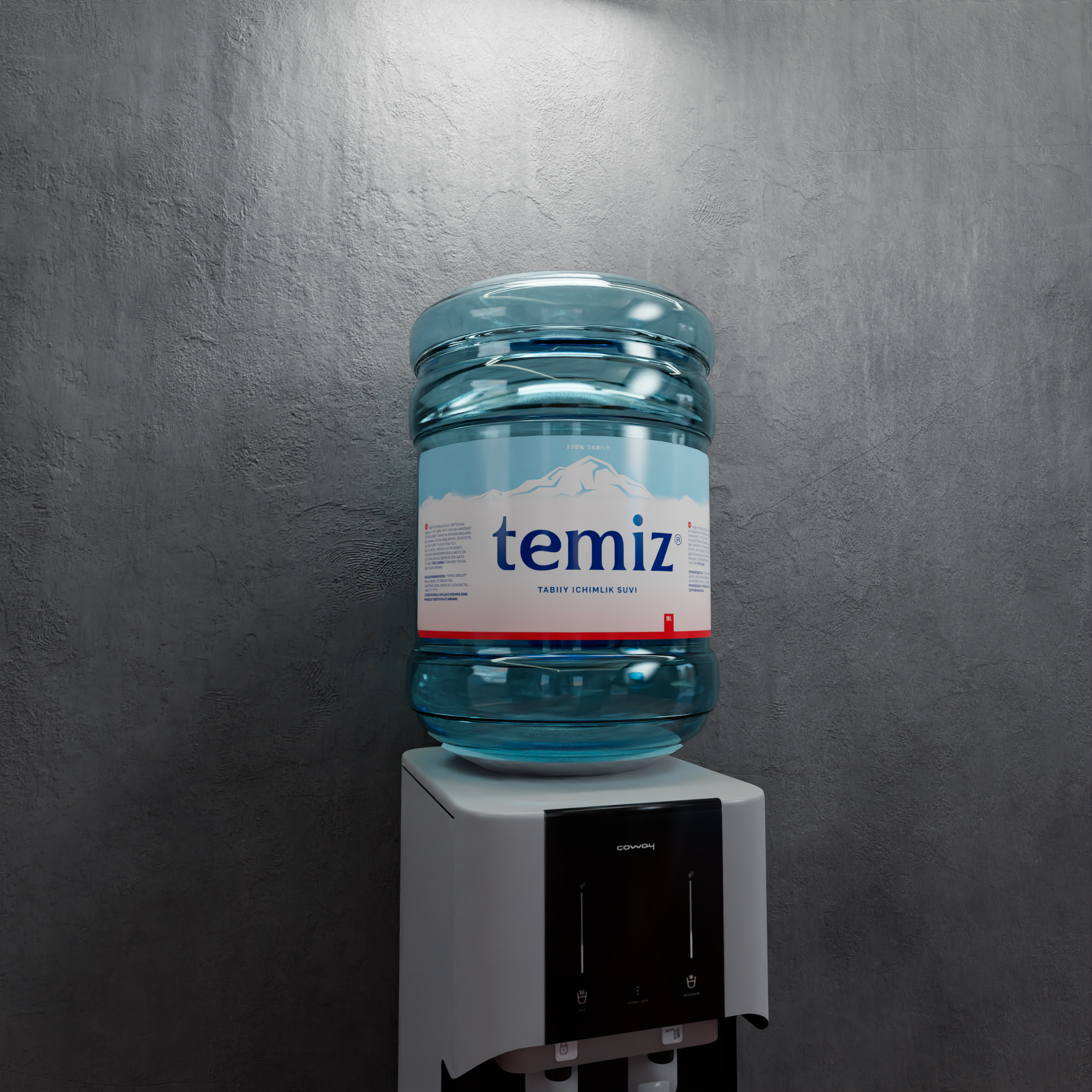
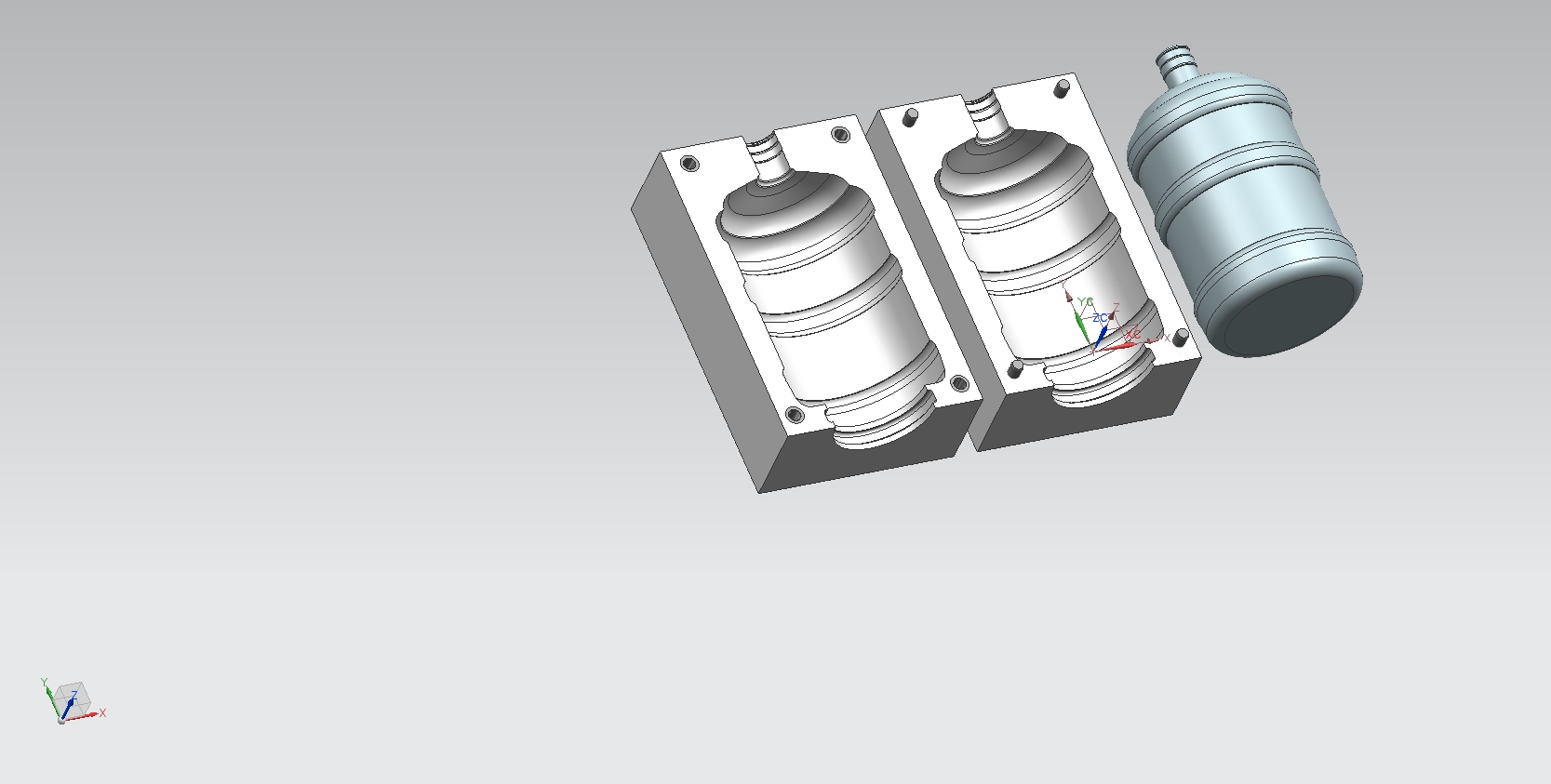
It was the turn for the container model – we developed an original 20-liter container model. The world experience was taken as a basis.
A business without a logo cannot develop, so we paid special attention to the logo. The logo is made in text style and depicts the name “temiz”.
We can see the connection of water theme with the logo by the example of the letter “e”. Inside this letter there is a silhouette of a drop, which symbolizes water, purity and freshness.
It is known that human health depends on the quality of drinking water. The sources of clean fresh drinking water are mainly mountainous areas. We showed this in the overall identity as a pattern element as well.
The result was an aesthetically appealing packaging and its design, which used eye-pleasing elements and colors.