Tetsu: Premium Drinking Water Branding and Design
Tetsu branding was developed — premium water from a 1968 source. The naming reflects the power of nature: "tetiklantiruvchi suv," which means "water that invigorates." Premium design features: a crown logo, color inversion for carbonated water, and "under-ice" packaging.
1. Task
A client came to us with the idea of launching a new drinking water brand. But this wasn’t just water — it was a product with a story. The source has existed since 1968 and is located 280 meters underground in an ecologically pristine area, surrounded by lush green hills.
Our task was to develop a name, create a logo, and build a compelling packaging design concept — all in line with the client's requirements and the product’s unique features.

2. Research
Research is a cornerstone of our approach. Understanding competitors, target audiences, and the market landscape allows us to uncover insights that drive strong creative decisions.
Before diving into design, we studied both local and international water brands. Light blue and white are commonly used in this category — naturally evoking freshness and purity. However, we chose to focus less on color and more on form, symbolism, and presentation.


3. Solution
• Naming
We aimed for a name with semantic depth, a clear sound, and high memorability. The inspiration came from the Uzbek phrase “tetiklantiruvchi suv” — meaning “invigorating water.” Using a mosaic approach, we shortened and stylized the phrase into a distinctive, resonant name: TETSU.
Interestingly, Tetsu also means "iron" in Japanese — a mineral naturally found in spring water. The name thus reflects both the product’s physical properties and its symbolic link to strength and natural energy.
• Logo
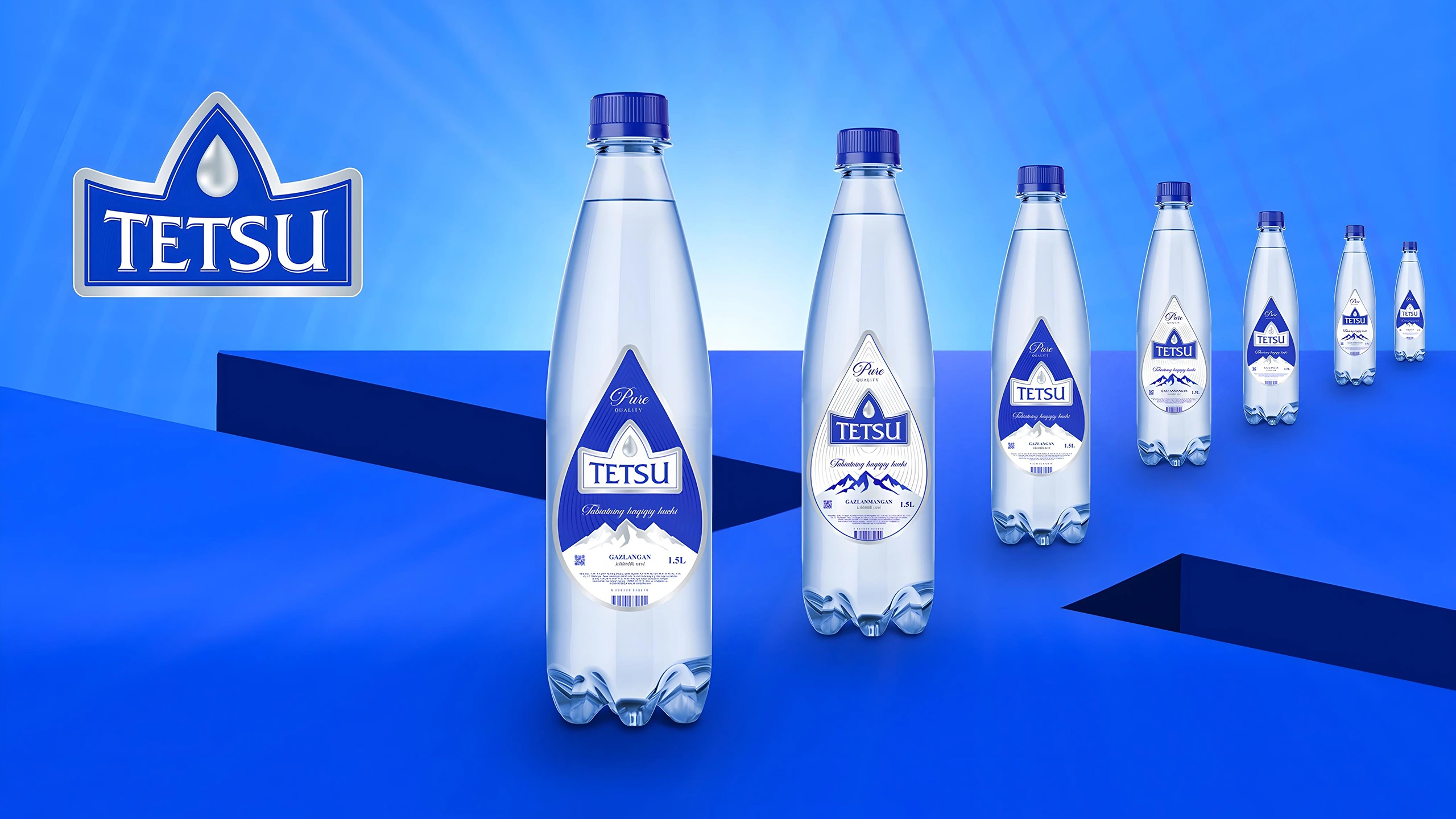
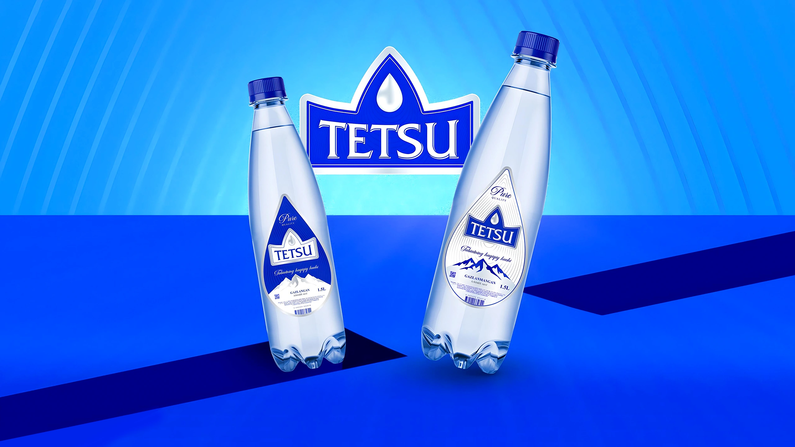
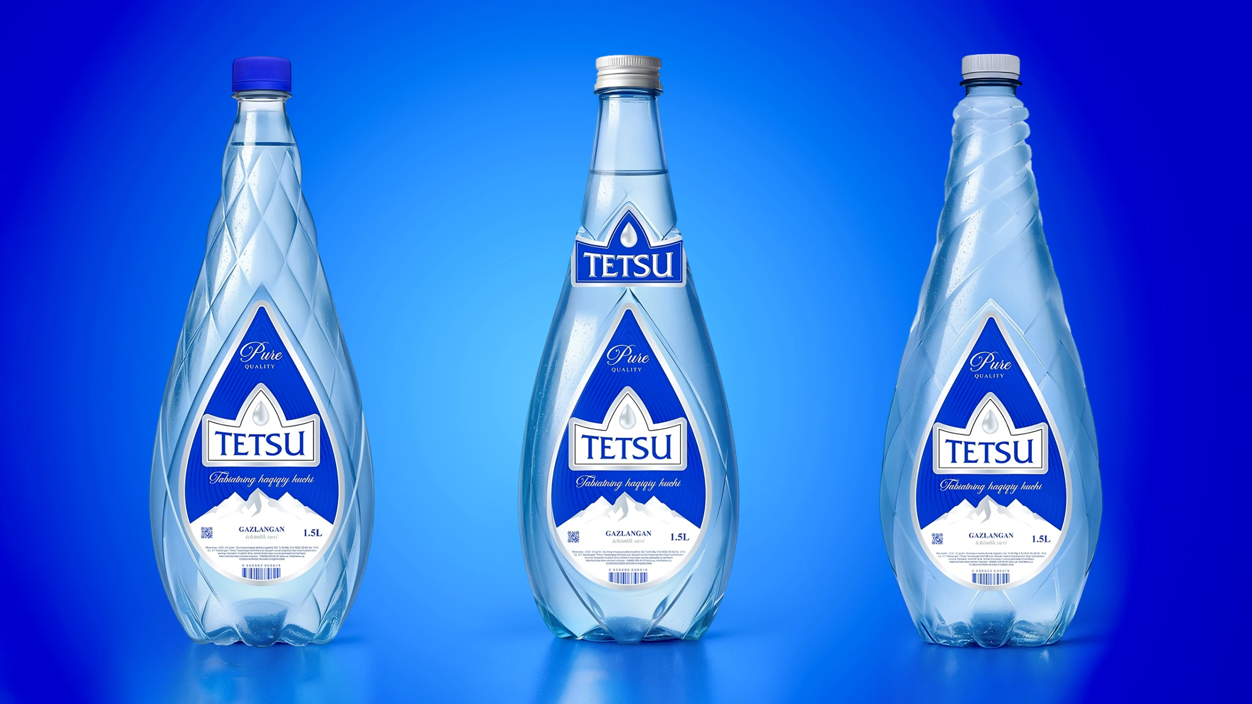
The logo features a water droplet nested within a shape that resembles both a mountain and a crown — symbolizing purity, elevation, and prestige. Beneath it, the brand name is set in a refined, modern typeface. The minimalist style, strict symmetry, and clean color palette work together to convey a premium, confident image.

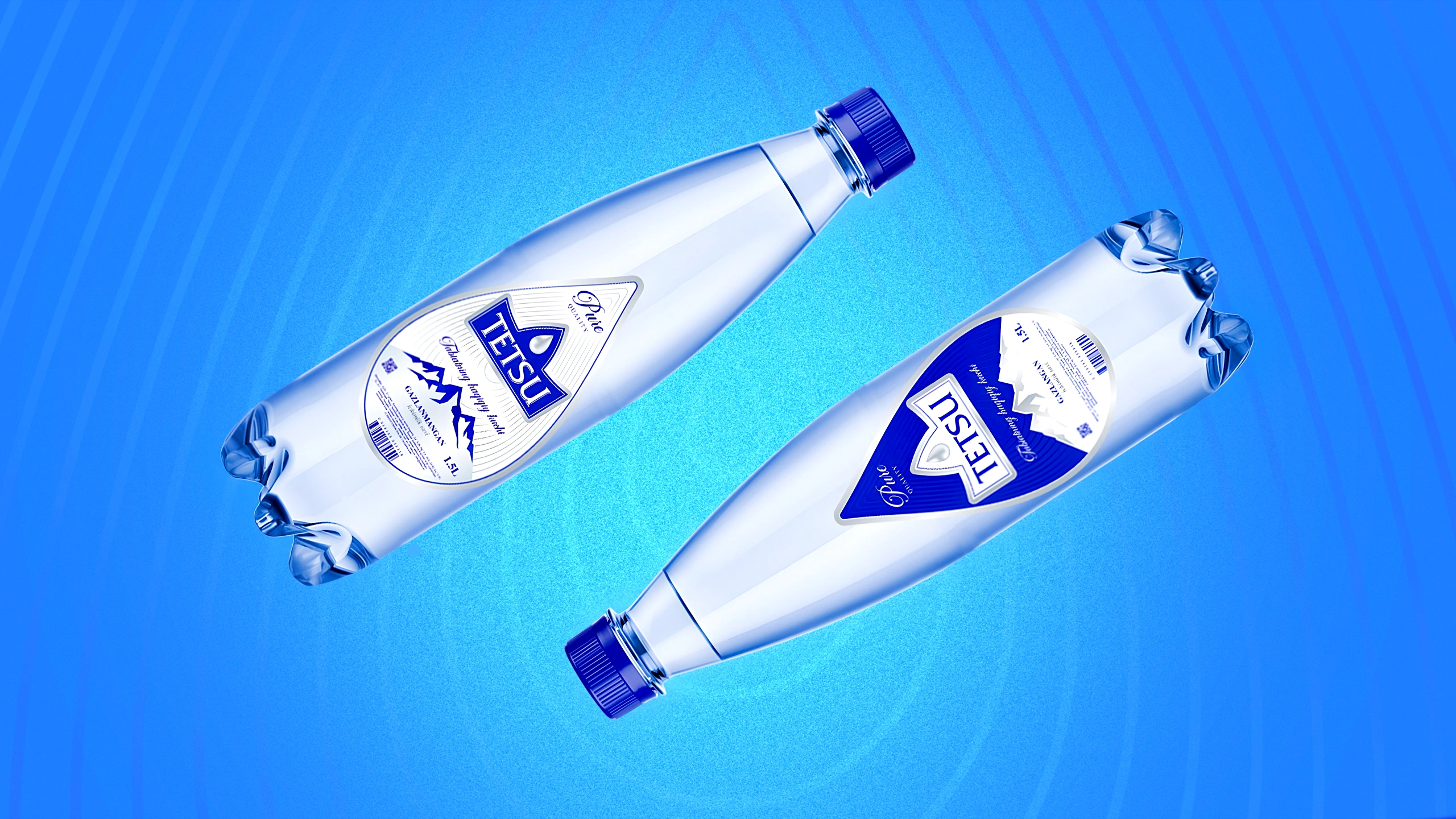
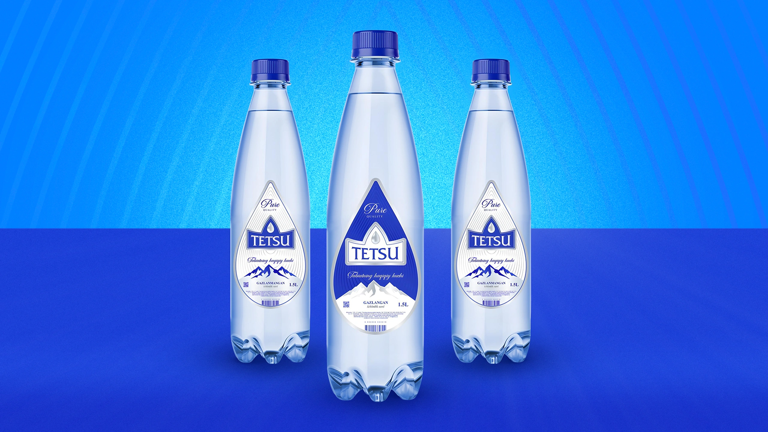
4. Packaging Design
We developed packaging across multiple bottle sizes, differentiating still and sparkling water through an inverted color scheme. For the premium line, we introduced a concept that visually mimics ice and minerals — creating a sleek, crystalline aesthetic. The label itself takes the form of a droplet, reinforcing brand identity and completing the overall concept. All illustrations and textual elements were carefully crafted to align with the brand story.
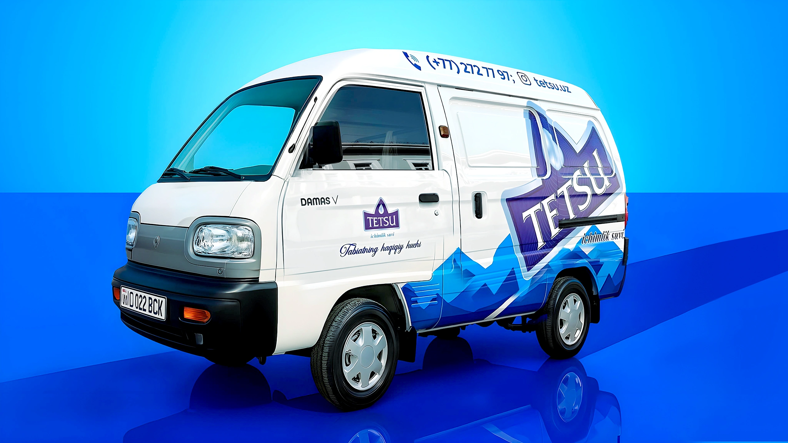
Additionally, at the client’s request, we produced mockups for a promotional flyer, a branded delivery vehicle, and a 19-liter bottle for large-scale use.
Result
This project went far beyond aesthetics — we built a complete, meaningful brand. TETSU now stands with its own voice, visual language, and story.
We believe this brand is poised to take its rightful place in the market and, more importantly, to resonate deeply with consumers seeking authenticity, strength, and purity.