ALMOS – Branding and Packaging Design for Confectionery Products in Tajikistan
- Client: Almos (Tajikistan)
- Industry: Confectionery
- Project: Full rebranding, logo, packaging design, design system
- Timeline: August 11 — November 11 (3 months of intensive work)
1. The Problem
- In business, there are situations where a company operates for years, shipping tons of product, yet no one in the market knows the actual manufacturer. A major confectionery factory in Tajikistan — Almos (similar to our "Crafers" or "N’medov") — found itself in exactly this situation.
- Opened in 2017, the factory ran non-stop for 7 years. However, their position could be described by the phrase: "We do the work, but others skim the cream." Why?
- The issue was that the factory operated exclusively based on orders from distributors and large wholesalers. Almos produced the product, but the pricing policy, the brand's destiny, and the sales strategy were completely controlled by the distributors. The factory was not the master of its own product, but merely an order filler.
- By 2025, the company's management decided to take the reins. An ambitious goal was set: to increase Numeric Distribution in Tajikistan's retail outlets from the current ~17% to ~67% by 2026. To achieve this, they needed to control the entire chain — from production to the store shelf — manage pricing, and create a strong BRAND that would secure its place in the market and prove "too tough" for competitors to crack.
- This task was entrusted to the Minim team.

2. The Research
- This was not a standard project, so we mobilized the forces of 4 agency departments simultaneously:
- Marketing department: to analyze the market and competitors.
- Brand design department: to develop visual solutions.
- Creative department: to generate ideas and copywriting.
- Print department: to control how the packaging would look in real life, not just on a monitor.
- An experienced Project Manager coordinated the entire process like a conductor.
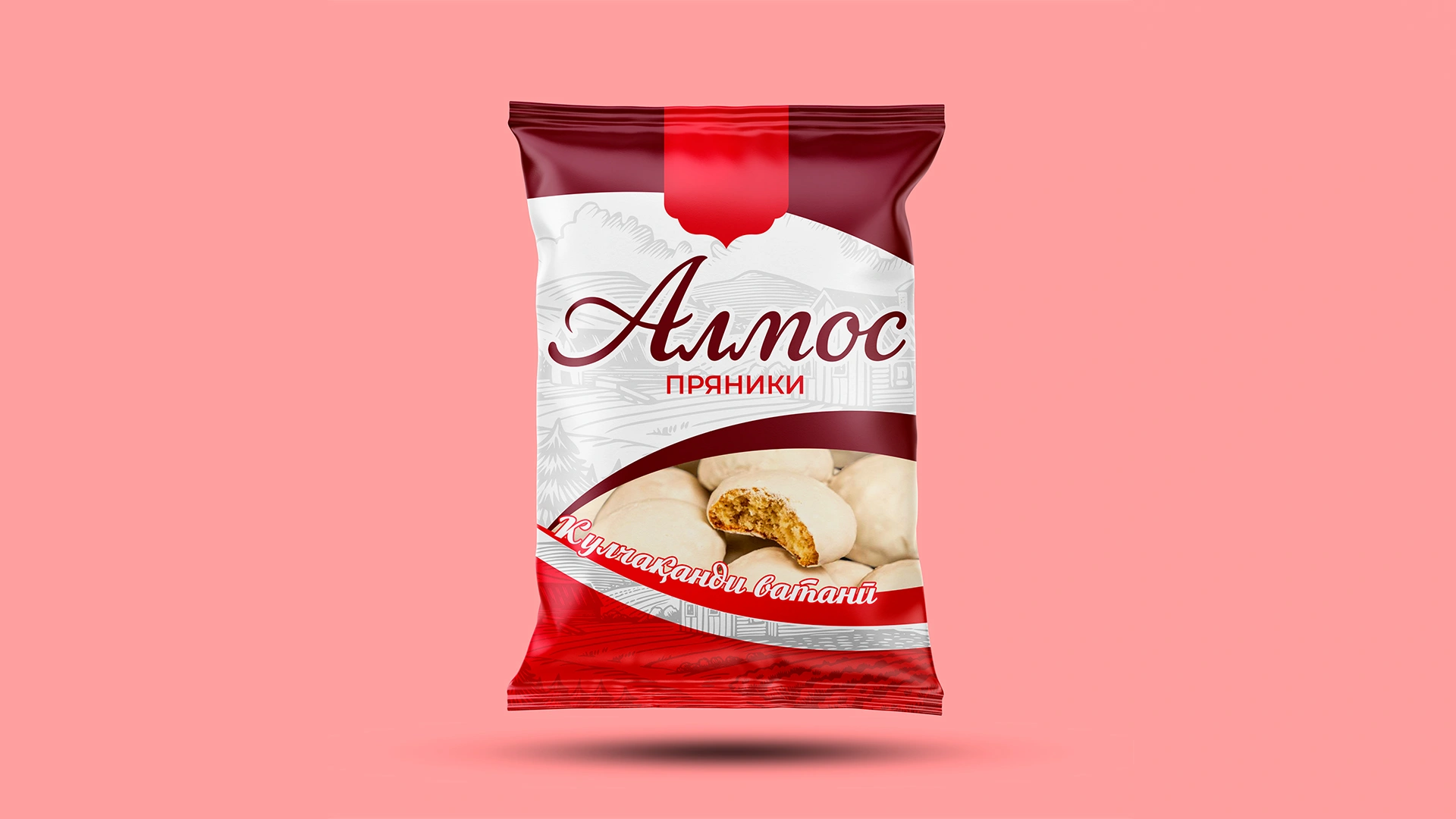
- We started with an audit of the current situation ("As Is"). The picture was bleak: the old packaging looked disjointed, as if the products were made at different factories. Gingerbread in 360g packs had one design, while the 180g packs had a completely different one.
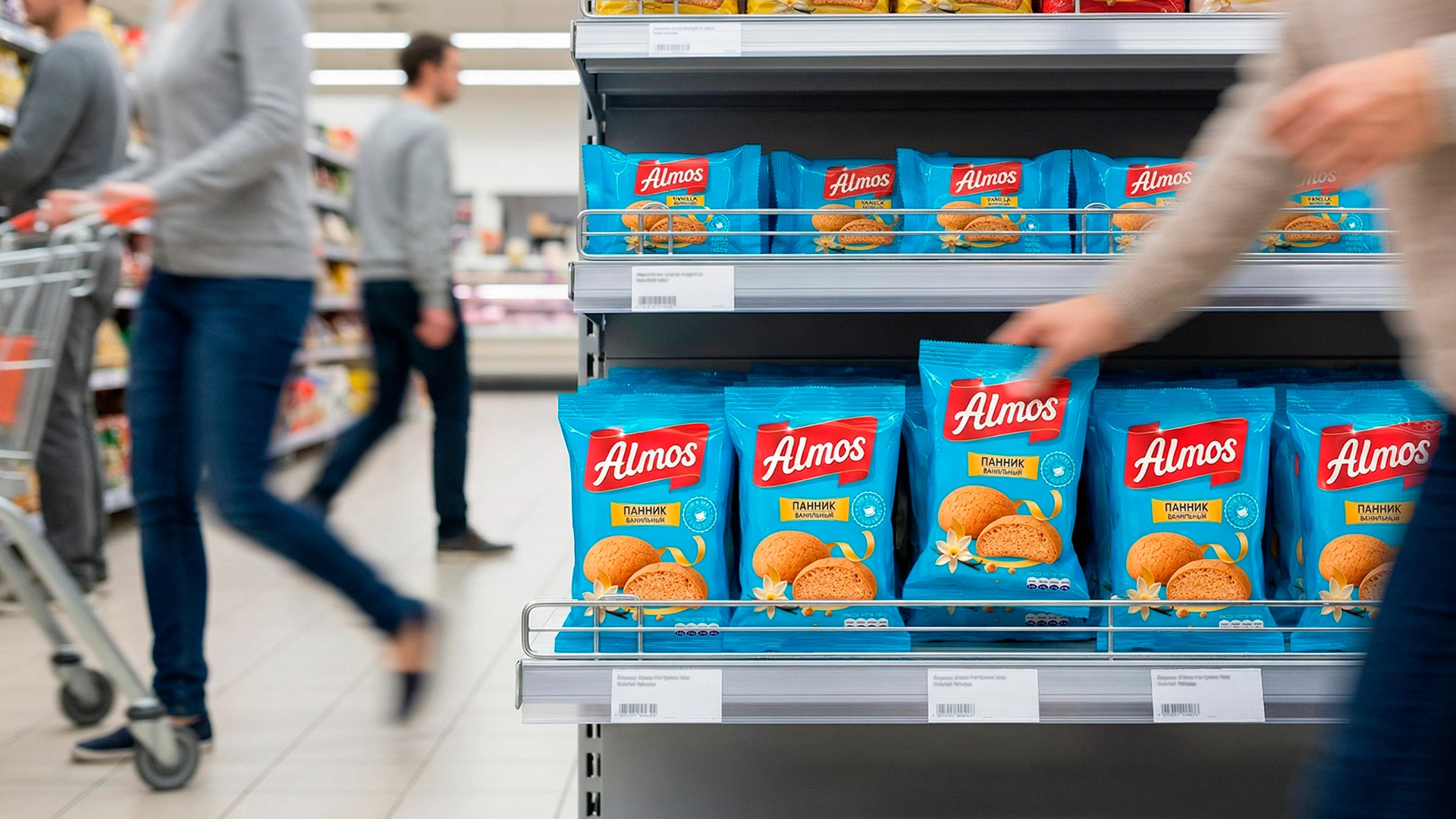
- Our mission was to create a Unified Visual System, ensuring the consumer could recognize the brand from 10 meters away on the shelf — just like they recognize major brands like "Яшкино".

3. The Solution: Attempt #1
- Transparency is our principle, both with the client and with ourselves. So, let’s be honest: we missed the mark the first time.
- The first logo and design concept prepared by our designers did not pass our internal Quality Control Department. Why? When cross-referencing with the Technical Brief, we discovered that 2 out of 8 key client requirements were not fully addressed.
- We didn’t show the "raw" work to the client. The team immediately held a brainstorming session. We analyzed the errors, redistributed tasks, and began developing an entirely new concept.
- This decision paid off: the result of the second attempt exceeded the client's expectations.


4. The Solution: Attempt #2
- During the analysis, we deeply studied consumer psychology and found a key insight:
- The main trigger when choosing gingerbread is softness. If the product in the package looks hard, dry, or stale, the buyer will never put it in their basket.
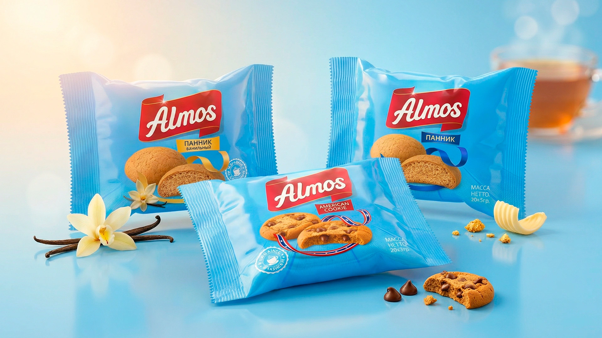
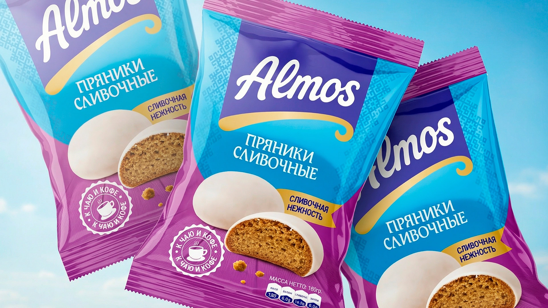
- The new design had to cure this specific "pain." Thus, our "Ribbon Style" was born:
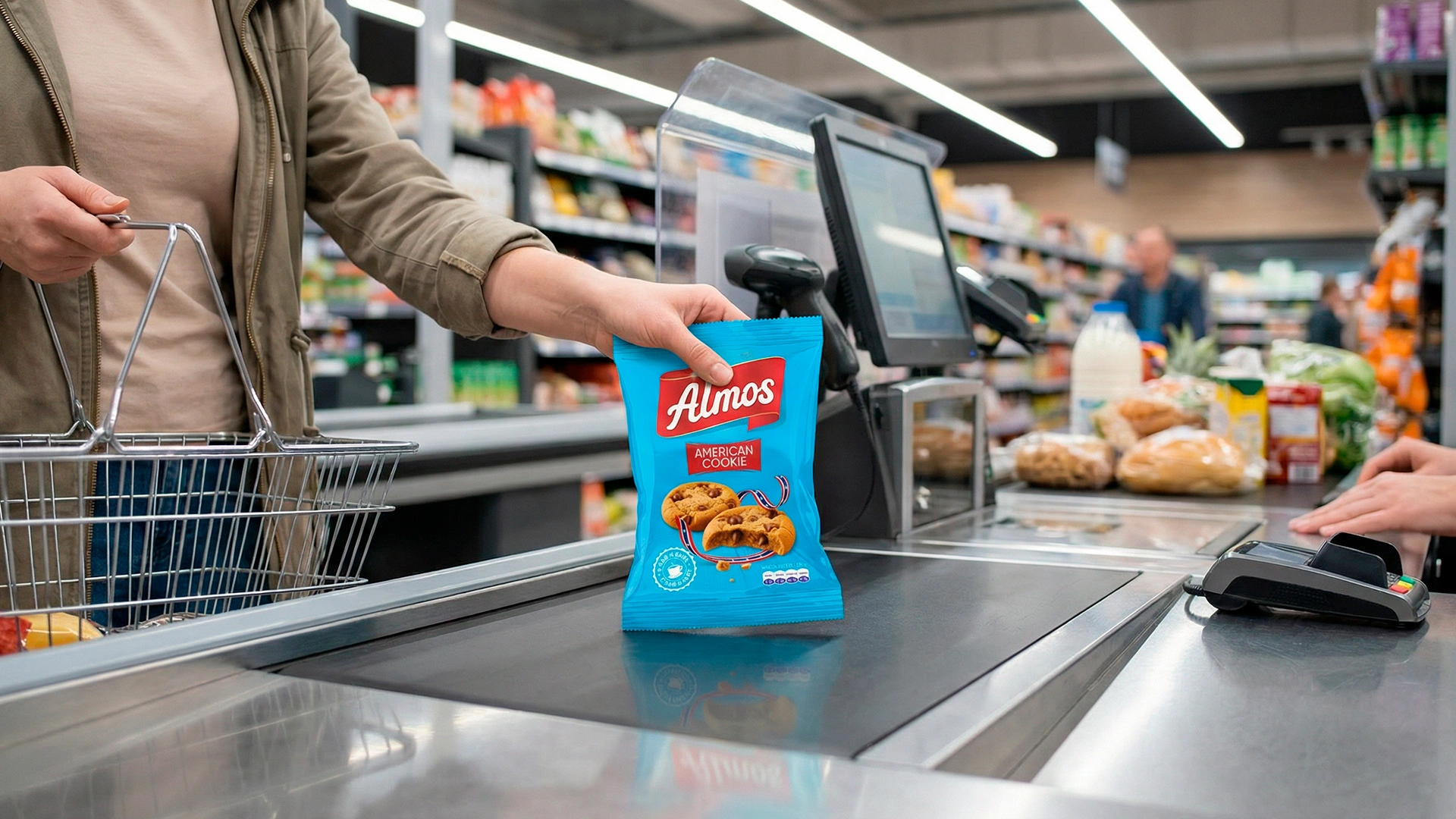
- Symbol of softness: the design utilizes gold, red, and colored ribbons. This isn't rigid geometry; it represents flow, delicacy, and the sensation that the product melts in your mouth.
- Color strategy: we didn't just need a pretty color; we needed a color that screams from the shelf: "Look at me!" We proposed several Pantone options to the client: Tiffany (Turquoise), Red, Green, and Purple. We settled on a unique Blue (Tiffany) shade. This color creates a bright visual "spot" on the shelf and pulls the buyer's gaze like a magnet, differentiating the product from competitors.
- Logo: we kept the name with its 17-year history — Almos — but modernized the font. The logo, placed on a red plate, serves as an attention anchor.
- Unified design system: products (SKUs) are differentiated not only by the photo but also by the color of the ribbons and the nameplates.


5. Additional Works
- Pretty design alone doesn't raise sales. We mapped out the product's path to market (Trade Marketing):
- USP (Unique Selling Proposition): developed a slogan focusing on family values.
- Visual communication: visualized how the product would look at the checkout zone, in show-boxes (display boxes), in corrugated shipping boxes, and even on branded delivery vehicles.
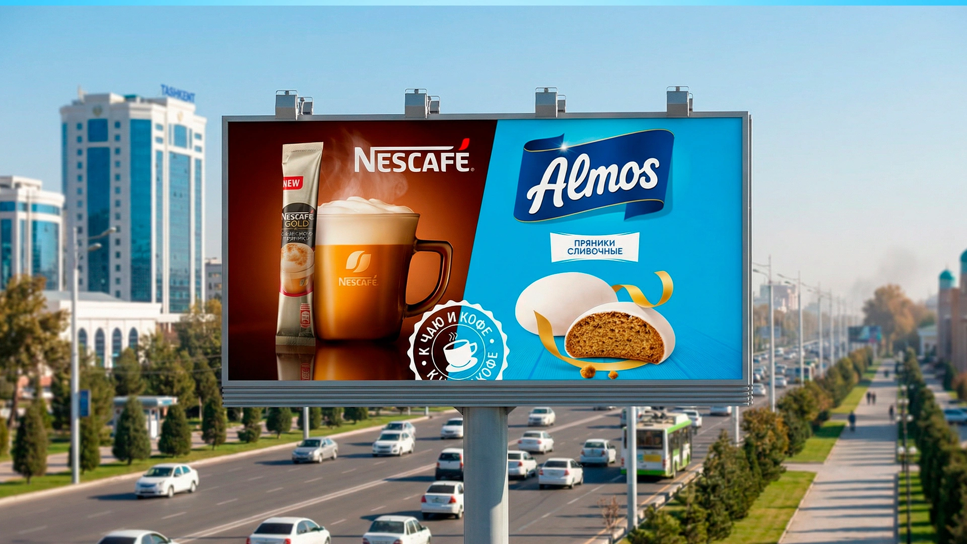
- Collaboration (Cross-marketing): to save the client's marketing budget, we proposed an excellent solution: partnering with "3-in-1" coffee brands. Coffee and gingerbread are the ideal pair. Such a collaboration helps Almos find its audience faster.
- Technical part: we brought all packaging text (ingredients, barcodes) into compliance with Tajik regulations and international standards, and implemented a QR code for website access.


The Result
- Initially, the client handed us only 3 products (SKUs) to work on: 180/360g gingerbread and Viennese waffles. However, the client liked the developed design system so much that the cooperation continued, and they ordered the adaptation for the entire remaining product line.
- The final result is not some abstract "know-how" or "wow-effect" for the sake of art. It is genuine "selling packaging" that performs its function on the shelf and tells the customer: "Buy me."
- P.S. Working with our partners from Tajikistan, we even managed to brush up on our Tajik. Salomat boshed! (Be healthy!) 😉