Dublik – Naming and Packaging Design for a Sandwich Cookie Brand in Uzbekistan
1. The Challenge
In the highly competitive FMCG market, launching a new product requires more than just a great recipe; it demands a meticulously crafted brand platform. Our client approached us with the task of developing the naming and packaging design for a new cream-filled sandwich cookie. Our goal was to differentiate the product—transforming it from just another sweet on the shelf into a unique visual attribute that naturally integrates into consumers' everyday lives.
2. Research & Insights
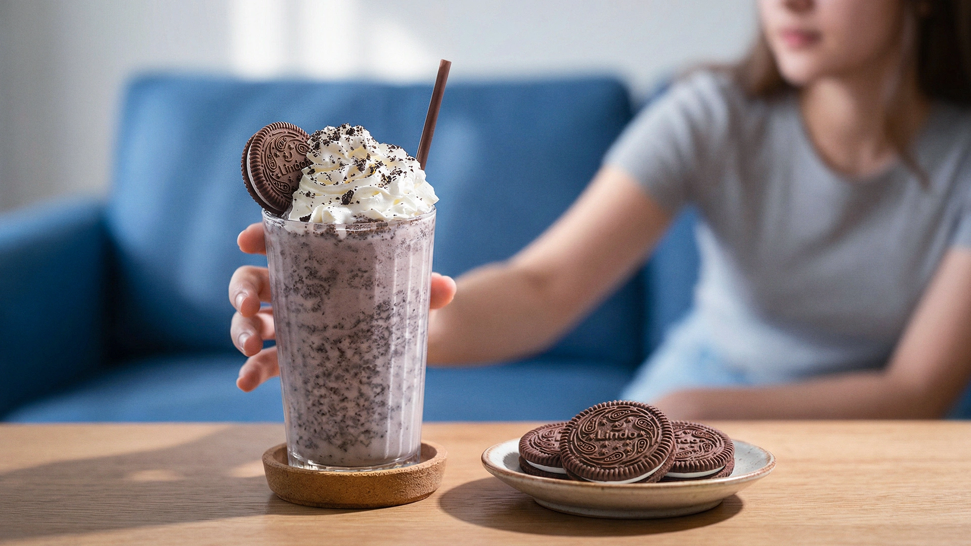
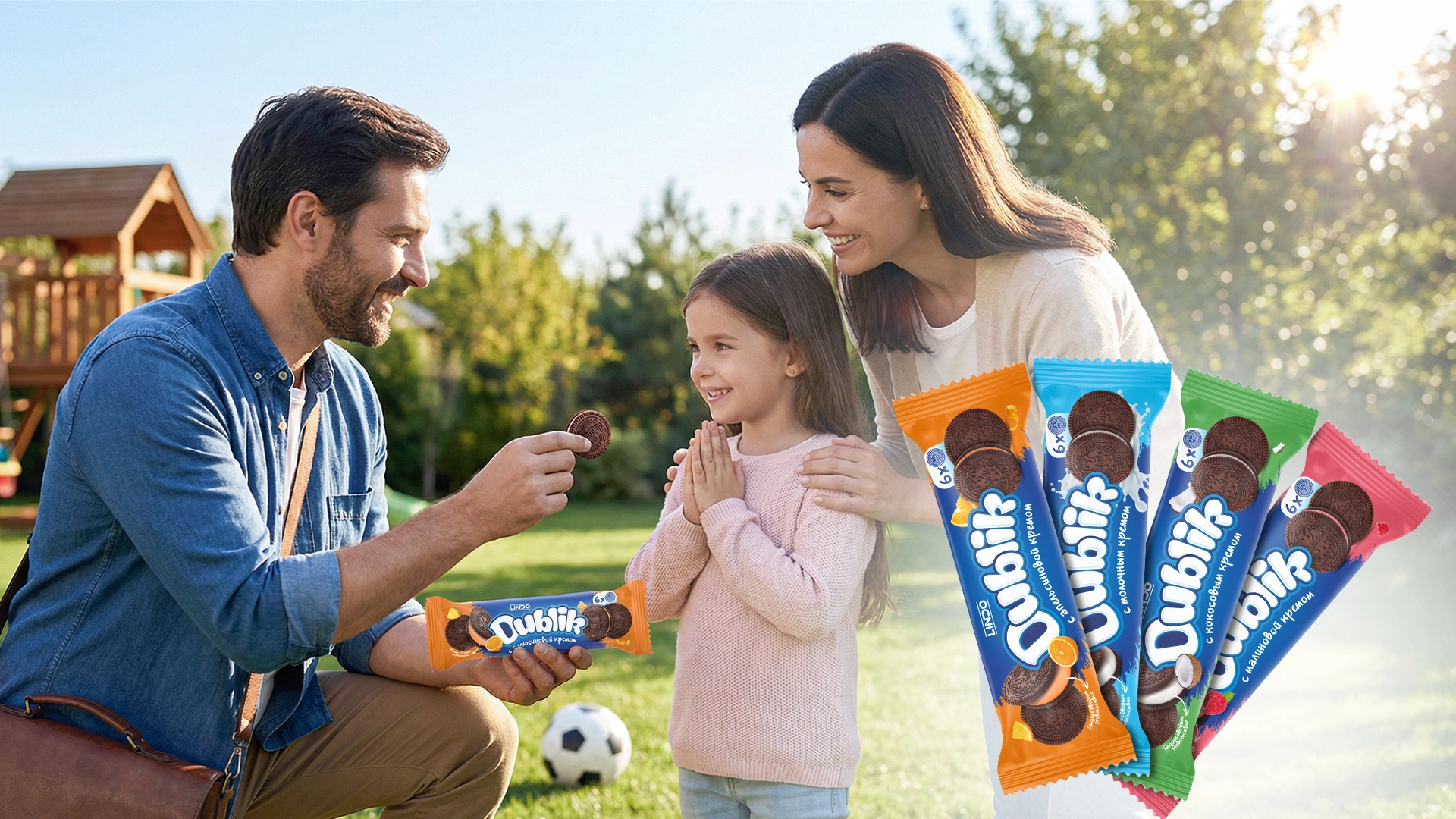
We kicked off the project by diving deep into the market, consumer behavior, and the target audience. Our analysis revealed that the core consumers would be children, teenagers, and predominantly girls. For today’s younger generation, visual aesthetics and self-expression are paramount. Girls love incorporating bright, “Instagrammable” packaging into their selfies or using it as aesthetic desk decor.
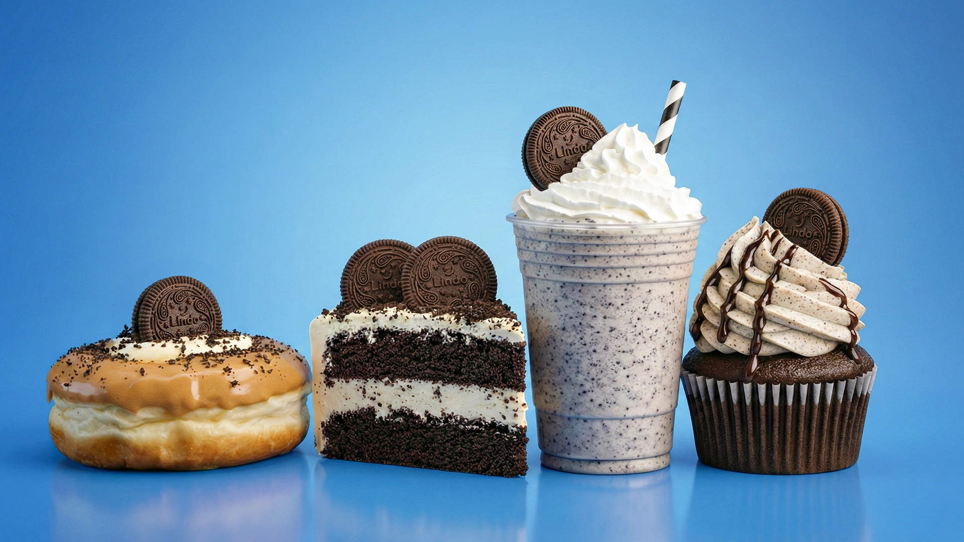
It became clear that beyond its functional properties, the product needed to achieve the status of a “fashion accessory” for social media. This, in turn, required a strong emotional trigger designed to stimulate organic User-Generated Content (UGC).
3. The Solution
We took a comprehensive approach to bring this vision to life:
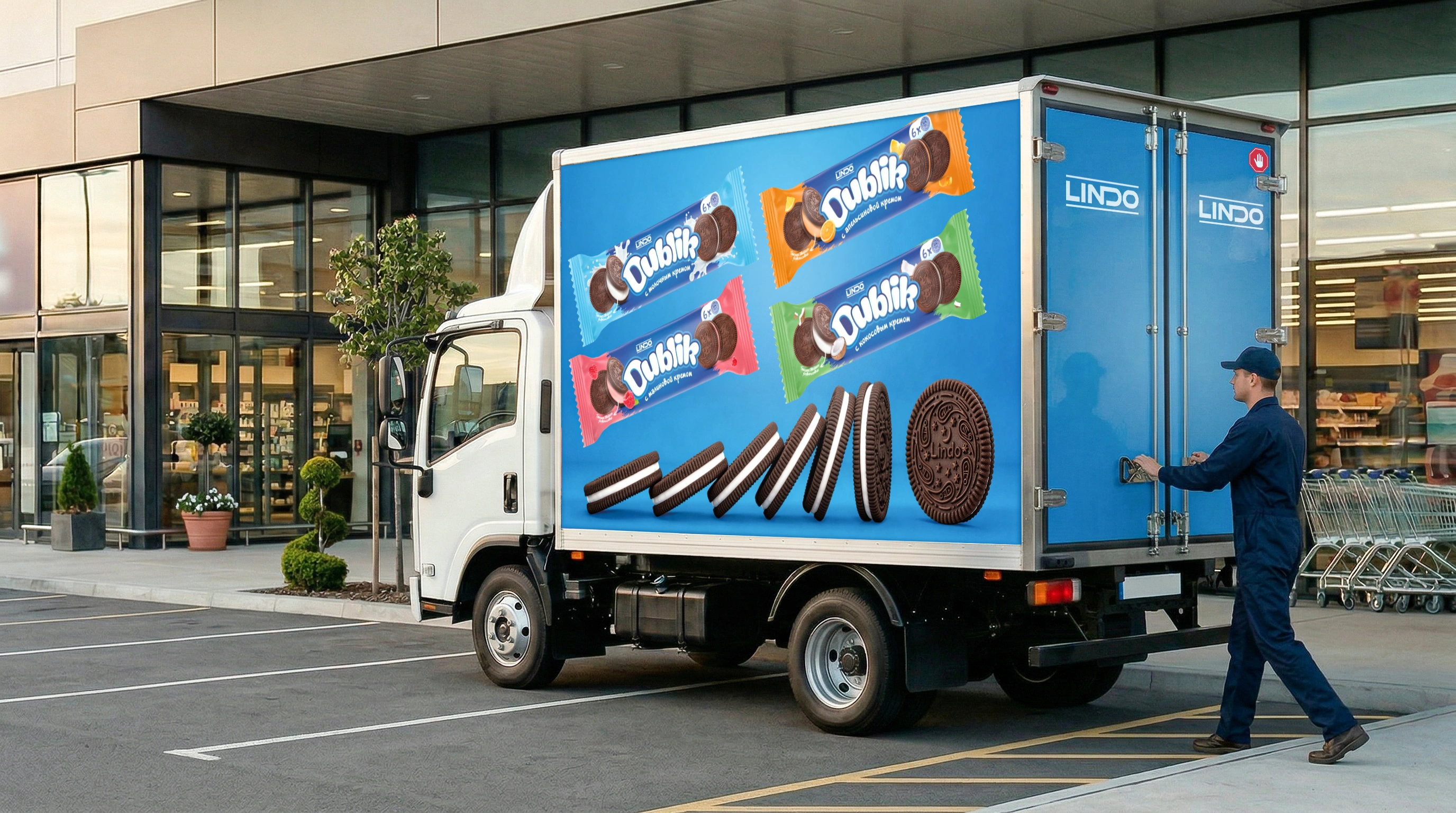
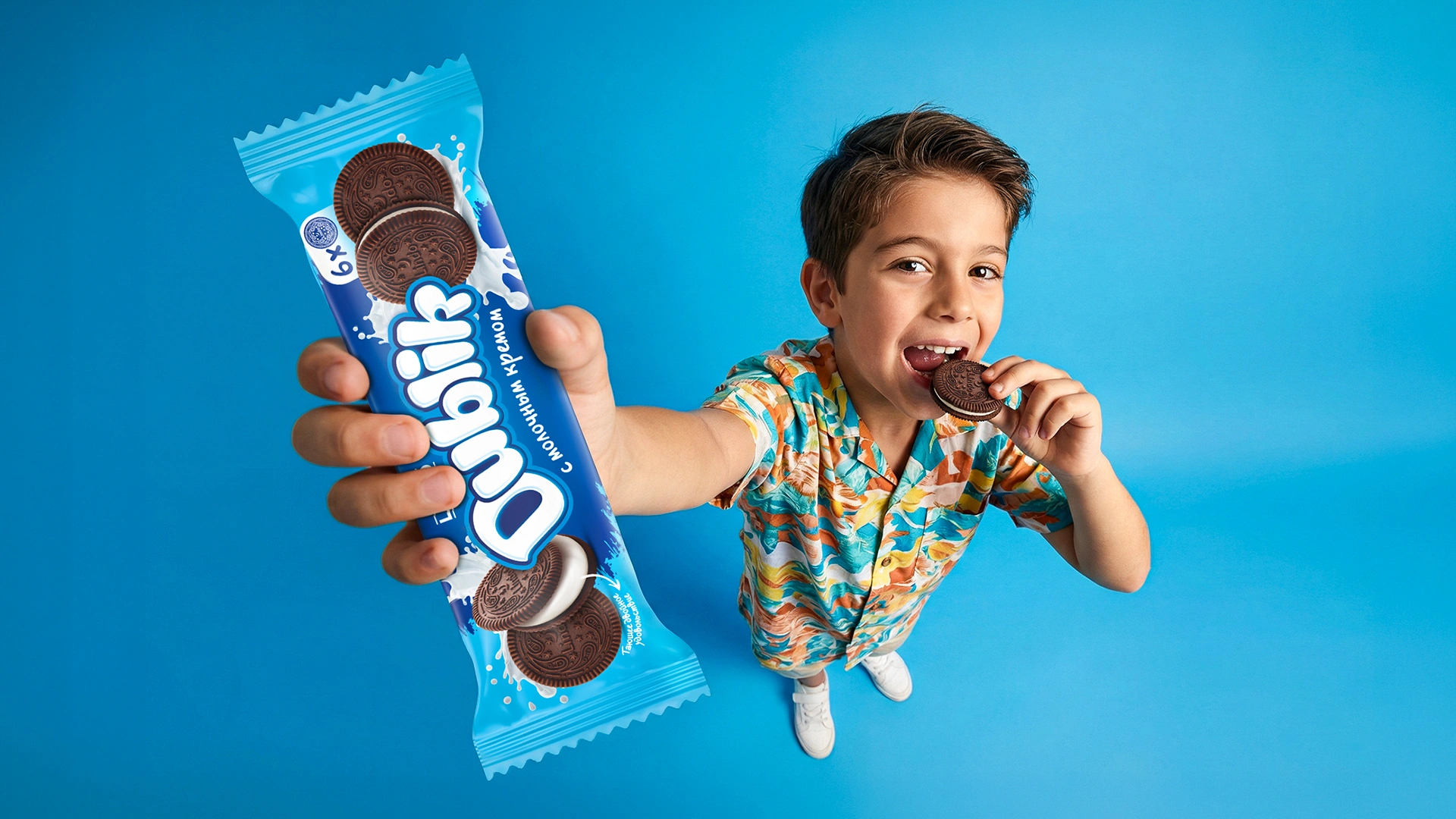
- Verbal Identity (Naming): We named the brand “Dublik.” The name is a clever fusion of two elements: “double” (referencing the double-layer cookie concept) and the affectionate Russian diminutive suffix “-ik.” The name sounds warm, is effortlessly pronounceable, and instantly establishes a friendly Tone of Voice.
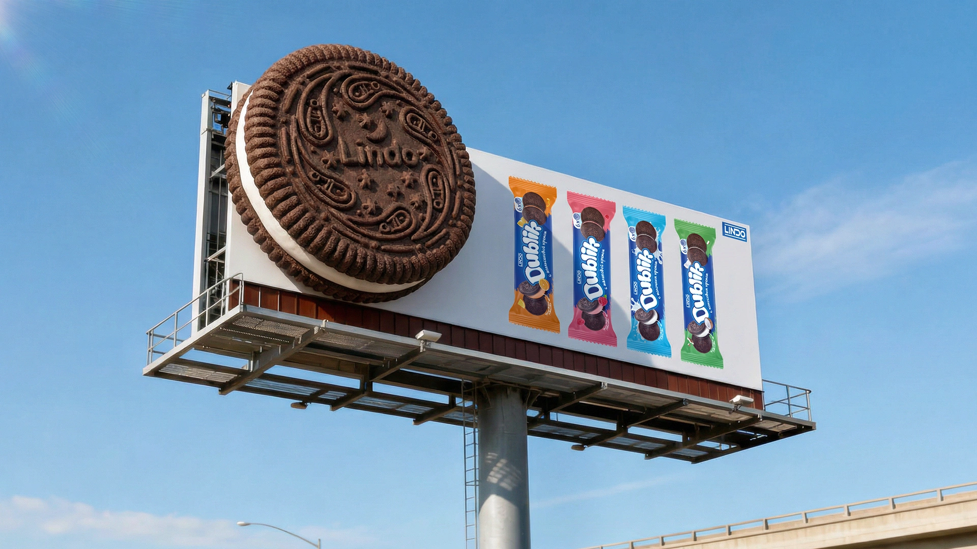
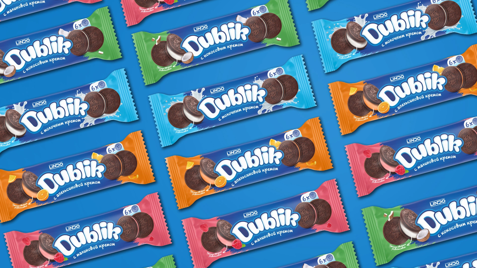
- Visual Identity (Packaging): We designed a packaging concept that is dynamic and visually loud. A distinct color palette and visual code were developed for four distinct flavors: milk cream, coconut, orange, and raspberry.
- Product Adaptation: Accommodating both 4-piece and 6-piece formats, we fully designed a total of 8 SKUs for the brand lineup.
- Trade Marketing: To ensure the product pops on the shelves and drives impulse purchases, we developed designs for showboxes, shelf talkers, customized price tags, and other tailored B2B and B2C materials.
The Result
The design phase has been successfully completed, and the brand is currently gearing up for its official market launch. The visual concept and brand platform received full approval from the client. Our visual and emotional hypothesis proved to be 100% accurate: the new design lays a solid foundation for the product to soon become a vibrant backdrop for youth selfies, a stylish desk detail, and a trendy, edible accessory.