


Lattico — Packaging Design for Greek Yogurt
It's impossible to imagine our dining table without milk, qatiq, qaymoq, sour cream, or kefir. These products are practically in our blood. But recently, a new and unusual guest has been slowly but surely making itself at home on the market — Greek yogurt. The demand for it is primarily driven by fitness trainers and content promoting a healthy lifestyle.
The MINIM agency was entrusted with an important task: developing a design concept for the new Greek yogurt by the Lattico brand.
1. Problem and Task
Greek yogurt isn't just another dairy product eaten for breakfast. It's packed with protein and probiotics.
Its main buyers are:
- athletes meticulously counting every calorie;
- people trying to lose weight;
- devoted fans of healthy eating.
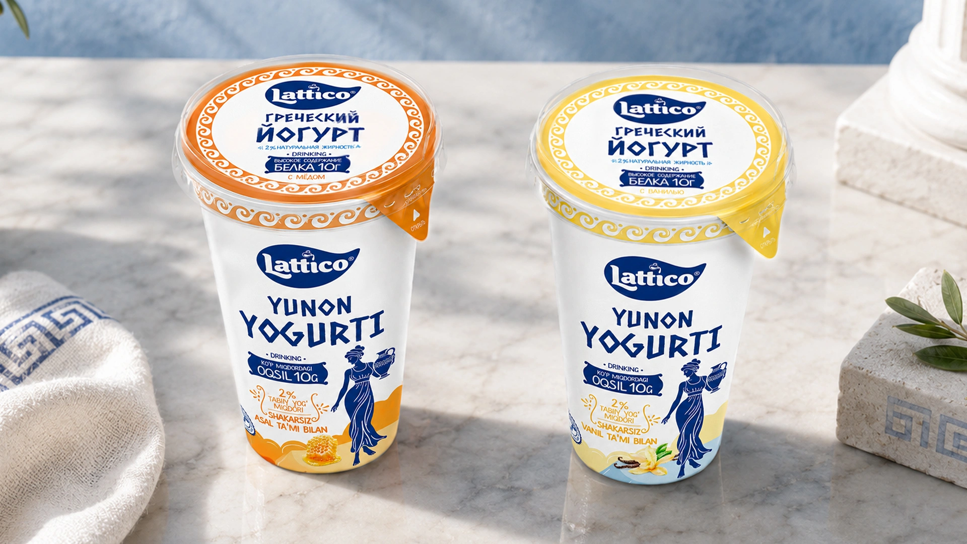
We needed to create packaging that would look “at home” and inspire trust on the dairy shelf, while simultaneously speaking to the sports audience in its own language and directly communicating the product’s health benefits.
2. Research
As is tradition, we started by studying the market. In marketing, there is a strategy known as “differentiation” — distinctly standing out from competitors. It was brilliantly explained by the famous marketer Seth Godin in his “Purple Cow” concept.
Imagine driving down a highway, seeing hundreds of ordinary cows, and not even paying attention to them. But if there’s a purple cow grazing in the field, you'll immediately hit the brakes and start taking pictures!
In an overheated, crowded market, such as snacks or water, this strategy hits the bullseye. If all water bottles on the shelf are blue or clear and you release water in bright purple packaging, people may buy it simply out of curiosity: “Oh, something new!” For such everyday products, the risk to the buyer is minimal.
But we realized that this rule wouldn't work in the Greek yogurt market. Why? Because the product itself is still relatively scarce, with only 3–4 options standing alone on the shelf.
A strict visual template for Greek yogurt has already been cemented in the buyer's mind:
- white color;
- dark blue color;
- a specific font stylized to resemble the Greek alphabet.
If we went against the system and designed the packaging in a non-standard color, the buyer might simply fail to notice it in the lineup. In this case, the customer doesn't need creative gimmicks; it is more important to find the desired product quickly and easily. Swimming against the current and offering unconventional visual solutions here would be akin to shooting ourselves in the foot.
3. Solution
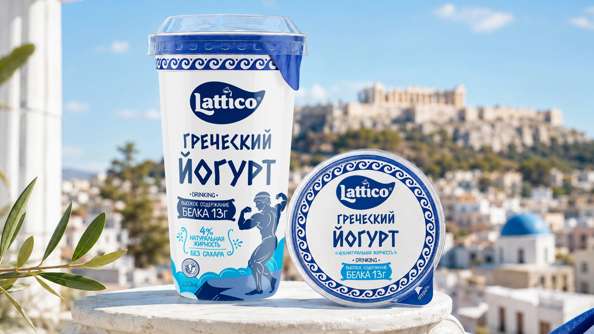
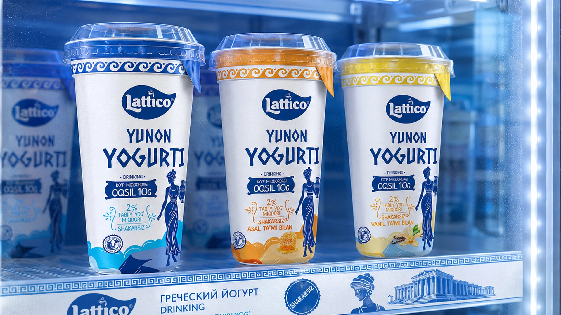
That’s why we didn't reinvent the wheel for this project. We kept the familiar white and dark blue colors, as well as the Greek-inspired font, which has become the category’s gold standard. However, our work still needed to catch the eye and aesthetically outperform the competition.
Ancient Greece
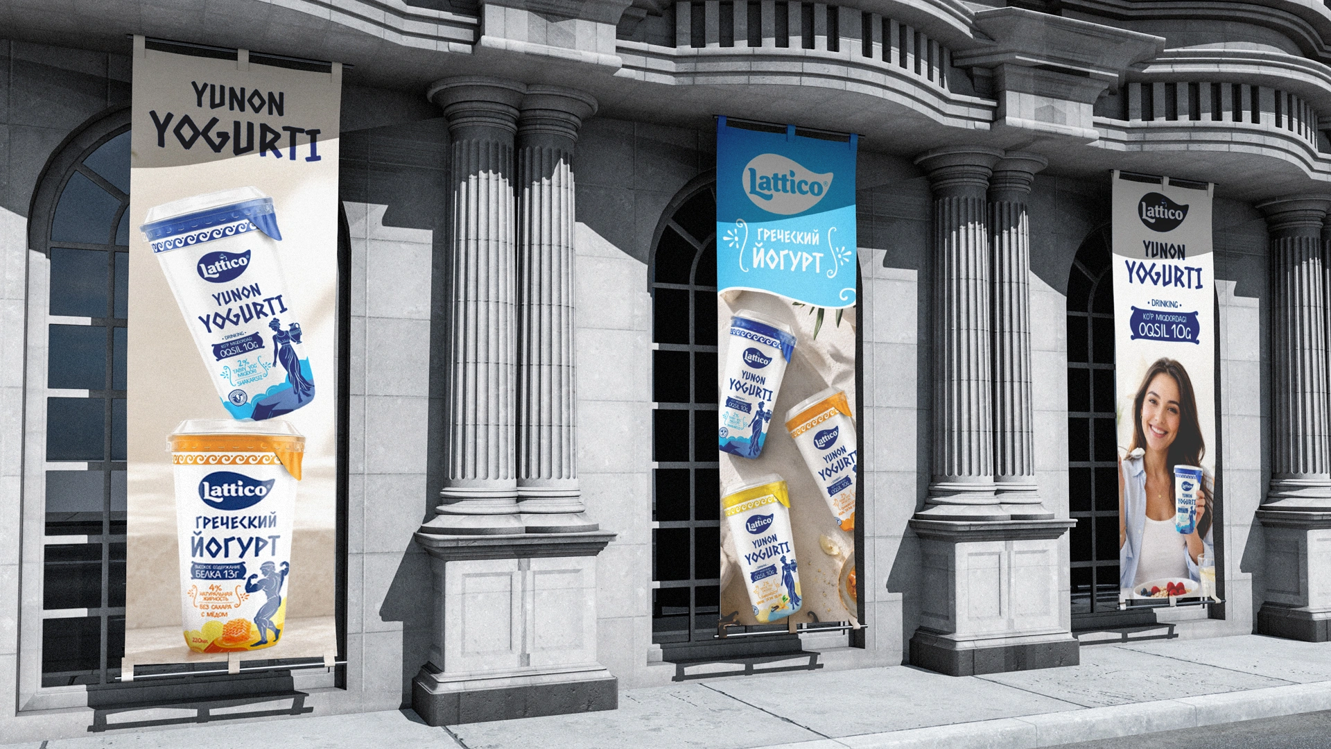
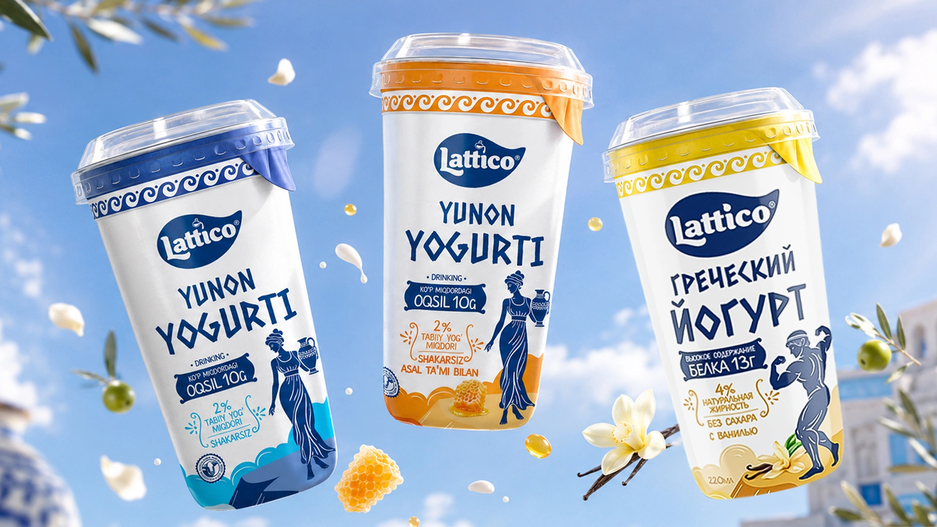
Who eats Greek yogurt? Athletes and health-conscious consumers. We connected this audience directly with the aesthetics of Ancient Greece. As shown in the images, we used two types of antique-style character illustrations in the packaging design:
- one side features a muscular male athlete flexing his biceps;
- the other shows a graceful woman holding a traditional Greek amphora.
These images reveal the very essence of the product — strength, health, and naturalness. With a single glance at the packaging, the buyer immediately understands: “This was made specifically for me.”
Why Not a Cow?
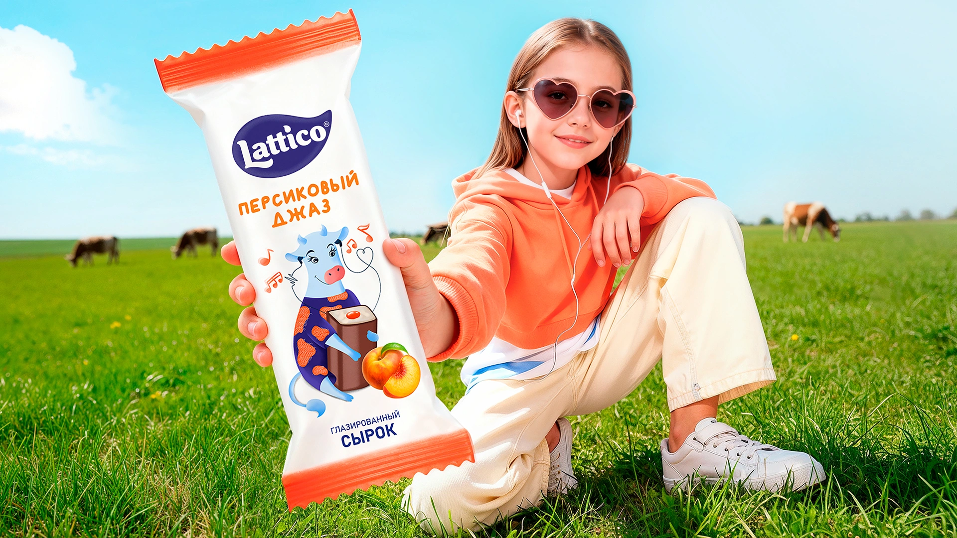
A little earlier, we designed packaging for glazed curd snacks for the same Lattico brand. In that project, we successfully differentiated the product through a character — a funny cow — and it worked like a charm.
But this time, we rejected the cow idea immediately. A person looking for protein-rich Greek yogurt might see a cow and think: “Ah, it's just another fatty dairy product,” and walk right past it.
The following visual themes would not suit this product:
- farming motifs;
- rustic imagery;
- traditional visual elements associated with ordinary dairy products.
For this product, an antique Greek theme was the most appropriate solution.
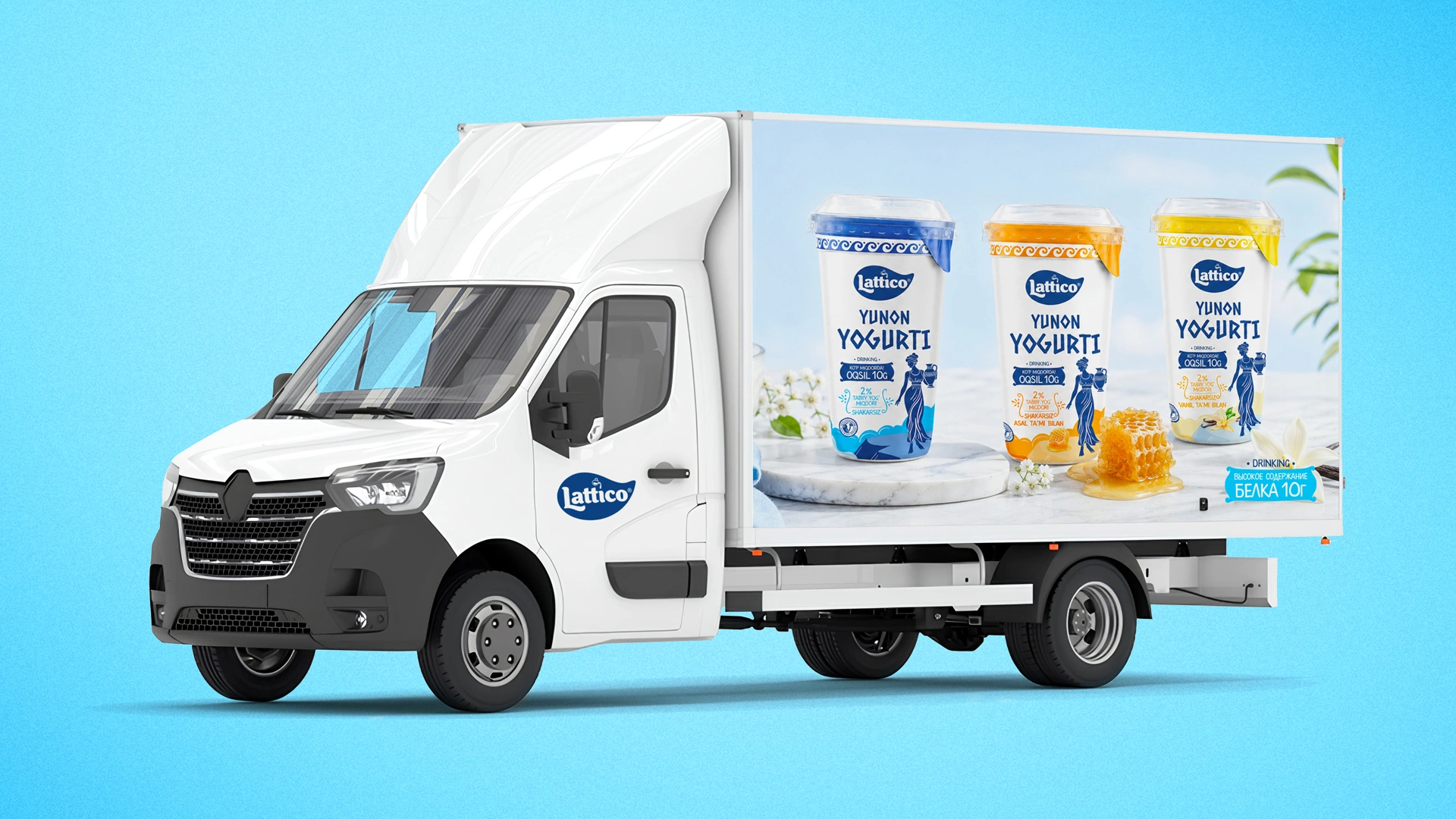
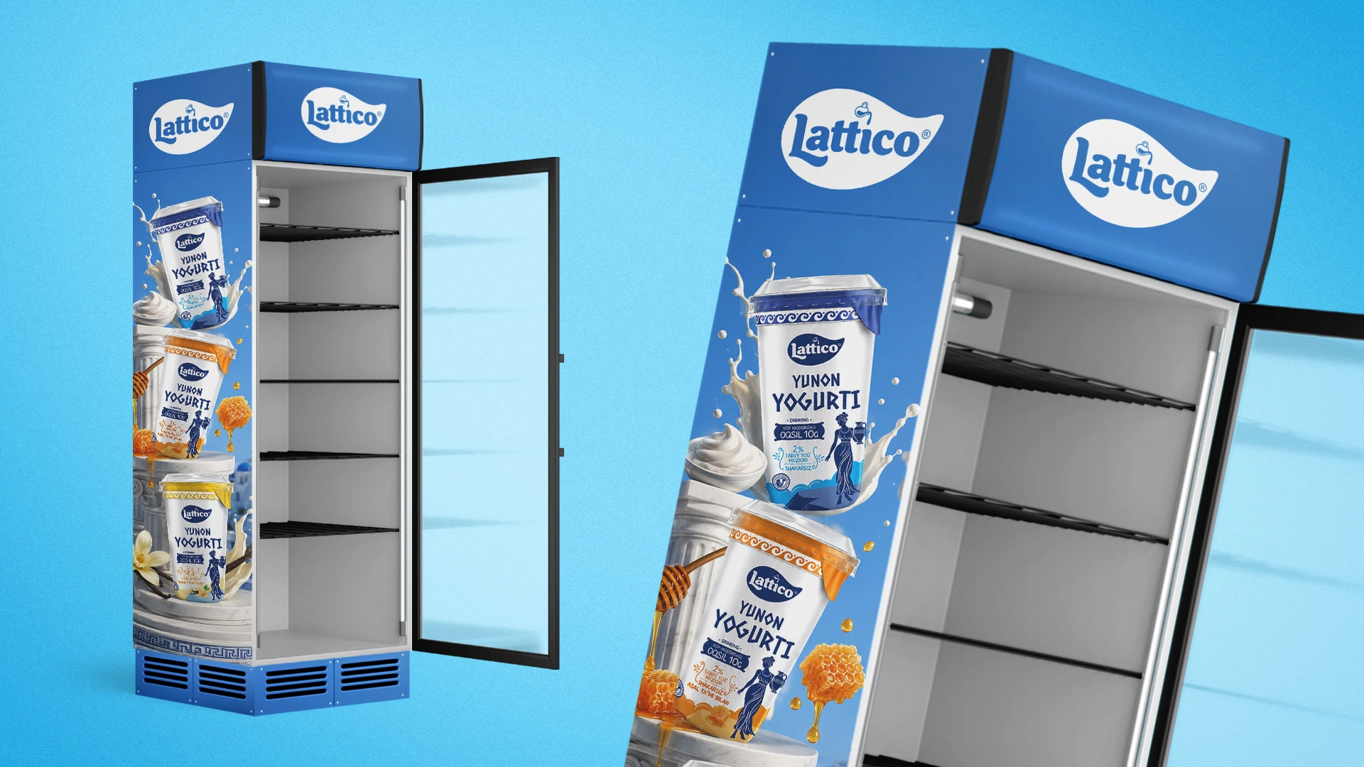
Result
The decision-makers on the client's side were a true “friendship of nations”: highly experienced professionals from Belarus, Ukraine, and Bukhara. This was an old-school team shaped by the demanding manufacturing standards of the CIS.
Such experienced professionals cannot be impressed by pretty words alone. Nevertheless, they approved our concept on the very first presentation, without a single objection.
The project results:
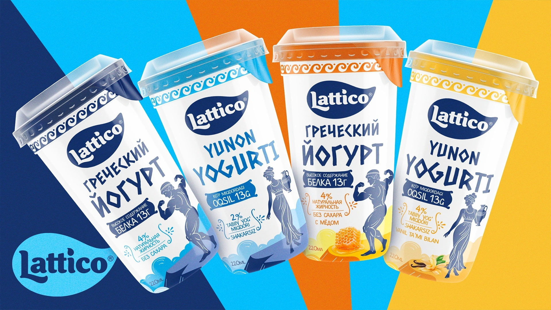
- the design concept was approved on the first attempt;
- more than 15 SKUs — Stock Keeping Units — were developed based on the design;
- Lattico products began securing their place on supermarket shelves;
- the packaging design started building a loyal audience for the brand.
Today, Lattico products are slowly but surely gaining space on supermarket shelves. Without unnecessary noise or hype, this strategically developed design has begun attracting a loyal audience and strengthening the brand’s position in the market.