


"Talkan" — Rice Flakes Packaging Design for Healthy Eating Enthusiasts
As the saying goes, "A healthy mind in a healthy body." Today, a healthy lifestyle is no longer just a passing trend, but a daily necessity. The ranks of fitness enthusiasts who pump iron at the gym and meticulously count every calorie are growing rapidly. It was for these health-conscious, sports-loving individuals that the creators of "Talkan" knocked on our agency's door with a rather unique task. The goal was ambitious: the product needed to confidently hit the shelves in both Arab countries and our domestic market.
1. Problem and Task
There's a common misconception that "healthy food can't be tasty." When people hear "dietary" or "sports nutrition," they often picture some bland, quickly tiresome porridge. But "Talkan" is actually a low-fat, high-protein, and—most importantly—delicious product made from natural rice flakes and bran.
Our main task was to prove to the buyer, right on the packaging, that this food is not only healthy but incredibly appetizing. In short, we needed to make sure that when healthy eating advocates glanced at the shelf, their mouths would instantly start watering.
2. Research
We started by thoroughly studying our audience. Yes, sports and fitness fans are used to reading long ingredient lists. But if the packaging itself features clear facts and an easily understandable visual, it saves them time and makes finding the right product a breeze.
Most importantly, we relied on the famous marketing concept of "Jobs-to-be-Done" for this project. What does that mean? A buyer doesn't go to the store just to buy rice flakes. They are looking for a ready-made solution that gets the job done: providing "a quick and healthy meal without wasting time." After all, "Talkan" isn't just dry cereal to munch on; it's a ready-to-eat meal that you mix with milk and genuinely enjoy. That's why we didn't just show a boring list of ingredients on the packaging; we showcased the exact appetizing end result the buyer is craving.
3. Solution
As the saying goes, "A picture is worth a thousand words." Therefore, we built the design concept in a highly transparent and mouth-watering style:
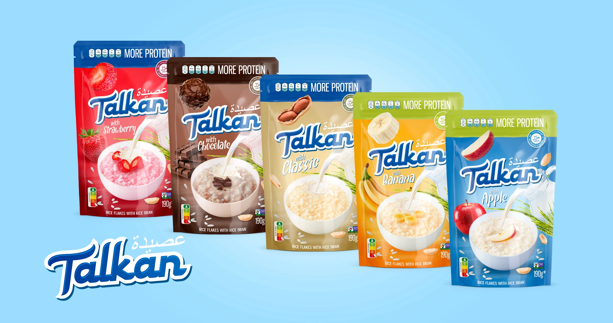
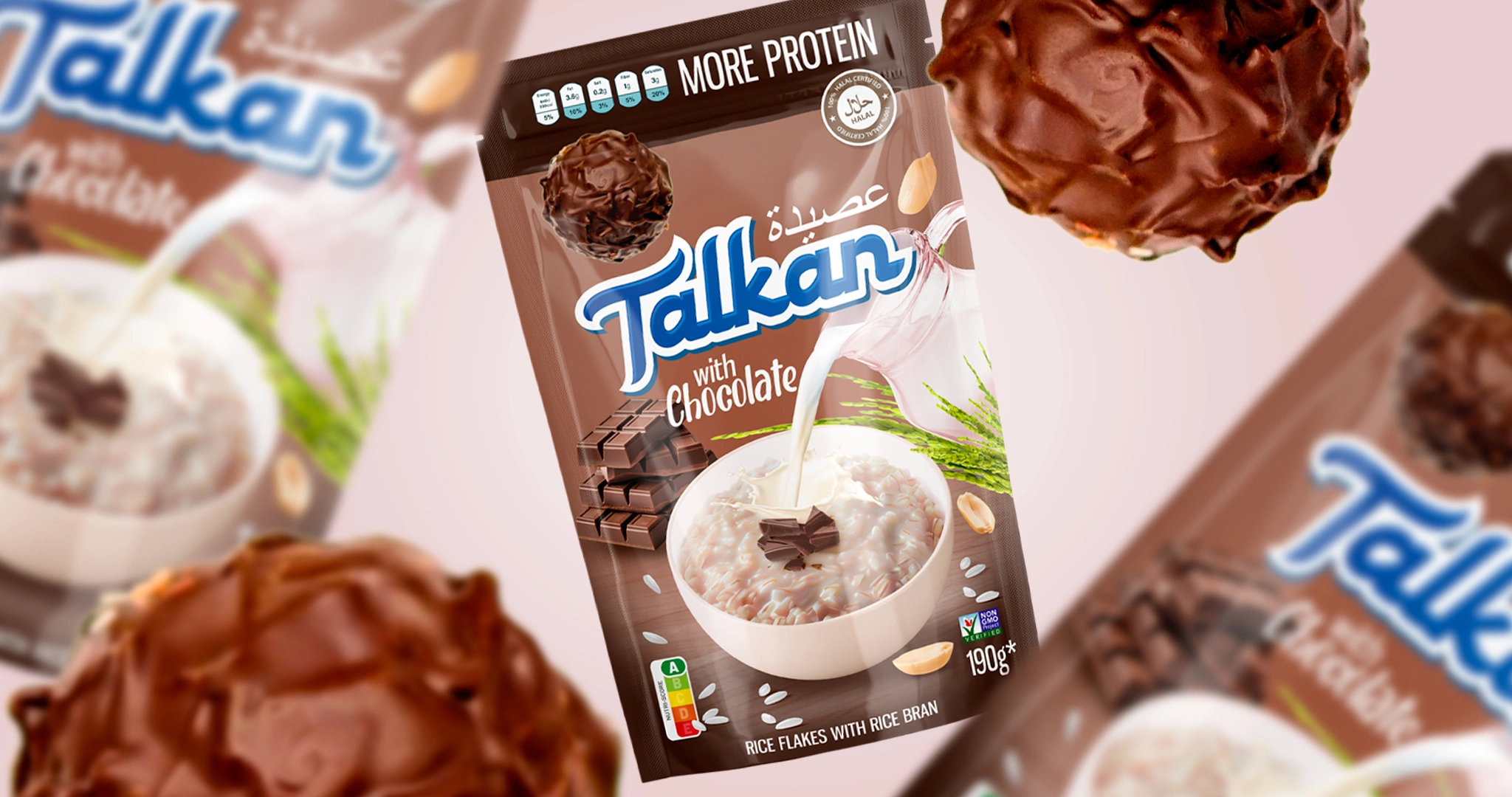
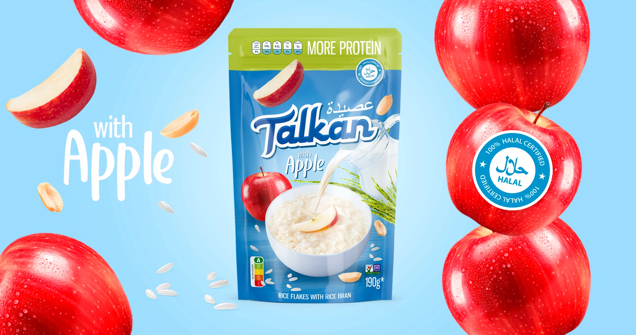
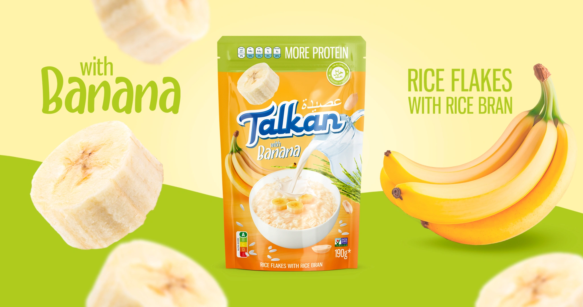
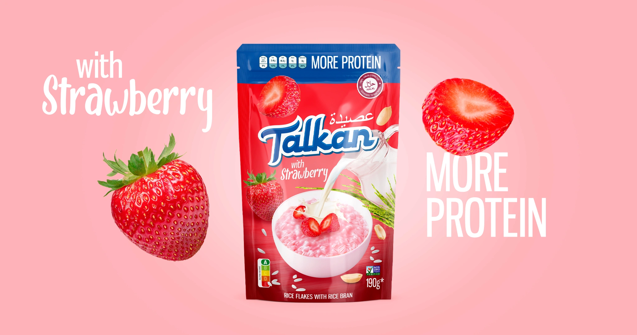
- The End Result: Right in the center of the packaging, we placed an image of the ready-to-eat meal with pouring milk and juicy fruits. This visual wordlessly explains exactly how to consume the product and instantly wakes up the taste buds.
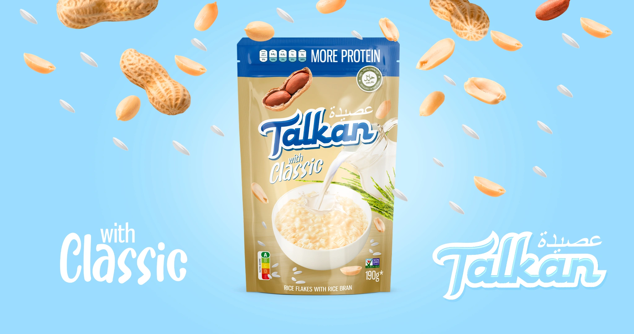
- Vibrant Colors: We didn't just pull the colors out of thin air, of course; we based them on the shades of the ingredients themselves. We chose bright red for the strawberry flavor, green-blue for apple, warm brown for chocolate, sunny yellow for banana, and an elegant creamy-yellow for the classic nut flavor.
- Trust Markers: Keeping exports in mind, we added an elegant Arabic script above the logo. Meanwhile, the phrase "MORE PROTEIN" (which makes any fitness fan's eyes light up), the "Halal" certificate, and the "Nutri-score A" healthy eating standard mark took the most prominent spots on the packaging.

Result
Ultimately, with its five flavors, "Talkan" received packaging so "muscular" and visually appetizing that it can confidently step into the ring with any heavyweight competitor on the market.
If you're a producer who completely vouches for the quality of your product, but its outward appearance is stuck at the "eh, good enough" level—it's high time for a design upgrade. Come to us. You take care of the taste and quality of the product, and we'll create that "talking" packaging that grabs the buyer's attention and leads them by the hand right to the checkout!