LEKATON & BIODETRIM – Pharmaceutical Packaging Design
A strategy to express the product's effect through 3D abstraction, breaking away from the monotonous standards on pharmacy shelves.
1. The Task
Pharmacy shelves are conservative territory. Here, we often encounter packaging that is overly pragmatic, "silent," and looks alike.
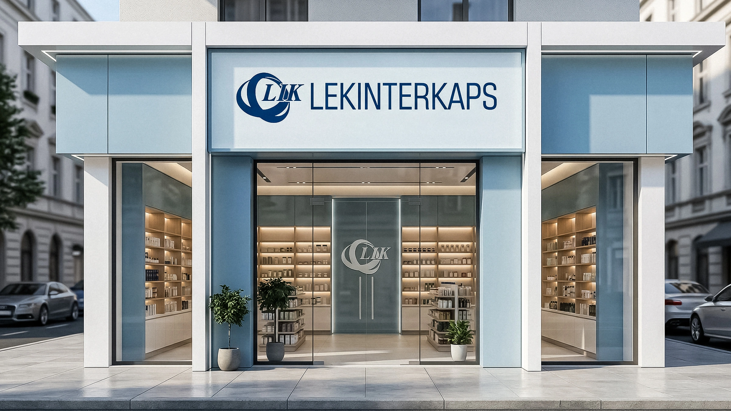
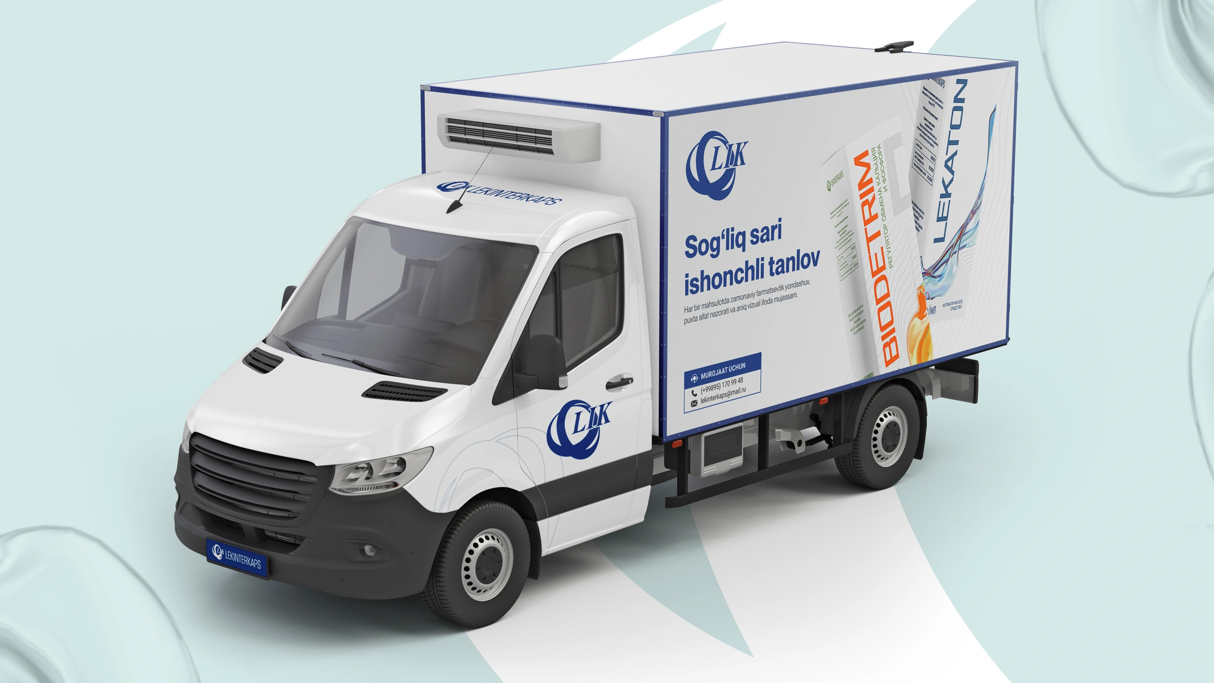
"Lekinterkaps" tasked us with developing the packaging design for two new preparations: "Lekaton" (a metabolic agent) and "Biodetrim" (a calcium and phosphorus metabolism regulator, D3). The goal was to create a modern packaging system that would inspire confidence in the buyer and have a premium visual appeal, while moving away from the "clinical" style prevalent in the market.
2. Logic and Approach
Typically, pharmaceuticals use direct imagery (such as a bone, heart, or stomach) to illustrate a product's function. However, for the modern consumer, this is an outdated method.
We preferred to convey the impact of the product through emotion and abstract metaphors rather than directly. Because today, minimalism and abstraction are signs of high quality, innovation, and a scientific approach.

3. Solution
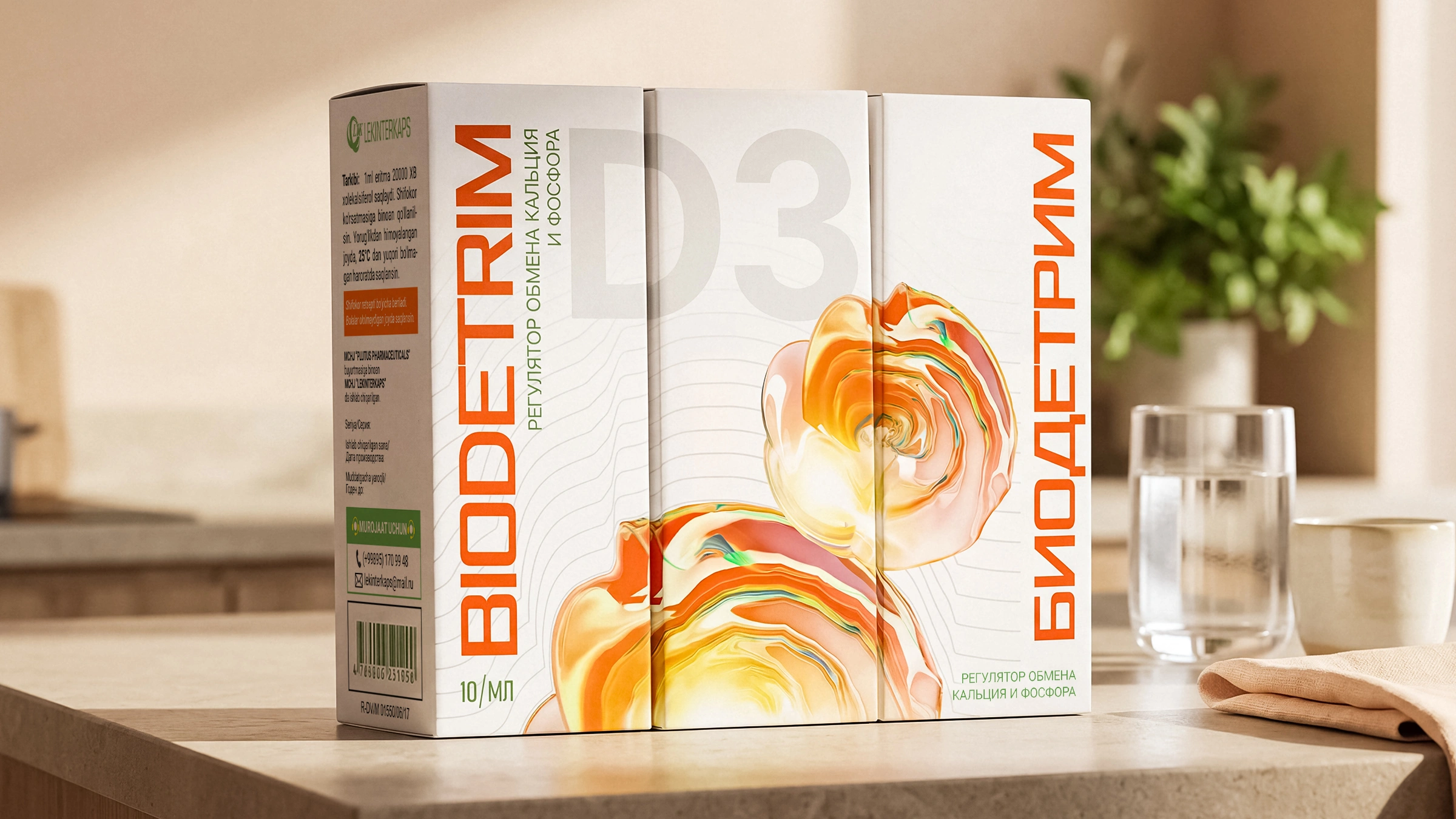
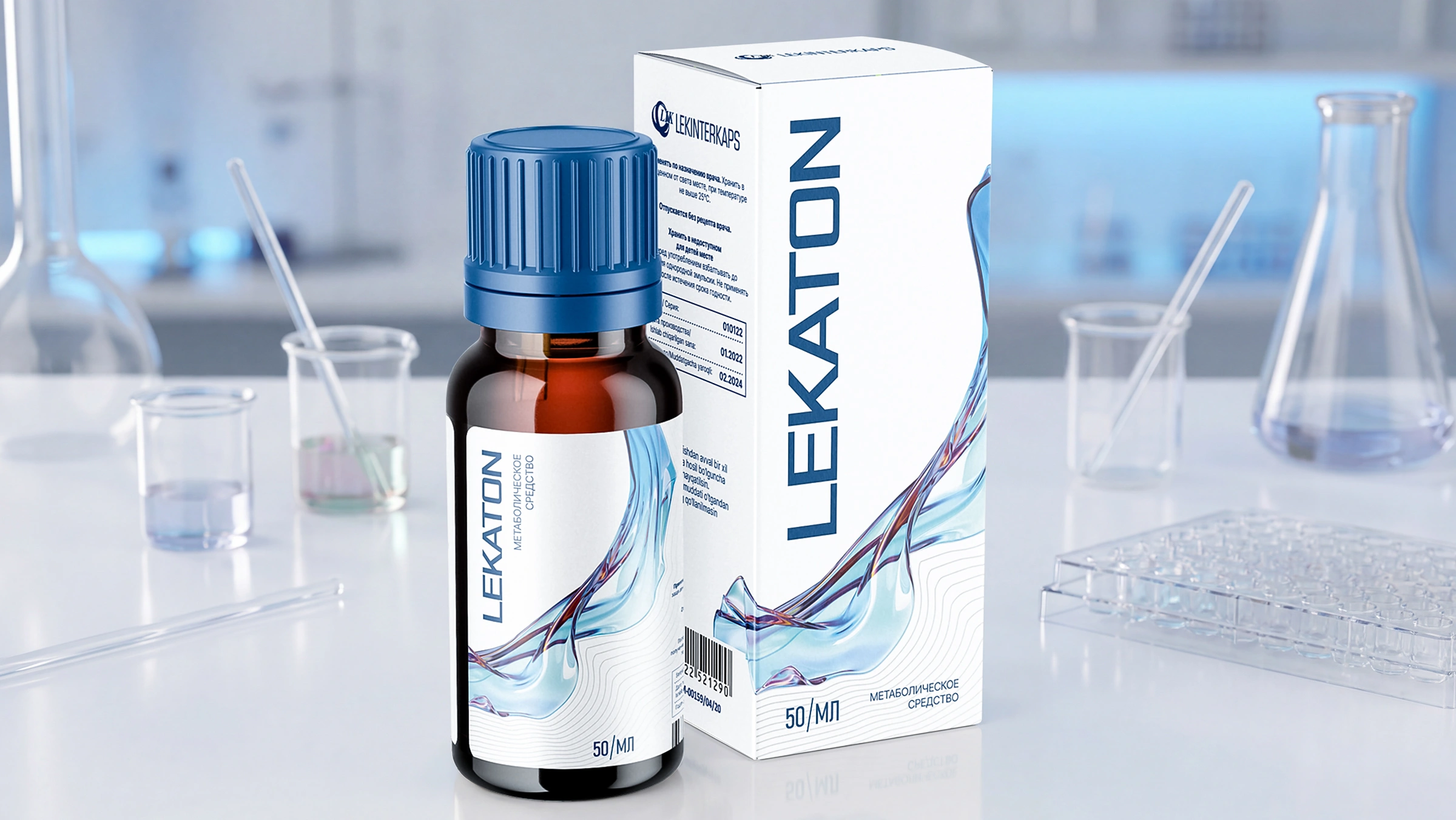
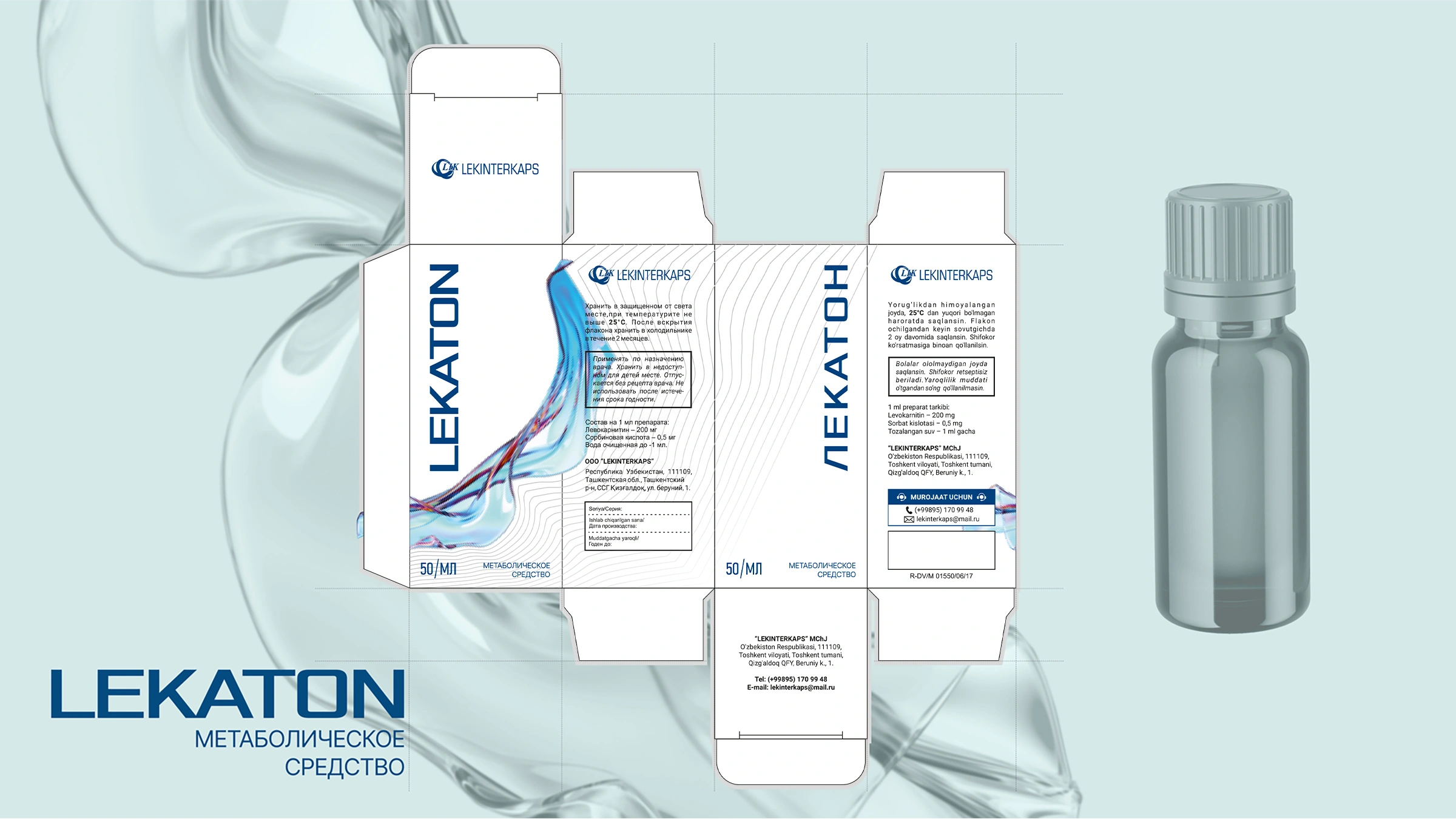
3D visuals of the same stylistic but completely different nature were developed for both preparations:
- Scientific minimalism. Pure white color and thin topographic lines (waves) were used in the background of the packaging. This gave the design pharmaceutical precision and a technological spirit.
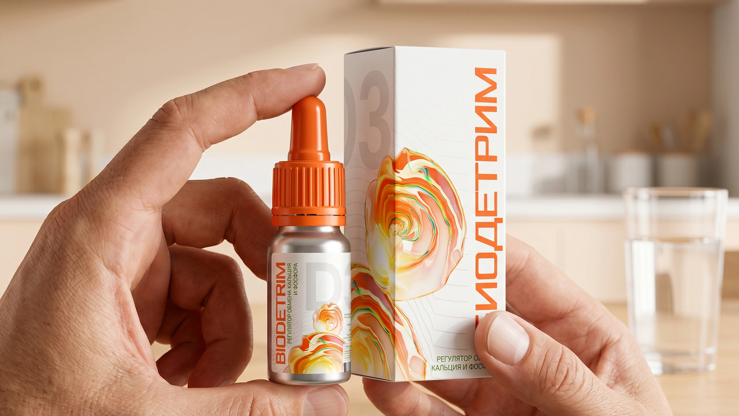
- Abstract 3D metaphors. The effectiveness of each drug was visually presented:
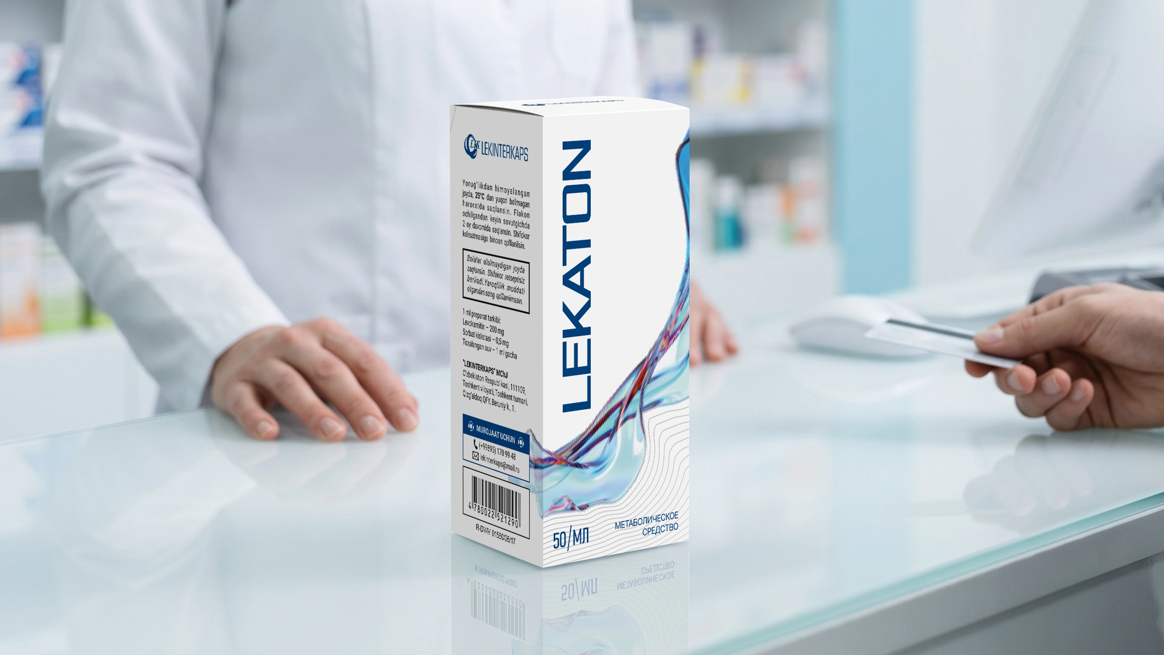
- Lekaton: A 3D abstraction of a dynamic, moving blue fluid was created to represent metabolism and energy flow. This gives the body a sense of recovery and cleanliness.
- Biodetrim: A bright, radiant 3D element in warm, golden-yellow colors was drawn to reflect vitamin D3 and solar energy. The large "D3" icon in the background explains the purpose of the product to the buyer in seconds.
- Vertical typography. The vertical and large font layout of the names made the packaging visually longer and more imposing, making it as easy to read as possible on the display case.
Result
We managed to create an ultra-clean and premium design without unnecessary details. On pharmacy shelves, "Lekaton" and "Biodetrim" are clearly distinguished from other products by their scientific and innovative appearance.
As the great inventor Leonardo da Vinci said: "Simplicity is the highest degree of perfection." The abstract forms and minimalist design we developed have become a true tool that demonstrates the perfection of the product without extra words.