


Canados — Naming, Logo, and Packaging Design for Freon Products
Dekat, a company that knows the freon market inside out and has been in the business for 12 years, has taken a major step in its development. Instead of simply importing products, they decided to create their own private label. Their main target audience is technicians.
MINIM agency was tasked with successfully introducing this new brand to the market and developing a comprehensive solution that would earn the technicians' trust.
1. Problem and Task
Working with technicians has its own nuances. You can't pull the wool over their eyes, and they don't fall for a pretty wrapper—for them, convenience and quality are paramount. We needed a name that sounded solid in English but was also easy to pronounce. Most importantly, just hearing it had to convey the product's purpose, evoking a strong association with cold.
The project involved four main tasks: developing the naming, creating a logo, assembling the packaging design, and adapting it for 8 different product types.
2. Research
We started by thoroughly analyzing the market. What's the picture on the shelves? Everything is cluttered with boring technical numbers or unpronounceable Chinese names.
How can you convey the feeling of cold? Snow and glaciers, polar bears, and penguins... To be honest, all of this is cliché and has long been overused by others. We needed a different, memorable, and more impactful approach.
3. Solution
Naming
During the naming search, we had a serious brainstorming session. Our research led us to a very logical and strong association: Canada, a country famous for its cold climate.
Thus, the name Canados was born. It's a solution that is written in English but easily pronounced by our technicians, and thanks to its connection with the country's name, it is perfectly memorable.
Logo
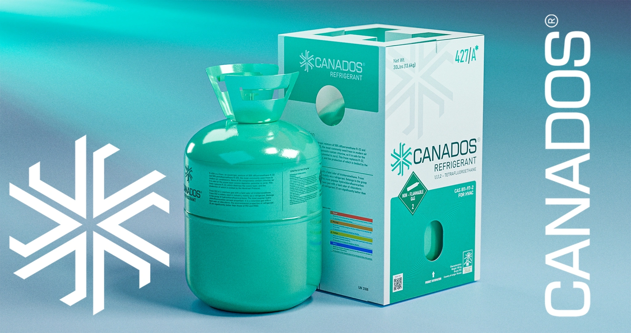
What should the face of the brand look like? An overly complex logo overloaded with details was unnecessary here. We needed clarity and minimalism. Therefore, we combined three main elements in the logo:
- The capital letter of the brand name — "C".
- A symbol of cold — a snowflake.
- The Canadian flag, as a direct reference to the name.
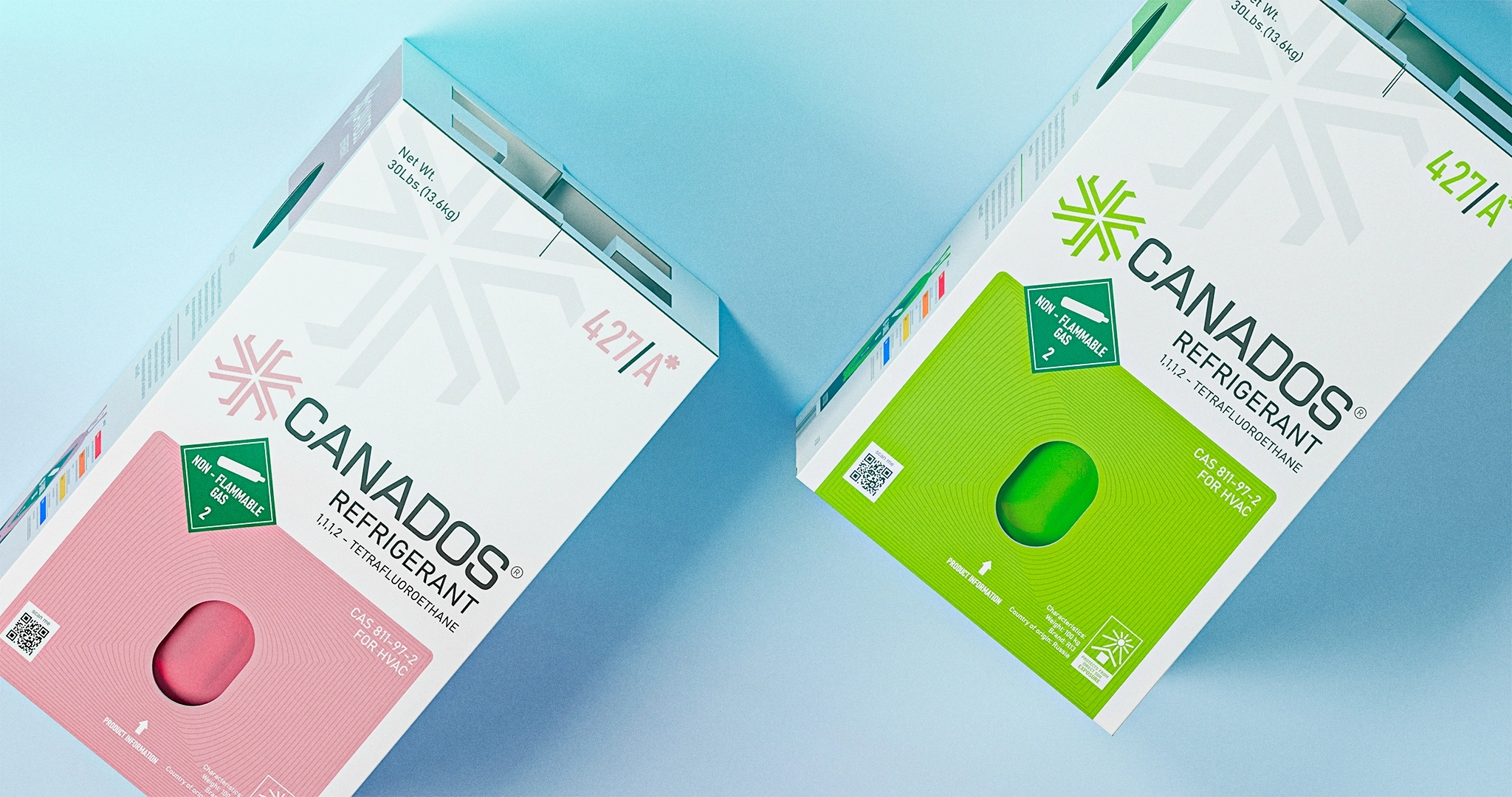
In addition, a special corporate pattern was developed that instantly catches the eye and is consistently used on the packaging, as well as in other promotional materials.
Packaging Design
While beautiful packaging on the shelf boosts initial sales, its convenience in the technician's hands ensures repeat purchases and growing trust in the brand.
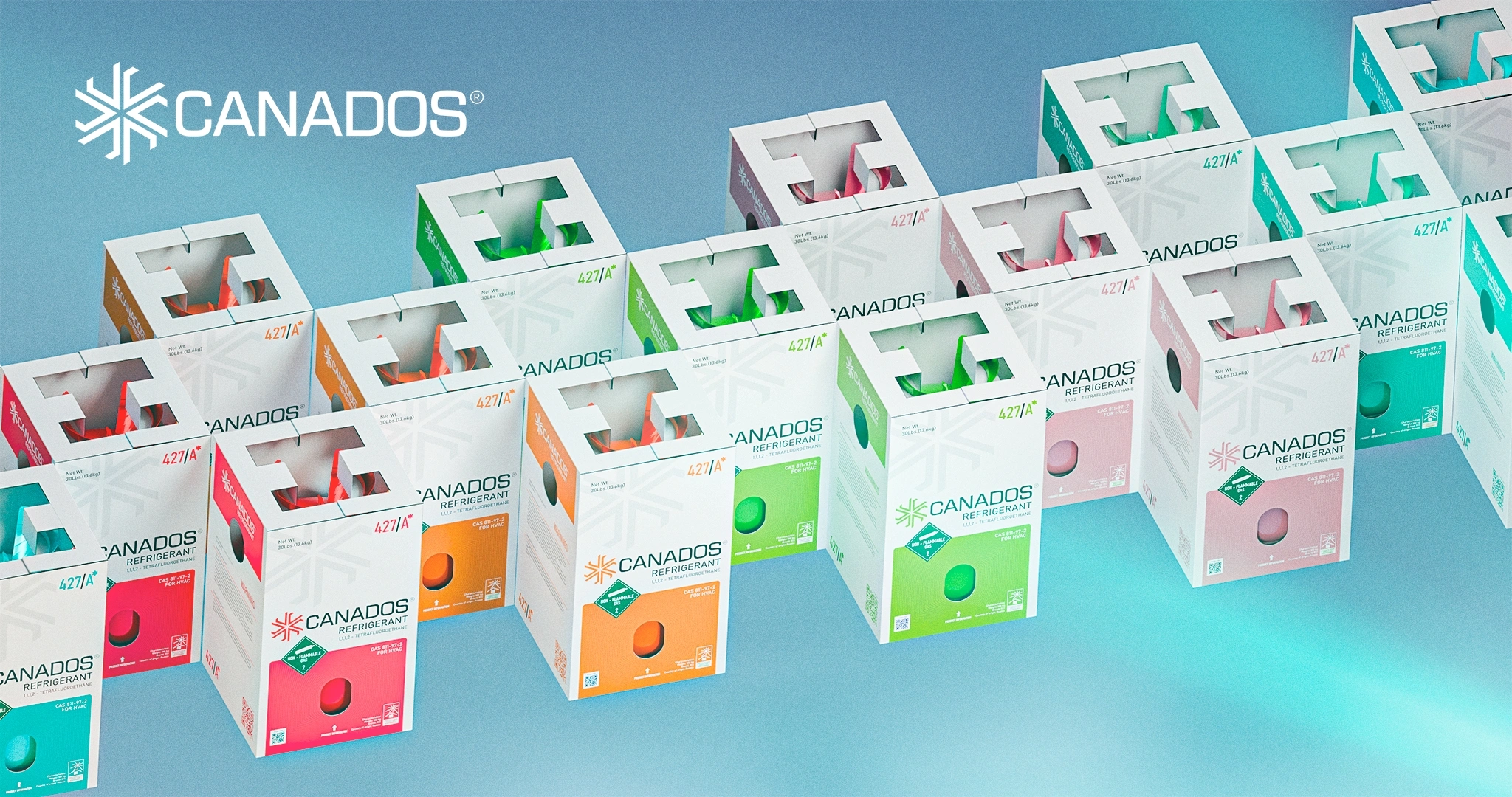
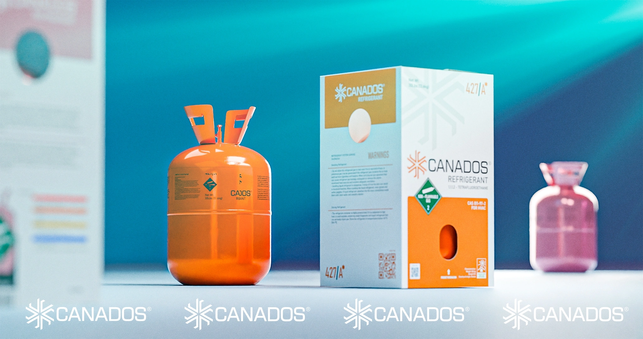
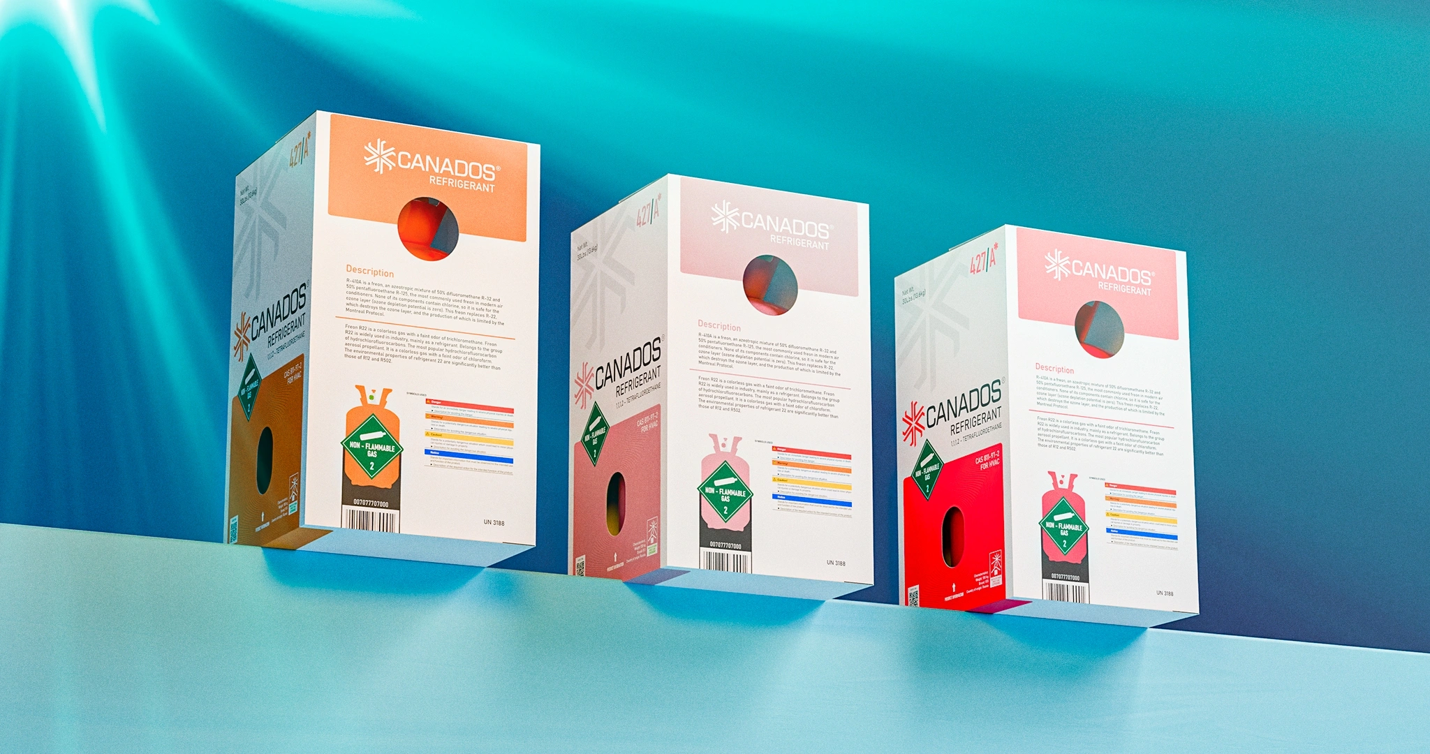
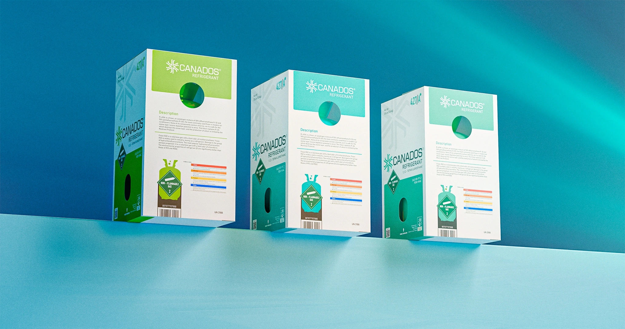
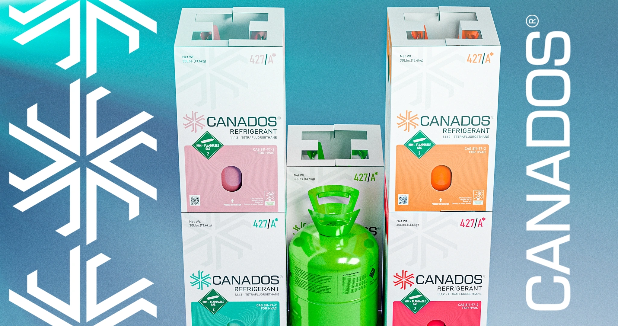
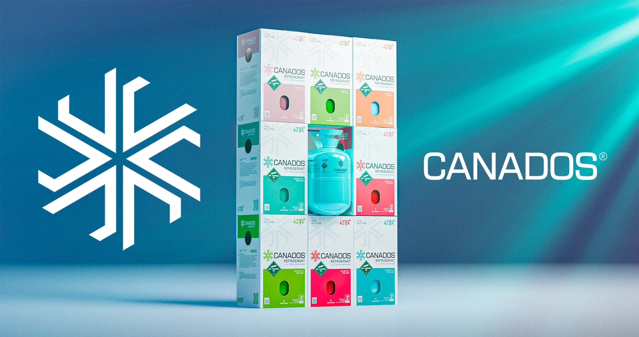
There are 8 types of products in the lineup altogether. To prevent the technician from getting confused during work, each type received a clear visual color distinction based on its characteristics.
To ensure safety during transportation, a special corrugated cardboard box was prepared. The texts, technical specifications, and warnings on the packaging were compiled in strict accordance with international standards.
Another important detail — we made special cut-outs in the box. Why?
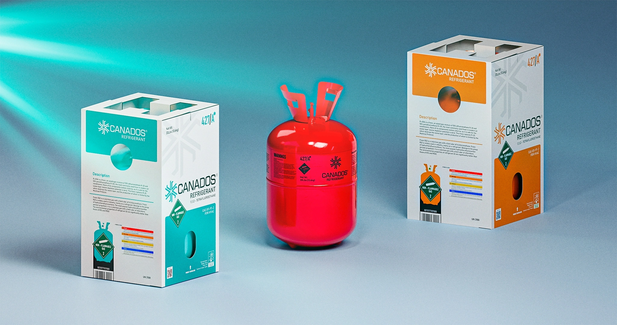
- First, the cut-out on the side makes the box very convenient to carry.
- Second, the product itself is clearly visible through the hole on the front. We have nothing to hide — everything is open and transparent.
Result
As a result, a strong and confident new player has entered the freon market.
The new name "Canados" will now be firmly entrenched in the minds of technicians — the product's main consumers. Moreover, they will no longer get lost among 8 different freon brands; thanks to color visualization, they can find the exact cylinder they need in a second.
Ultimately, we delivered a reliable solution: packaging that is easy to carry and through which the freon cylinder itself is clearly visible.