Needz: Comprehensive Personal Hygiene Products Branding
Needz branding was developed for diapers and personal hygiene products. The naming refers to needs, the logo to cotton (care, tenderness). A unified design concept in pastel tones for recognition.
1. Task
We are always excited to see products that people truly need on the market. In this case, we worked on creating branding for a manufacturer of diapers and personal hygiene products.
Our tasks included developing a brand name, designing a logo, creating a unified concept for the packaging design, and selecting the right color combinations.

2. Naming
We began with the naming process. The foundation was the English word "needs," which directly reflects the core of the product. To make the name unique, we adapted it into the form “Needz.”
Thus, the name was born, symbolizing products created to meet the daily needs of both children and adults.
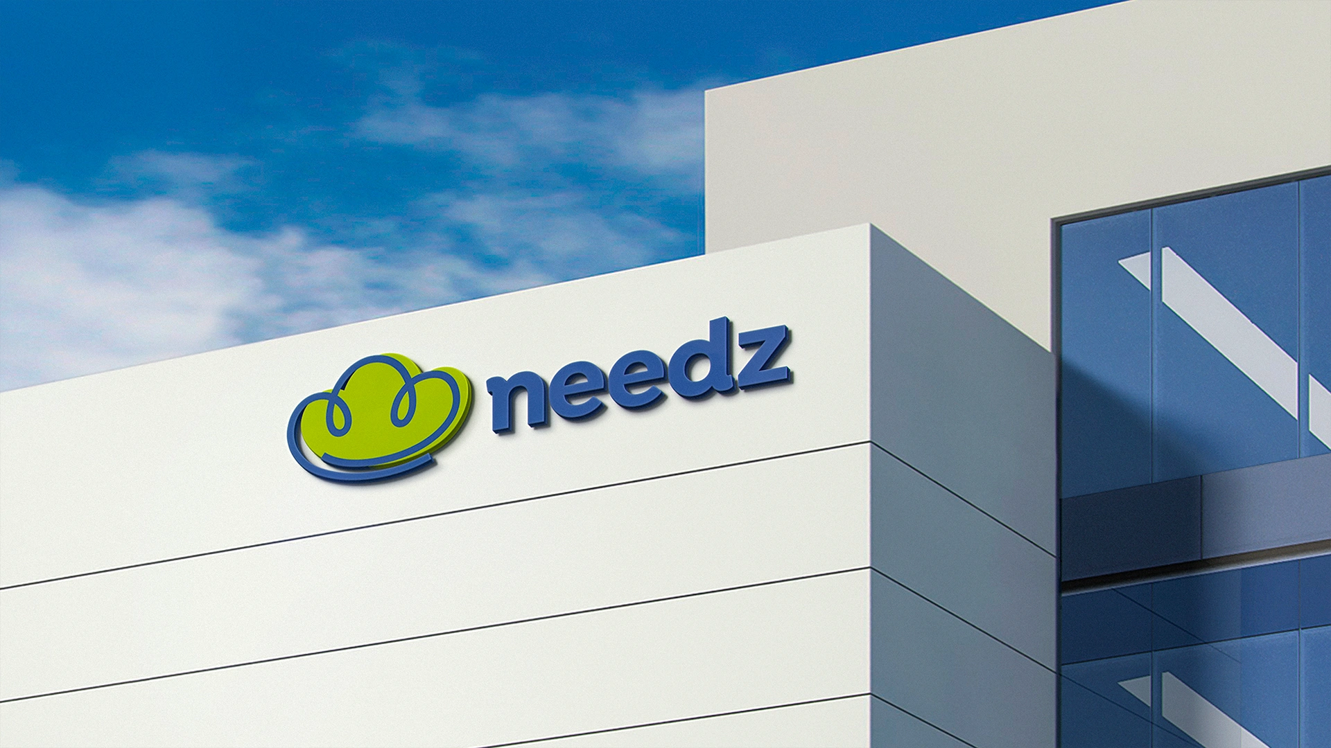
3. Logo
Minimalism and simplicity are key trends in modern design. Therefore, when creating the logo, we chose cotton as the central image. Cotton is a key component of many hygiene products, symbolizing softness, purity, tenderness, and naturalness. Additionally, from a design perspective, the logo subtly incorporates the image of a cotton bud embracing, reinforcing the connection to care and comfort.

4. Packaging Design
Before our involvement, the company used different styles for packaging, often following trends that were popular at the time. This approach led to inconsistent designs, as the packaging styles of various products were copied from well-selling products, which caused visual fragmentation. The inconsistency reduced brand recognition and created confusion among consumers.
While this approach may bring short-term results, it would not be effective in the long term. Therefore, we developed a unified design concept that brings all products together under one cohesive style.

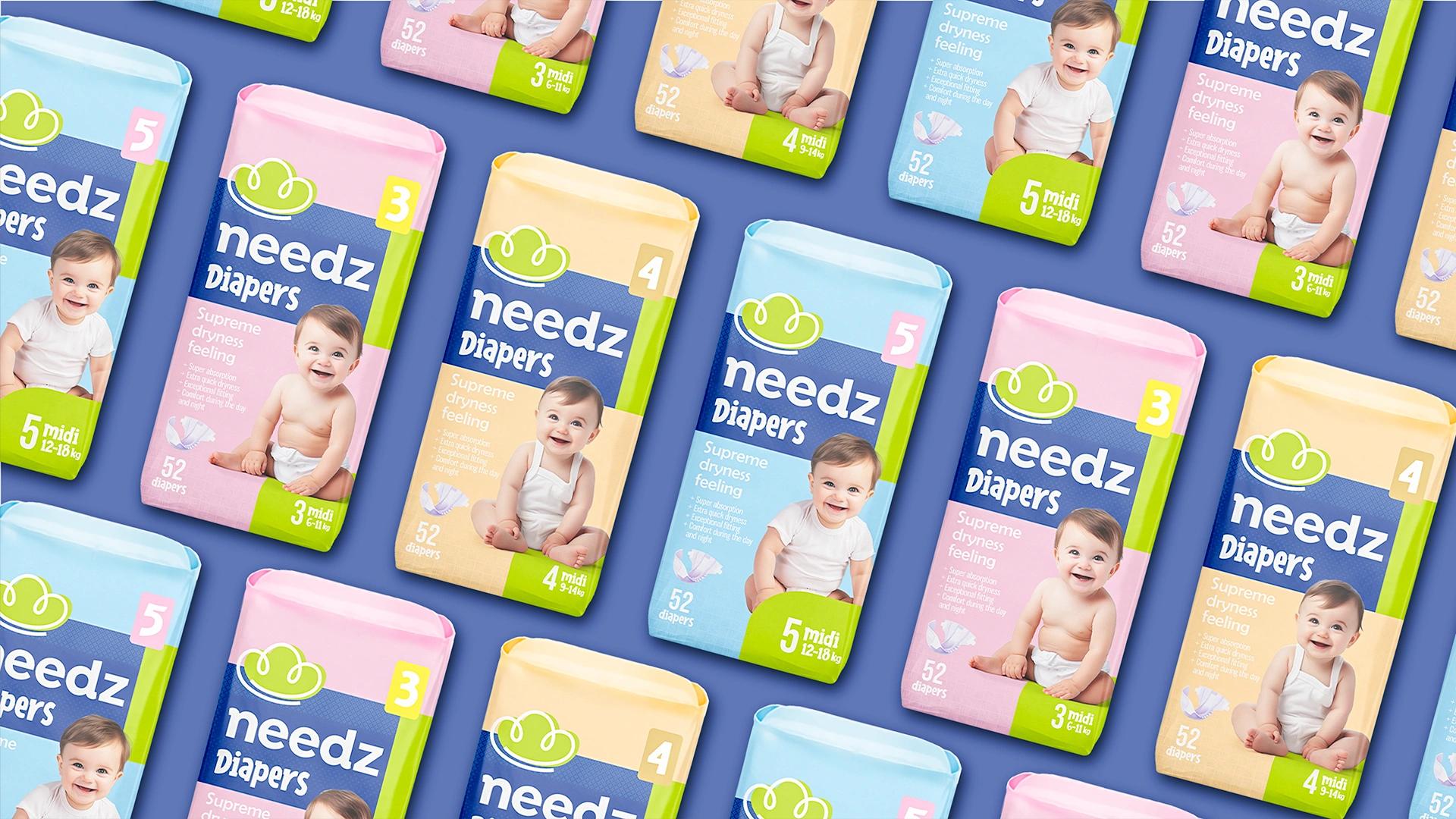
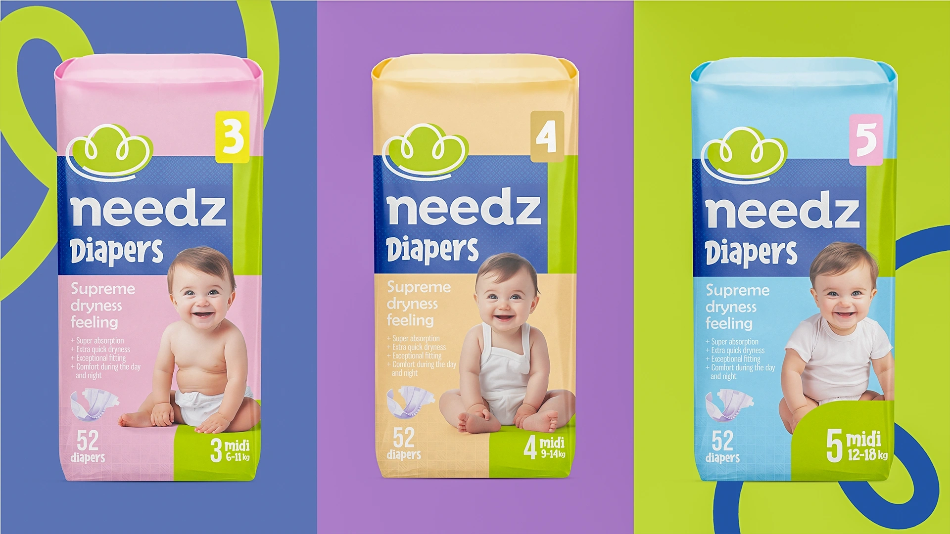
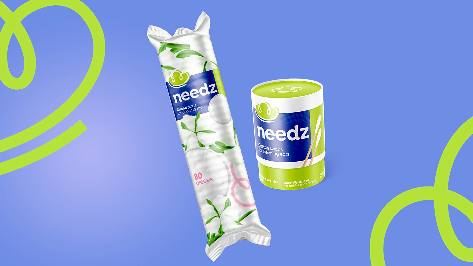
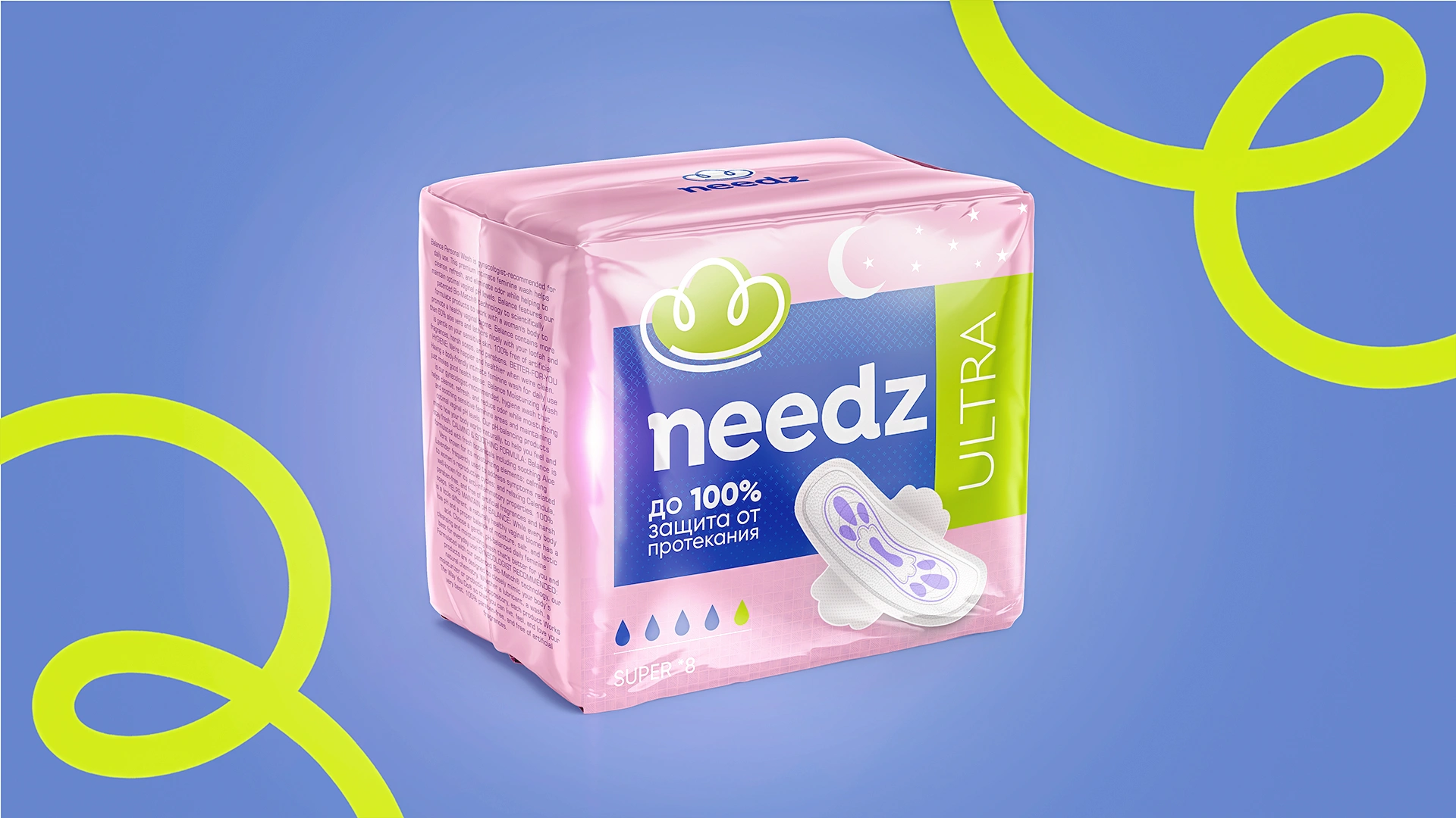
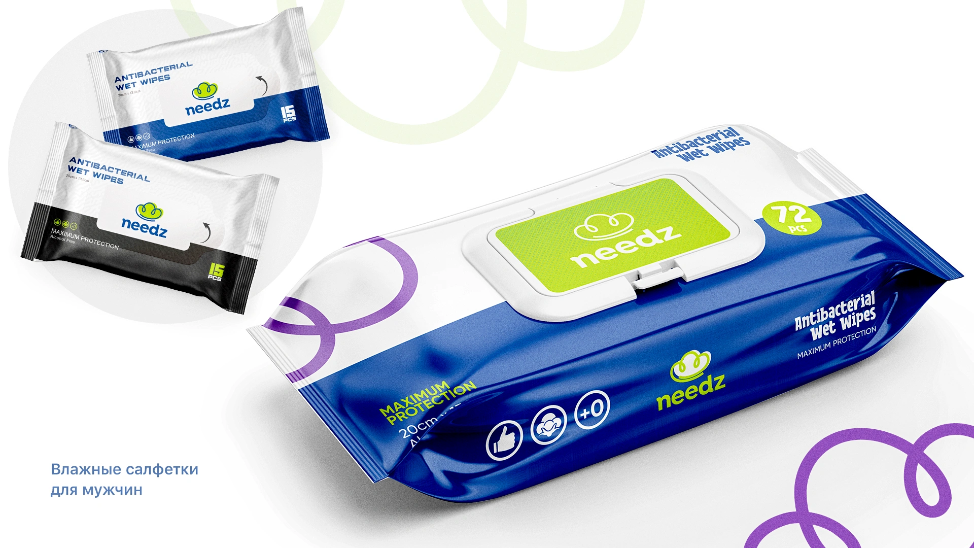
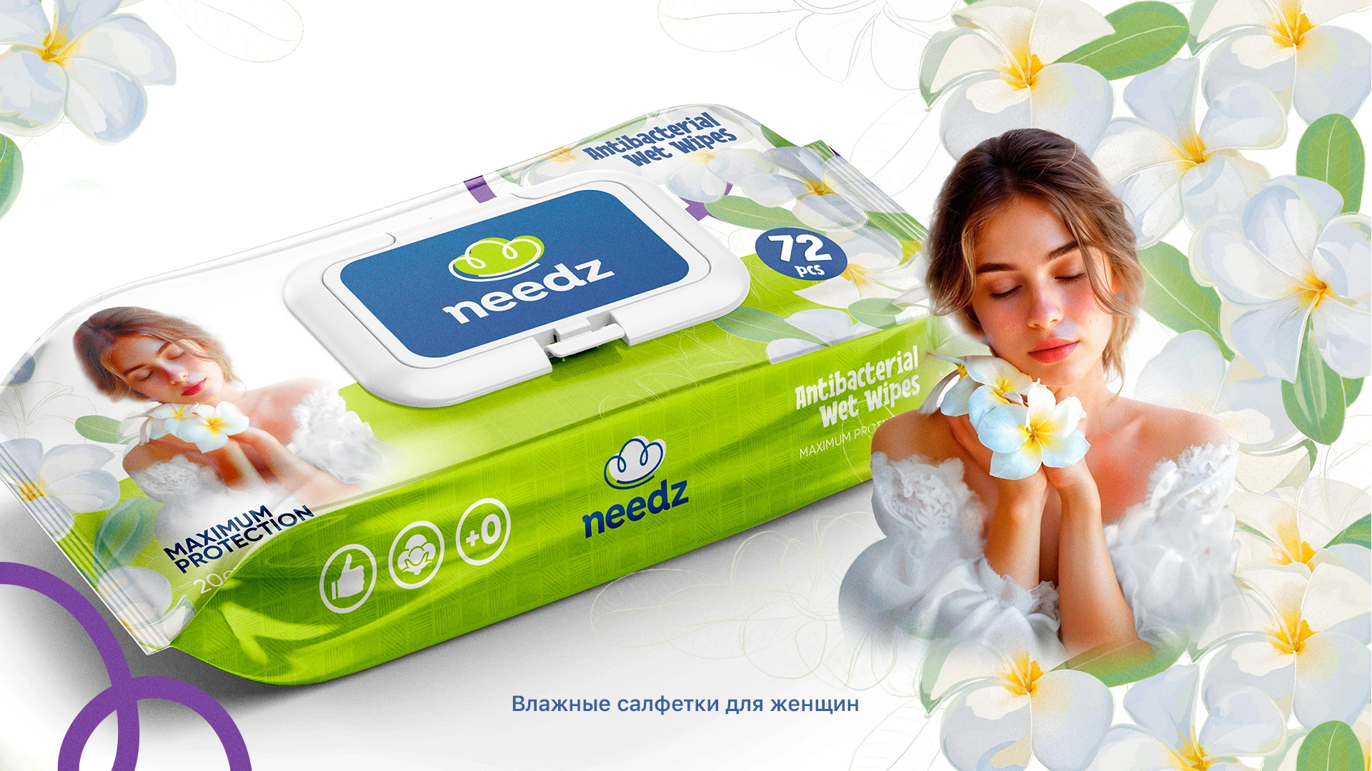
5. Packaging Design
We selected blue, light green, and white as the main colors — symbolizing purity, softness, and safety. To distinguish between different types of products, soft pastel shades were used, creating a harmonious visual experience.
Packaging Design
To grab attention on the shelves, we created a bar in shades of blue and light green, with a spot effect that stands out prominently in the display.
We are confident that the thoughtfully crafted name, logo, and packaging design will elevate the company to new heights and earn a well-deserved place in the hearts of consumers.