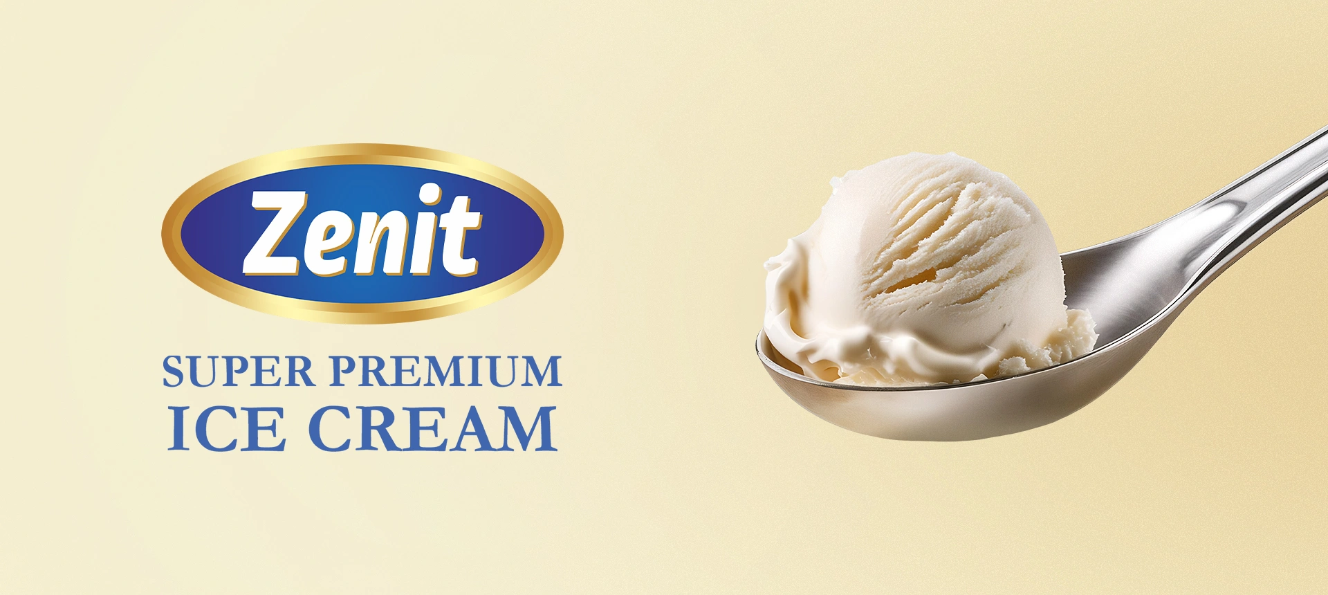
Zenit Kilo — Packaging Design & Naming for Family Ice Cream
In Uzbekistan, family-format ice cream is more than just a dessert—it is a distinct cultural phenomenon. It serves as a "strategic reserve" for hospitality, always ready for the warm welcome of guests. For our long-standing client, Zenit, we developed the packaging design and naming for their 1kg ice cream line.
Note: We have previously developed packaging for other Zenit product lines. You can view that case study here.
1. The Challenge & Context
Context: Previously, Zenit’s family-sized products suffered from visual fragmentation. The designs were inconsistent, making it difficult for consumers to identify them as a single product line. Consequently, the brand was getting lost amidst competitors on the shelf.
The Task:
- Elevate the Aesthetic: Create a design that looks premium and undeniably appetizing.
- Unify the Brand: Consolidate scattered products into a cohesive visual brand architecture.
- Navigate Flavor Codes: Visually communicate popular flavors without infringing on the copyright of global giants.
2. Research & Insights
- Vernacular Naming: We noticed a pattern: customers rarely recall specific fancy names. In the store, they simply ask, “Do you have the Kilo ice cream?” Embracing this simplicity, we avoided over-complication and proposed the name "Kilo."
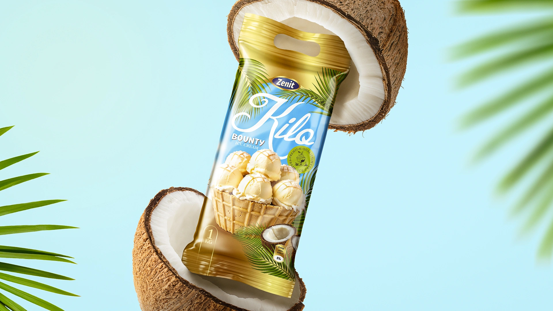
- The 3-Second Rule: Shoppers navigate by color and texture, not text. For example, a coconut bar flavor is instantly recognized by light blue hues and palm trees; condensed milk is identified by geometric blue-and-white patterns.
- The Golden Opportunity: The segment is dominated by white or transparent tubs. To dominate the freezer aisle, we needed a radically different approach to stand out.
3. The Solution
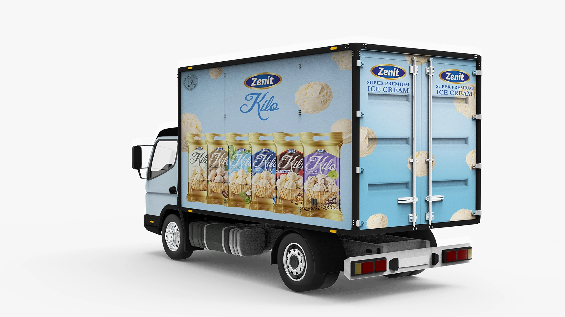
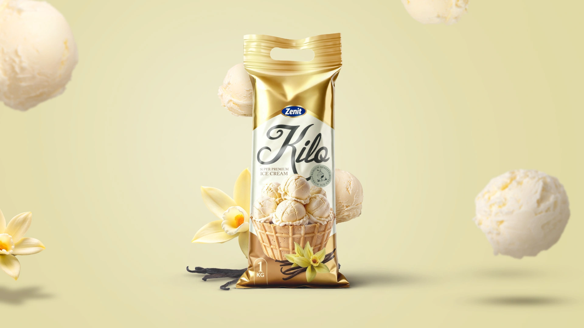
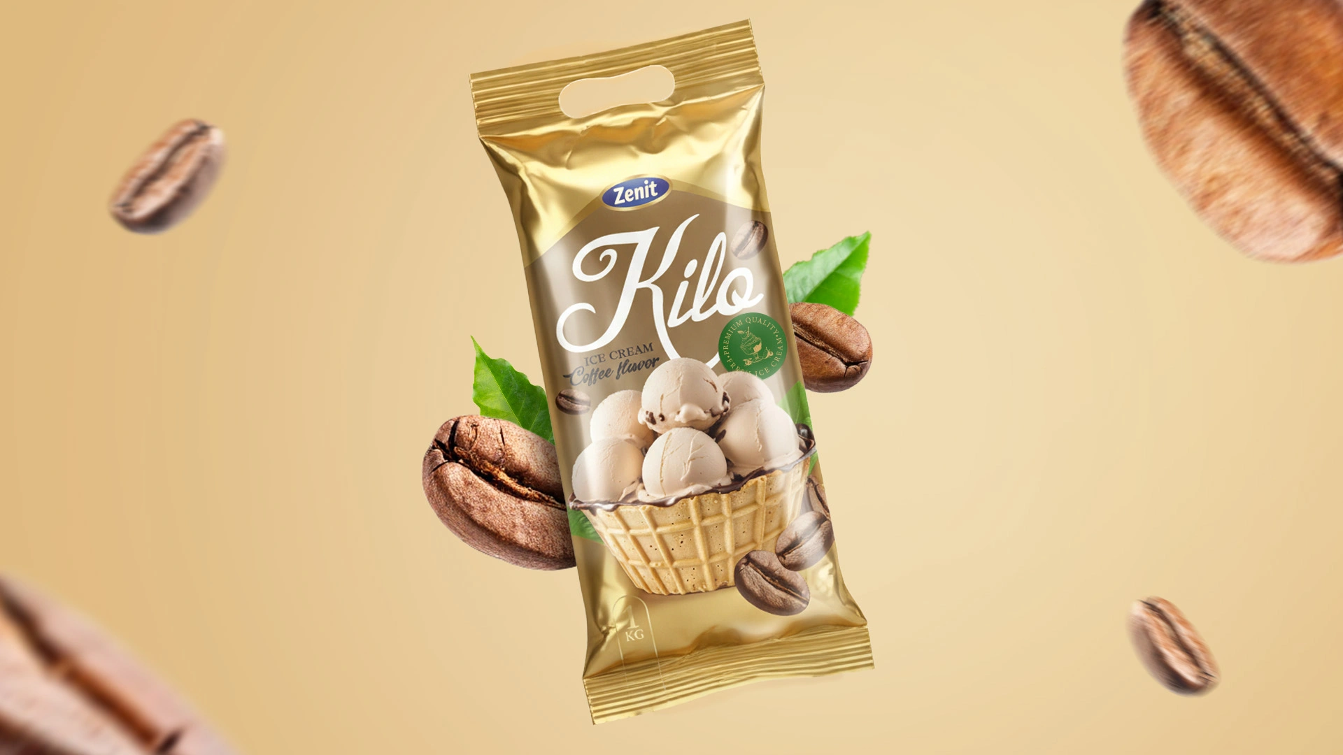
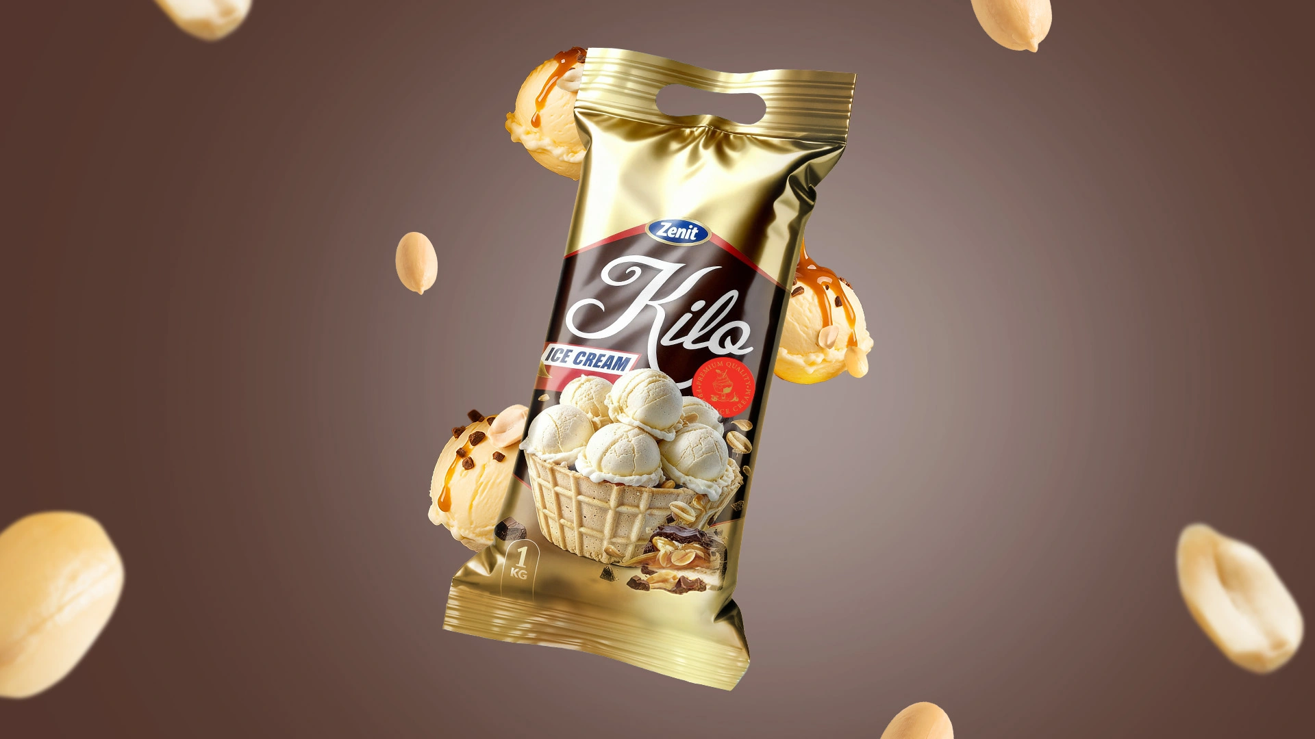
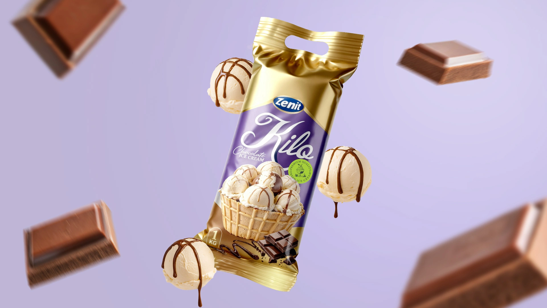
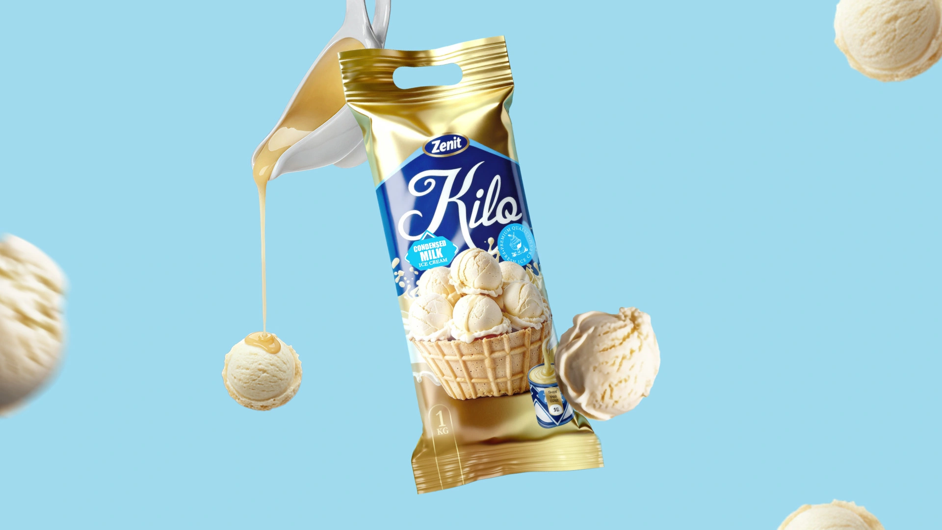
We engineered a design system based on metallic gold film, creating the effect of a “premium gold bar” sitting in the freezer.
Design Details:
Center Stage (Food Zone): We developed hyper-realistic 3D graphics featuring ice cream scoops in a waffle basket. This imagery triggers a subliminal call to action: “Buy this and serve it to your guests.”
Visual Flavor Codes: We communicated specific tastes without using third-party logos, relying instead on universally recognized visual cues:
- Condensed Milk: Utilizing the iconic blue-and-white geometry that evokes a sense of childhood nostalgia.
- Coconut: Light azure backgrounds, palm fronds, and coconut slices that promise a “heavenly delight.”
- Peanut & Caramel: Deep browns, stretching caramel, and roasted peanuts signal the familiar, beloved profile of a nutty chocolate bar.
Typography: The “Kilo” logotype is rendered in a large, handwritten script, adding a touch of friendliness and softness to balance the serious, premium gold background.
The Result
The redesign has revitalized the Zenit brand:
- Shelf Domination: The unified gold background creates a powerful color block, making the product impossible to ignore.
- Brand Cohesion: It is now instantly clear that all these products belong to a single, strong brand family.
- Intuitive Navigation: Thanks to precise color markers and large-scale ingredient imagery, consumers can identify the flavor in milliseconds.
- Perceived Value: The product looks significantly more expensive than its price point, making it the perfect choice for hosting guests.