Mikki Crispy – Packaging Design for Sweet Corn Snacks for Kids
You have exactly 3 seconds to grab a child's attention at the store shelf—just enough time for the eye to see and the brain to process the image. Now, ask yourself: does a kid care about a boring logo slapped in the center or a long paragraph about the product's health benefits? Absolutely not! So, what do they actually want? The answer lies in the packaging design for the "Mikki Crispy" brand, developed by MINIM agency.
1. The Challenge
The client's product is a creative twist on the sweet corn puffs we all loved as kids, but made in the shape of little flowers. The client's brief was strict and uncompromising: "Break away from tired market standards and deliver a completely fresh solution."
Our task wasn't just to draw a pretty picture. We had to create a truly "living" packaging that would act as a magnet for kids' eyes on the shelf and speak to them in their own, genuine language.
2. Research & Insights
We kicked off the project by analyzing competitors on the shelves and studying consumer behavior. This led us to two powerful insights:
- Visual Monotony: Every competitor in the market clings to the exact same template: a giant logo in the center with a basic product photo underneath. When a shopper looks at the shelf, this monotony quickly causes visual fatigue, and all products blur into a single spot. In such visual noise, a new brand would simply disappear.
- Design for the Consumer, Not the Brand Owner: Most brands design children's packaging with adult tastes in mind—making it too rigid and serious. We, on the other hand, needed a cheeky, playful character who could win a child's heart and communicate with them directly.
3. The Solution
We didn't just slap the product onto the packaging. We transformed it into the core, interactive element of the design:
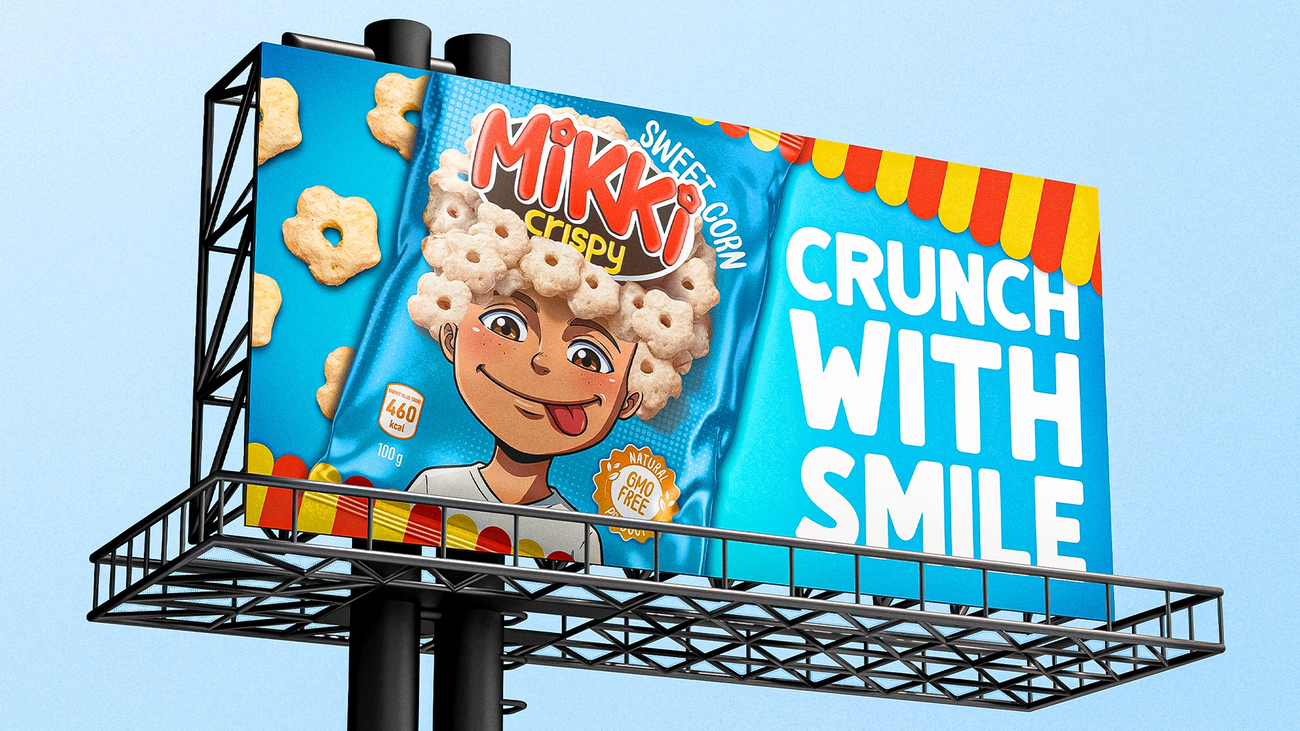
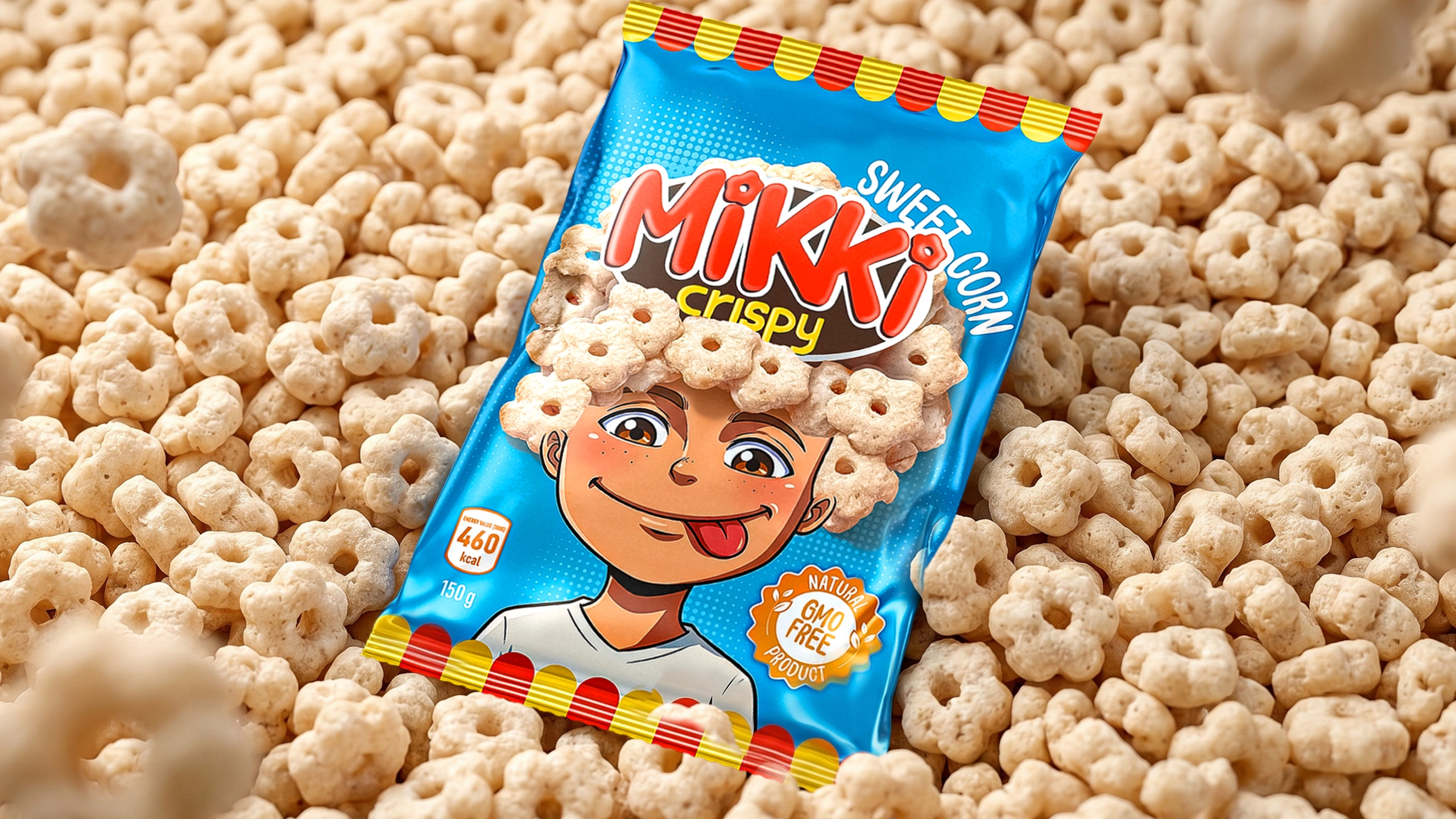
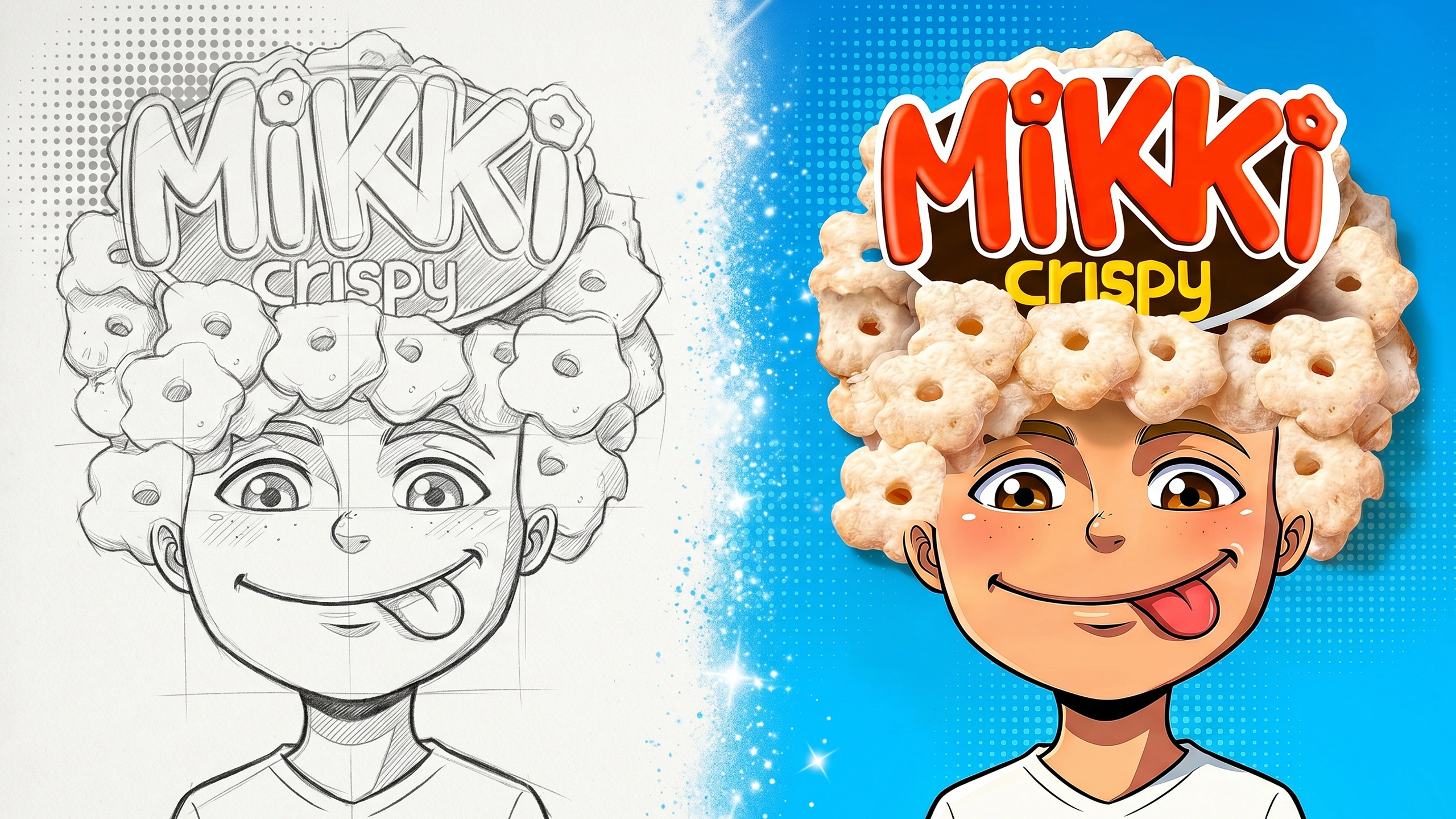
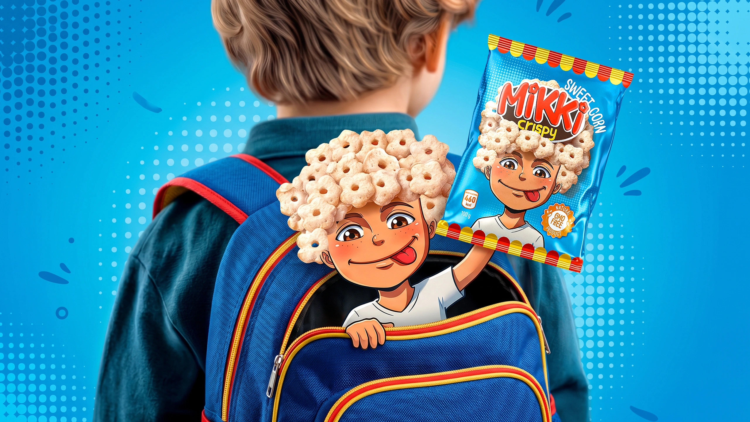
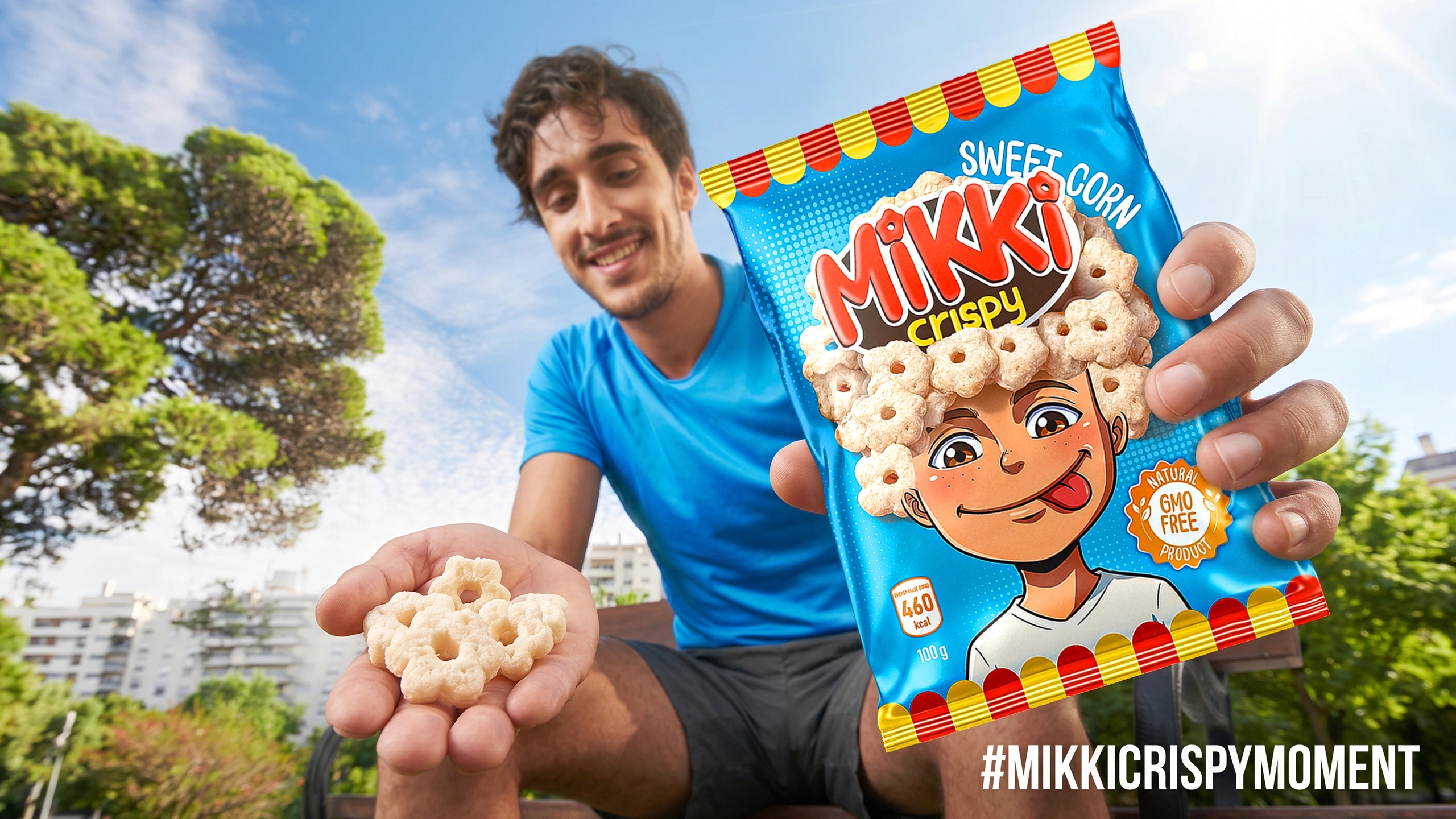
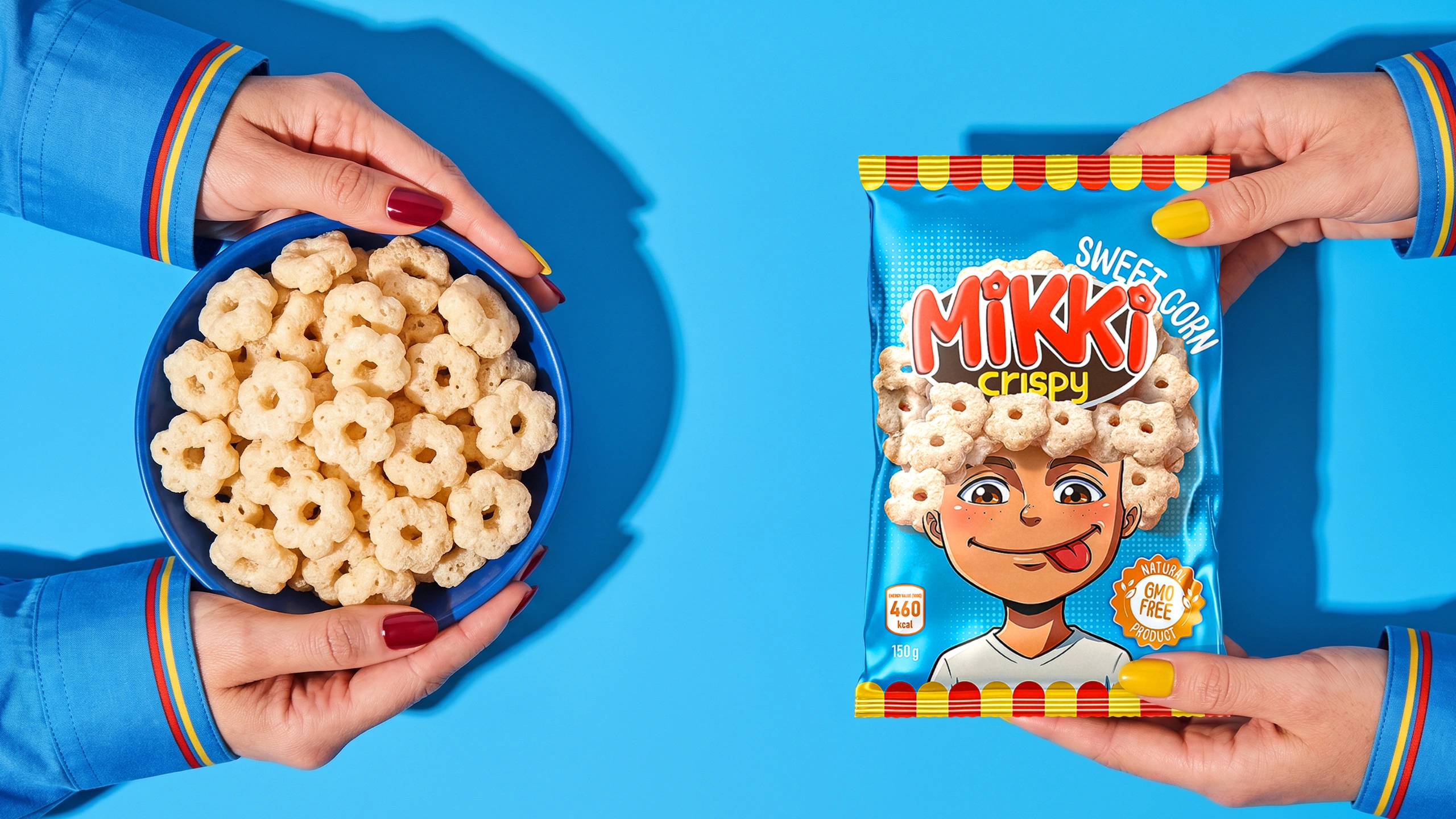
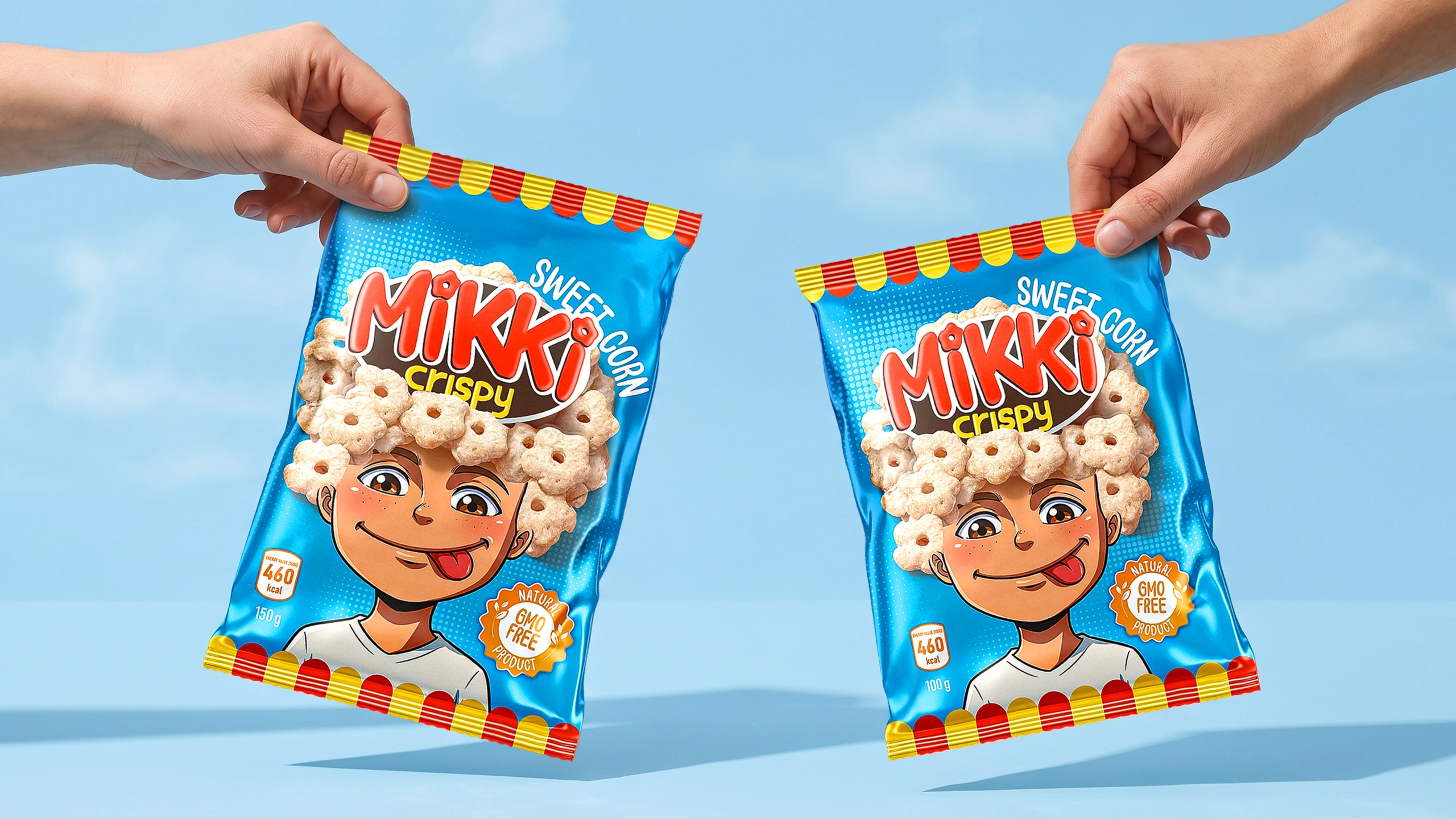
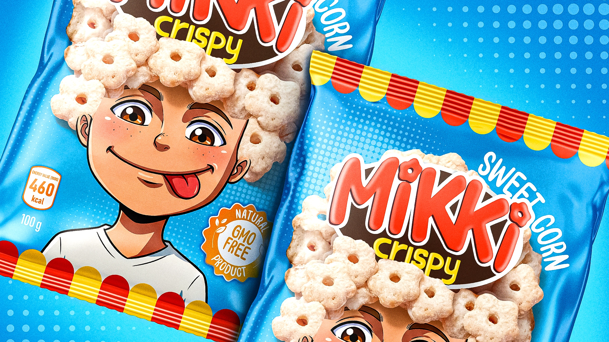
- Corn Flowers Instead of Hair: Inspired by cartoon heroes, we created the character of a cheerful boy. The ultimate "wow" factor of the design is that his curly hair is made entirely of the product itself—the crunchy, flower-shaped snacks. This way, the real appearance of the product came to life creatively, becoming an integral part of the character.
- 100% Handcrafted: In an era completely overrun by artificial intelligence (AI), our illustrators made a point to draw the hero entirely by hand, pouring their souls into the work. Thanks to this, the character turned out incredibly natural, sincere, and full of life, without a single hint of AI-generated artificiality.
- The Easter Egg in the Logo: If you look closely, the dots above the letters "i" in the "Mikki" logo are designed as miniature flowers, exactly replicating the product's shape. It’s these micro-details that make the entire design concept cohesive and flawless.
- Colors and Vibe: For the background, we chose the light blue shade of a clear sky, and added red-and-yellow stripes — circus aesthetics — at the top and bottom to set a festive, holiday mood.
The Result
The logic behind the concept and visual execution was so strong and well-reasoned that the client approved the design in the very first round, without any revisions.
Now, instead of dull templates, the shelf features a joyful character who smiles and playfully sticks his tongue out at the buyer. For the local market, this is a highly bold and unconventional solution.
If you also need to develop a packaging design that perfectly matches your product and strikes right at the heart of your target audience, MINIM agency is always ready to help.