Oppa
There is a lot of competition in the potato chip market, so the only way to enter the market faster and easier is with a product that stands out and has special characteristics. And naturalness has been trending lately.
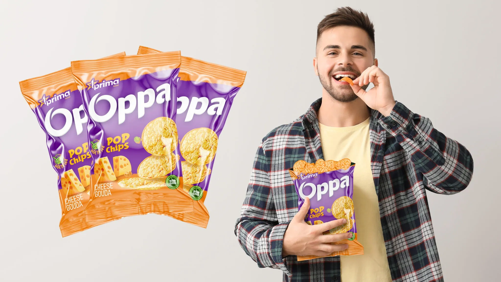
The use of real potatoes, no frying and no GMOs are significant advantages (USP) for chips. Prima Food announced the launch of a new line of chips under the Oppa brand, using these very advantages.
1. Solution
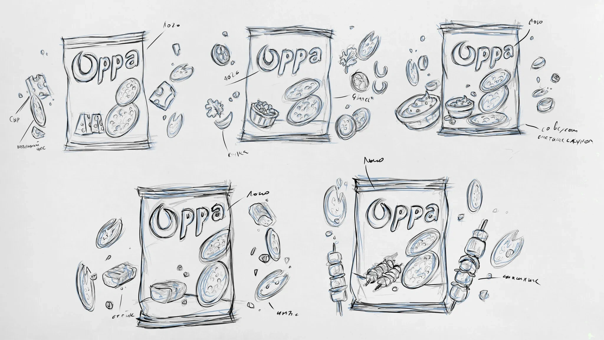
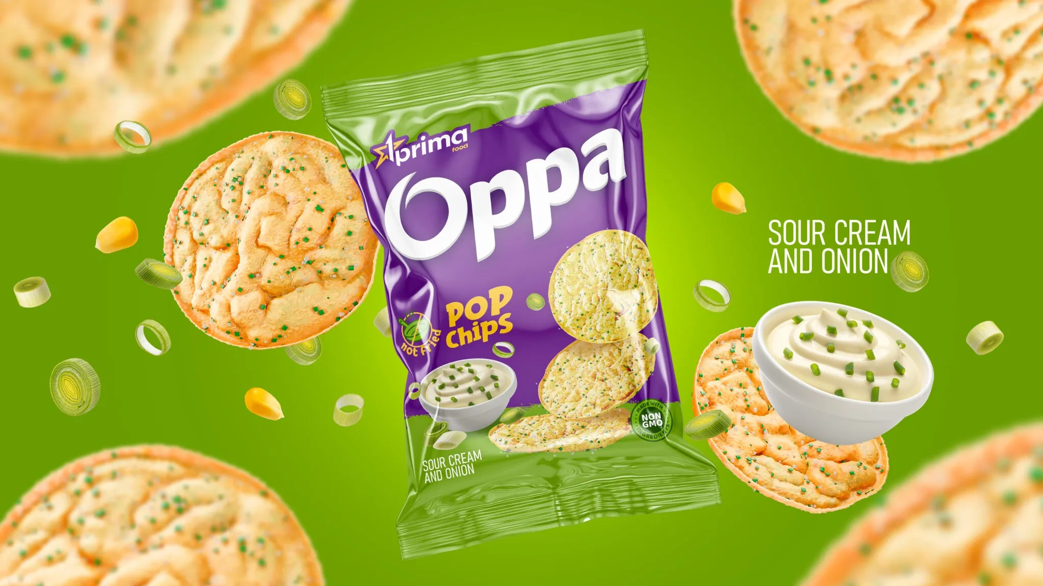
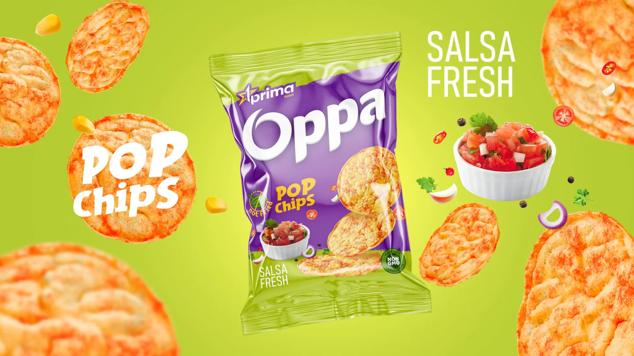
We, in turn, developed a logo and packaging design for the new product. In the font logo, given the rounded shape of the chips and the target audience, consisting mainly of young people, we used a rounded and cheerful style.
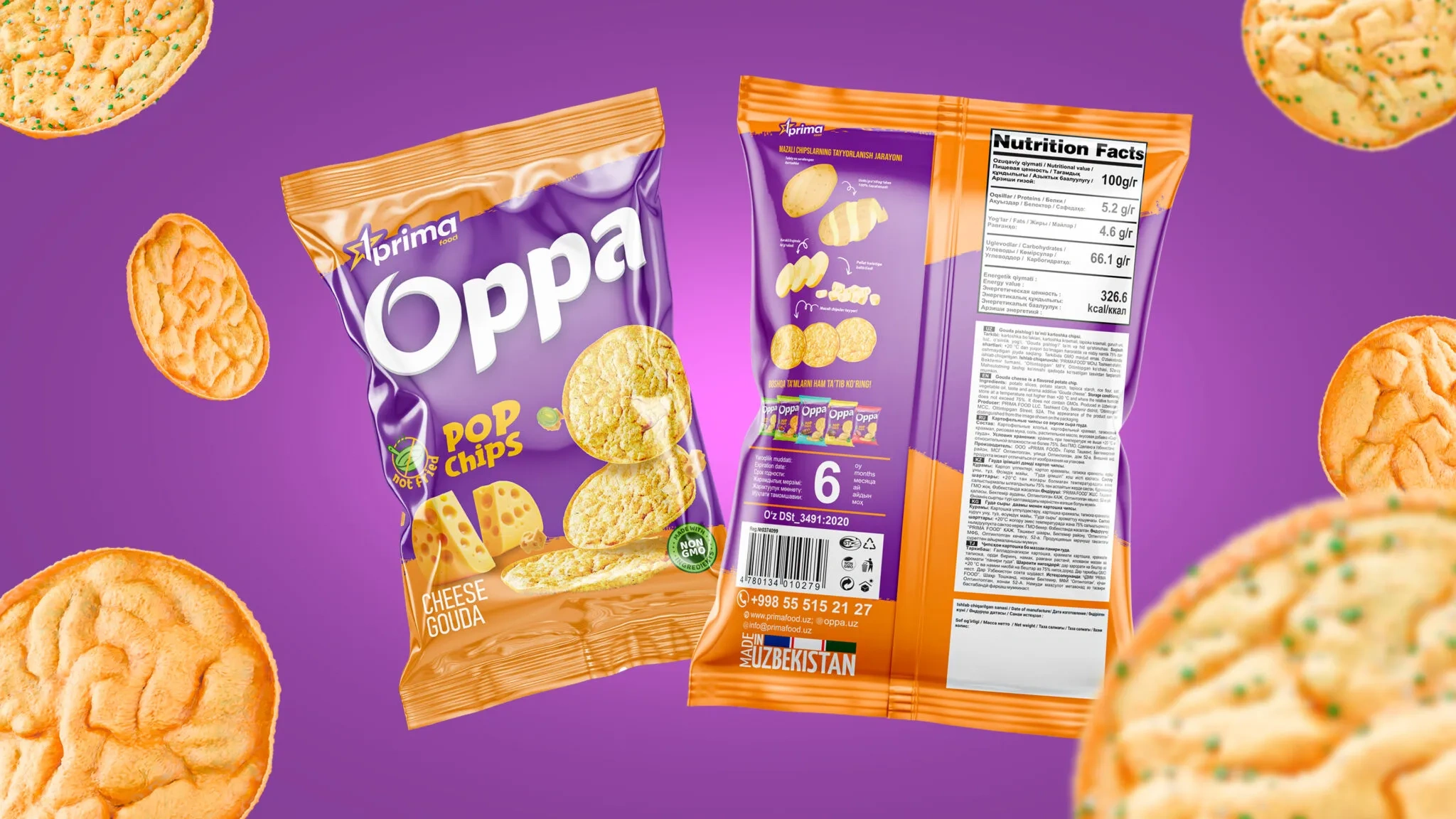
In addition to the name, the central place on the product packaging is occupied by appetizing images of chips. In addition, the packaging separately shows the taste characteristics of the chips. And such advantages as the absence of frying and GMOs were emphasized with the help of icons.

Result
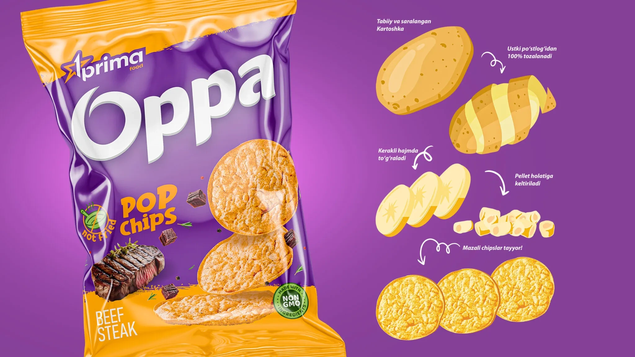
We placed the product composition, its nutritional value, barcode and other important information in the appropriate places on the packaging. In addition, on the back of the packaging we visually showed the stages of production to the final result.
You can always contact the Minim agency for high-quality and thoughtful services in developing packaging design.