Ake – Pure & Refreshing Mineral Water for Hydration | Minim Design
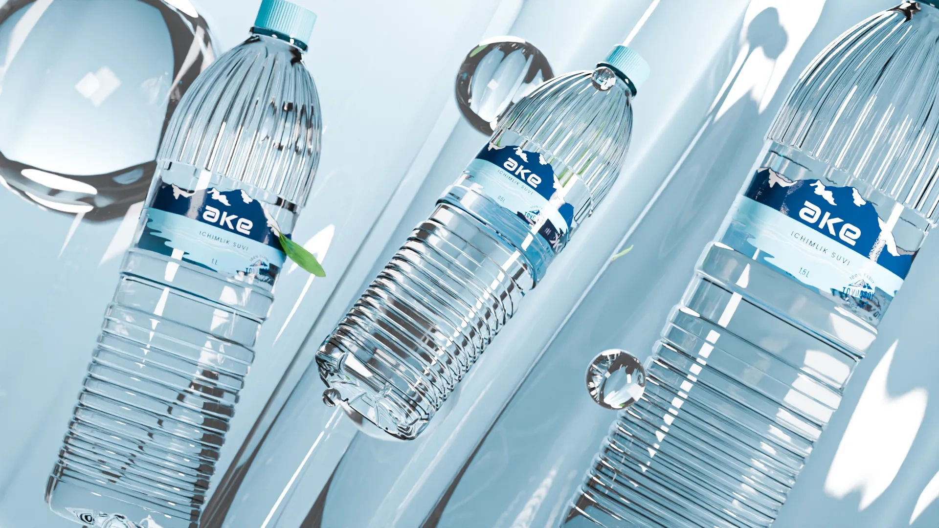
The design of the mineral water packaging embodies the grandeur and naturalness of mountain water. We sought to convey this impression through every detail.
1. Solution
The minimalist logo design has a deep symbolic meaning. The letter "a" in the name "ake" in mirror image creates the letter "e". This symbolizes the unity and harmony that are in the very essence of our water. The soft font with rounded corners reflects the softness and tenderness of this gift of nature.


Result
In the background you can see majestic mountains. They serve not only as a reminder of the origin of water, but also symbolize its strength and energy. The mountains are reflected in the clear water, creating a beautiful mirror image that invites you to a world of purity and natural harmony.