Aloe Vera – Refreshing & Healthy Aloe Drink Packaging Design | Minim Design
Aloe vera drink is very popular in the Uzbek market, but the visual representation of this product repeats the same forms from year to year, forcing the category into a framework that makes products of different brands too uniform for consumer perception.
1. Solution
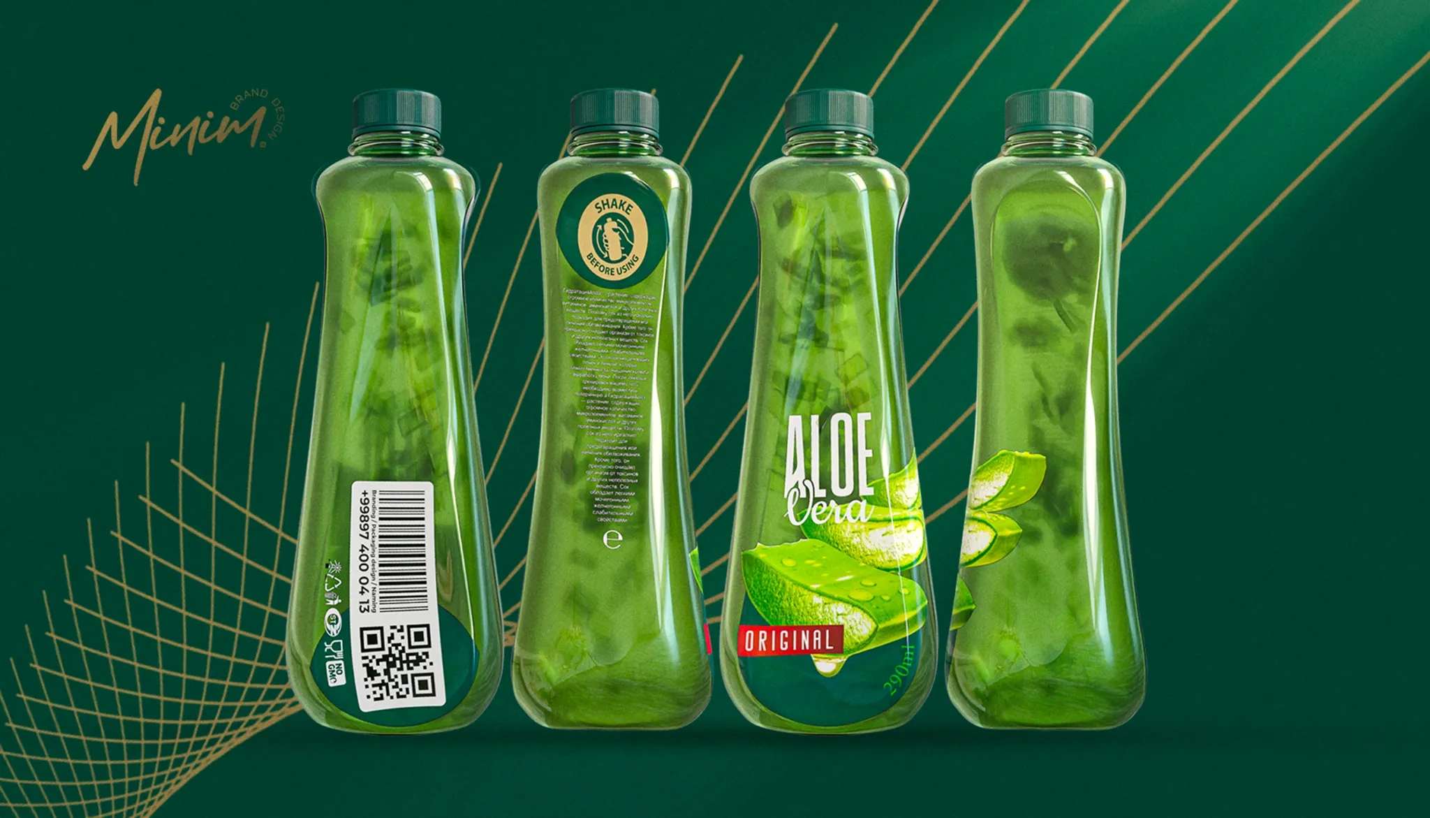
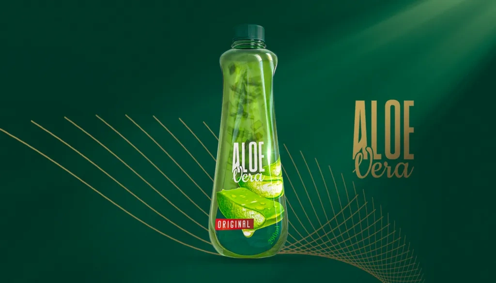
This concept was created specifically to distinguish a certain product from competitors, to give it more liveliness, ergonomics, and to make the overall image of the product more preferable and premium.
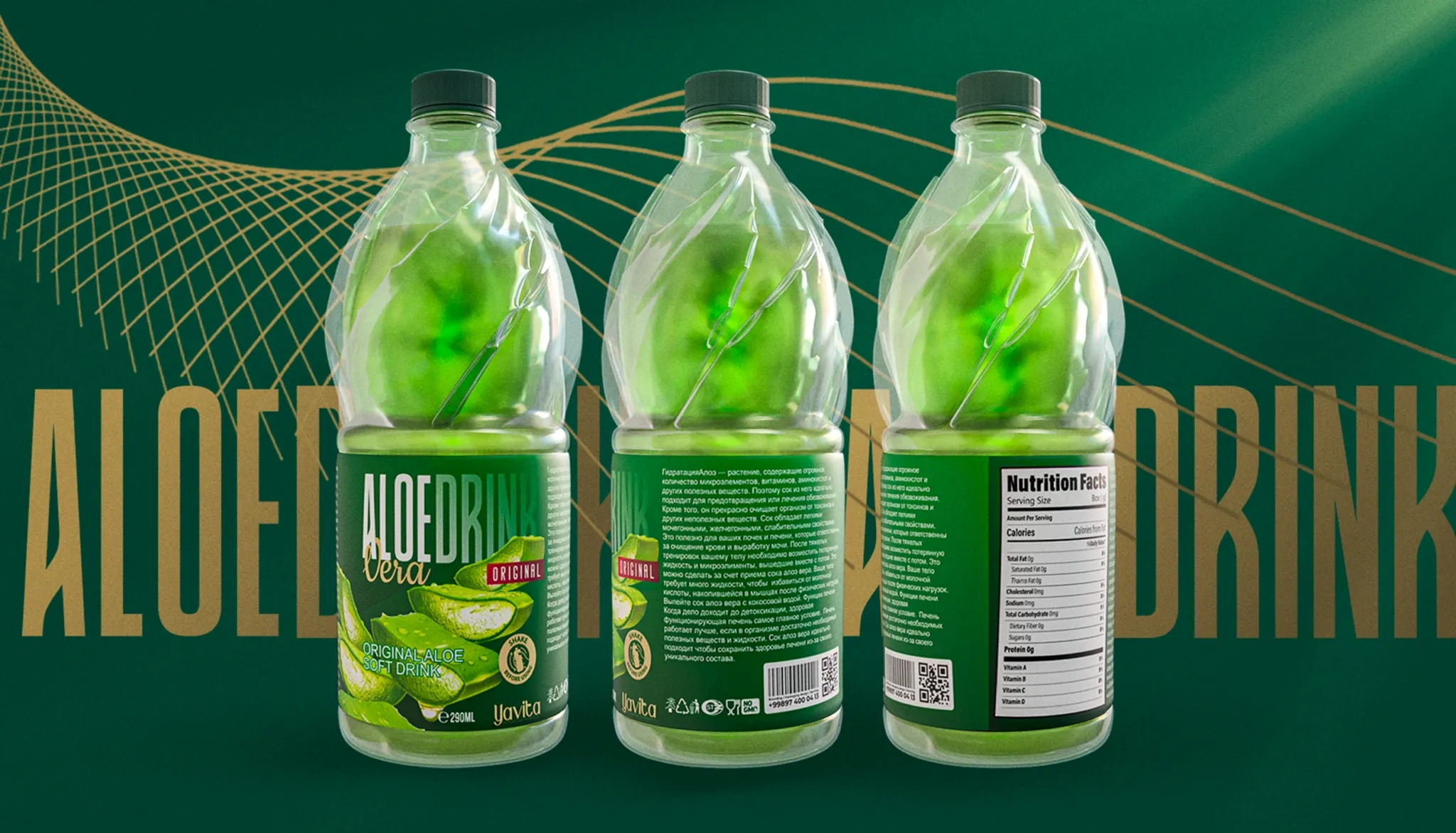
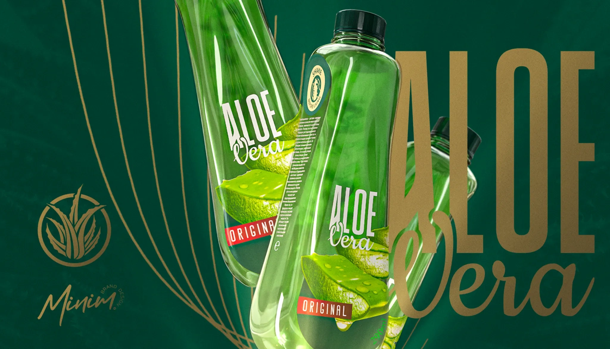
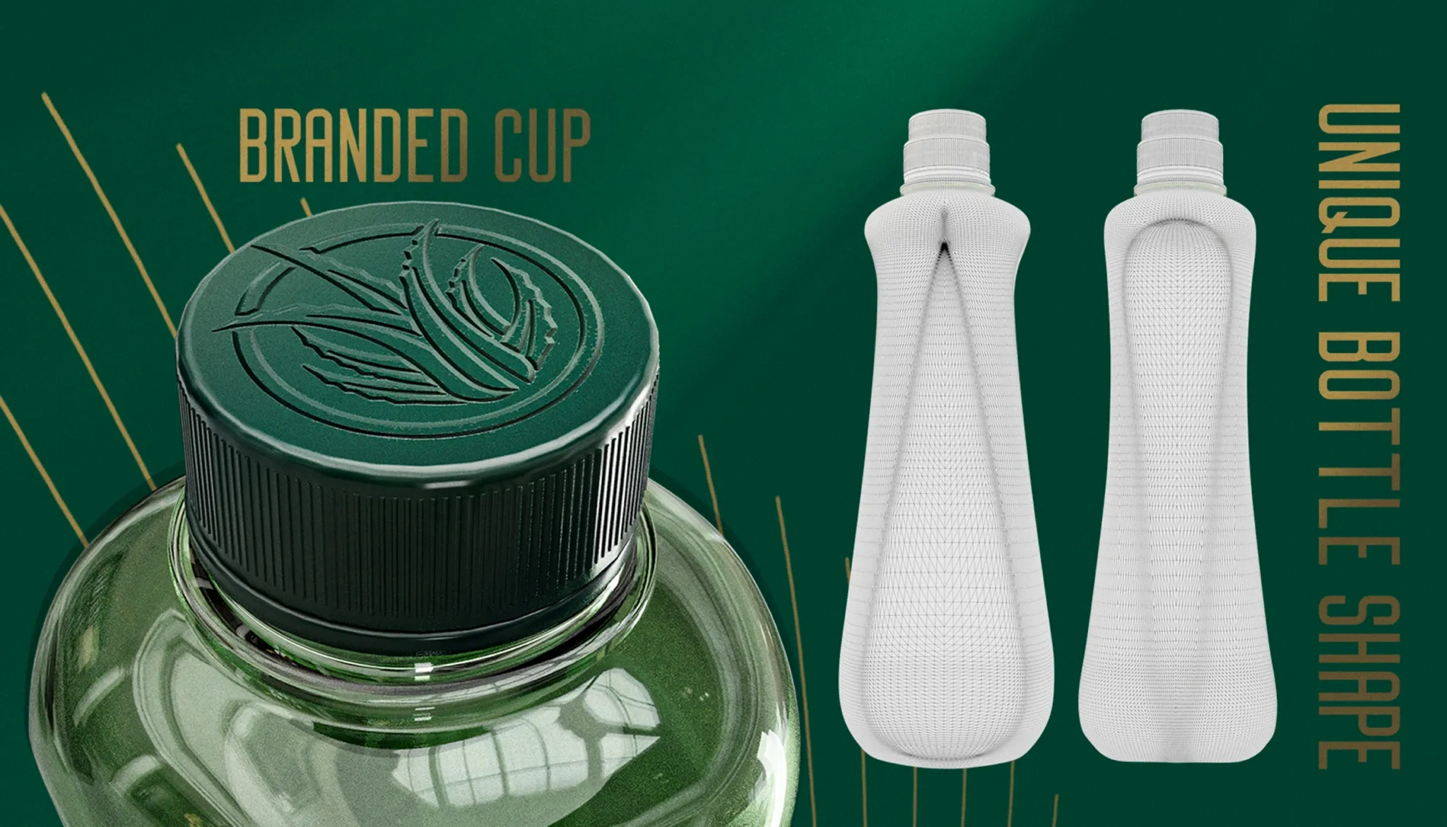
Much attention was paid to the shape of the bottle - it was important to separate it visually and tactilely from competitors, who usually adhere to more square-like shapes, giving the bottle a rectangular look.
Result
In our case, the bottle fits more comfortably in the hand, it is easier to interact with, and the smooth curves are reminiscent of not just an ordinary drink, but refer to something more refined and elegant.
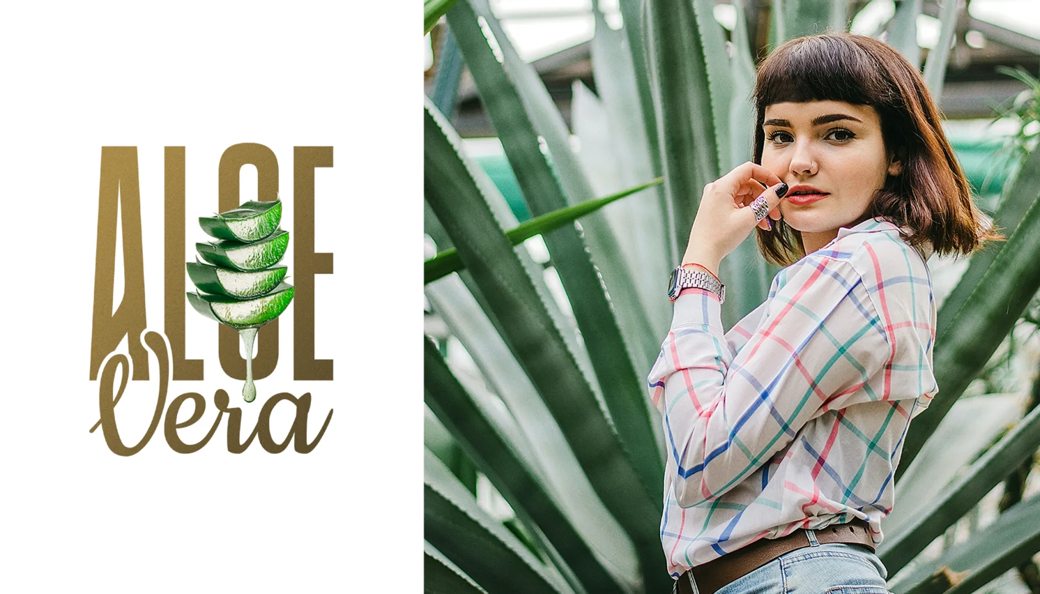
To emphasize the naturalness of the product, we decorated the packaging with aloe leaves, and reduced the visual identity to a minimum so that the consumer could concentrate on the content and shape, and not the labels on the bottle