Aminomaks – Powerful Amino Acid & Vitamin Complex Packaging Design | Minim Design
The packaging design of Aminomaks combines modern aesthetics with functionality, reflecting the professionalism and reliability of the product. The final result highlights high-quality standards and captures the attention of consumers.
1. Task
Our aim was to design packaging for vitamin supplements that would stand out in the market, while maintaining a professional and mature style that appeals to the adult consumer.
2. Analysis
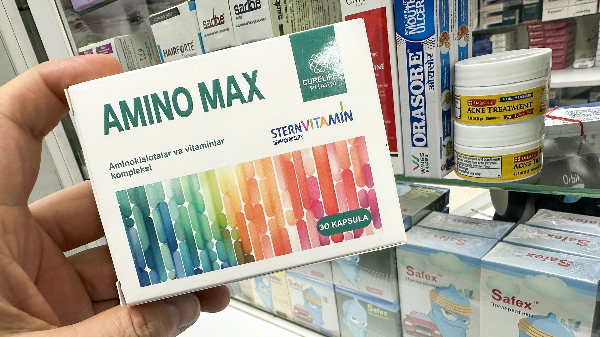
After conducting market research, we found that most vitamin supplement manufacturers use bright and saturated colors in their packaging. However, considering the specific nature of our product and its target demographic, we decided to deviate from this trend.
3. Decision
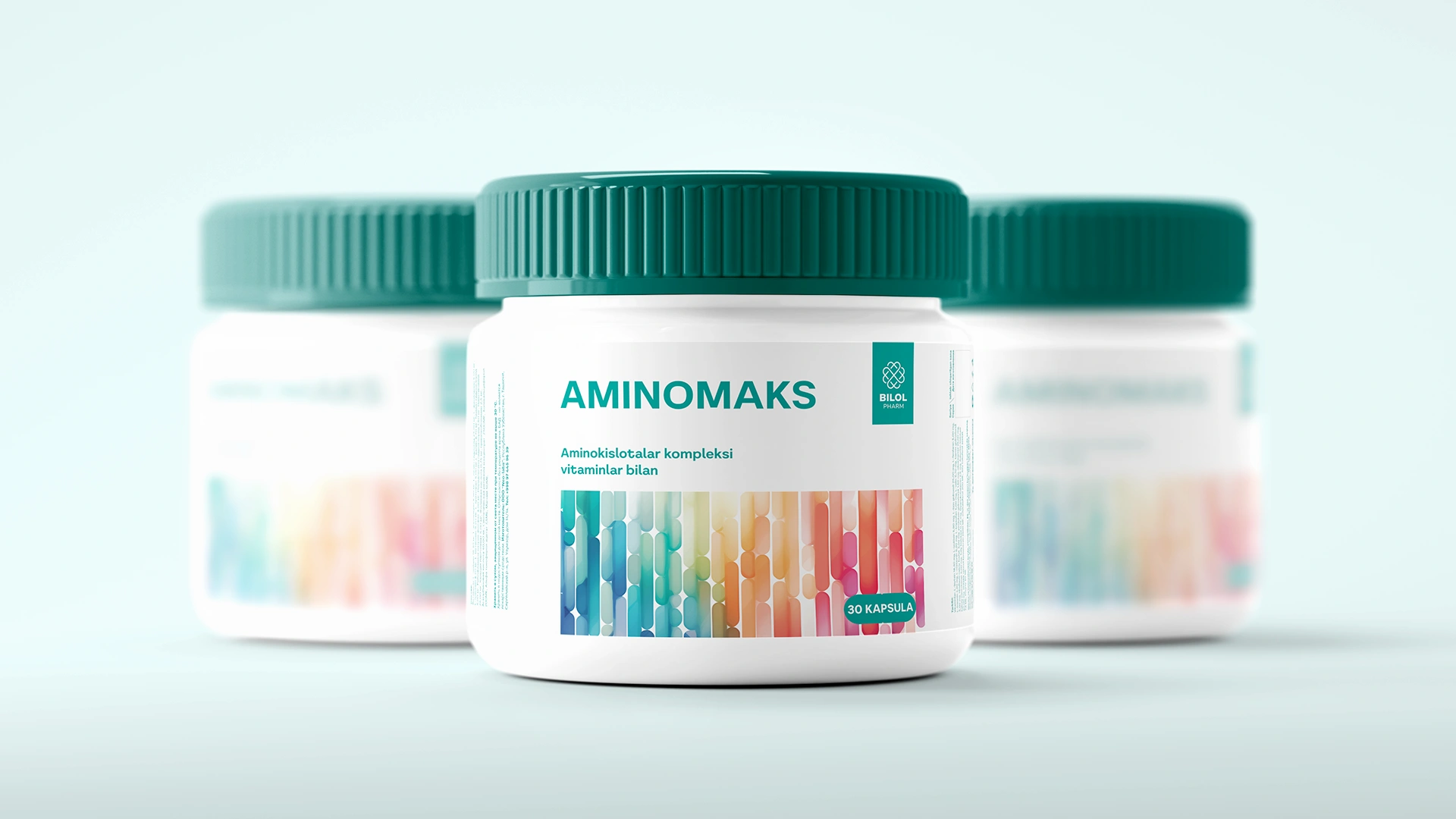
We opted for watercolor shades, as they have been shown through neuromarketing studies to be perceived as calming and therapeutic, reducing anxiety levels by 15-20%. This color palette helps create a sense of trust and confidence in the brand for consumers.
Additionally, research indicates that the human eye processes images of softer colors approximately 12% faster, making such packages more visually appealing. Furthermore, packages with gradient colors attract attention approximately 30% more frequently than monochromatic solutions, enhancing the overall visual appeal of the product and helping it stand out on store shelves.

Result
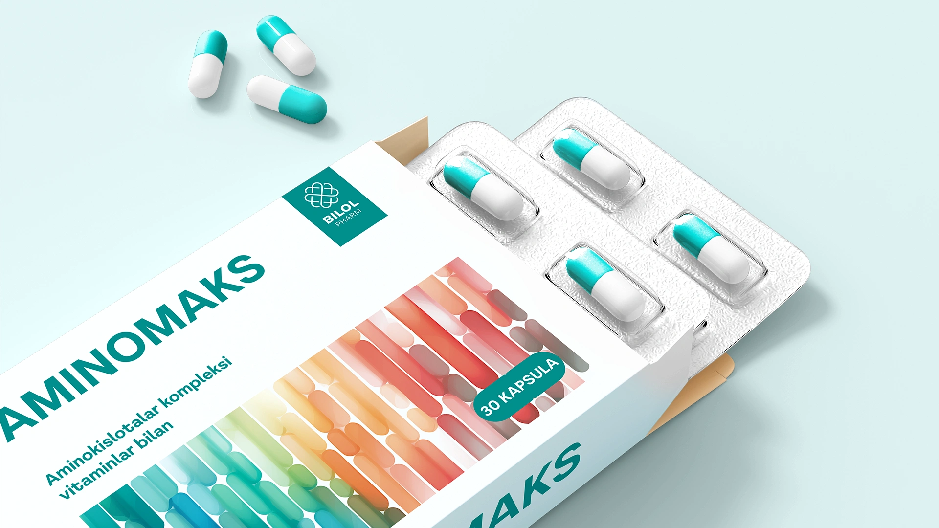
As a result, we have managed to strike the perfect balance in our new packaging design. On the one hand, the multicolored design retains the symbolism of a rich vitamin complex. On the other hand, thanks to the use of watercolor shades, the packaging appears restrained and professional, ideal for the adult market. This fully satisfies the client's requirements. We are confident that this new product, with its packaging, will soon find its rightful place on pharmacy shelves.