Cross – Crunchy & Flavorful Sunflower Seeds Packaging Design | Minim Design
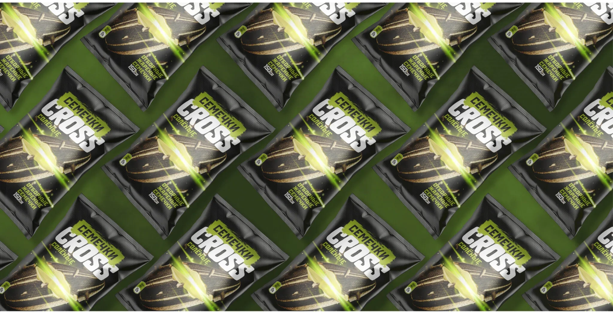
Cross is a local sunflower seed producer who approached us for packaging design.
1. Solution
We built all the work around the product naming – cross means “to cross”, “to meet”, because when we meet with friends, we think about seeds.

Result
The visual code of the packaging also conveys the meaning of the word - we crossed the seed and divided it into two parts, thereby also making a unique reference to the theme of a meeting of two friends.
As a result, we created a dynamic, bright and attractive design for the brand's target audience - young people.