Detox Energy – Minimalist & Clean Energy Drink Packaging Design | Minim Design
The packaging design concept for the Detox energy product was developed in a minimalist style, without unnecessary details, to draw the consumer's attention to the main purpose of the product - detoxification of the body.
1. Solution
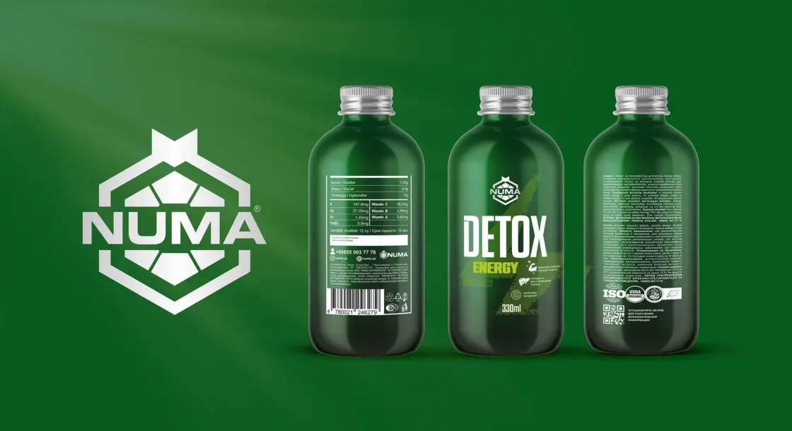
The main color of the packaging was chosen to be dark green, which is a symbol of health and recovery. Dark green can also have a calming effect on consumers, which is important for people looking for products to heal the body.
Result
On the front of the package, we used the laconic name “Detox energy”, which clearly and understandably describes the function of the product. We also used an image of lightning on a dark green background. Lightning is a symbol of energy, dynamism and strength, which helps to express the idea that the product helps people feel more alert and energetic.