Esla – Creamy & Indulgent Chocolate-Coated Eskimo Ice Cream | Minim Design
The Zenit brand, an ice cream producer in Uzbekistan, faced a challenge: it was necessary to create a unique identity that would distinguish the new product from competitors and emotionally connect it with cultural values. We were faced with the task of developing a naming, logo and packaging design for a new line of ice cream. The company's existing position did not convey its uniqueness and did not reflect the high quality of the products.
1. Solution
We started with a thorough analysis of the target audience and the market. We interviewed consumers to understand their preferences and expectations. We paid attention to the importance of traditions and emotional connections in the choice of sweets, in particular ice cream. The logo itself had to be simple and memorable, reflecting the core values of the brand.
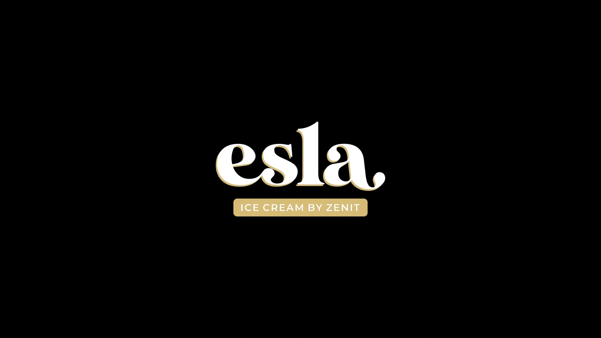
Based on the data we received, we proposed the name "Esla", which means "remember" in Uzbek. The inspiration for the naming came from Uzbek culture, as well as from the popular song "Eslab-eslabˮ" performed by Farrukh Zakirov, emphasizing the importance of memory and connection with the past.


Result
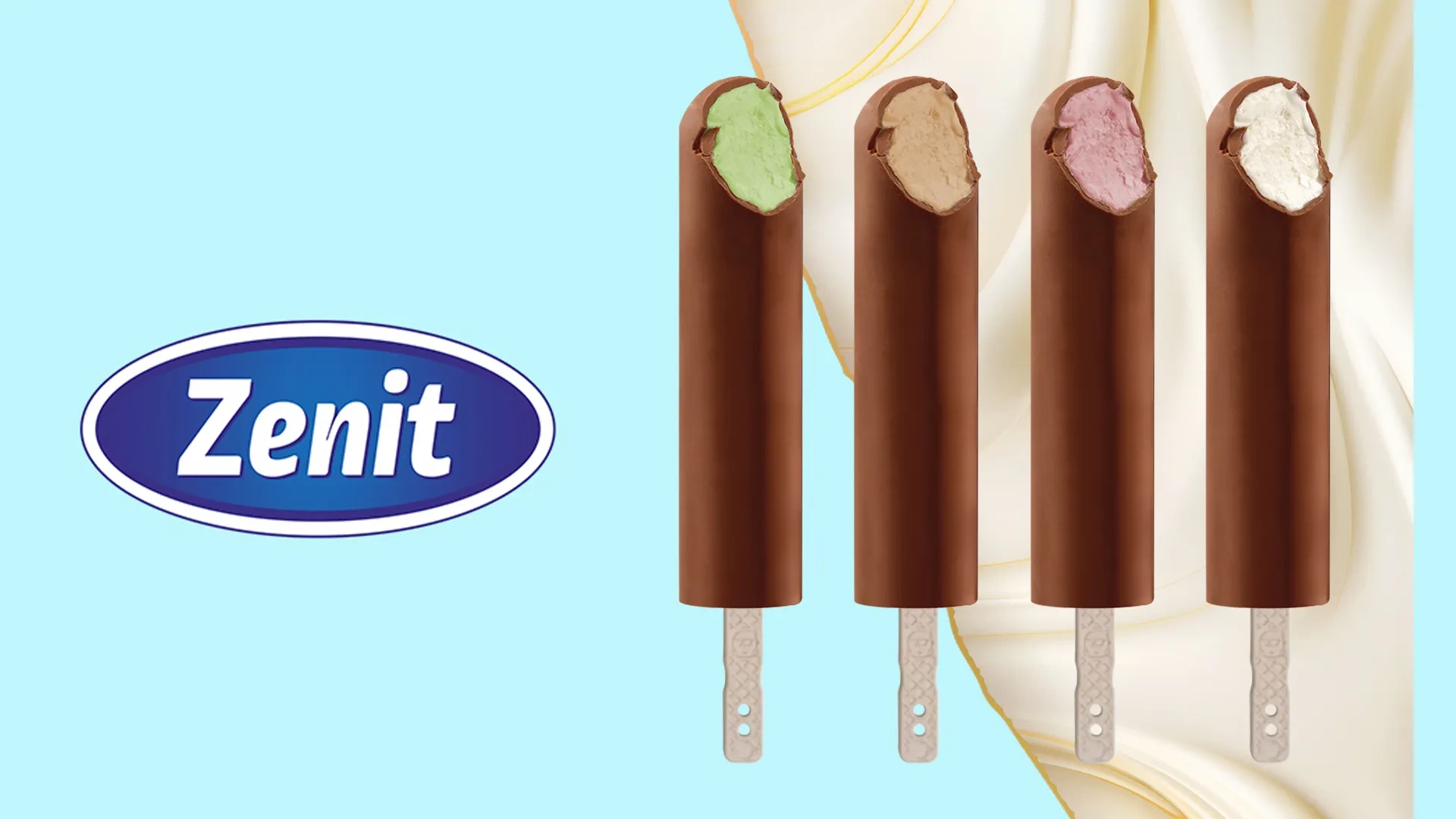
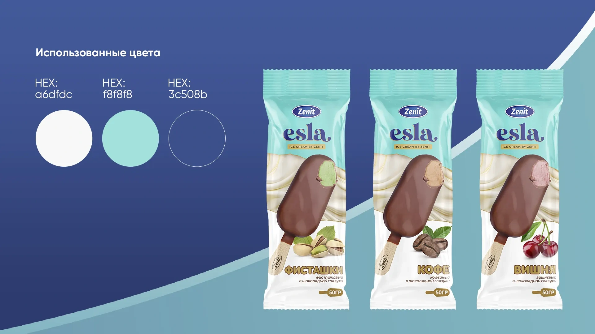
This name became the basis for creating a bright and memorable identity. The logo was made in blue and consisted of typography, which emphasizes the reliability and professionalism of the brand. For the ice cream packaging, we used a soft turquoise background color, which symbolizes freshness and lightness.
We also proposed a chic marketing strategy for the product: small ice creams that are quickly eaten. These ice creams are sold both in boxes and at retail, which allows consumers to buy ice cream in larger quantities for their children and relatives.
Thus, with the help of a new naming, logo, packaging and marketing strategy, we helped the Zenit brand take a unique position in the ice cream market, linking it with traditions and culture, which makes the product attractive to a wide audience.