Nushi – Gentle & Refreshing Wet Wipes for Everyday Use | Minim Design
The client approached our agency with the task of developing a naming, logo and packaging design for a new product - wet wipes, which would reflect the brand's values, such as care, tenderness and safety.
1. Solution
Solution
Naming: The name "Nushi", borrowed from the Japanese language, means "master" - a symbol of responsibility and care for those under guardianship. This choice emphasizes the brand's desire to provide the most gentle and careful skin care.
Logo
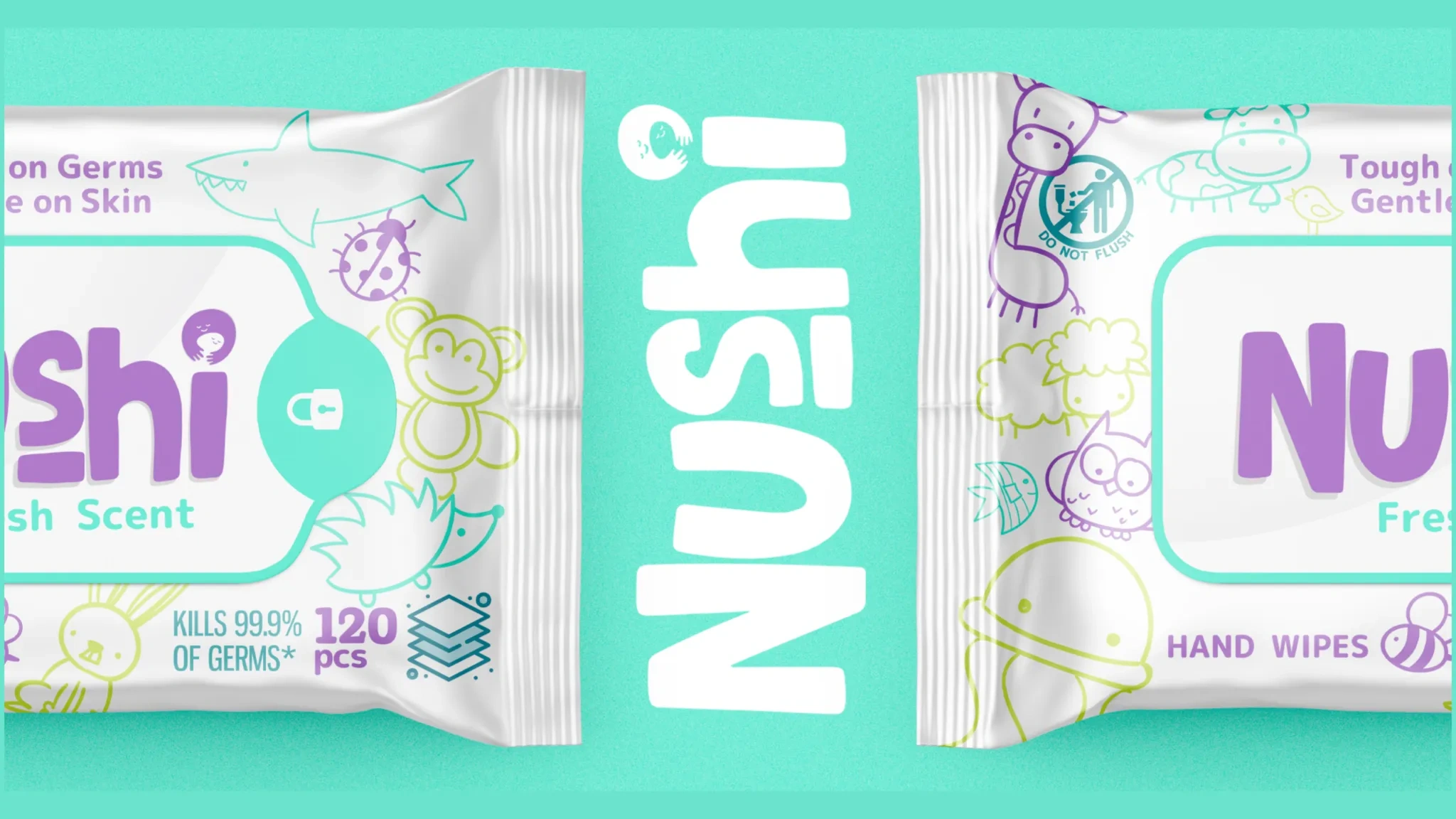
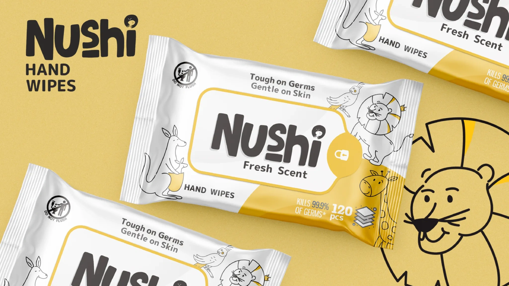
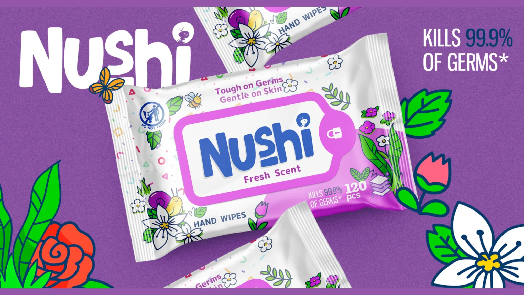
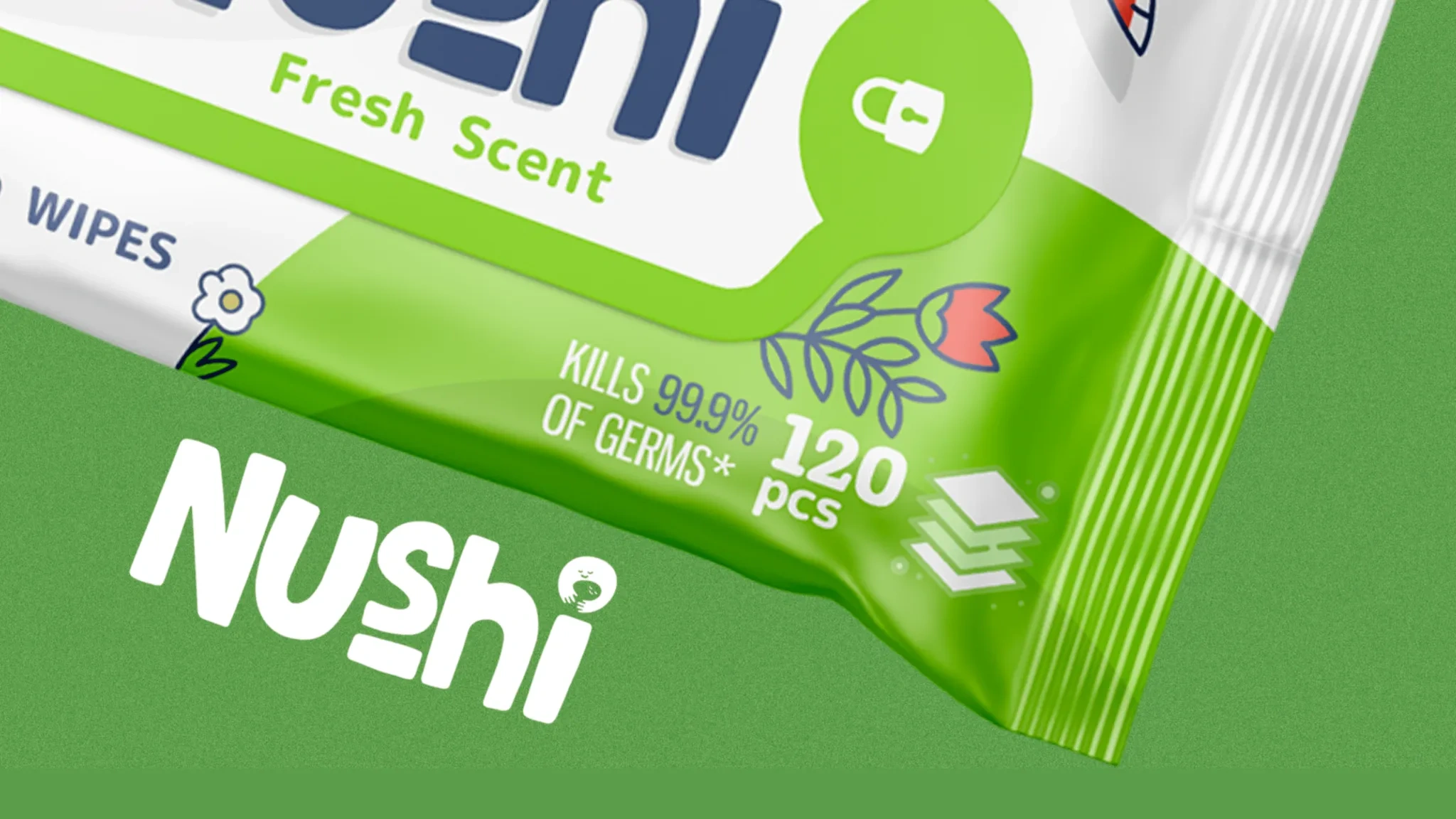
The logo is based on the image of a smiling face hugging a child. This image conveys the warmth, care and affection with which Nushi brand products surround their users. The color scheme in green tones was chosen to associate with safety, nature and tranquility.
Result
Packaging design
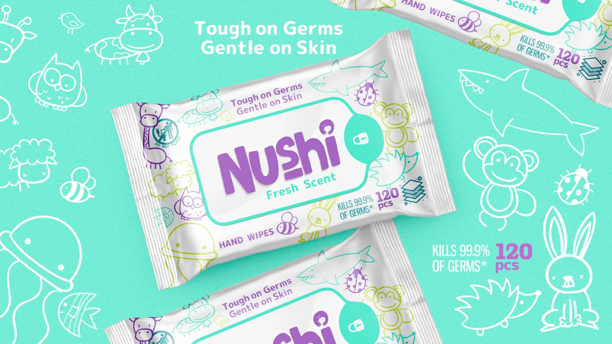
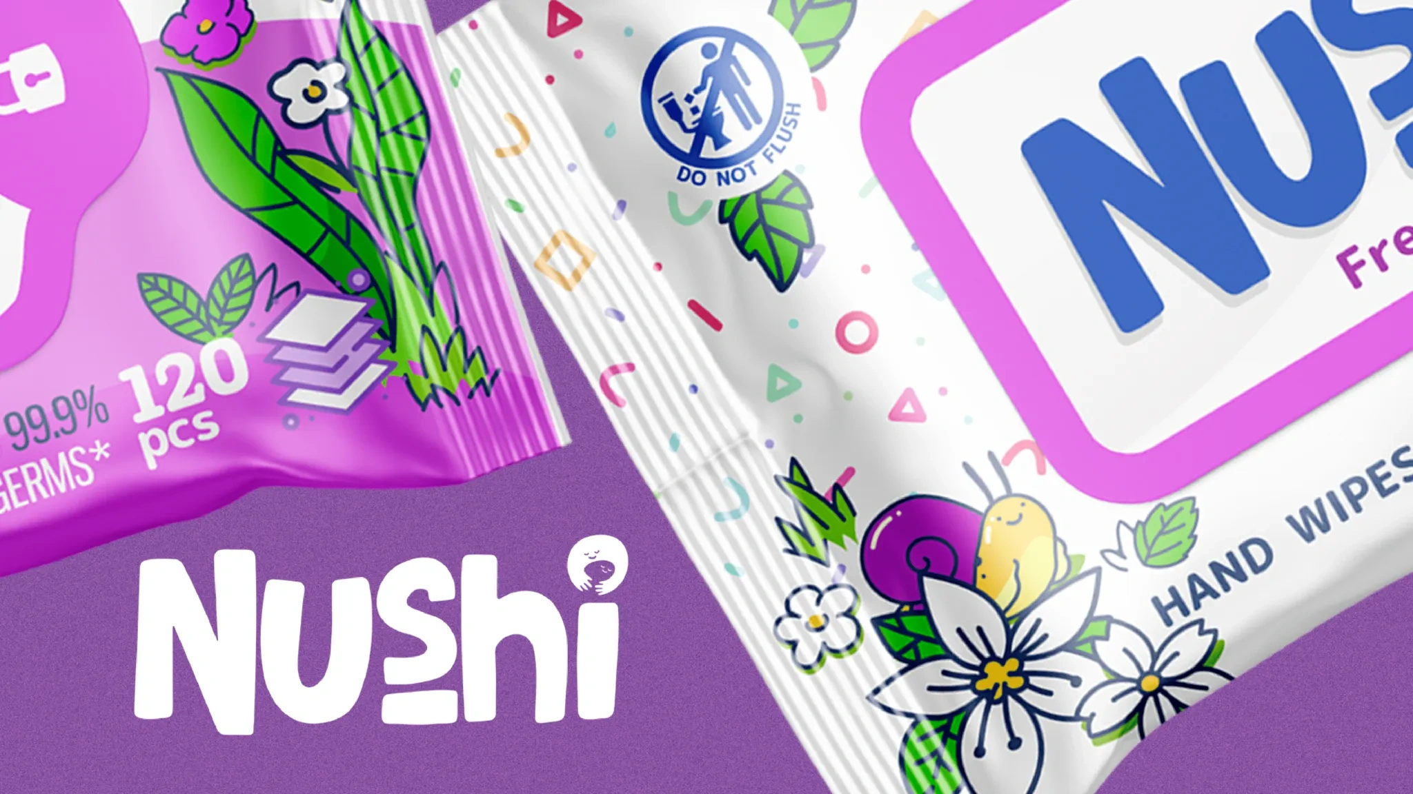
We focused on the key values of the brand: care, tenderness and safety. The use of bright colors and funny pictures of animals makes the packaging friendly and safe, which will especially appeal to families with children. We added elements of nature and funny symbols so that customers know: Nushi is a reliable choice for daily skin care.
Result
The developed naming, logo and packaging design played an excellent role in recognition and trust in the product. They not only accurately reflect the key aspects of the brand, but also successfully form its visual identity. This solution will allow Nushi to take its place in the wet wipes market and build an emotional connection with consumers.