Potto – Soft & Reliable Baby Diapers Packaging Design | Minim Design
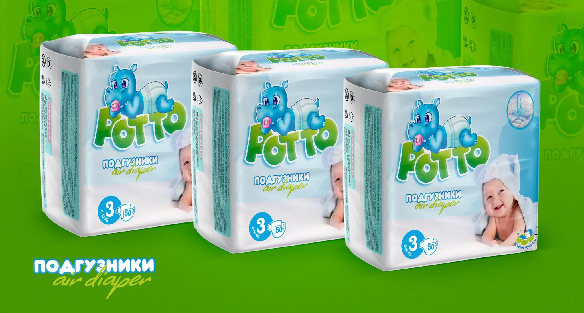
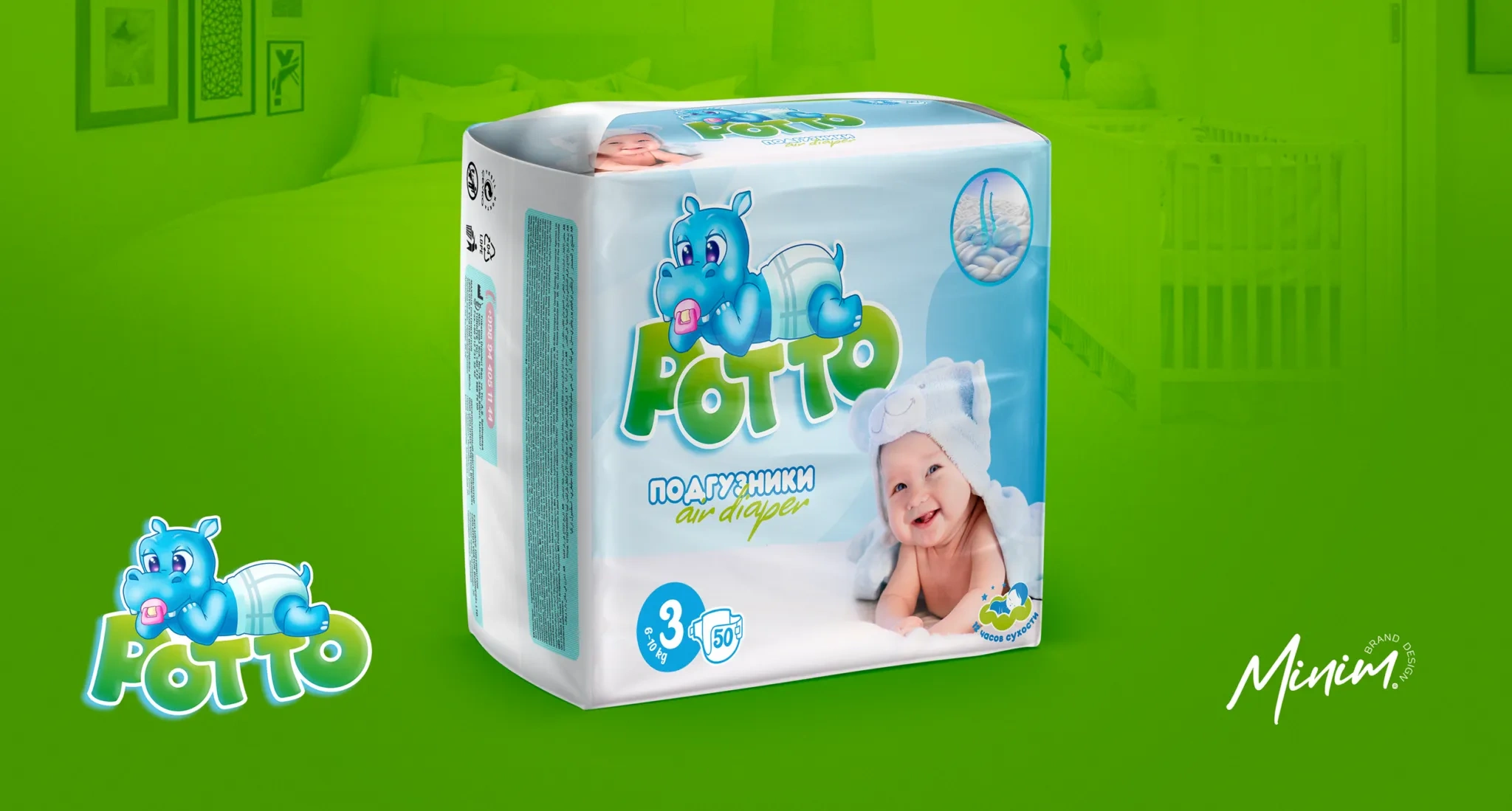
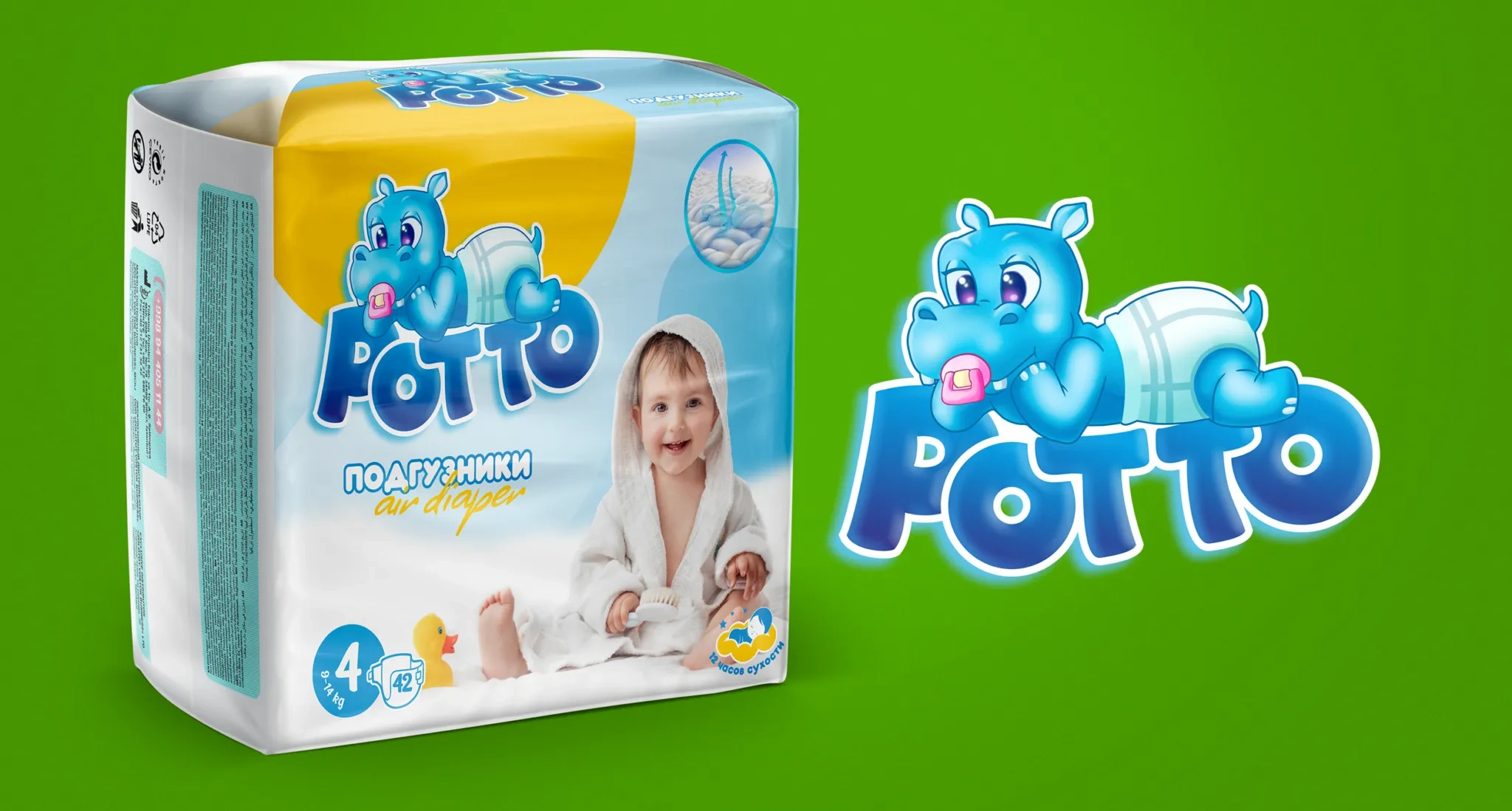
Potto is a locally produced baby diaper with a convenient range of sizes. The brand came to us for an identity that could distinguish them from competitors and clearly show the advantages of the product - convenience and comfort for babies.
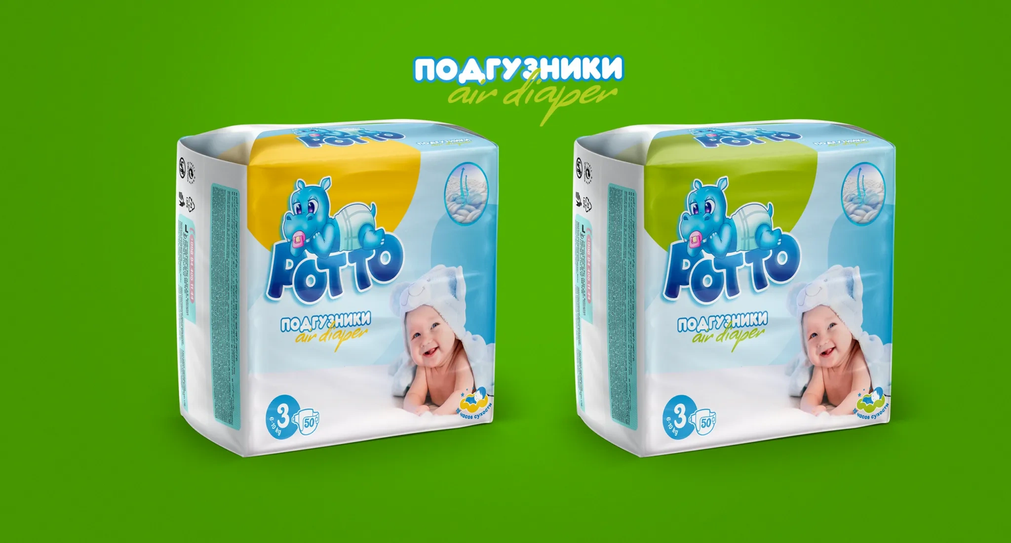
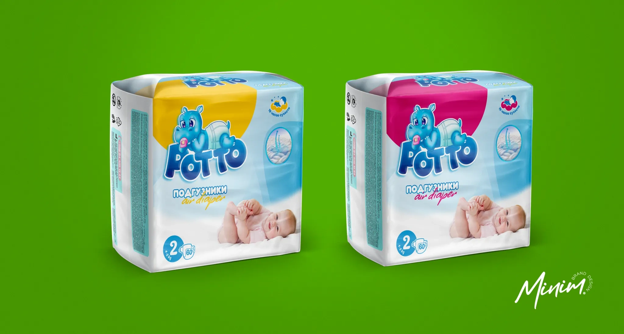
Having studied the market, consumers and context, we came to the conclusion that we needed a mascot with which children could unconsciously associate themselves, as well as for direct demonstration of the product on the packaging.
1. Solution
The naming had to sound childishly joyful, memorable and easy to pronounce for the entire population of Uzbekistan.
As a result, we came to the conclusion that the naming Potto would ideally solve our problem, while at the same time referring to the product mascot - a hippopotamus, who always wears Potto diapers.
Result
The overall visual style of the product was made in a child-friendly form, using complementary pastel colors, for a more pleasant and calm perception by the child audience.
The location of the mascot itself on the packaging also plays an important role, it is based on the habits of children of different ages - somewhere they only lie, somewhere they are already starting to crawl, and somewhere they are almost standing on their feet.
All work with the visuals, including drawing the mascot and developing the typography, was done manually, with attention to every detail, so that the final result would be as original and distinctive as possible for both the category and the market as a whole.