Rapm
RAPM — is a brand of shampoos and gels for men produced by a local company. RAPM products are made using natural extracts and components to make daily hygiene a pleasant experience for even the most energetic, not very emotional and sentimental men.
1. Solution
Our task was to comprehensively rebrand the brand while maintaining a visual image that is familiar to current customers. To achieve this, we tried to update the appearance while preserving the key elements of the brand.
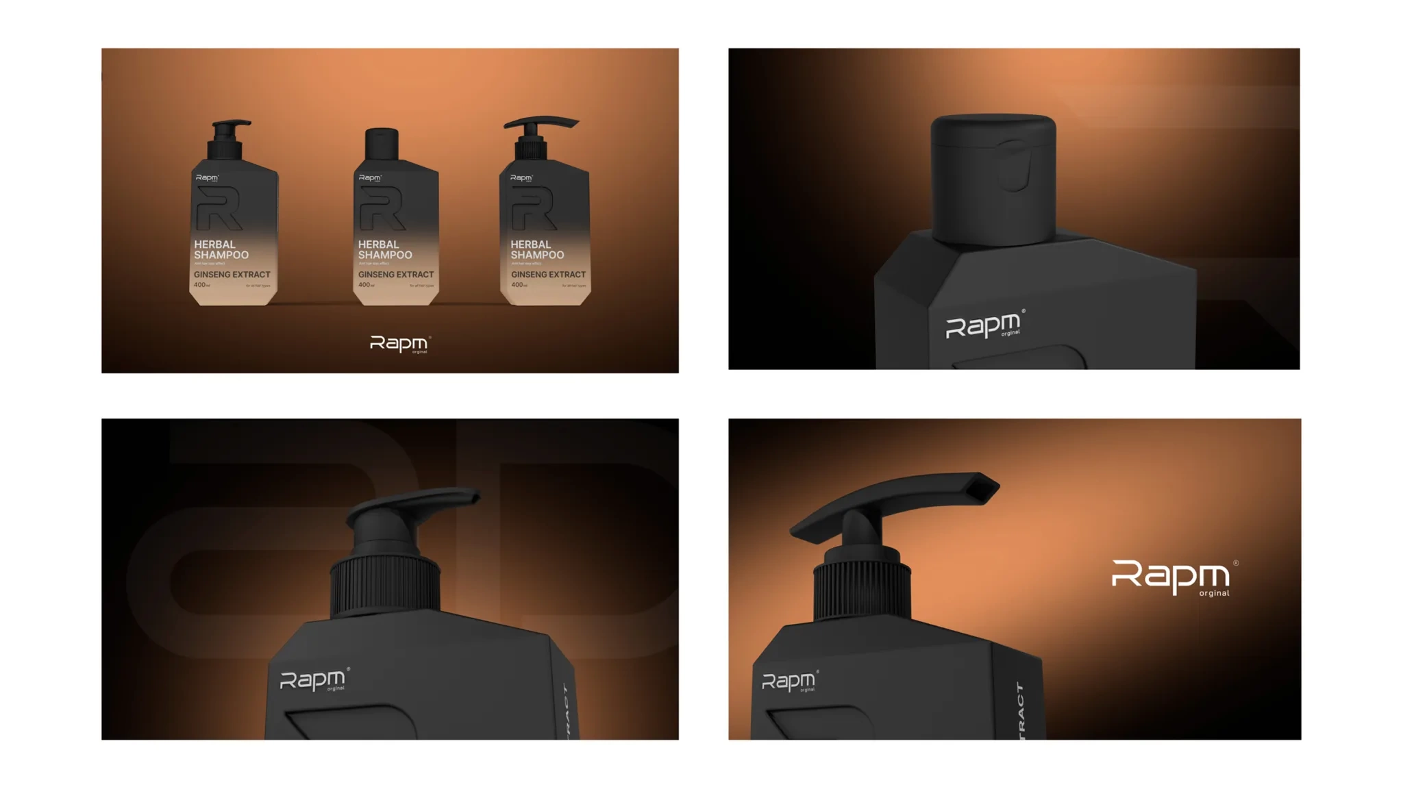
We also paid special attention to expressing the masculine nature of the packaging: it became sharp, serious, strict and clear.
Creating a unique style that combines elements of minimalism and premium design was one of the most important tasks within the project.
Result
Given that this product is promoted by bloggers and influencers, we focused on creating a packaging that would be attractive and dignified for the general public on various social media platforms.
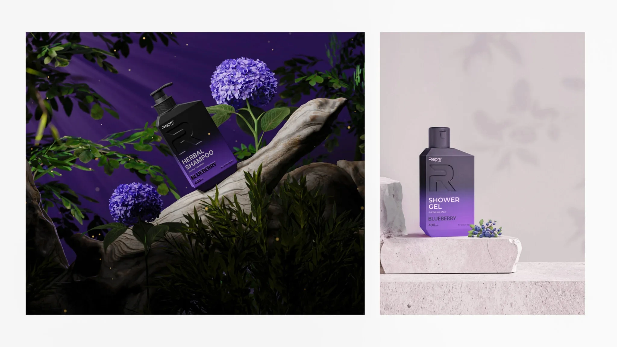
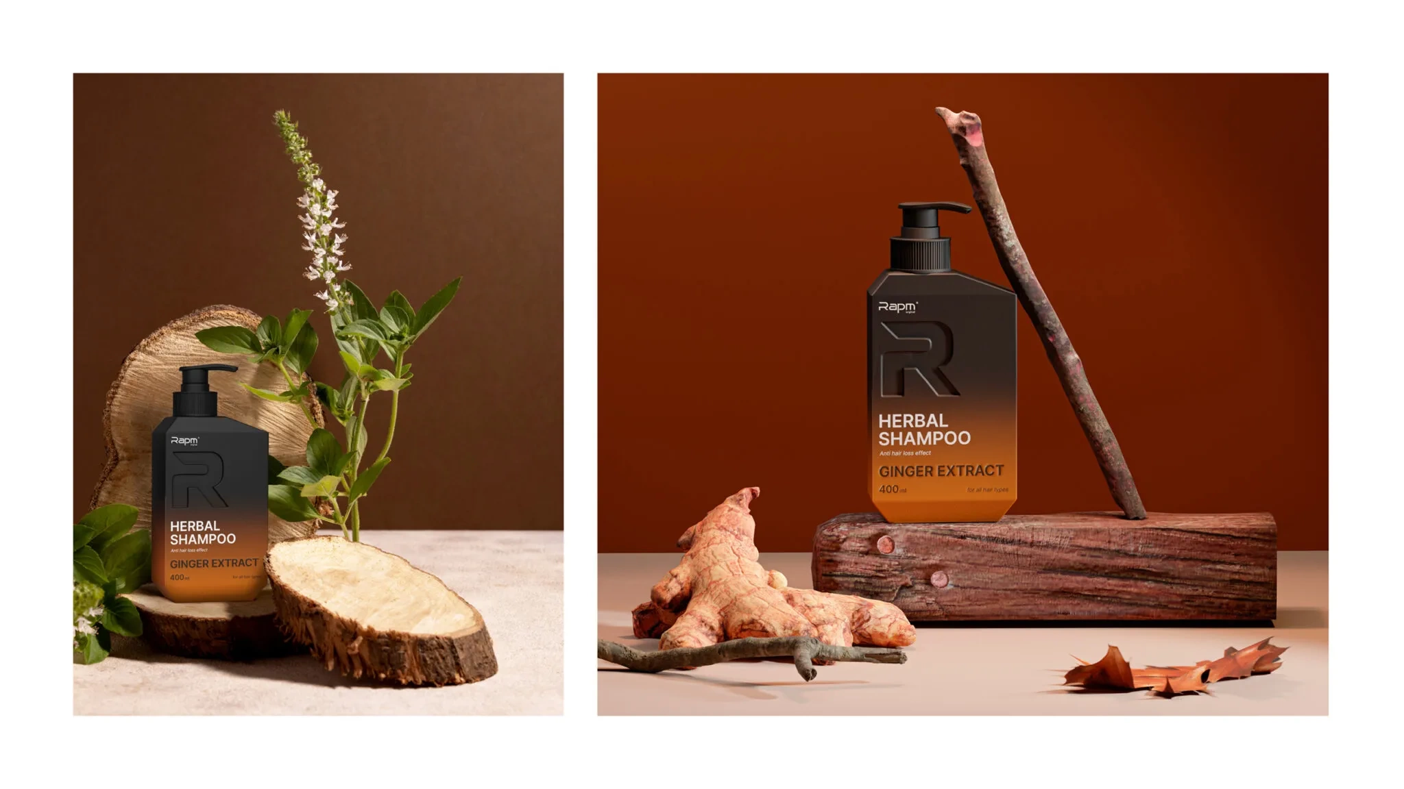
The color solution was also based on all of the above criteria. To express the diversity of our products, we combined black with other brighter colors: black and silver to represent cedar oil, elegant pink to represent blueberries, bright carrot to represent ginger, and ginseng to represent ginseng. we combined light brown.
In addition, we left space on the packaging to reflect the various features of the product: for example, these shampoos have an effect against hair loss, which is extremely important information for the audience, so it must be indicated on the packaging.
In the end, the product acquired a visual identity (unique style) and packaging that would suit any business purpose, and RAPM products began to increase sales.
