


Udar — Sunflower Seed Packaging Design
Cracking sunflower seeds isn't just a habit; it's a kind of national sport that's in our blood! Whether you're chatting at the teahouse or watching TV series with the family, there is always a bowl of seeds in the middle of the table. Recently, a new brand entered this red-hot market, and we were tasked with creating its packaging design.
1. Problem and Task
Our client came to the agency with an approved logo and brand color (green). The logo featured the word "UDAR" written in thick, bold letters.
Let's be honest, what comes to mind when you first hear this word? Naturally, boxing gloves, aggression, or a street fight. If we had adapted the packaging design to the direct meaning of this name and decorated it with fists, fire, or similar aggressive elements, we would have done more harm than good. A product with such a design would only be bought by street toughs (and even that is highly questionable).
Our main task was, despite the aggressive name, to bring the product to a universal position and create a classic packaging that any audience could buy without hesitation.
2. Research
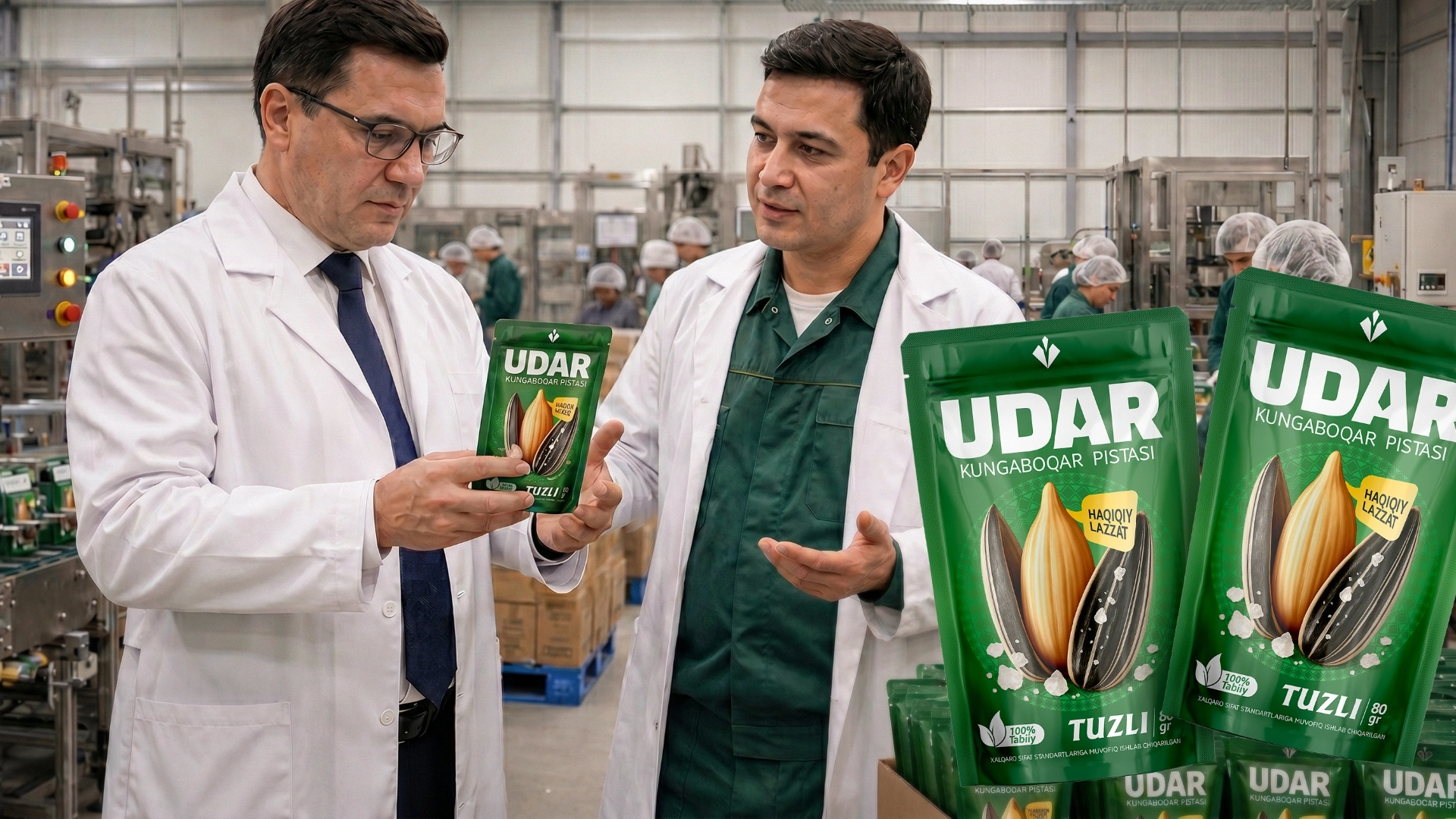
To solve the problem, we started by studying the product itself and its contents. According to the client, these packages would be filled with the famous Chinese "363" caliber seeds—meaning the most select, large, and high-quality seeds on the market.
Based on this insight, we needed to forget the fighting connotation of the word "udar" (strike/blow) and emphasize its second, slang meaning—"killer (i.e., awesome, incredible, top-tier) quality." The buyer eats the kernel, not the shell. Therefore, we decided to focus entirely on the product's main advantage: the large size of the kernel.
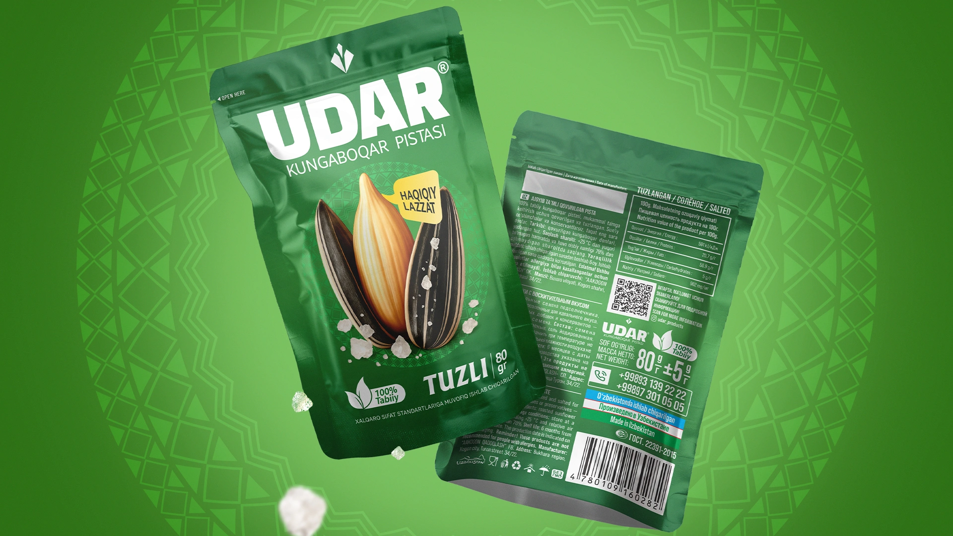
3. Solution
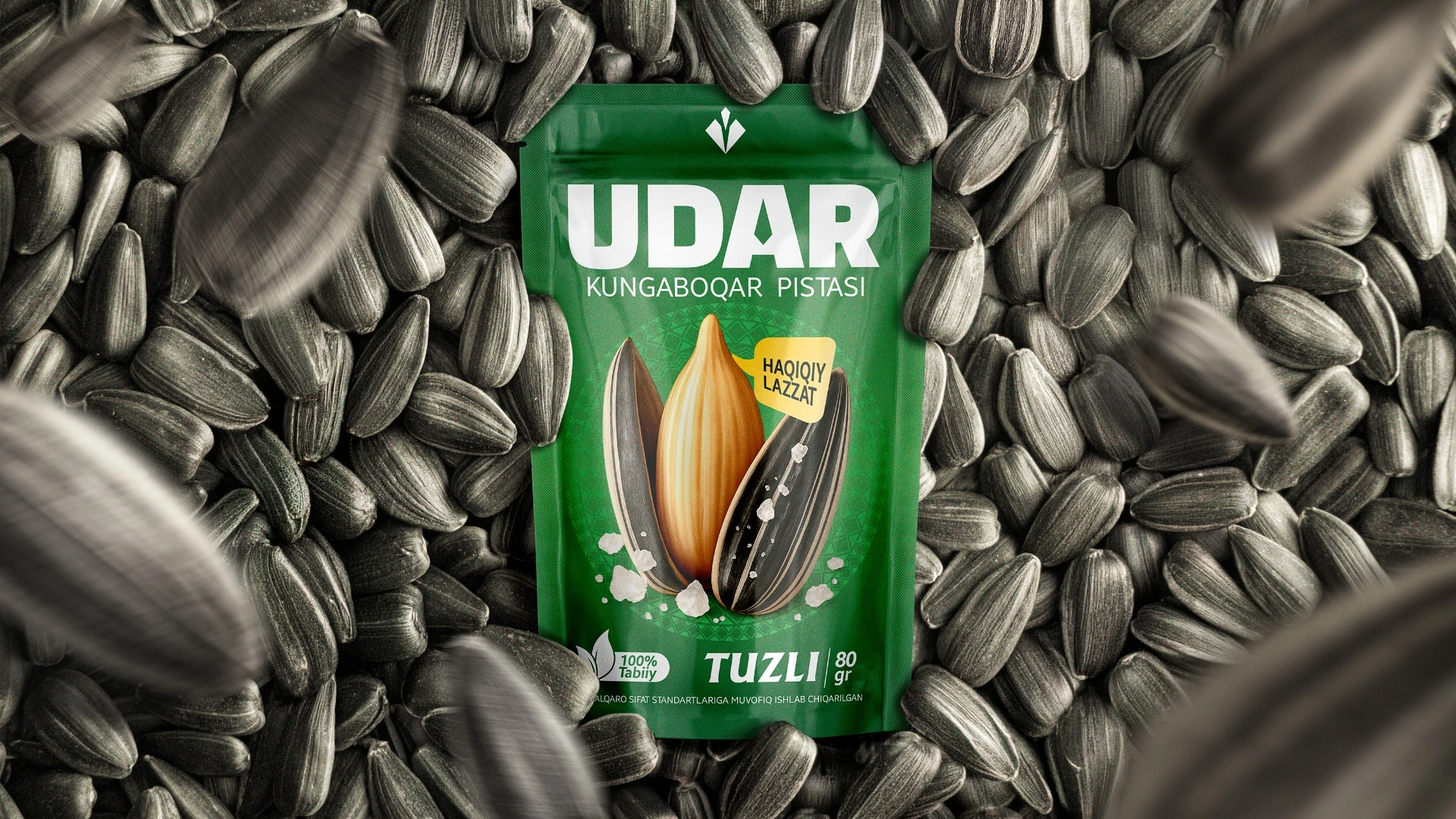
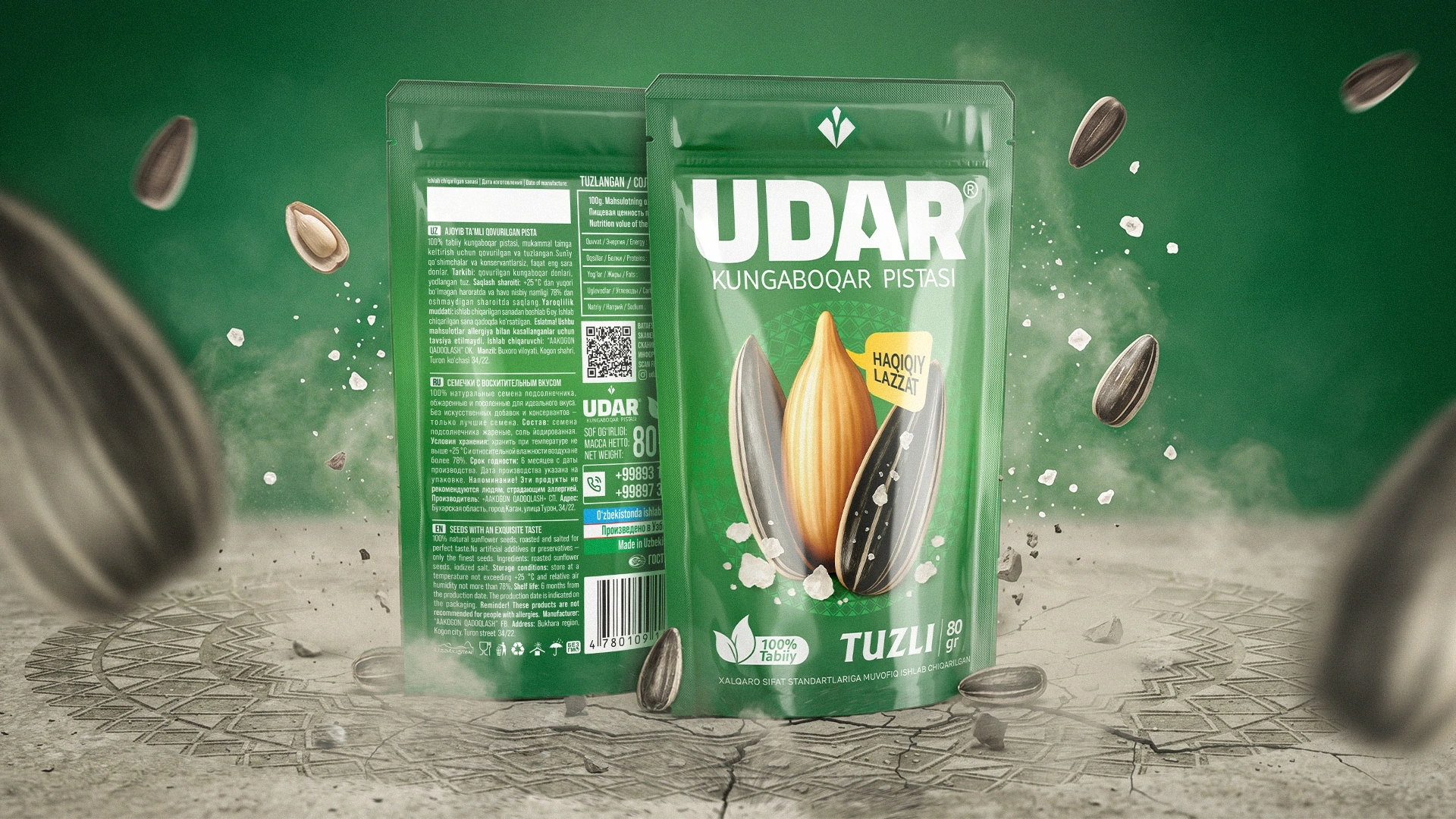
We abandoned unnecessary visual noise in the design and opted for a clean, classic style.
- The Large Kernel and "True Pleasure"
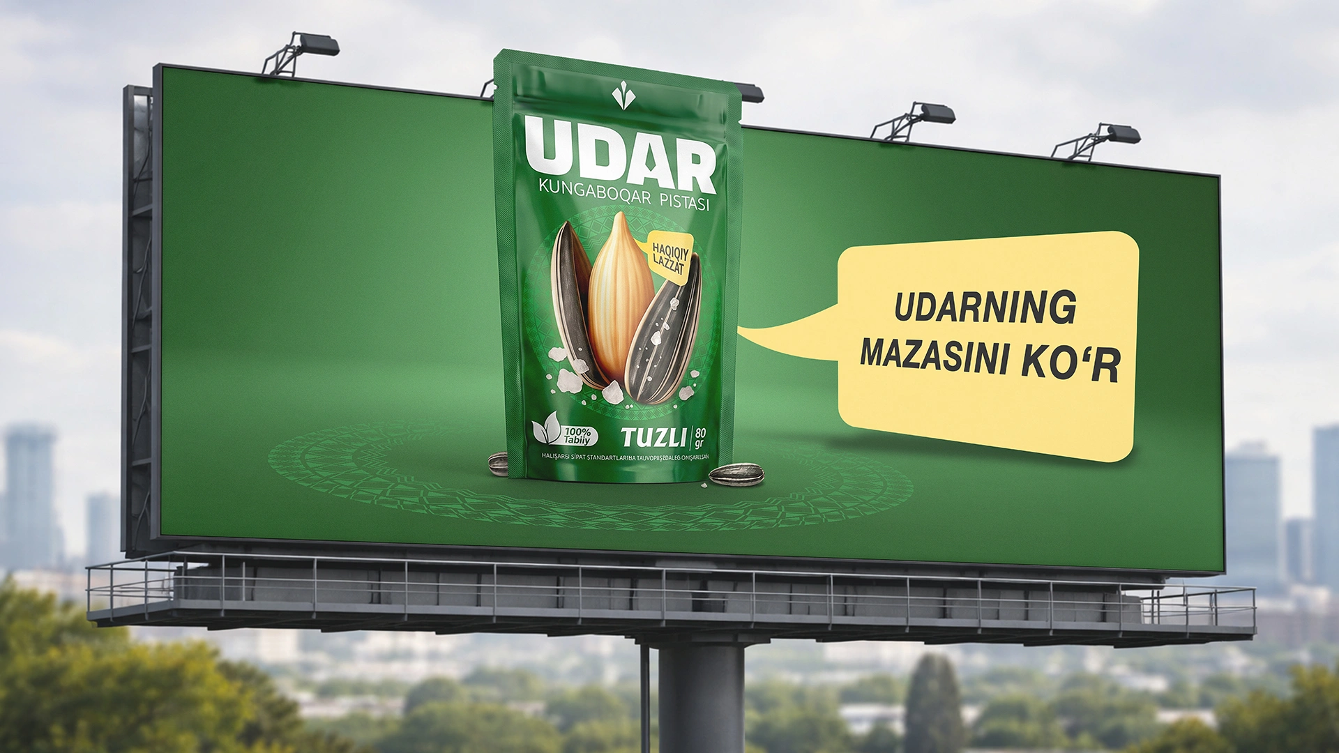
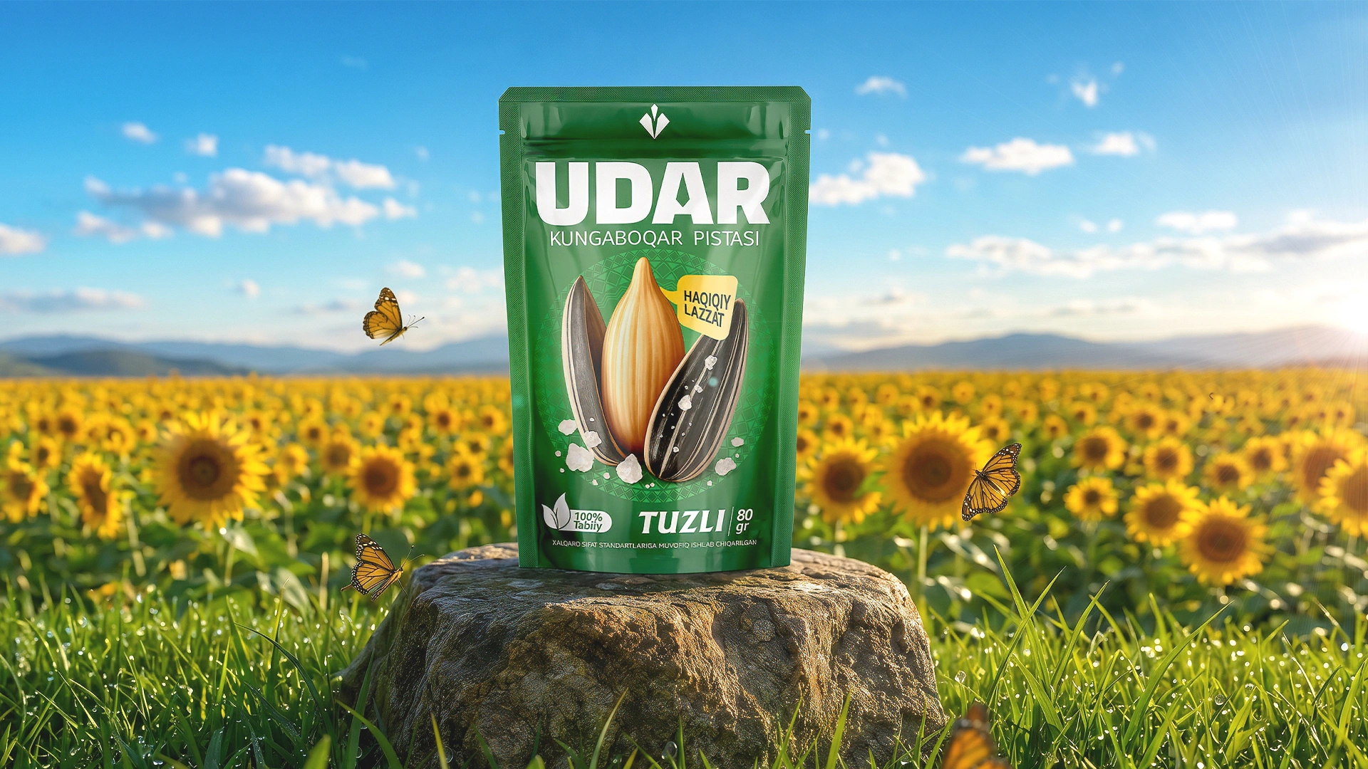
Right in the center of the packaging, we depicted a large, golden, and appetizing sunflower kernel. This sends a clear signal to the buyer: "Our seeds aren't empty inside; they are this big!" Against the green background, this visual solution looked very solid and attractive. Additionally, to soften the aggressive name and draw people to the taste, we used the slogan "Haqiqiy lazzat" (True pleasure).
- Color Play for the Assortment
To visually separate product variations, such as salted and unsalted, we changed the background colors while maintaining the core classic style. This solution is clearly visible in the blue and dark red packages of the product. There are no superfluous details here—only the short and punchy name "UDAR," the giant product, and its advantages.
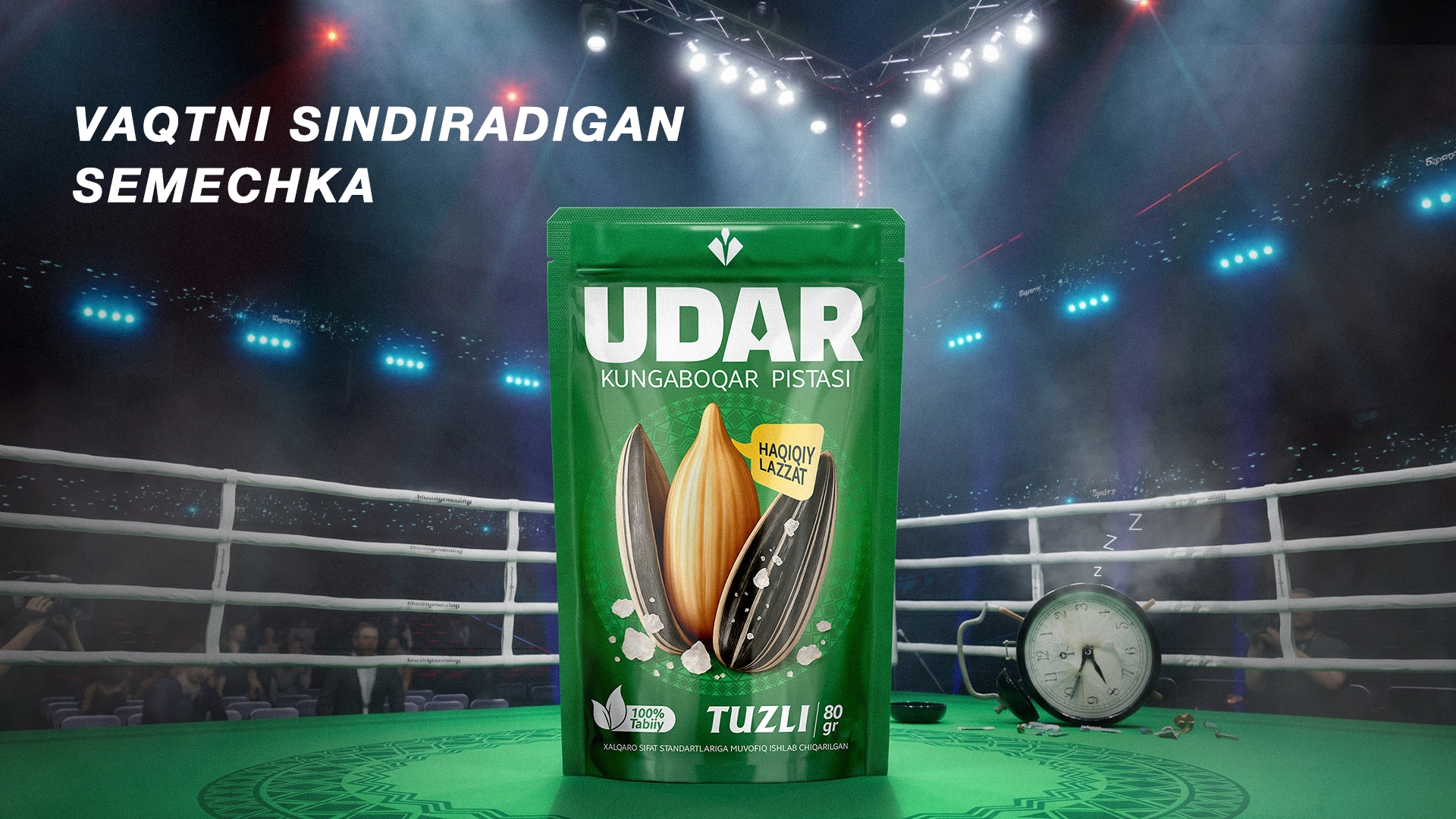
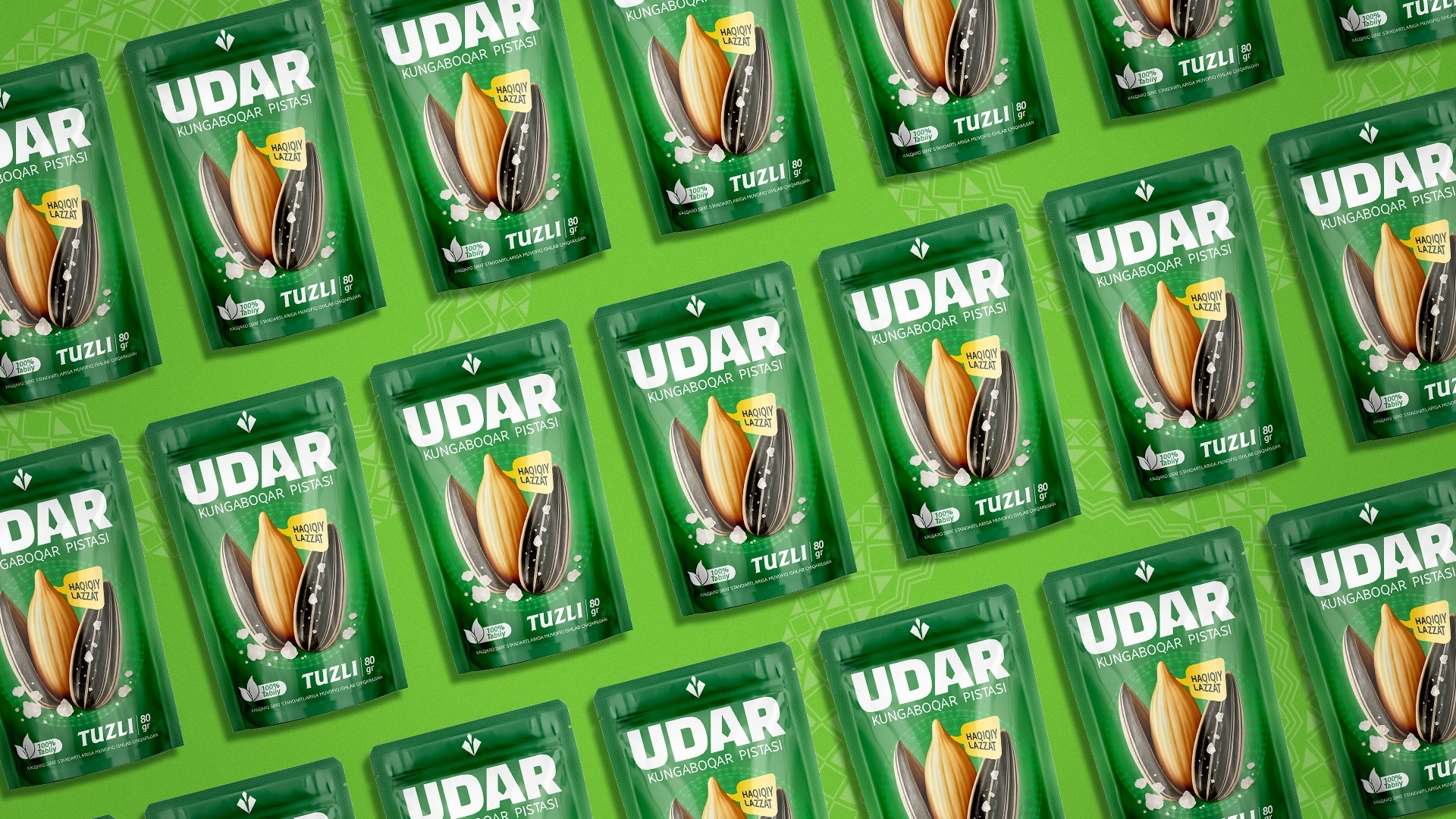
Result
Thus, "Udar" seeds received an elegant and appetizing packaging that harmonizes perfectly with its resounding, catchy name.
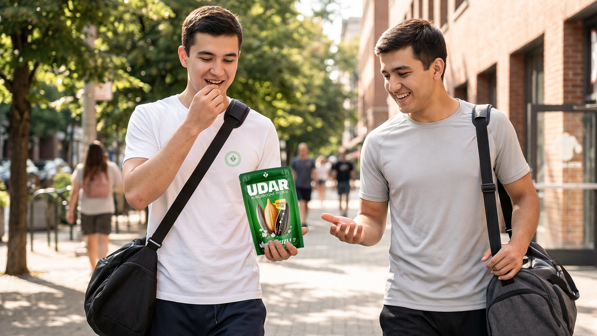
Now, a person seeing these seeds on store shelves won't be scared away. Thanks to the right positioning and design, a solid foundation was laid for the product to become a favorite purchase not only for the youth but also for grandfathers shopping at the bazaar and housewives watching TV series at night. The right design delivers a truly "killer" result in sales!