XIT – Sunflower Seed Packaging Design for a Youth-Focused Snack Brand
1. Problem and Task
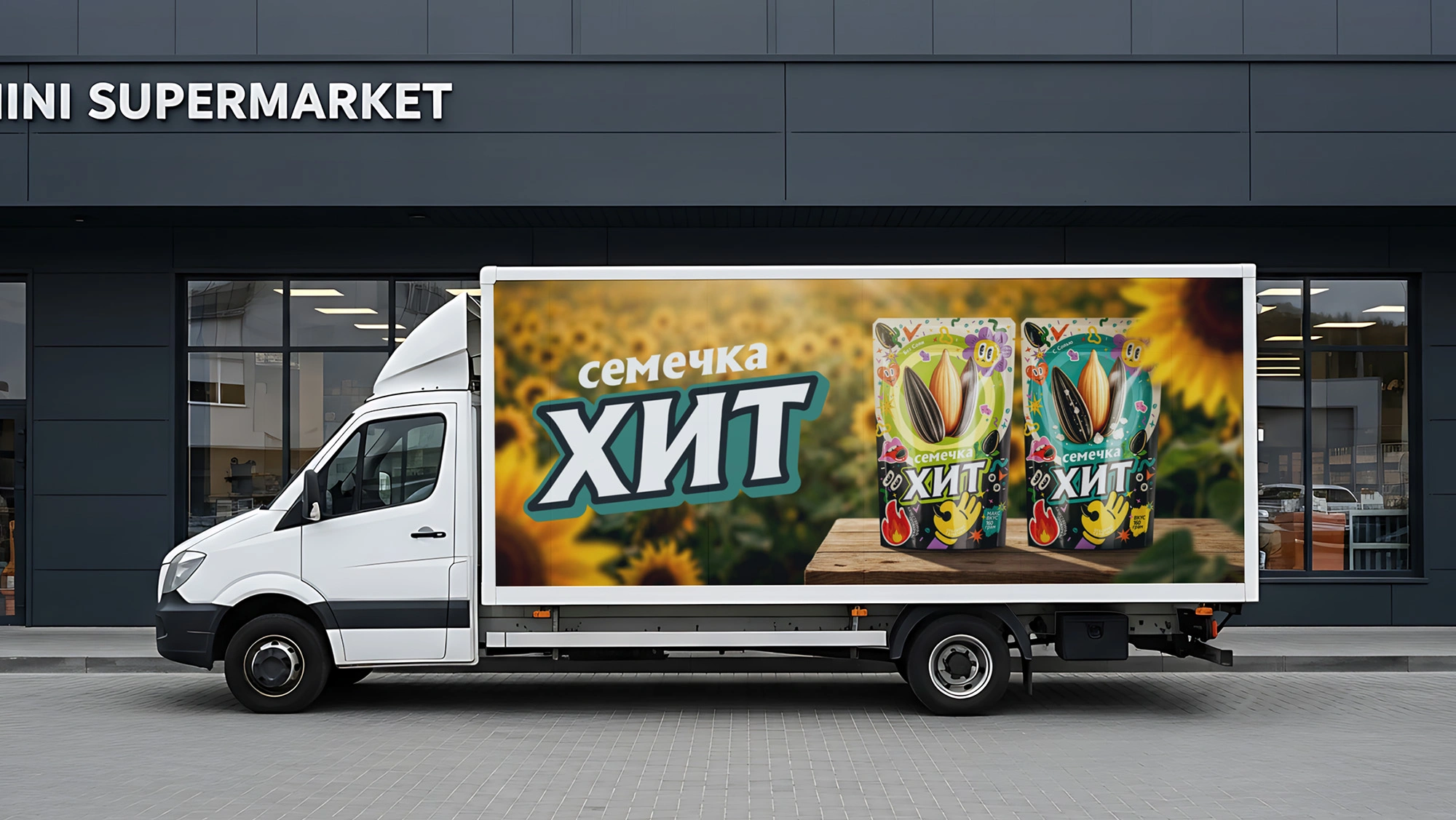
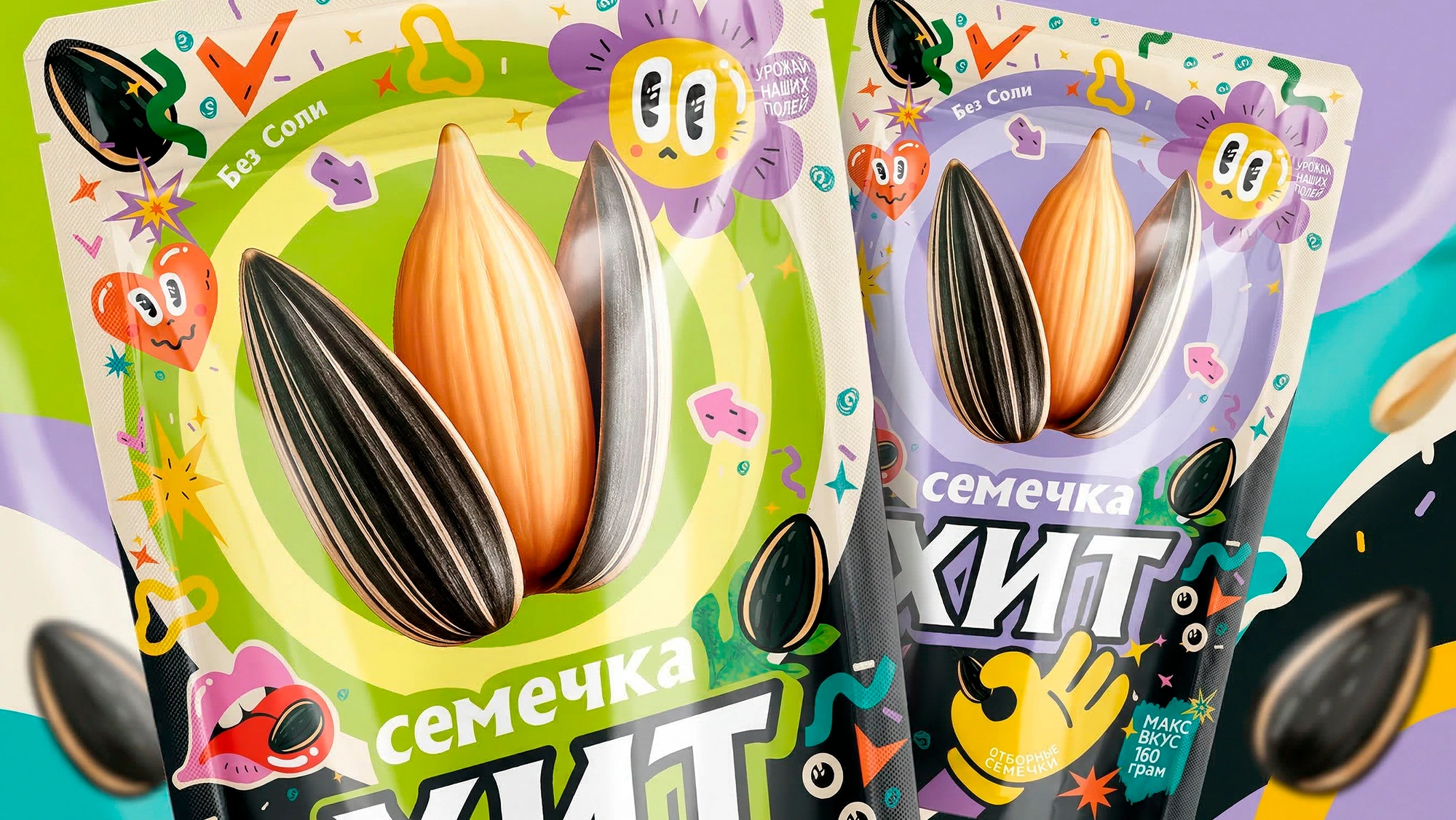
The starting point for this project was clear: the client had already chosen the name — "XIT" (Hit). Inside the package is a highly valued product: premium Chinese "361" hybrid sunflower seeds. This variety stands out for its large caliber, elongated shape, distinct white stripes, and a signature sweet, nutty flavor when roasted.
The main task was to package this high-quality product not just as "another pack of seeds," but as a trendy brand capable of capturing the attention of youth and modern consumers while visually dominating the supermarket shelf.
2. Research
While analyzing the FMCG snack category and the sunflower seed market, we relied on the following insights:
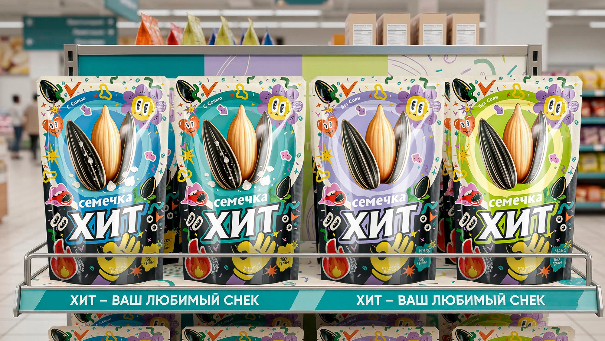
- Category "Blind Spot": Most seed packaging on the market shares the exact same visual code — grey or brown backgrounds, agricultural motifs, and giant sunflowers. The shopper's brain automatically filters out these repetitive templates, causing the products to blend together on the shelf. To trigger an impulse purchase, we had to radically break this pattern.
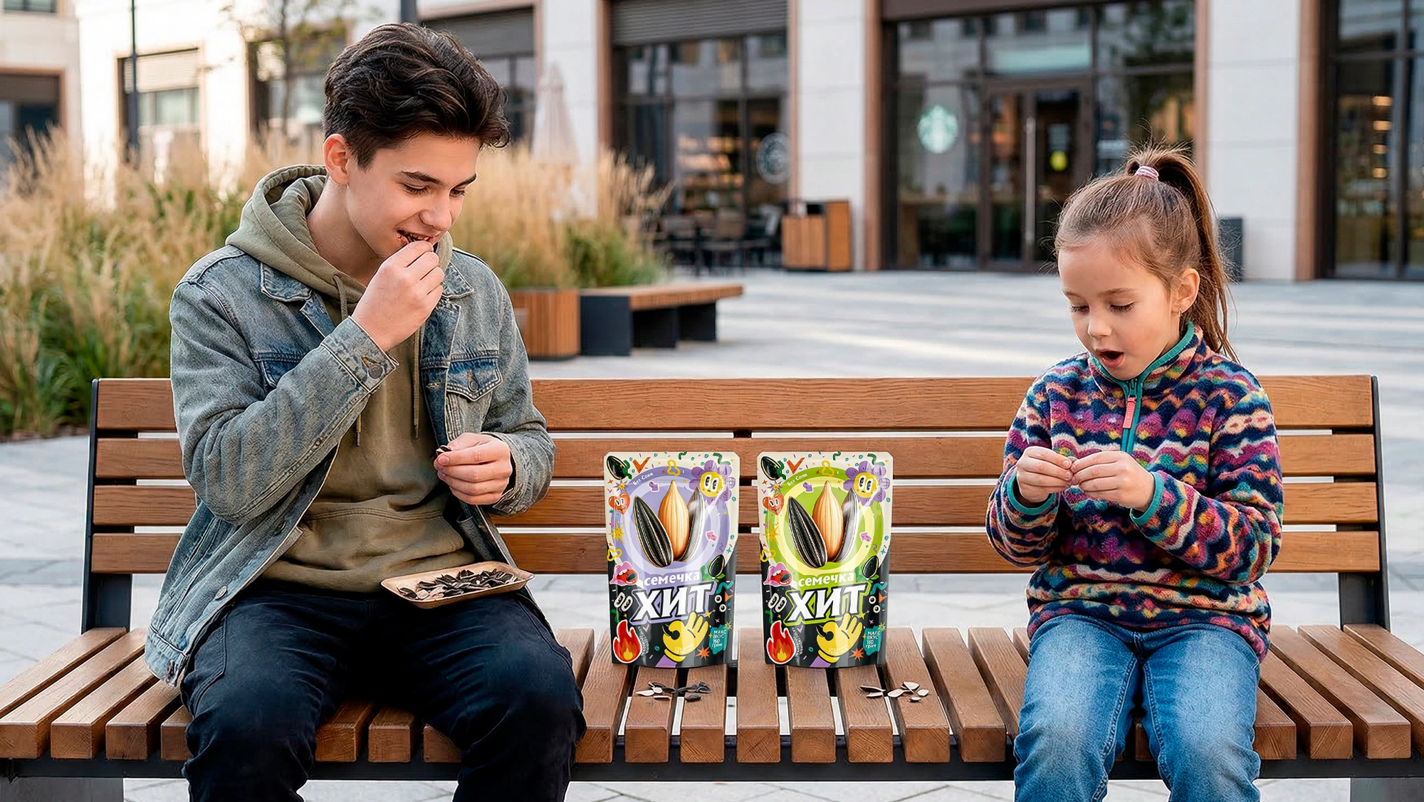
- A Shift in Consumption Culture: Cracking seeds is no longer just a mundane outdoor habit. It has evolved into a go-to snack for gaming, binge-watching series, and active youth recreation. Consequently, the target audience reacts to hype, pop-art, and street culture rather than "farmer" aesthetics.
3. Solution
We consciously abandoned the currently popular minimalism and applied a strategy of "controlled maximalism":
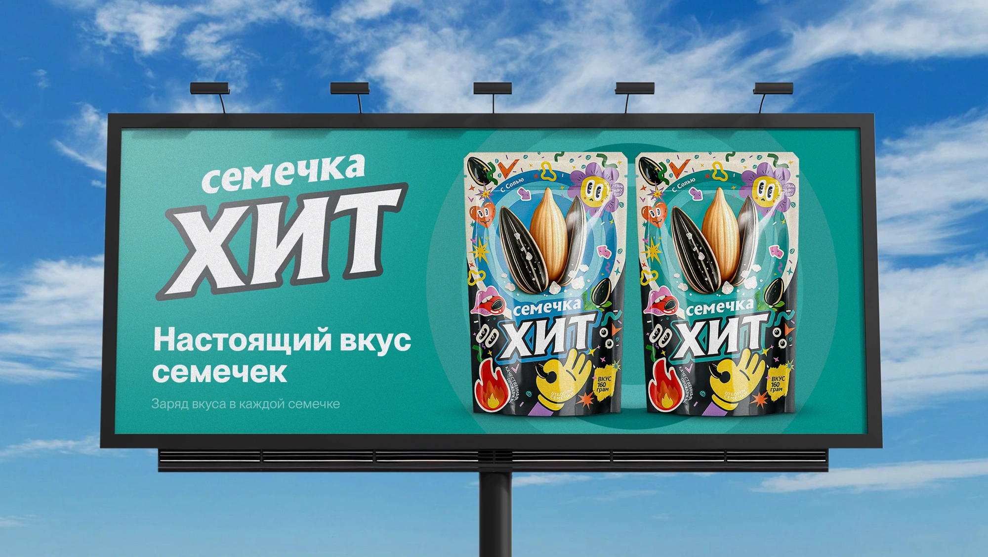
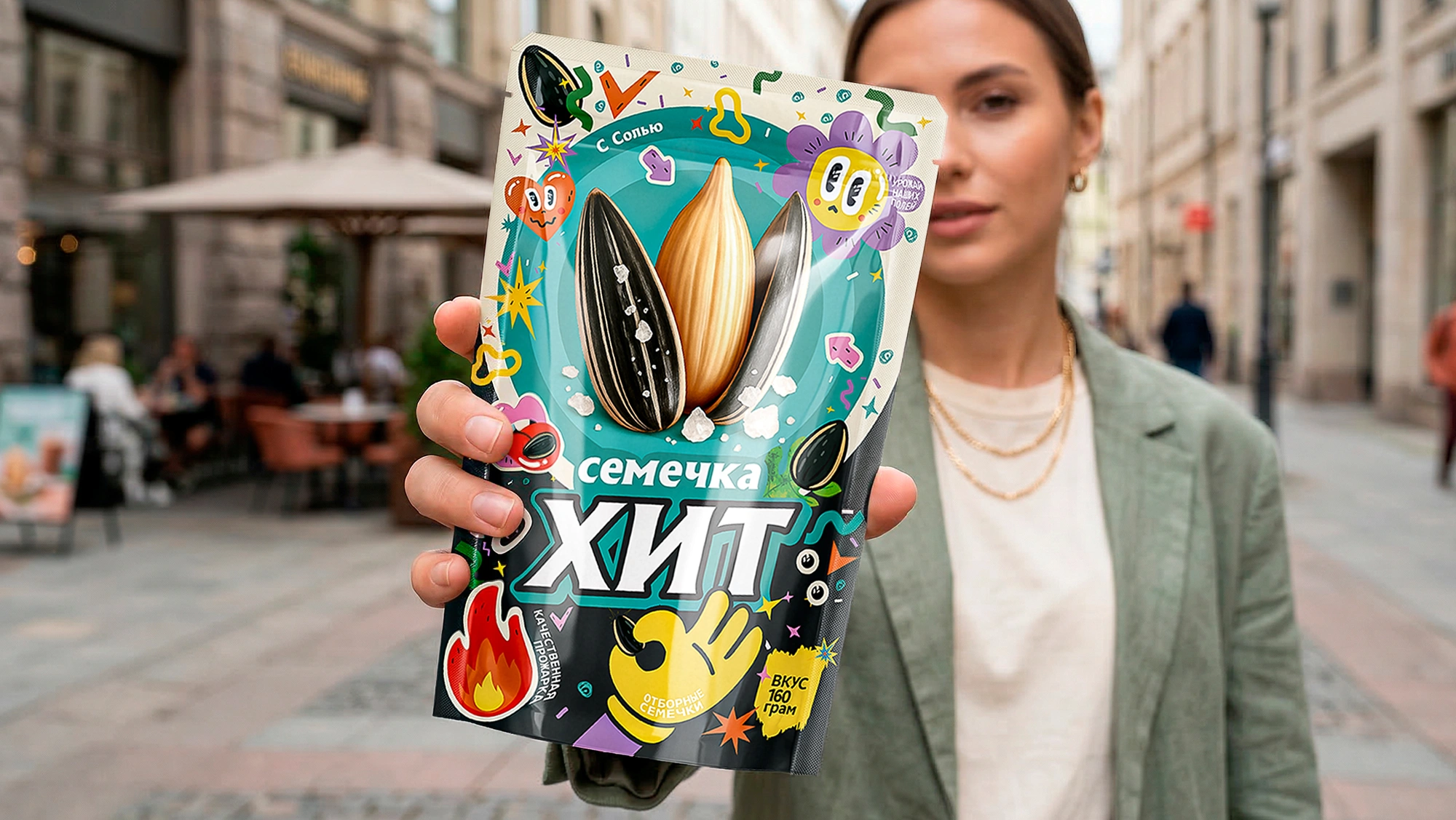
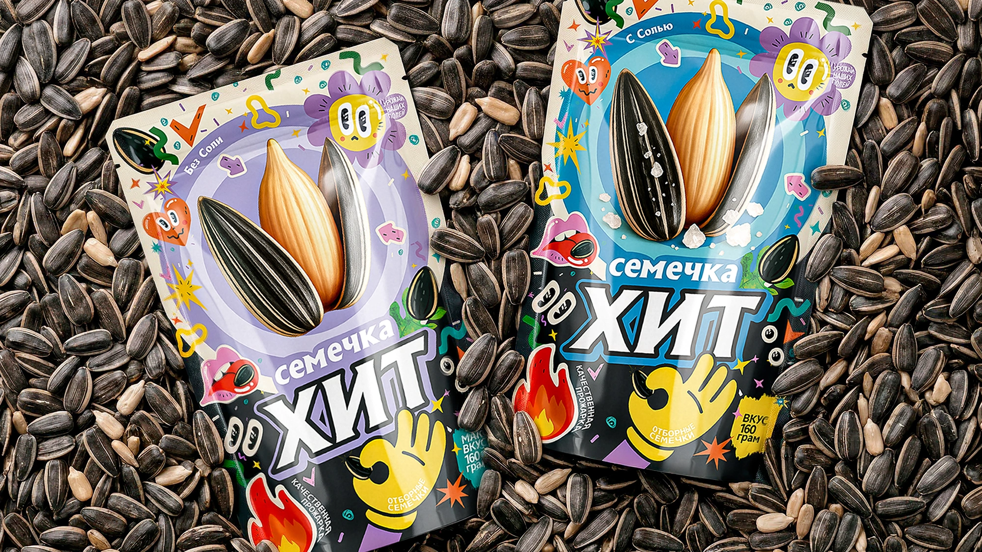
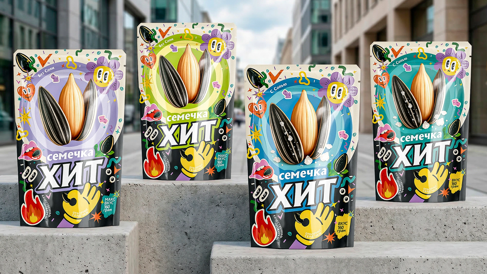
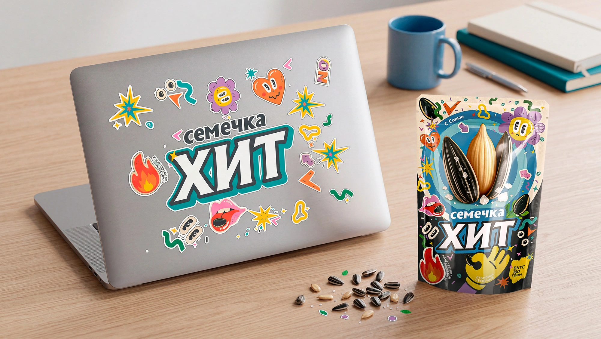
- Youth Slang & Aesthetics: The packaging surface is designed in a "sticker-bombing" style, reminiscent of teenagers' skateboards or laptop covers. Dynamic typography, cheeky emojis, and an "OK" hand gesture shape the brand's bold, youthful character.
- Hyper-Realism & Contrast: A highly detailed, large 3D image of the seeds is placed in the center of the packaging. Against the chaotic background graphics, the product itself looks incredibly appetizing and pops vividly.
- Product Matrix (SKU): The line is divided into two flavors. For the "Salted" version, we used an energetic, sharp combination of deep turquoise and black. For the "Unsalted" version, we opted for a blend of light green and lilac, creating a lighter, more relaxed vibe.
Result
Thanks to its architecture and bold design solutions, "XIT" has taken on the appearance of a modern, international snack brand. This design aggressively sells itself on the shelf and absolutely stands out among traditional competitors.
As an initial go-to-market strategy, the product is being launched in the Republic of Karakalpakstan. This regional test drive will validate the product's visual strength and serve as a solid springboard for scaling across the entire national market.
For Distributors: "XIT" sunflower seeds — a brand unafraid to break standards and capable of grabbing a shopper's attention in 3 seconds — are open for new partnerships. If you are interested in collaboration and introducing this product to regional retail networks, contact us, and we will connect you directly with the manufacturers.