SIRIUS — Logo for a Medical Center
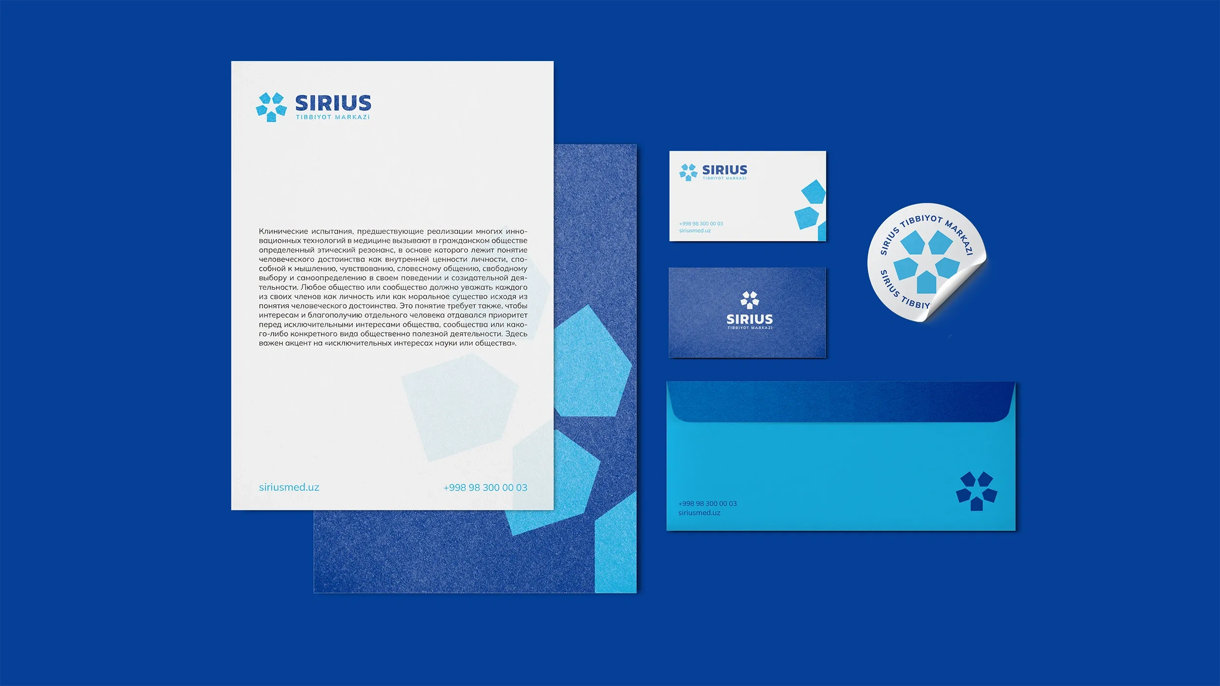
Logo for Sirius Medical Center
As always, when developing a logo, we started with studies, research, and analysis. We found out why the medical center was named Sirius.
Sirius is the brightest star visible to us. This star has long been a symbol of goodness for many peoples. For people seeking healing, Sirius Medical Center serves as a symbol of salvation. Therefore, our first suggestion for the logo was to represent the shape of a star.
Result
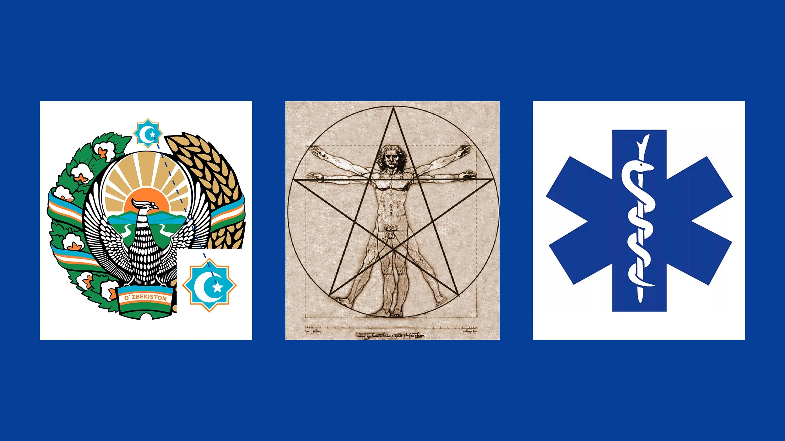
The star symbol is not unfamiliar to us:
- The flag and coat of arms, which are the symbols of our state, also feature stars;
- Leonardo da Vinci's work depicting ideal human proportions contains a reference to the star shape. The idea of a healthy person is just as appropriate for the medical center;
- The five points of the star represent the five main goals of the medical center:
1. High qualifications and experience
2. Modern equipment and technologies
3. Universality of services
4. Individual approach
5. Innovative methods
So that the logo does not simply consist of a star shape, we have enriched it with a medical theme. We were inspired by the emergency medical symbol known as the "Star of Life" in the USA and many European countries.
The result is a logo that is simple at first glance, but embodies many ideas. We will not spare the likes!


