Ti.Coffee — Logo and Branding for a Coffee Shop Chain
Ti.Coffee is a coffee shop that aims to build a network throughout Uzbekistan and expand to the CIS countries through franchising in the next 3 years. To achieve this goal, it will require proper and well-thought-out branding, which will serve as the basis for the successful development of the network.
1. Task
We had a clear task to approach the development of the logo from a business point of view, namely, the logo should:
- contribute to brand recognition for a wide audience;
- distinguish the brand from competitors;
- represent the main associations and values of the brand;
- be simple, expressive and easy to remember.
2. Solution
We studied the coffee shop market, identified key competitors, and identified trends that effectively engage the target audience.
Our research showed that many coffee shop logos feature a cup on a saucer. But how can you stand out from your competitors and express your coffee shop image without using a cup?


Result
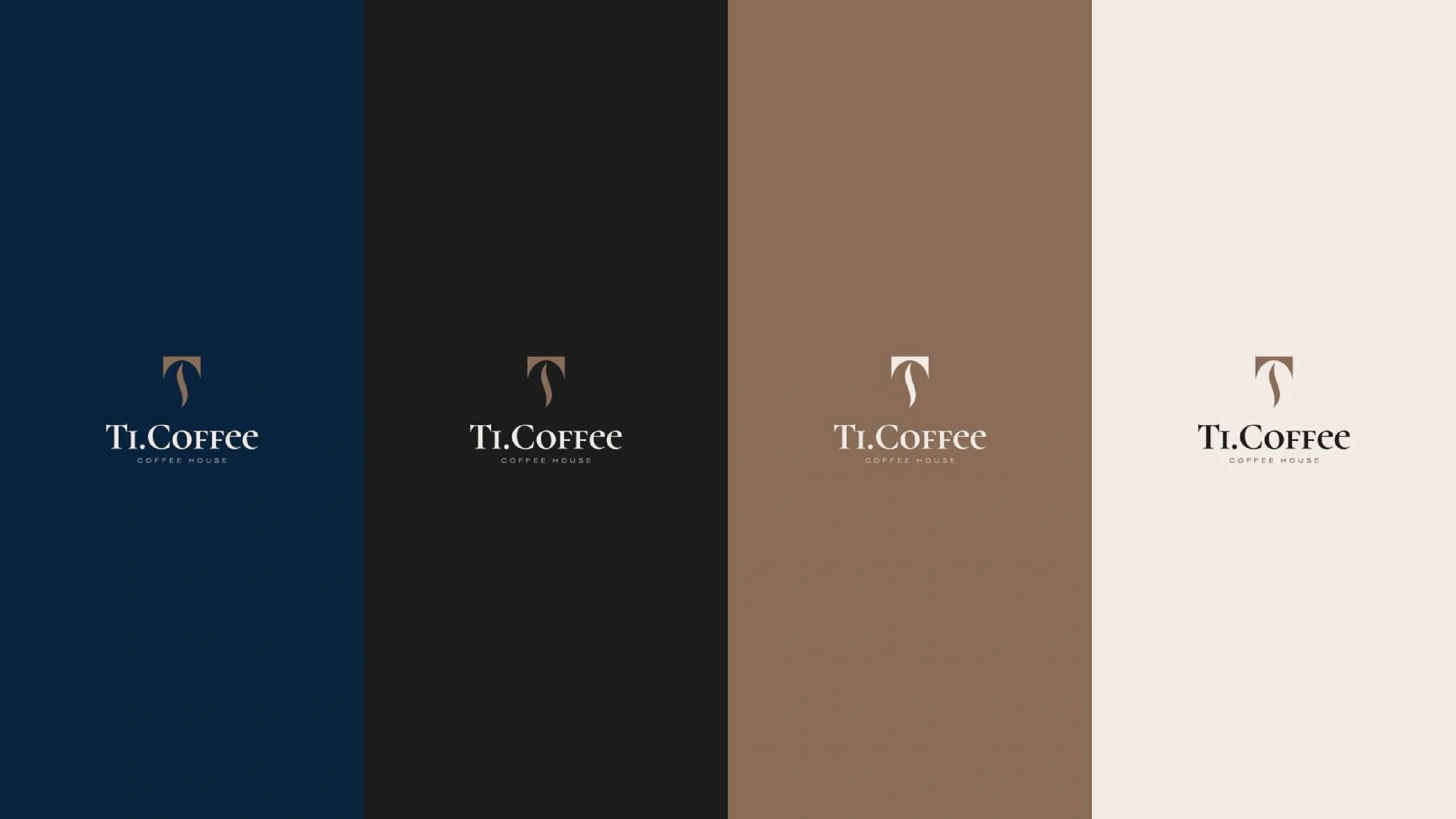
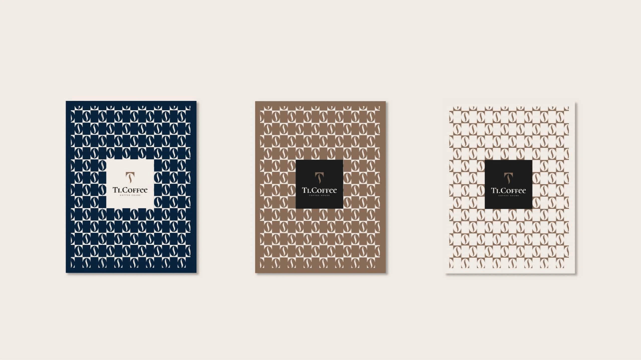
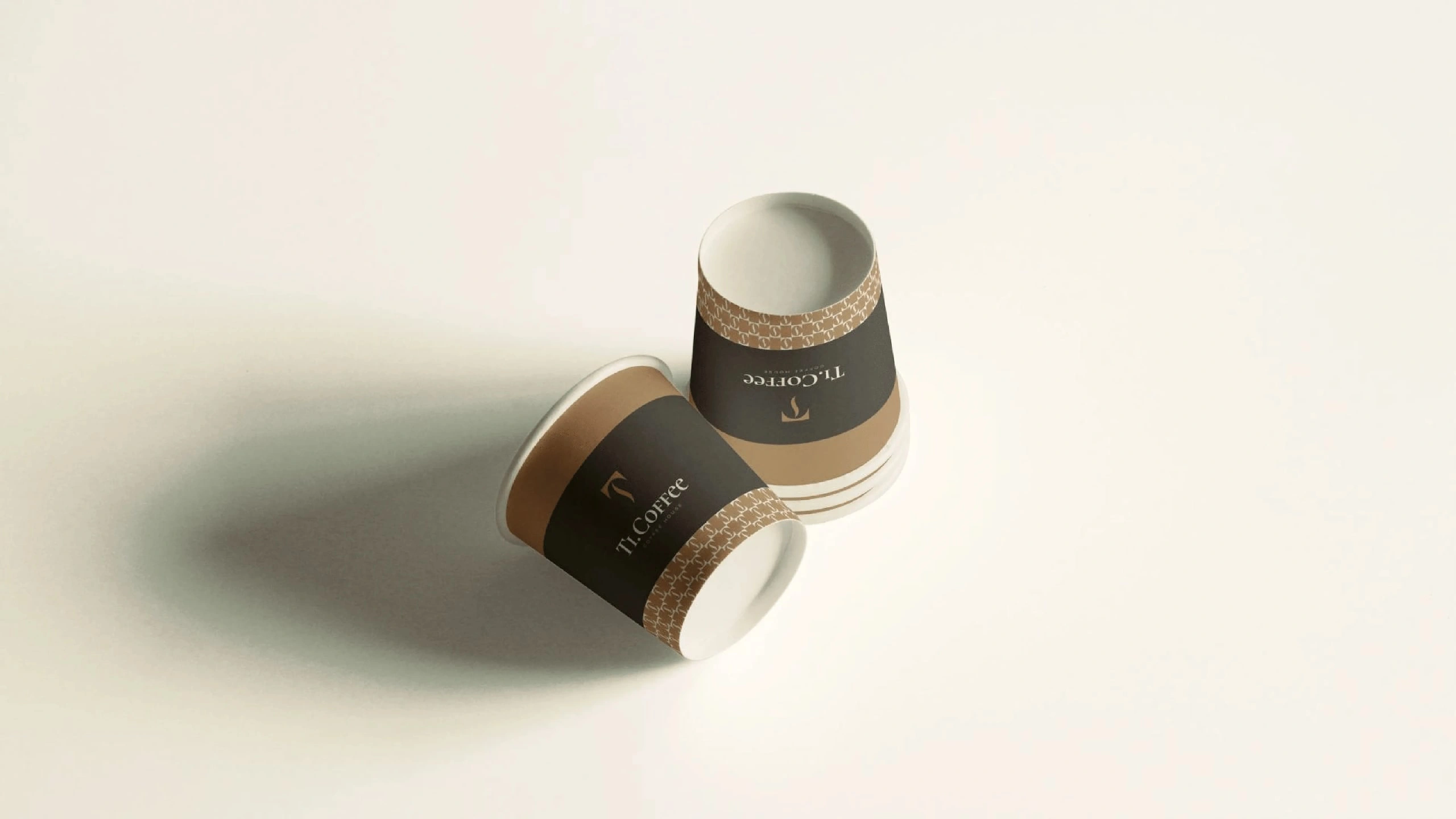
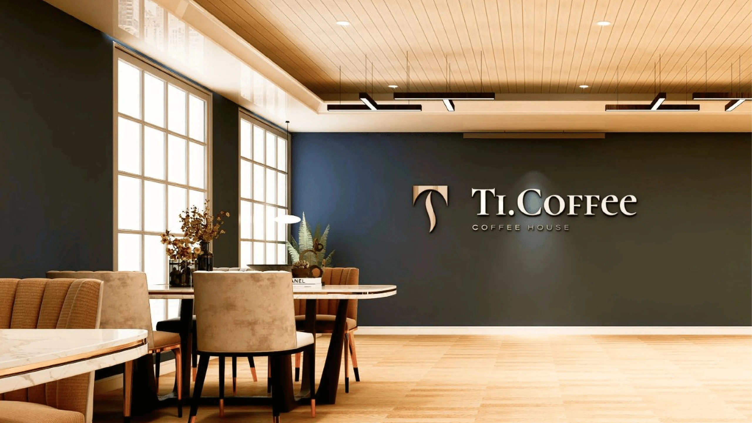
The Ti.Coffee logo we created is a masterful blend of creativity and minimalism. Its central element is the letter "T" in an unusual style, reminiscent not only of the steam rising from freshly brewed coffee, but also of coffee beans.
The designed logo meets all the business objectives set for it: it expresses the brand's direction, distinguishes it from competitors, is simple and easy to remember.