Agri Food — European Packaging Design for Agricultural Products
Agri Food – European Packaging Design for Pulses from Uzbekistan
1. Task
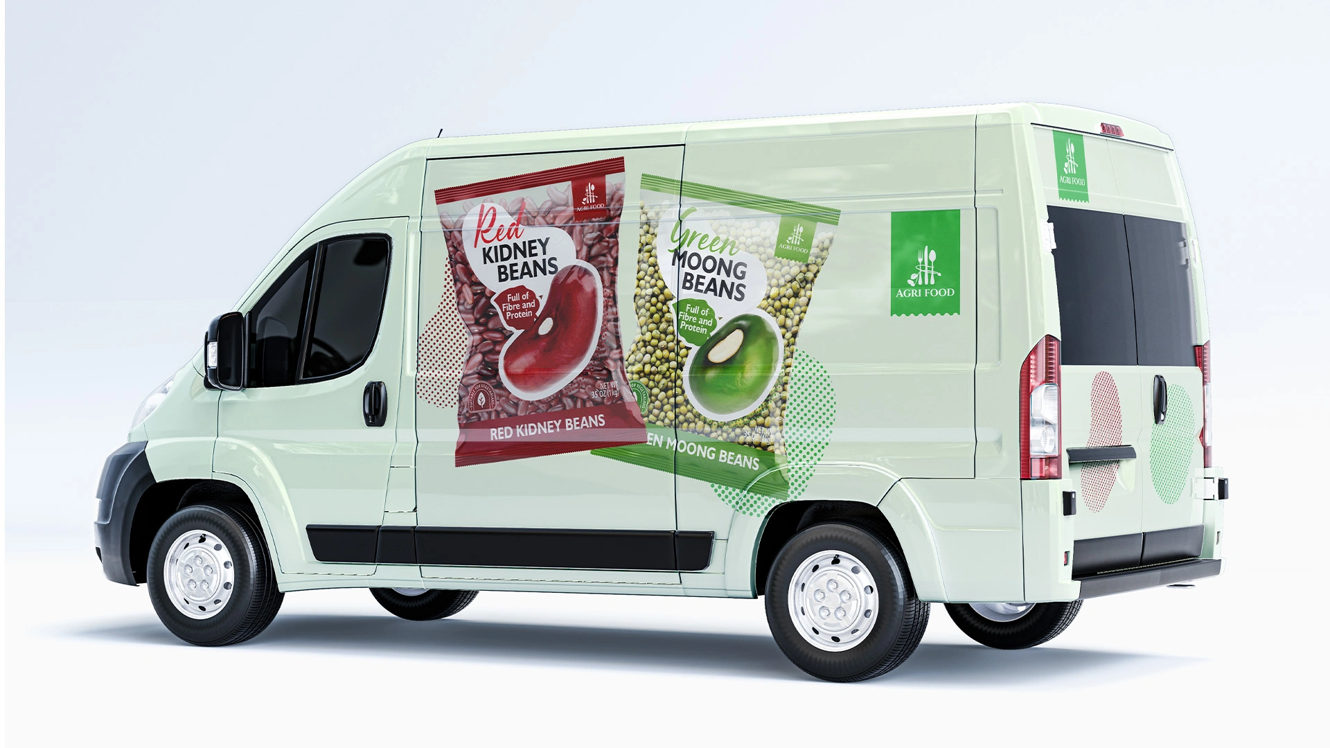
Agri Food is one of Uzbekistan's leading exporters of legumes. For years, the company built a reputation as a reliable B2B supplier, shipping tons of premium red kidney beans and moong beans (mung beans) to international markets.
At a key stage of its growth, the business hit the "ceiling" of its B2B model. To scale further, add value to the product, and increase marginality, a strategic decision was made: to create their own retail brand.
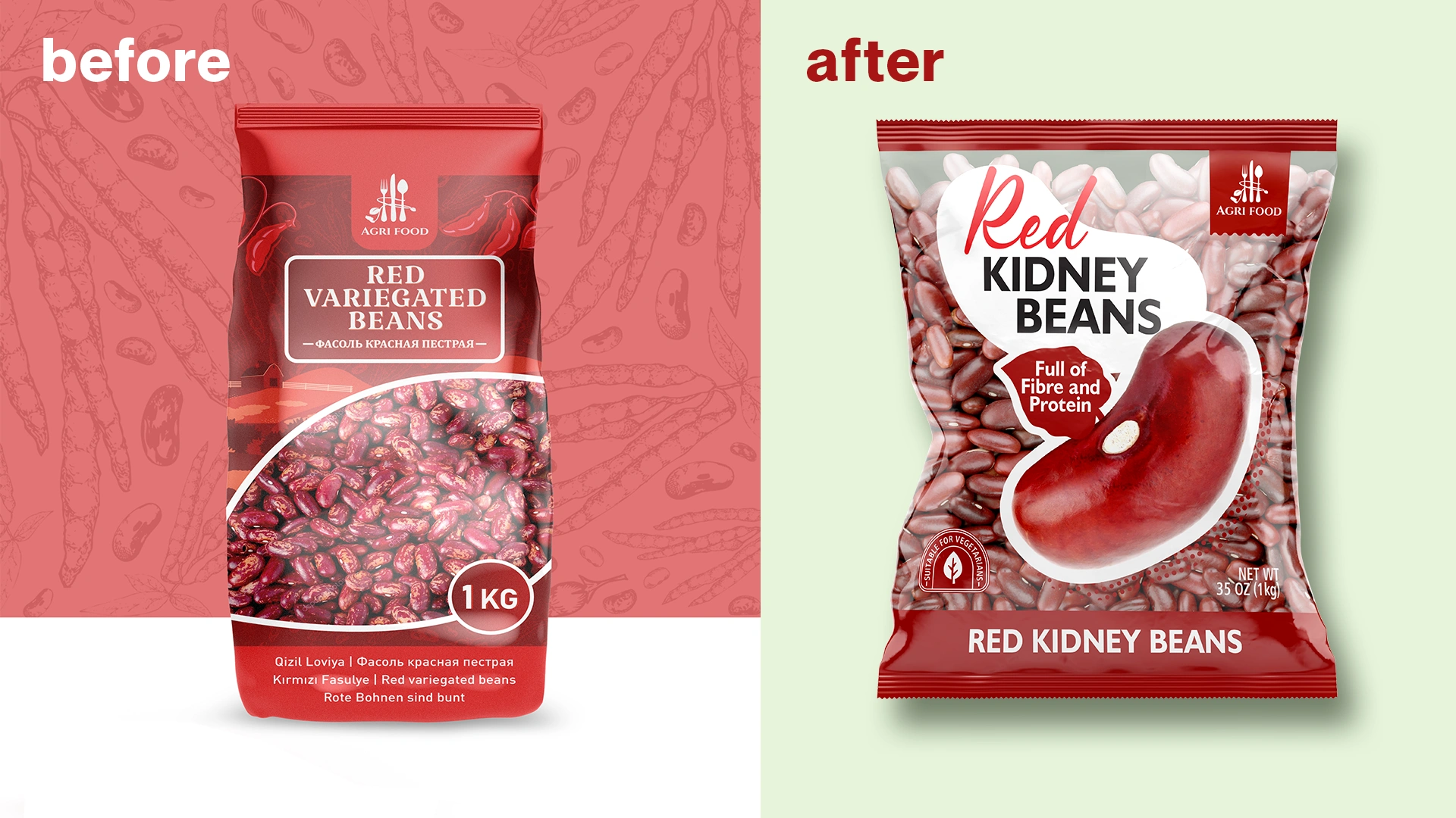
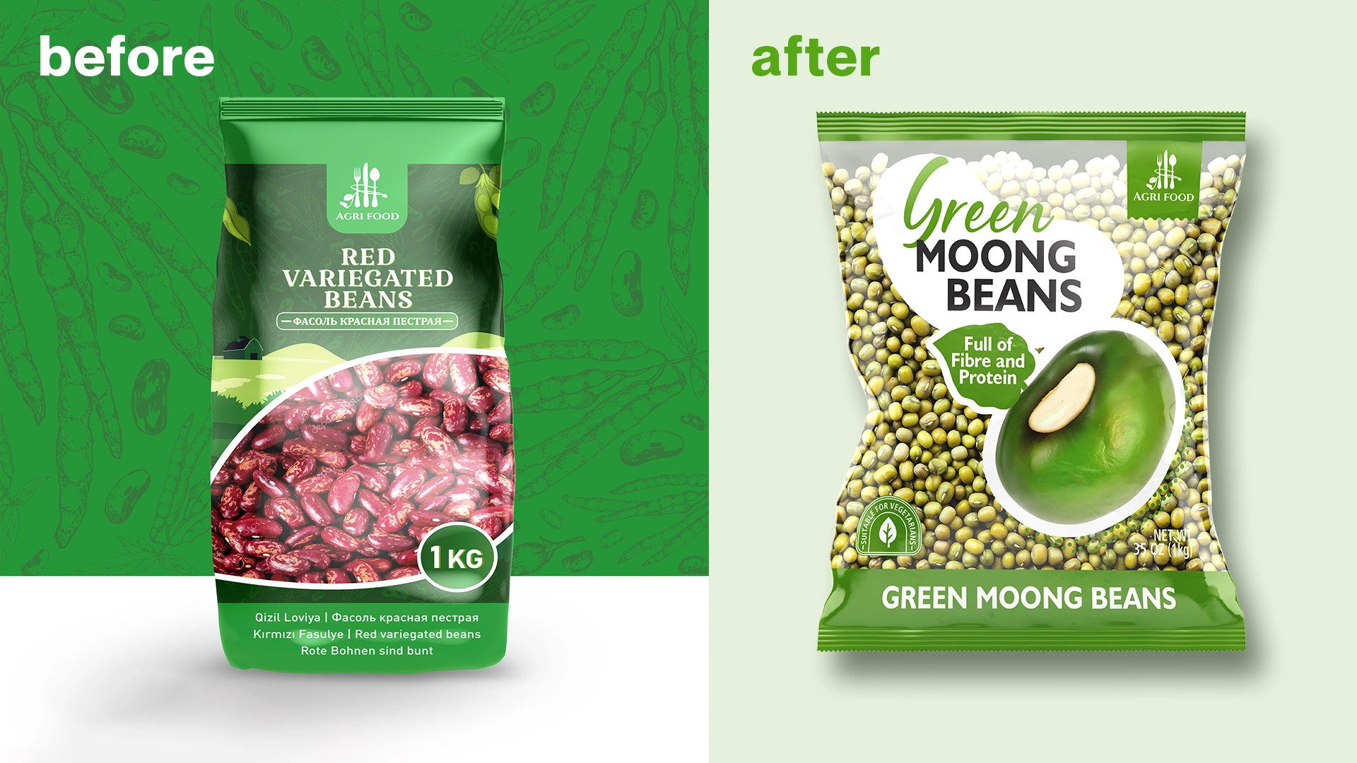
The problem was that the client's existing local packaging was designed for domestic markets and was completely misaligned with the expectations of European consumers. It was overloaded with information in multiple languages and had an outdated design.
We were given a clear task: to develop a packaging design for a line of beans and moong beans that would allow them to "get on the shelf" in supermarkets across the UK and Germany and look competitive.
2. Research
The project began with an analysis of the shelves in the target countries. The legume segment in European retail is oversaturated. We identified two main types of packaging that dominate the space:
- "Blind" Packaging: Cardboard boxes or dense pouches that completely hide the product. The consumer is forced to buy "blind," trusting only the brand.
- "No-Name" Bags: Budget-friendly, fully transparent bags that fail to inspire trust and look like a raw commodity, not a finished brand product.
The European consumer values quality, sustainability, and transparency. They want to see exactly what they are buying.
This analysis gave us a clear insight: don't hide the product. While competitors either completely conceal their goods or present them carelessly, we decided to make the product itself the hero of the design.
3. Solution
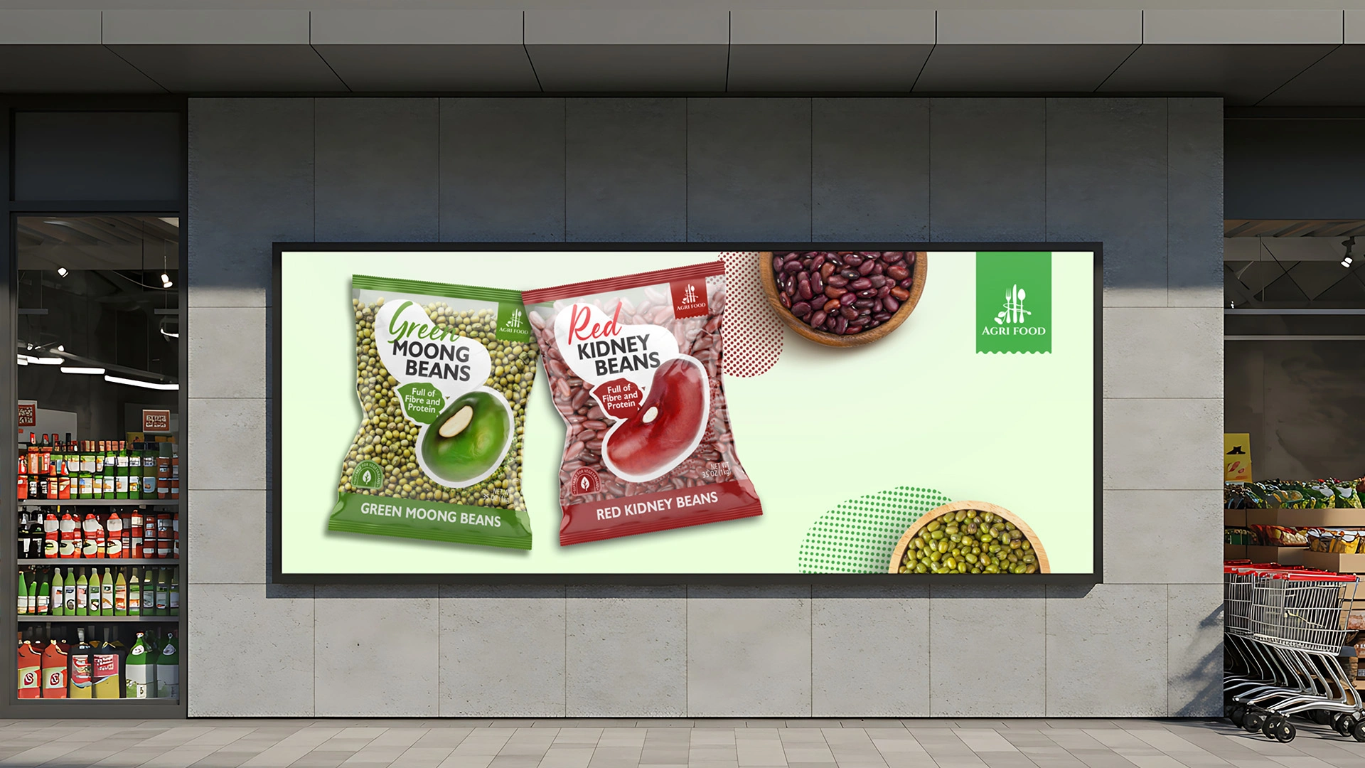
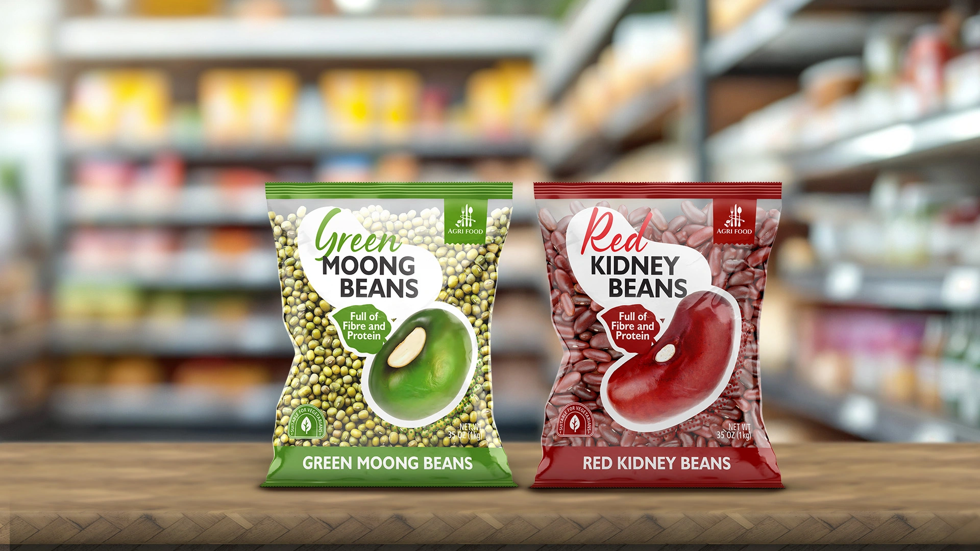
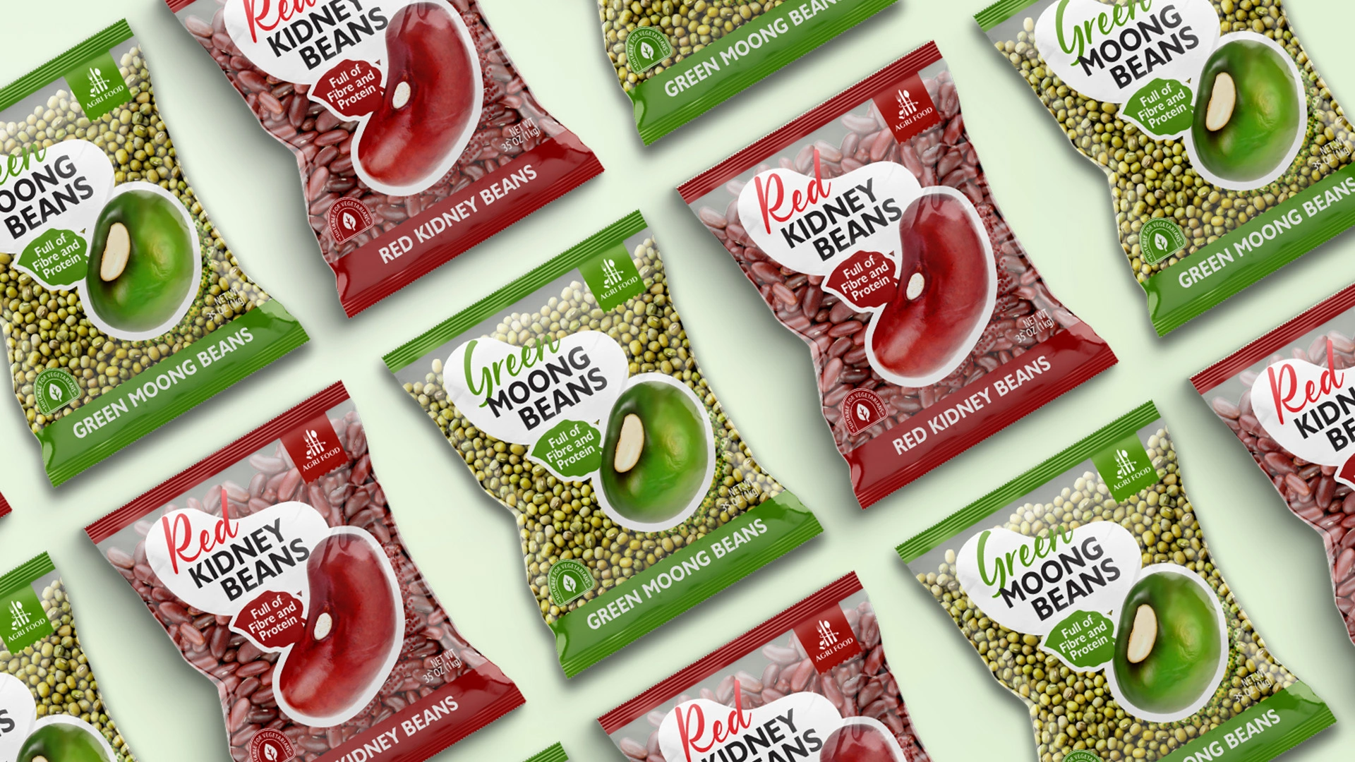
We developed a clean, honest, and quintessentially European minimalist design that is built around the product.
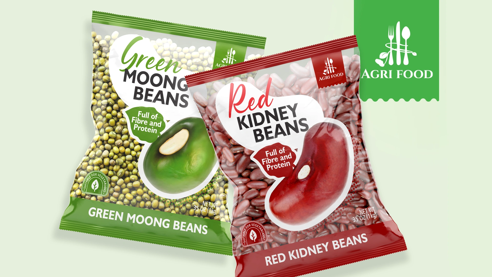
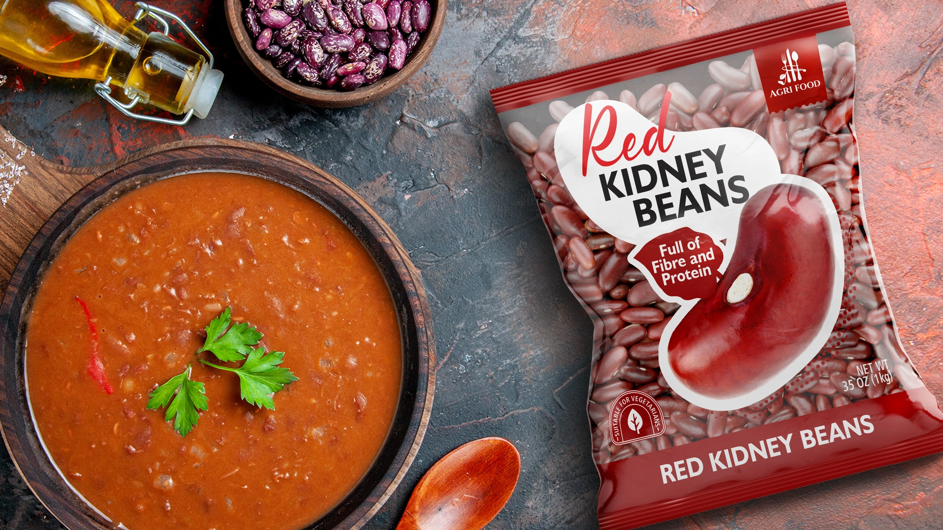
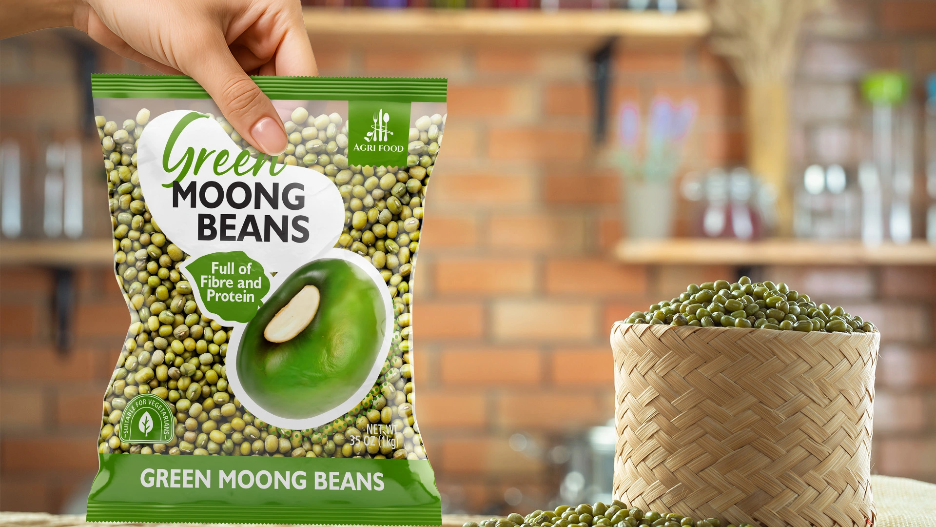
- 1. Barrier-Free Design: Full Transparency. We made almost the entire front of the package transparent. This allows the product — the premium beans and moong beans — to sell itself. The customer sees 100% of the contents, which is the highest form of honesty and builds immediate trust.
- 2. The "Floating" Label and Clean Typography: All key information — the name, logo, icons, and an appetizing illustration — is placed on a central "floating" label. This element creates a focal point and brands the product without obscuring it.
- 3. European-Focused Information: A soft, organic, handwritten-style font was chosen for the product name (Red Kidney Beans, Green Moong Beans) to create a natural feel. Key triggers for the European consumer (e.g., "Full of Fibre and Protein," "Suitable for Vegetarians") are given a prominent place and rendered in a clean, easy-to-read sans-serif font.
- 4. Appetizing Food Zone: The centerpiece of the label's composition is a hyper-realistic, luscious illustration of the product. This creates an appetizing image and helps differentiate the product on the shelf, even from a distance.
Result
As a result, our client received a ready-made tool for entering highly competitive markets. The new design helped Agri Food successfully negotiate with distributors in the UK and Germany.
Thanks to this shift in positioning — from an anonymous raw material supplier to a fully-fledged B2C brand — the company was able to begin a new stage of development, offering a high-value-added product to the European market.